Learning how to work with images
Before I began this project I decided that I want to work with real life images and use them in my designs as this is something that I have never done before. Before beginning this I wanted to do some research into where to get really good images from online- my topic is about space therefore I couldn’t exactly go out and take images of Jupiter myself so I needed to download high quality planet images. I wasn’t sure where to start so I decided to research the best place to find these images.
Where do I get good, high quality images?
From research I believe that the most popular place to get good and free high quality images is – UNSPLASH.
Some honourable mentions-
- GRATISOGRAPHY
- PIXABAY
- STOCKVAULT
I researched the planets that I wanted to include within my elements project and downloaded 5 planet images from Unsplash. They didn’t need much retouching as this website provides really good images but I wanted to sharpen and enhance them slightly so they look good onscreen. Keep reading to see how I did this!
Learning…
I decided to take to Linkedin Learning where I was taught how to use photoshop to increase the quality of images and how to make them look better for screen. I learned a lot from this and I took my images that I found on Unsplash and enhanced their quality using these tips.

Looking at the smart sharpen feature…

The process…
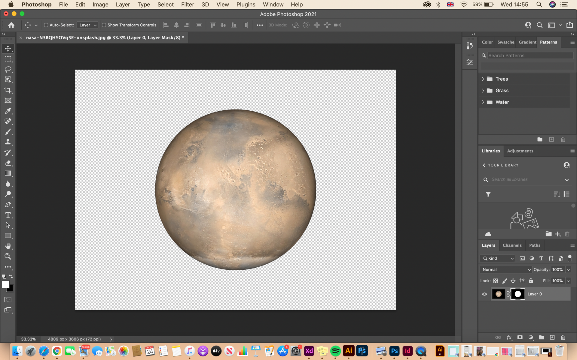
I began with removing the background and the struggle was to make sure they kept their high quality when saved and exported to Figma. I’m rather new to Figma so I needed to ensure that this was done correctly for when it came to my prototyping stage. The instructor showed 3 different ways to sharpen and enhance an image which was helpful because it does depend on the images resolution.

What did I learn from this?
I learned how to sharpen images as well as how to save them so they keep their quality. I did this by increasing the edge contrast on the sharpen filter section which is something I wasn’t aware of before. I did this by looking at Threshold, Amount and Radius and it was all about getting a good balance for the contrast to make it look like the image is higher quality. It was important here that I didn’t go too overboard until there was a halo- that meant I went to far with the contrast this makes it the image look fake and just weird…
Another section that I found helpful which I have screenshotted above was the smart sharpen feauture- this allows me to play around with the highlights of the image and this is good for images taken in low light or if there are a lot of noise in the background for example. The instructor talked about the use of shadows and how lowering the amount of shadow sharpening in the background can also help with the final outcome. This information and the values that I played around with would be different if I were printing but this is solely for screen usage so I think that this resulted in a really nice subtle outcome!
I am happy with my outcomes and I think that my planet and the image that I chose to sharpen look really good and they exported well into figma which is something that I was apprehensive about. I will update my blog with the results.