James Round
I have decided to complete a pocket profile on James Round as research for my infographic project, I have included my thoughts and opinions on his work below.
About this designer
James Round is a designer who has a love for printed products, compelling data visualisations and bold illustrations and he enjoys creating work that engages and delights his audience and he has even had his work featured at The Information is Beautiful Awards. He describes himself as I’m an independent, multi-award winning graphic designer and illustrator (which is a very impressive tag line).
His advice on data visualisation-
Bring clarity to the complex with an attractive and accessible infographic or data visualization that will engage, educate and delight people.
An example of his client list:
- BBC
- BAFTA
- Wired
His work
I went over to James Round’s website where I found a lot of data visualisation inspiration! He has a great website which I found very enjoyable to look through and his ‘Work’ section was overflowing with illustration and data focused work, I have chosen a few of his projects and have given my thoughts below.
The Many Moons of Jupiter
this project is a data visualisation that maps all of Jupiter’s 79 known moons, this was a personal project for James. it is a landscape visual and each of the 79 planets feature the year of its discovery, who discovered it and a representation of its’ scale.
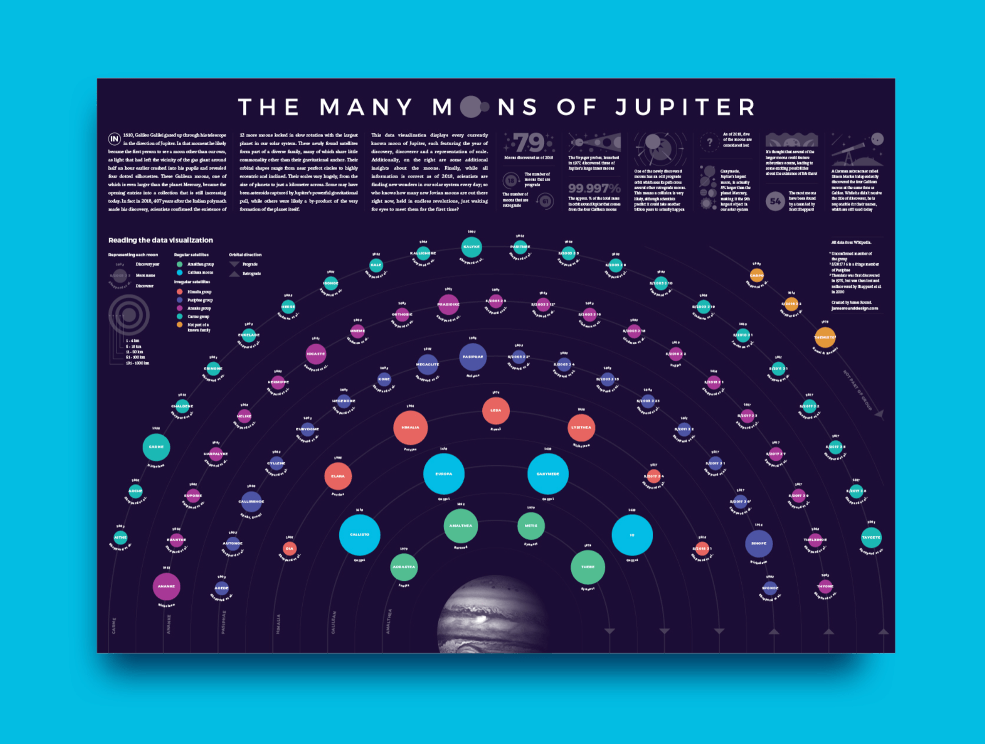

What do I like about this?
I love the overall idea behind this visual as I am fascinated by all things space related and this data based visual that he has created here is well laid out, organised and the final composition works great. I love the colour scheme the bright planets contrast nicely with the darker background. It is easy to read and follow as the main focus in on the main planet illustrations.
What do I not like?
There isn’t a lot of things that I don’t like about James Round’s work, however with this project the text and planets are on the small side and I struggled to read the text at the top without zooming in.
The Florida Climate Outlook
The infographics below are surrounding the topic of climate change and it’s many effects but it is has been narrowed down to the area of Florida. I have included this data project as I was a fan of this approach and I have gained a lot of inspiration for my own infographic.


What do I like about this?
I love the overall layout, the vertical layout is enjoyable to scroll down, the data is clear and easy to follow and understand. Both colour schemes look great and their colour palette suits the topic and data, the blue is representative of the sea levels in Florida and the red is used where there is a lot of mention of housing and construction, which reminds me of bricks. He has made facts about climate change very fun to read and understand.
What do I not like about this?
Personally I think some of the information here is a little close together on the map area and I am not a fan of the font that was used. I am a big fan of his illustrations and his style and I would have liked to see even more on these infographics.
The Science of Geoengineering
I have included Round’s project of a set of diagrams that visualise some of sciences most ambitious plans to tackle climate change that he had created for a company called China Dialogue.

What is geo engineering?
Geo engineering is the science of adapting the environment and our atmosphere in an effort to tackle the effects of climate change.

Why have I included this?
I am very interested in climate change and the environment and Jame’s style of illustration here is something I find very influential and I think this may be the route I would like to venture down. I love the colourful and engaging iconography he has used in this project and I feel like this is the perfect type illustration style for an infographic, as it is simple, clear and easily recognisable. Illustrated diagrams like the examples above are an element that I definitely want to include into my infographic.
What did I learn?
James Round is a talented data visualiser and illustrator and from researching deeper into some of his projects I have gained a lot of design inspiration! I have learned how to condense my ideas and the data I should display on my infographic as well as the fact that data can be structured in a way that is clear but still very enjoyable to read!