Stefanie Posavec
I have decided to research Stefanie Posavec’s work as research for my infographic that I will be designing. So I took to her website, which is simple to use and all of her projects are clear to view and select- link here.
About her
Stefanie Posavec is a London-based information designer, artists and author who’s work mainly focuses on non-traditional representations of data. She has explained clearly on her website that she enjoys exploring playful and friendly approaches to communicating data and information to a wide range of people of all ages and walks of life.
Her work has been exhibited at a range of major galleries including the MoMa in New York, the Victoria and Albert Museum in London, the Centro Cultural Banco do Brasil in Rio de Janerio and many more. She has an impressive client list and has worked with some great designers and companies.
Looking at her work
I have included some pieces of her data based work down below (it was very difficult to narrow it down to a few favourites) and I have added my thoughts and opinions on her approach and designs.
Dear Data
Dear Data is a collection of postcards containing data recorded from the everyday lives of information designers Stephanie Posavec and Giorgia Lupi.


I have previously looked at this project and have expressed my thoughts on it and you can access that blogpost- here. Posavec has a great website, that is simple to use and all of her projects are clear to view and select, I have added some of my favourites below and given my thoughts.
(En)tangled Word Bank
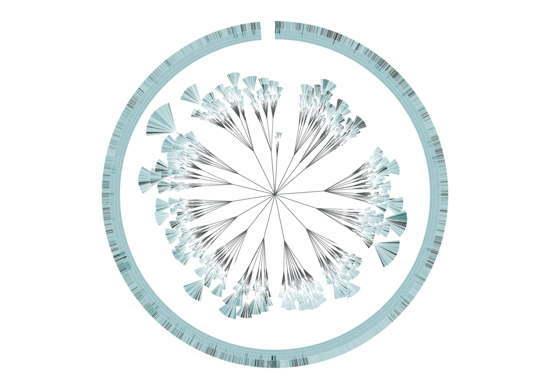

The above visuals are diagrams based on The Origin of Species, by Charles Darwin, they visualise the insertions/deletions of text through the six editions. Each diagram represents an edition of The Origin of Species, and is modelled on the ‘literary organism’ structure used for On the Road, by Jack Kerouac.
I have included this piece of her data work as it is so beautiful I just had to include it in my research. Her colour choices alongside the intricate illustrations and diagrams are stunning, however this piece is extensively detailed and it took me a while to actually understand it, this type of work is too detailed and intricate for the type of infographic I will be making.
A Periodic Table

I then came across this data visualisation entitled ‘A Periodic Table’ and it is a remodel of the traditional periodic table with a data driven twist! The design of the element icons is informed by the structure of the periodic table and each element’s unique data. I thought this project was so cool and the elements were executed so well, I spent a long time looking at this periodic table this approach makes science to me much more fun and visually stimulating to understand and enjoy.
From research I have discovered that the icons above are coloured according to the element’s group within the periodic table and its weight: therefore the heavier the element, the more intense the colour. When you click on the image it zooms into the elements so it is clear to see the various differences between them, I have included this visual below.

I loved this approach and the colour palette is gorgeous, as a complete data visualisation project it definitely made periodic elements much more exciting to look at and observe.
What did I learn?
Stefanie Posavec has taught me that there are a range of ways to design and display data, and there are a number of approaches that I can take as well as there being countless composition ideas, layout approaches and colour possibilities. Posavec’s work has taught me that data doesn’t have to be represented in a traditional way and that it can be unconventional. Data design can be fun and experimental, Posavec’s work clearly showcases this but combined with a beautiful intricate twist, highlighting the beauty in numbers.