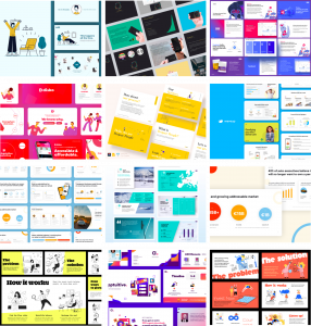
GATHERING INSPIRATION:
I had a look at the various different layouts for pitch slides online and decided to make a moodpboard. I concentrated on the layout of content as well as colour scheme and branding for these.
LOOKING AT PREVIOUS WORK IN MORE DETAIL:
AIRBNB:

PROS
- Immediately defines the problem, the solution, and the outcome of using the product within the first 3 slides
- includes the facts and figures secondmost and displays it very well visually so investors aren’t confused
- lists the competitive advantages in the final slide
CONS
- could potentially include more illustrations as each slide looks a little similar and this can become boring to look at
ORATIO:
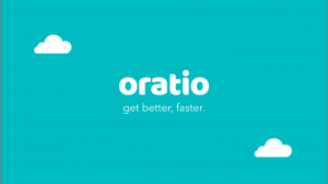
PROS
- Very clean illustrations, enough variety visually to keep it interesting, however keeps with the same visual consistency and style for a level of professionalism
- first and foremost gives her intentions with the product – the main goals are presented loudly and clearly
- shows problem, and her solution to it immediately
- The heart iconography at the top left of the screen creates a tone of care and reassurance throughout the presentation – it also helps draw your eye to the heading so you follow along with the structure better
- included lots of information about the target audience, including survey information, and user personas
YOUTUBE:

What I really liked about this presentation was how short and to the point it was, they really focused their attention on the key pros of the product, and didn’t wander away from the subject matter allowing the audience to get bored.
PROS
- Very clean structure content wise – should take inspiration from this when structuring your own (less is more)
- very to the point in each slide
- Doesn’t include too many words per slide
CONS
- Alienates people using weird language – says “users”, and “consumers” instead of just calling them people
- Every slide looks the same visually
- No illustrations