ANALYSING PACKAGING FROM NON FORMAT
Non-Format is a contemporary London-based Anglo-Scandinavian graphic design team specialising in projects for the publishing and music industries. Daniel recommended them to me as he felt they were similar in their approach to typography to me and that they created design identities that I could take inspiration from and use aspects of in my own work.
Gatefold LP packaging for “Lucifer is a Flower” by Black Devil Disco Club, 2020
I found this project in particular really interesting. I love the typography used in the cover and I feel a lot of different shapes could have been taken from that and used throughout the brand identity. The type is a work of art itself too, its been hand drawn rather than a typeface being used. I love the usage of geometric shapes to fill negative space, making it interesting too; this is something ill keep in mind when creating my own brand identity.


Gatefold LP packaging for the “Digital Technology” album by The Chap, 2020
I love how simple, key elements are used throughout this identity to create the final product. A typeface has been created specifically for this album – made up of simple shapes to create intricate letterforms. These shapes have then been continued throughout the identity in order to add further decoration elsewhere. I love the way text has been curved around corners in unconventional ways throughout too – for example on the record itself it has been positioned in a rough, pointy swirl shape. I think that the colour scheme is really effective throughout too here – only black and white with blue accents have been used – creating a very striking, memorable outcome.


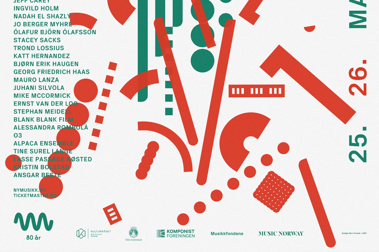
Poster, program and t-shirt for the 2018 Only Connect Festival of Sound organised by nyMusikk
I love the simplicity of the shapes throughout brand identity. When they’re all combined they create a design that’s very intricate looking and dramatic – each shape involved is simple and easy to create – each is either made up of simple rectangles cropped in different places or else made up of different circles.


WHAT I’VE LEARNED
- that I should include geometric shapes into my wordmark – simplifying letters down to their most basic shapes (every identity)
- that I should overlay these shapes over future work within the brand identity (third identity)
- that I should only use a maximum of 3 main colours to maintain consistency (every identity)
- that black and white when combined with a primary colour can be very effective in creating a professional looking identity (first and second identity)
- that typography can be curved in unconventional ways for effect – (think of the spiral in the second identity)
- that typography can work as art within the design itself – think less about communicating something and more about creating art (first identity)