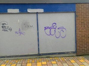
LOOKING INTO TYPOGRAPHY IN STREET ART
After looking at Appear Offline’s typography style and understanding that much of the inspiration for their work comes from graffiti lettering I decided to go out into Belfast and have a look at the variety of street art and typography from a first hand perspective:
RESEARCHING DIFFERENT FORMS OF TYPOGRAPHY IN GRAFFITI
1.) “TAG”
A tag is the simplest form of graffiti, it’s the backbone to basically all the other types and can be characterised as being made up of only lines to form a simple signature. It is usually done with either a marker or a spray can.
Examples:
2.) “HOLLOW”
Hollow graffiti typography is the next step up where the word is represented at a much larger scale. In order to do this the letters are simplified again but this time they form gestural and bubbly shapes. It is strictly only the outline of the bubbly letters and no shading.
3.) “THROWUP”
To be considered throwup the bubble letters will be filled in with one colour and then outlined with a second. Usually they can also include a shadow effect and an outline around the whole shape. For the most part though – they always include two colours.
4.) “STRAIGHT LETTER”
The throwup disguises what letters are saying with the bubbly style, straight letter is purely about legibility. It’s an attempt to quickly have people understand your name or message.
WHAT I’VE LEARNED:
– I should incorporate more hollow and throwup style typography into my brand for more of a playful, bubbly tone of voice
– I should experiment with overlapping of tag typography and hollow typography as I really like the effect of this on many of the walls in Belfast


