Self-Reflection IxD
- Author By silva_reyes-v
- Publication date 13/02/2023
- Categories: AAD012, Workshop 02
- No Comments on Self-Reflection IxD
My first attempt to digitalize the icon was done on clip studio paint. Although this app is great for drawing I felt it didn’t give me enough control over the distance between different elements and made it difficult to keep things consistent. Here I decided to round the corners as I wanted the icons to be very cute and soft, this also influenced my choice of colours as from the start i new i wanted to try a filled icon style but I wasn’t sure what aesthetic I wanted to follow. I initially opted for magenta-purple tones and a small heart to connect all the icons.
Although the designs had potential, they were messy, the lines were too thin and uneven so they couldn’t be seen well from afar, some corners weren’t rounded out and the keys weren’t that visible because there was not enough contrast between the base colour and the keys.


I made the main colour a dark purple and the accompanying colour a bright blue, the contrast between these colours made the icons stand out, I applied this to the background too as it made the icons more noticeable while also giving them a more polished appearance.
![]()
The first icon in this set is the monitor, I found it difficult to make it look different from a TV however I think the detail of the aqua-heart not only creates unity between it and the other icons but also doubles ad a power button or brand which are more commonly found in PC monitors in that location. To improve the design from the original I made sure to round all the corners and keep all the lines at a consistent thickness (1 pixel).

I continued with the keyboard replacing the escape key with a heart and the area the cable connect to the keyboard with another heart, tying it in with the other icons. I made the base rectangle longer and narrower as it differentiates the shape from the monitor. The main kays are all missing as it would make the icon too busy and only the enter, backspace and space keys are necessary to convey the concept of a keyboard.

The webcam model I chose was very different from the webcam I photographed. I chose an older version as I think it would be more recognizable and it has a different shape from the monitor and keyboard which would avoid any potential confusion between them. I replaced the red- light , that indicates if the webcam is active, with a heart to continue the theme throughout the icon set.

The mouse icon was quite challenging because of it’s shape however I found that by keeping the scroll wheel and the wire I could keep a very simple oval shape while still being able to convey the idea of the object. The aqua-heart is seen at the end of the wire, following the theme.

The final icon is the headset. I looked at existing icons for this design as I struggled to convey the concept of the earmuffs, what I noticed is that most headphone icons split the earmuffs into two shapes whether they are connected or not, there’s usually a rectangular shape attached to a semi-circle or oval shape. I used this concept to make that part of my icon, splitting the two and rounding the edges. The final detail was the mic, this was created by joining two rectangles and rounding the corners, then attaching the signature heart at the end.
Overall I think the icons are quite successful and although they could be improved in certain aspects, my goal to have aesthetic unity and and recognizability were met.
I began this assignment by researching Icons and how to make a successful icon taking notes in my sketchbook.

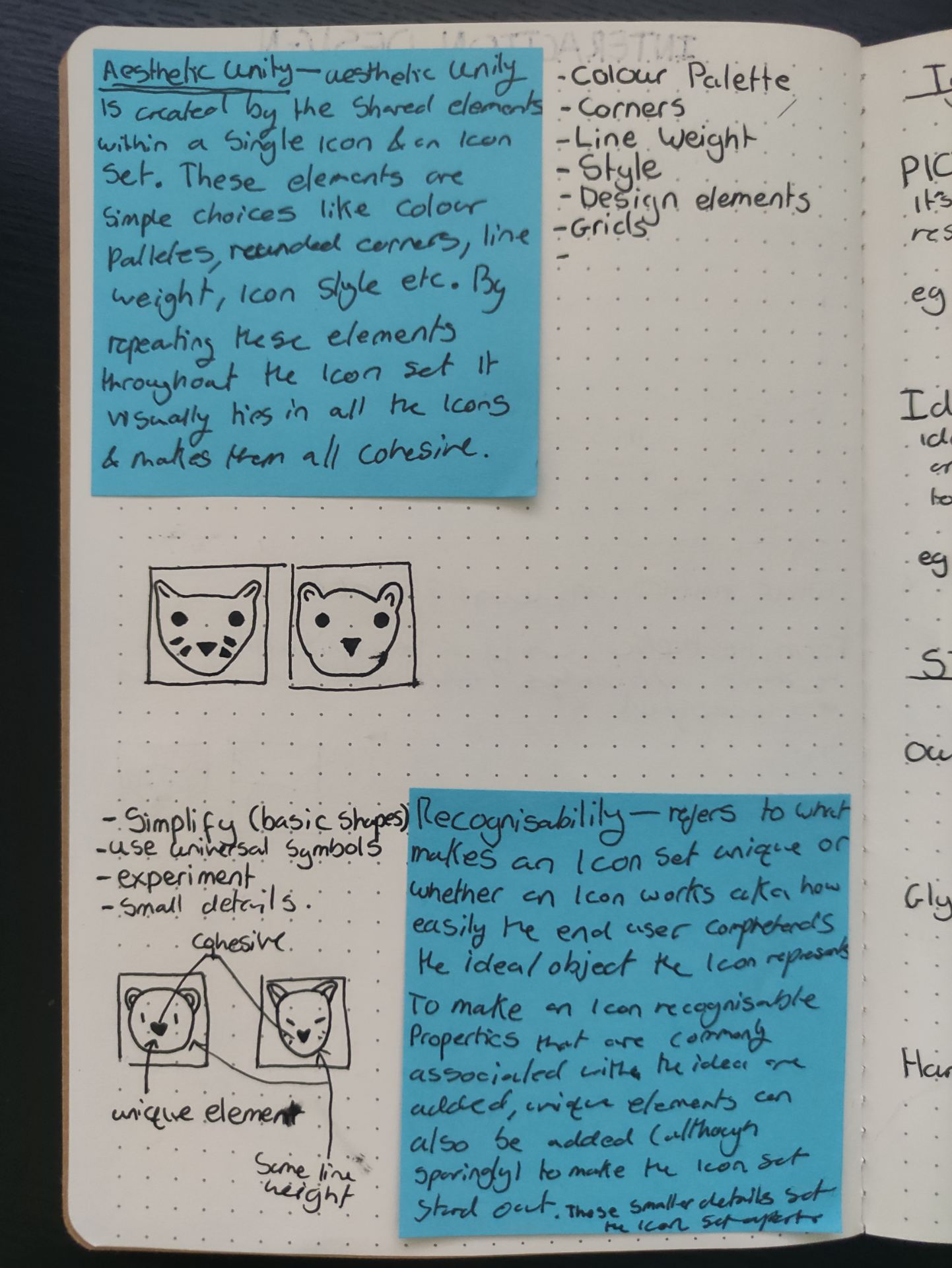
I chose to do 5 pictograms in a ‘filled icon’ style with a coloured outline. From my research and examples of icons I found, I decided I wanted to make my icons recognizable using colour and a specific element throughout the icon set.

I drew from my photographs, adding in details and staying true to the image, however just from this step, the object was already greatly simplified. I continued to draw the objects, trying different shapes, rounded corners vs sharp corners and simplifying it further. from my drawings I chose the shapes, object models, styles and elements I liked most and took note of it to later recreate digitally.


I decided to do ‘My desk’ as a theme for the 5 icons. The following images are the photos of my computer set up in my house, followed by an analysis of the most important features of the objects.


The first object is a monitor. My monitor is rectangular and flat, with a circular stand. From my research, my initial thoughts are that the stand can be simplified in the icon and that making this icon may be difficult due to many of the most recognizable features being shared by modern televisions, those being the rectangular shape and stand.


The second object is a computer mouse. The defining features of the mouse are the scroll wheel and it’s hand-sized oval shape. As my mouse is a specific gaming mouse it has a different, curved shape to help with grip, along with extra shortcut buttons and RGB lights, these are features that are not necessary to communicate the concept of a computer mouse in an icon. I’ll be looking into office mice as they are simpler and the most commonly seen type of computer mice and therefore the most recognizable.


The third object I chose is a Web-Cam. Web cameras vary greatly in shape and style however the most consistent features are the small light on the left hand side, that indicates if the camera is active and the circular lens. Similarly to the mouse, I foresee that I’ll likely have to look at older versions of this object as this style is not the most recognizable, older versions have a more unique shape and as they have existed for longer more people are familiar with their appearance.


The fourth object is a keyboard. This is a standard keyboard, it’s most recognizable features are it’s rectangular shape and the keys (specifically the space, enter and up/down/side keys). I think I will user the top view for the icon as it is the most simple and the front back or side of the keyboard doesn’t offer any additional information that would make the icon more recognizable.


The fifth object is a headset. The main shapes I see are a semi-circle that makes up the head band and two additional ovals for the ear muffs. although having a mic is not necessary for headphones and could be removed to simplify the icon i want to represent a headset which does include a mic. I like the second image most as you can see the whole headset and mic.
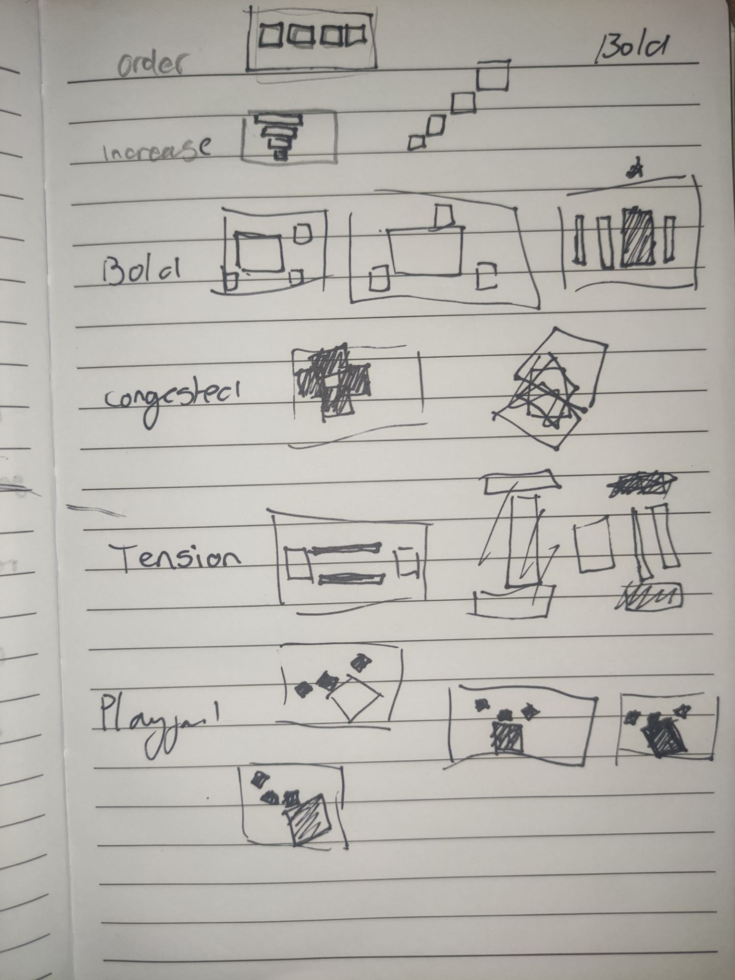
On our first day we did a couple exercises that tested our design skills and made us think about design legibility. In the first exercise we received six words and we were tasked, in groups of 2-3, to represent those words only using four squares.
The six words we were given were; Order, Bold, Playful, Tension, Increase, Congested.
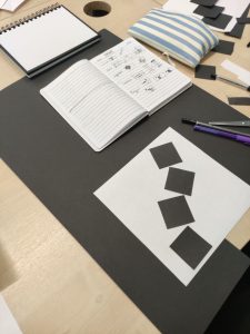
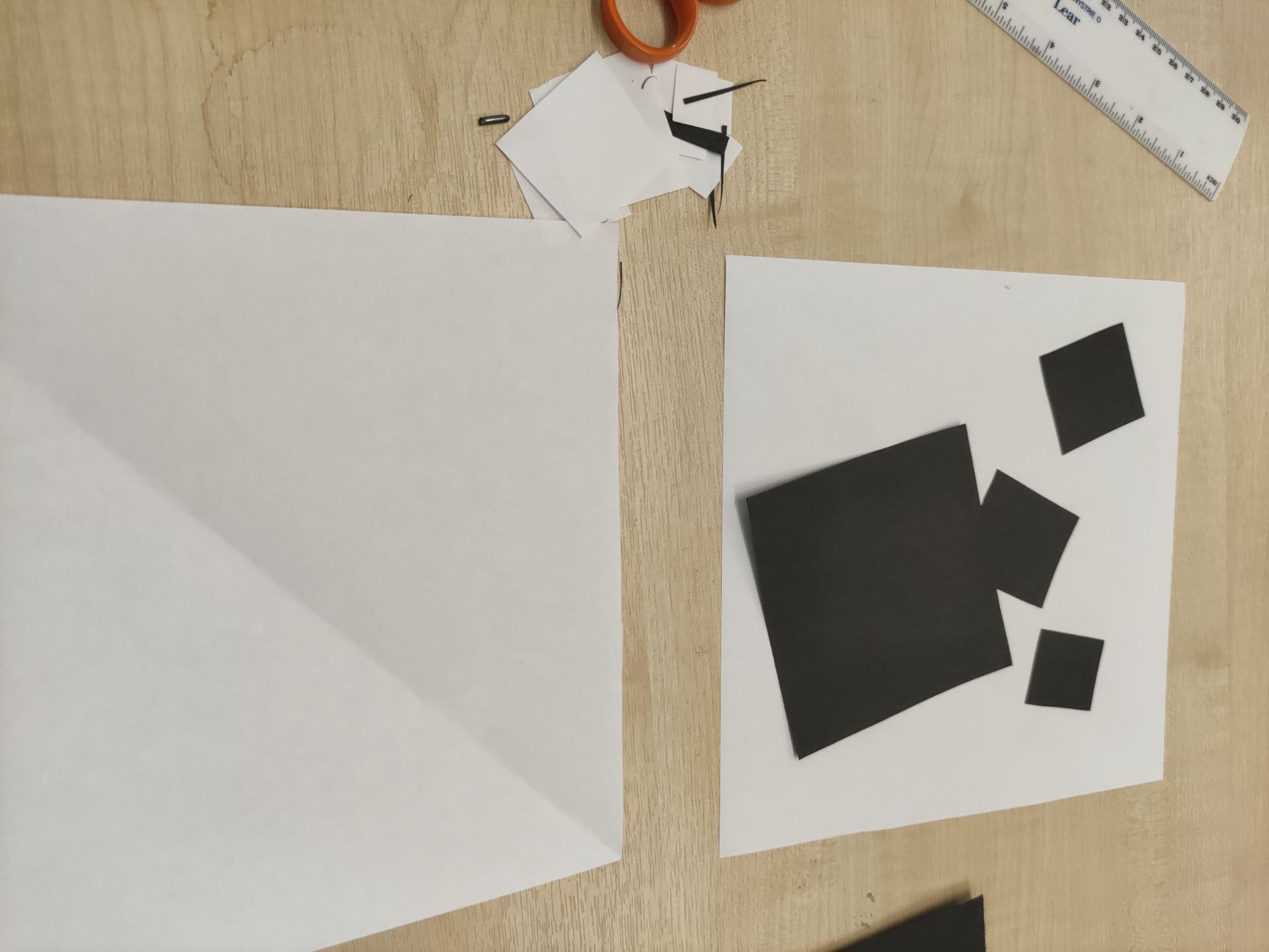
After sharing our ideas and commenting on what designs we thought were most the most clear, we chose two designs from each person in the group and began to cut out the squares for our individual designs. At this step I was paying attention to the size of the squares both in comparison to the page they’d be displayed on and relative to each other.
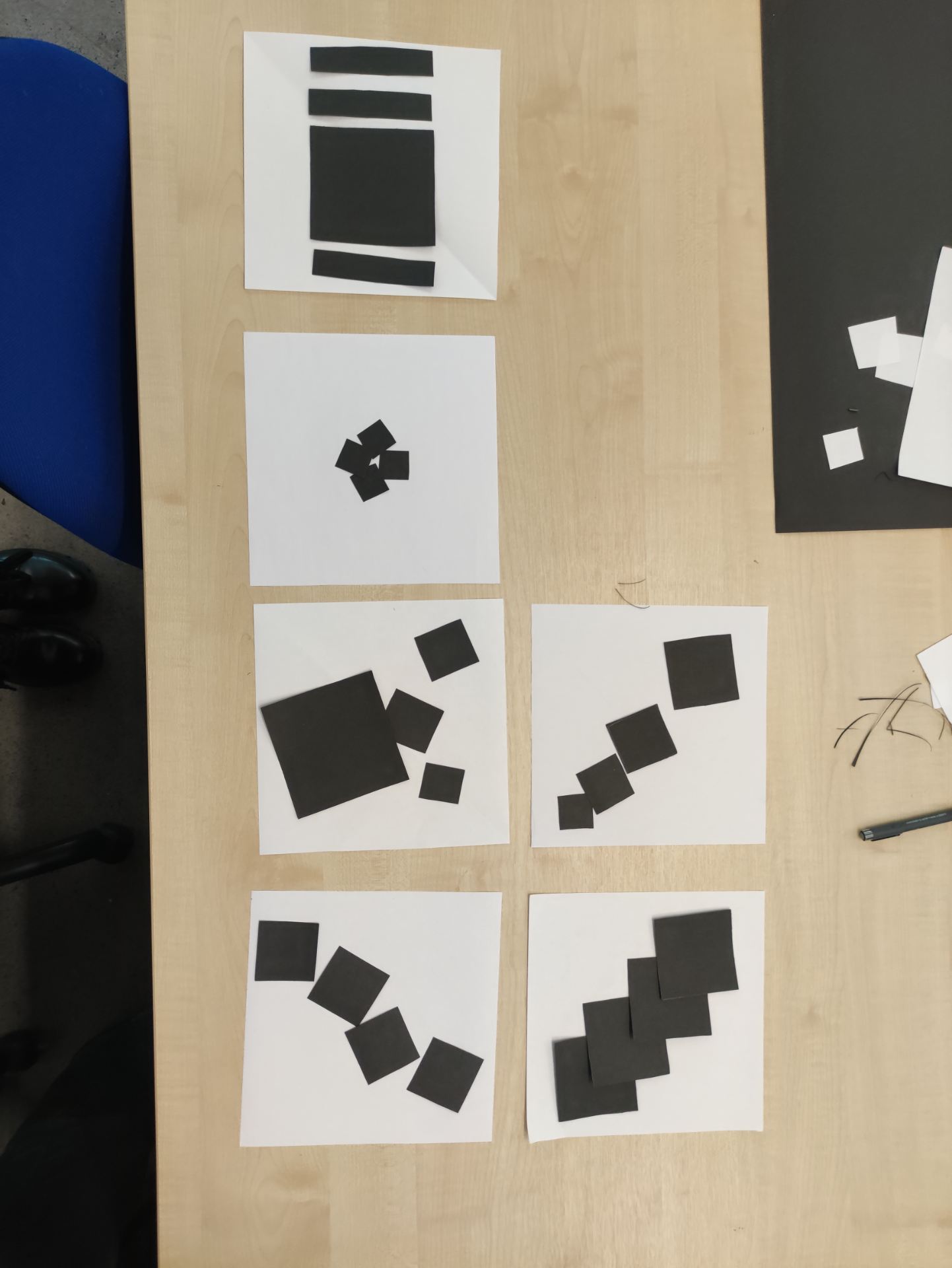
My designs for playful and bold were chosen. My idea to represent playful was to use the squares in such a way that they resemble a kids play box, I also changed the angle to give them more energy, I also overlapped two of the squares to give the impression that the small squares are jumping out of a box. To represent bold I used contrast between three of the squares and the fourth square, I made three of the squares equal and small while making the fourth square a lot larger but equal to the others in height.
The second exercise was two represent three things using only geometric shapes (in the same groups as before). I suggested choosing an animal and a common object as they’d be very recognizable. Our three ‘things’ were; A mouse, glasses and a boat. I made the glasses and offered designs for the mouse, following the suggestions of one of my teammates I chose to show circular, 3D glasses as they were most recognizable as 2D glasses could be mistaken for dumbbells or goggles and circular glasses are most recognizable because of ‘Harry Potter’.


I was happy with the results of both exercises as both the other teams correctly guessed all the words the images were suppose to represent. These exercises showed me how a couple changes can completely change the message that’s communicated to the viewer and gave me good insight into what I showed focus on for the brief.

