Category: DESIGN [2D Digital Design]

Game design

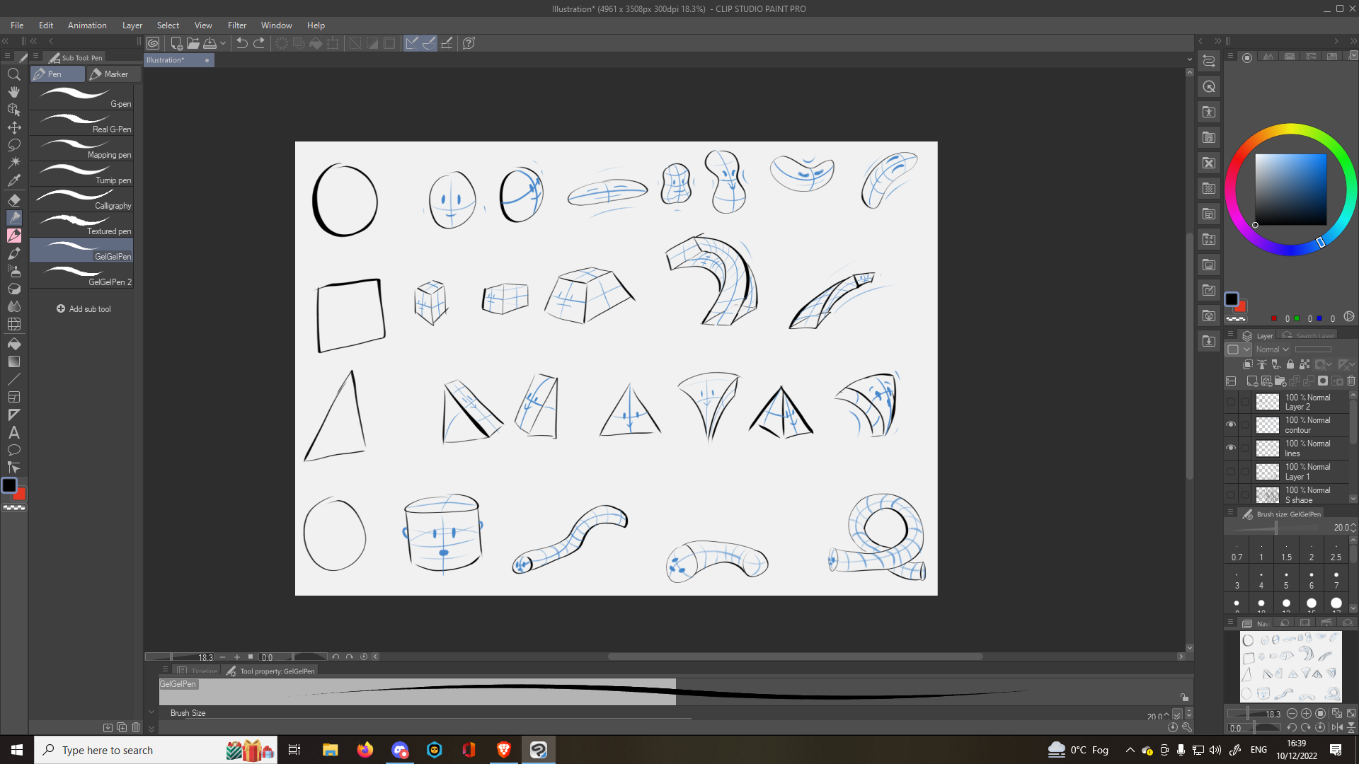
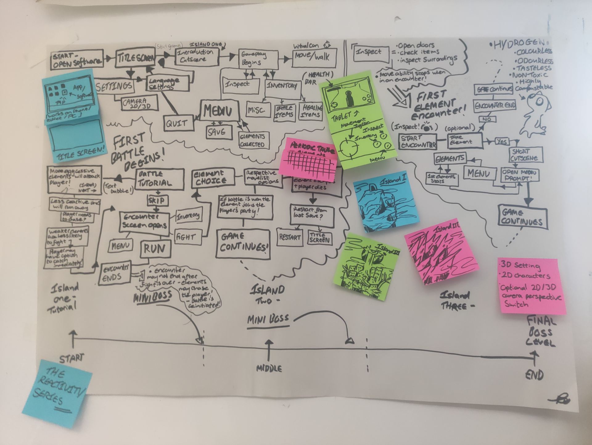
Our board Game was based on the game “The reactivity series” we made for the interaction design workshop. It’s a monopoly style game based on collecting all the elements on the periodic table (smaller version of the periodic table made especially for the game).

Crow and I came up with the original concept for the game and figured out the general mechanics together and figured out a few of the visuals that Aoife and Tabs would use to make the actual game pieces.


This was the original design for the Rules manual however I found the cover to be too busy and the logo of the game to be lost, so I changed the design and made it a booklet style manual with the first page just being the logo and for how many players the game is as that is the first thing players should know about the game.


I made the rule manual and dusted up any inconsistencies or added in important rules to keep the game fun.


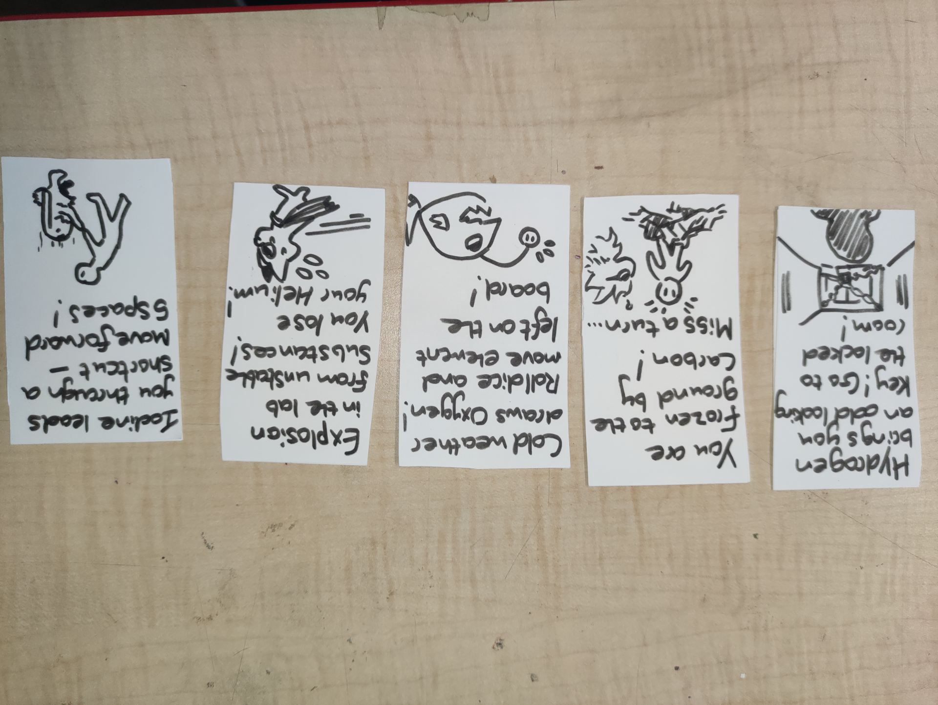
These are the chance cards and the tokens for the players and elements.


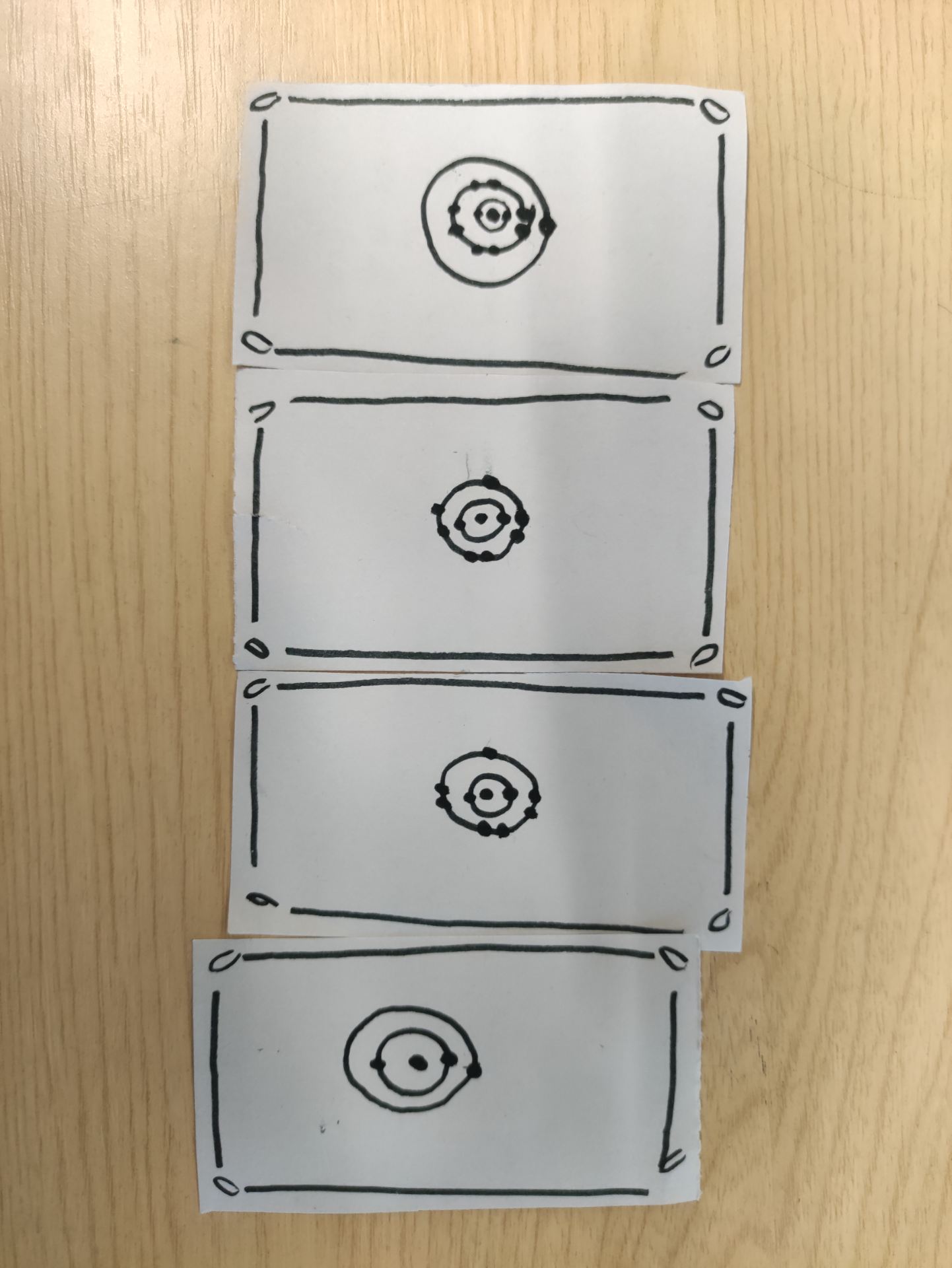
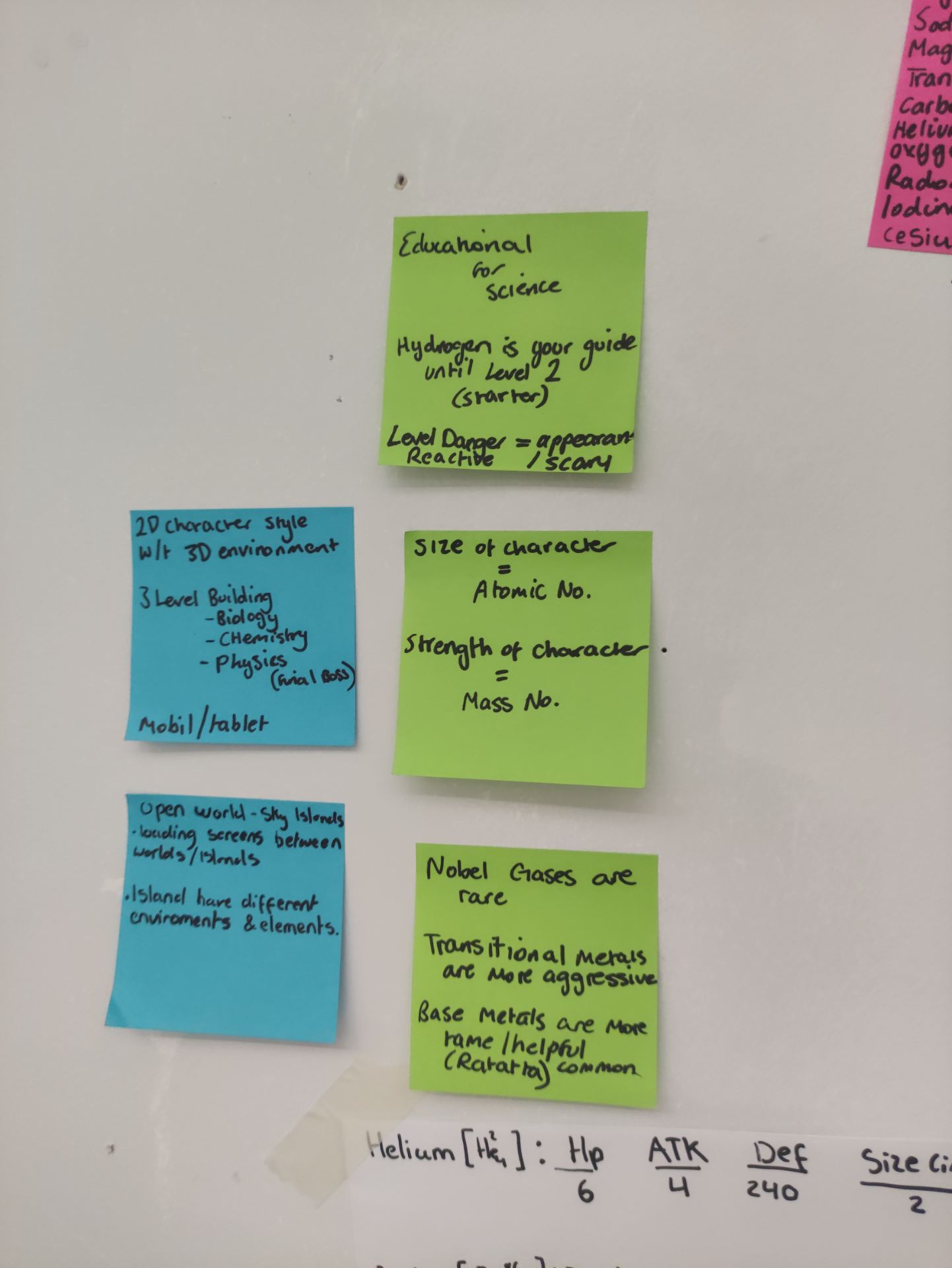
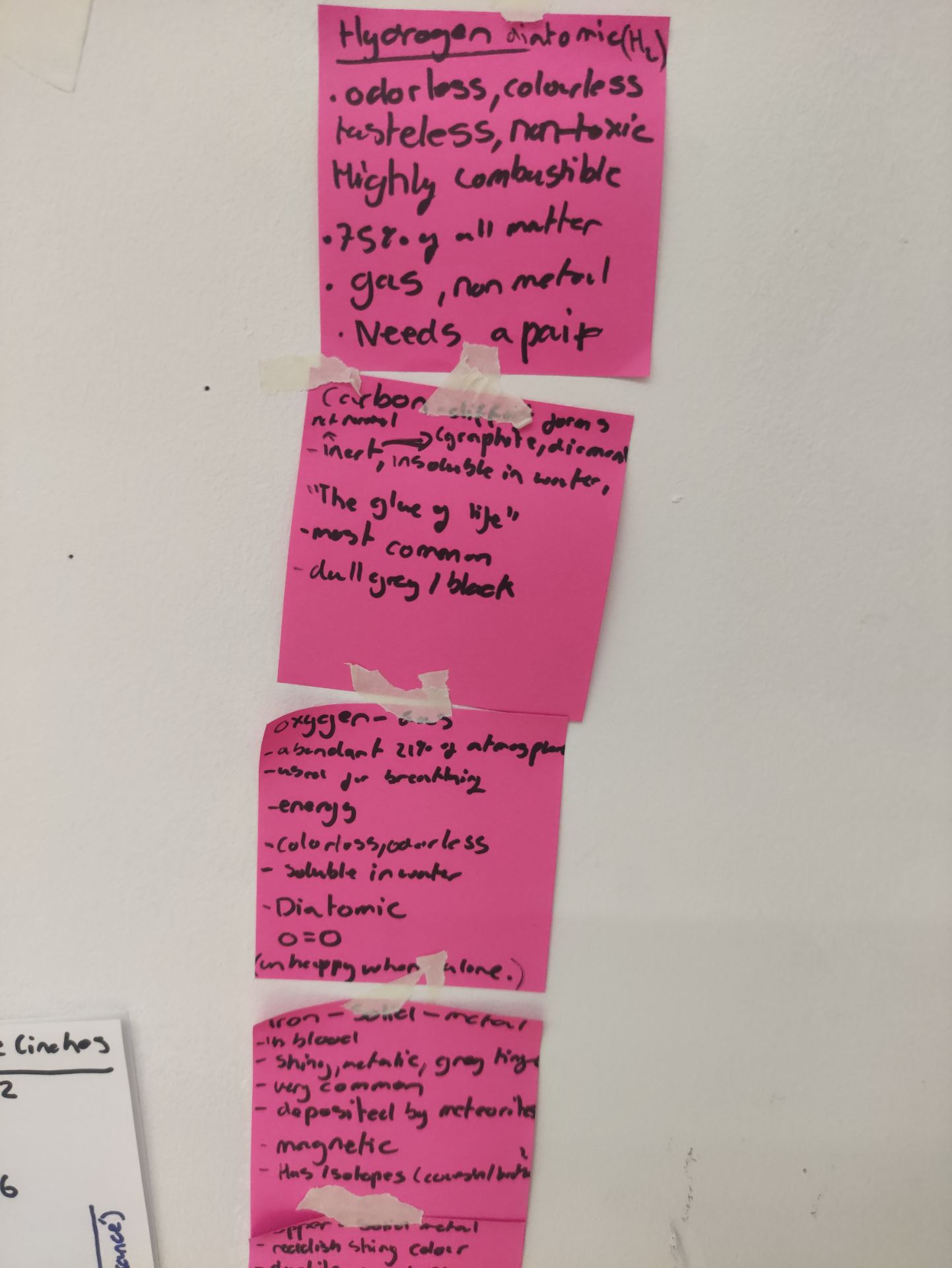
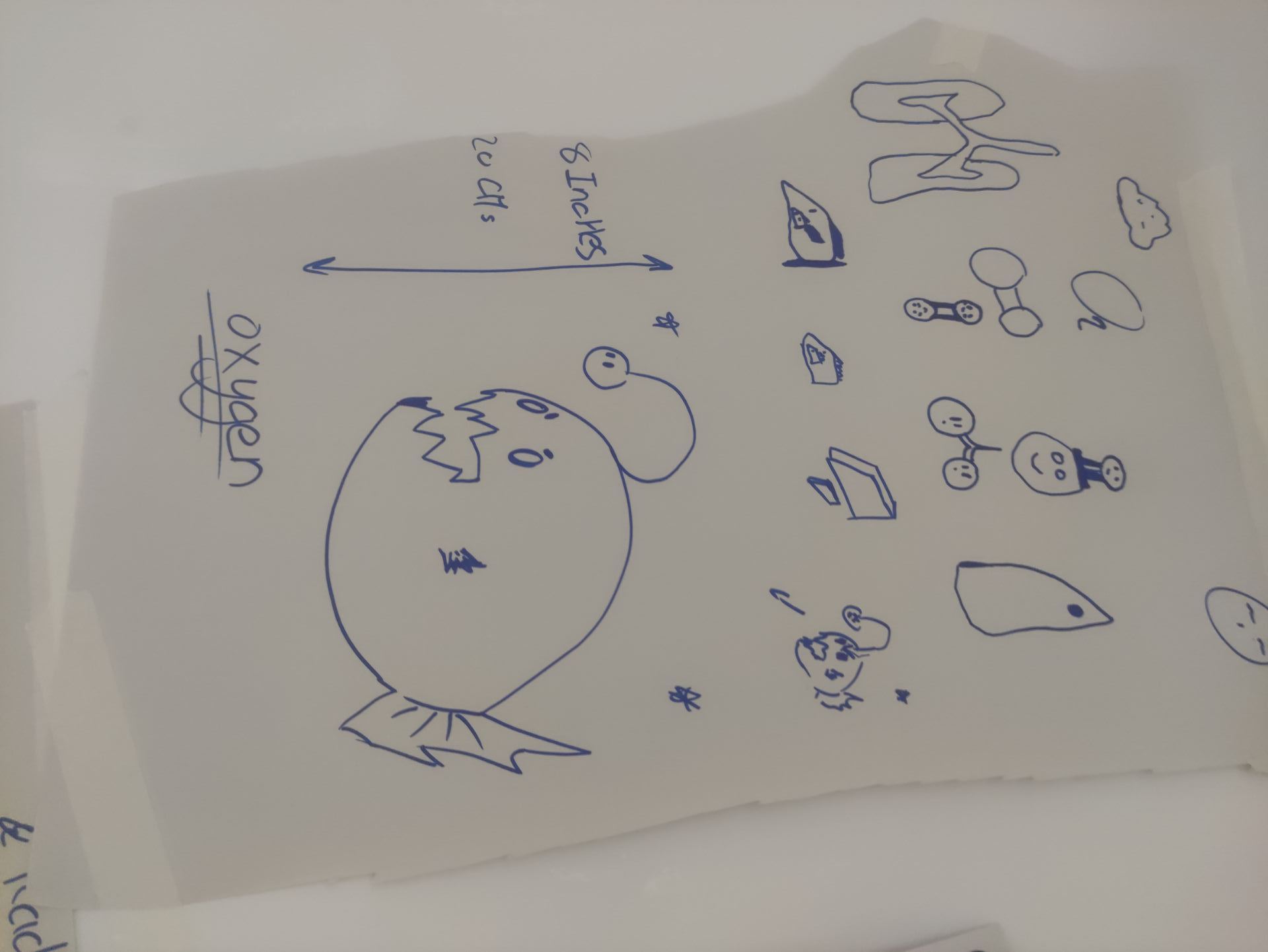
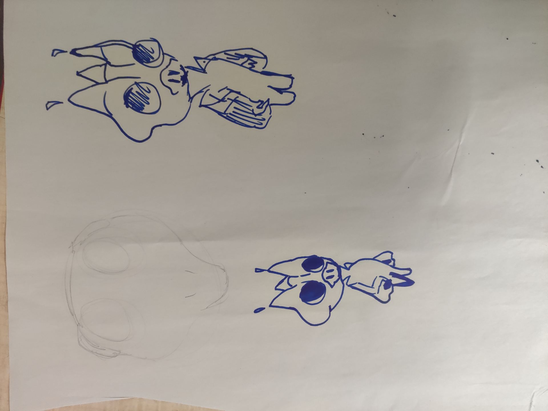
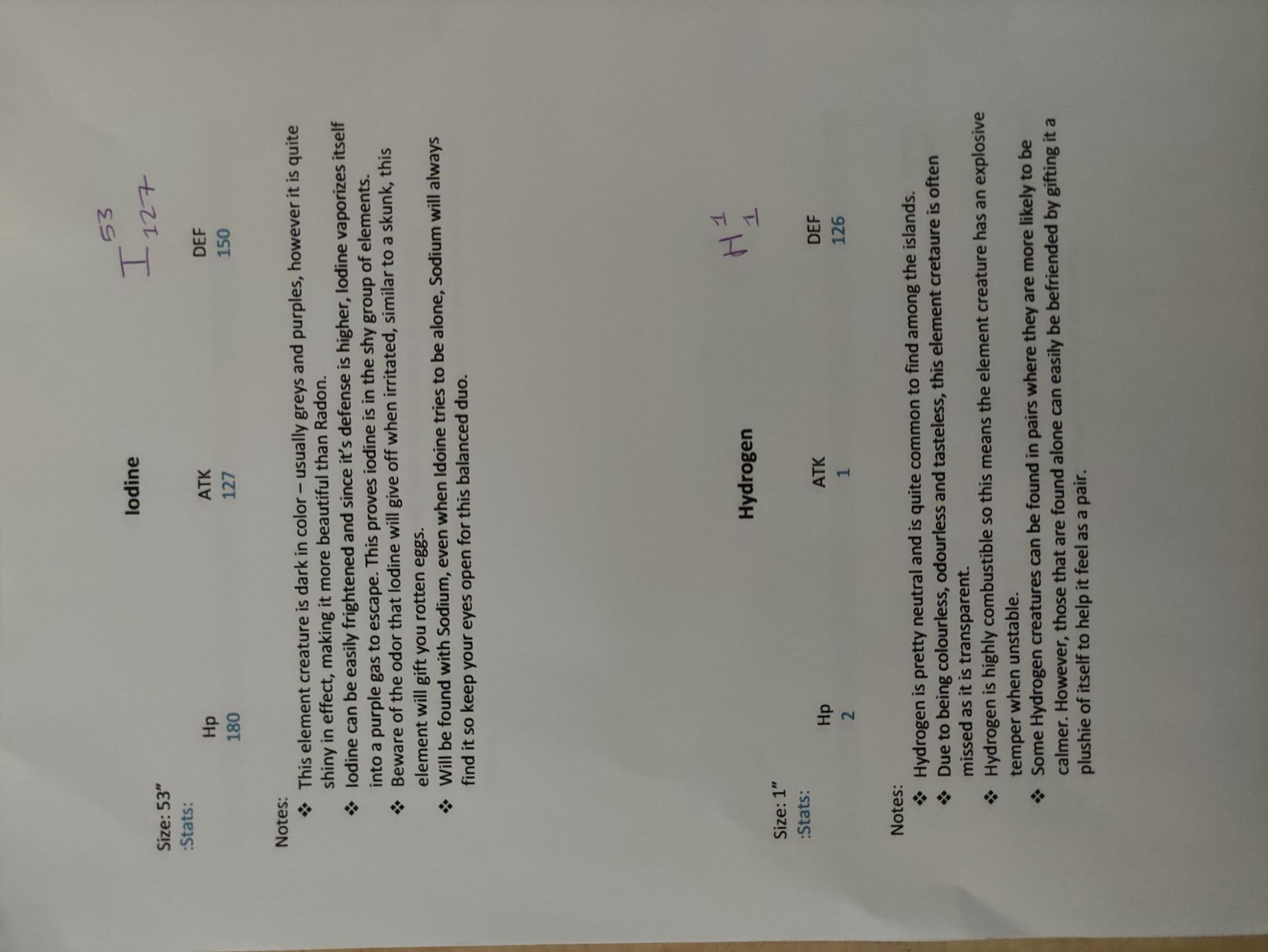
These are the atom cards, I made them, They are cards that only affect the elements and their interactions with each other.


“sparkle cards” these are card that would change the would dynamic of the game, they are rare to get as they only appear in two spots however one player getting one of these cards will cause a lot of fun interactions between players like trading or withholding elements. (these were also made by me)


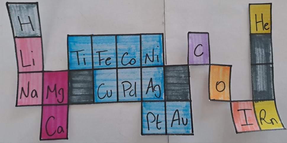
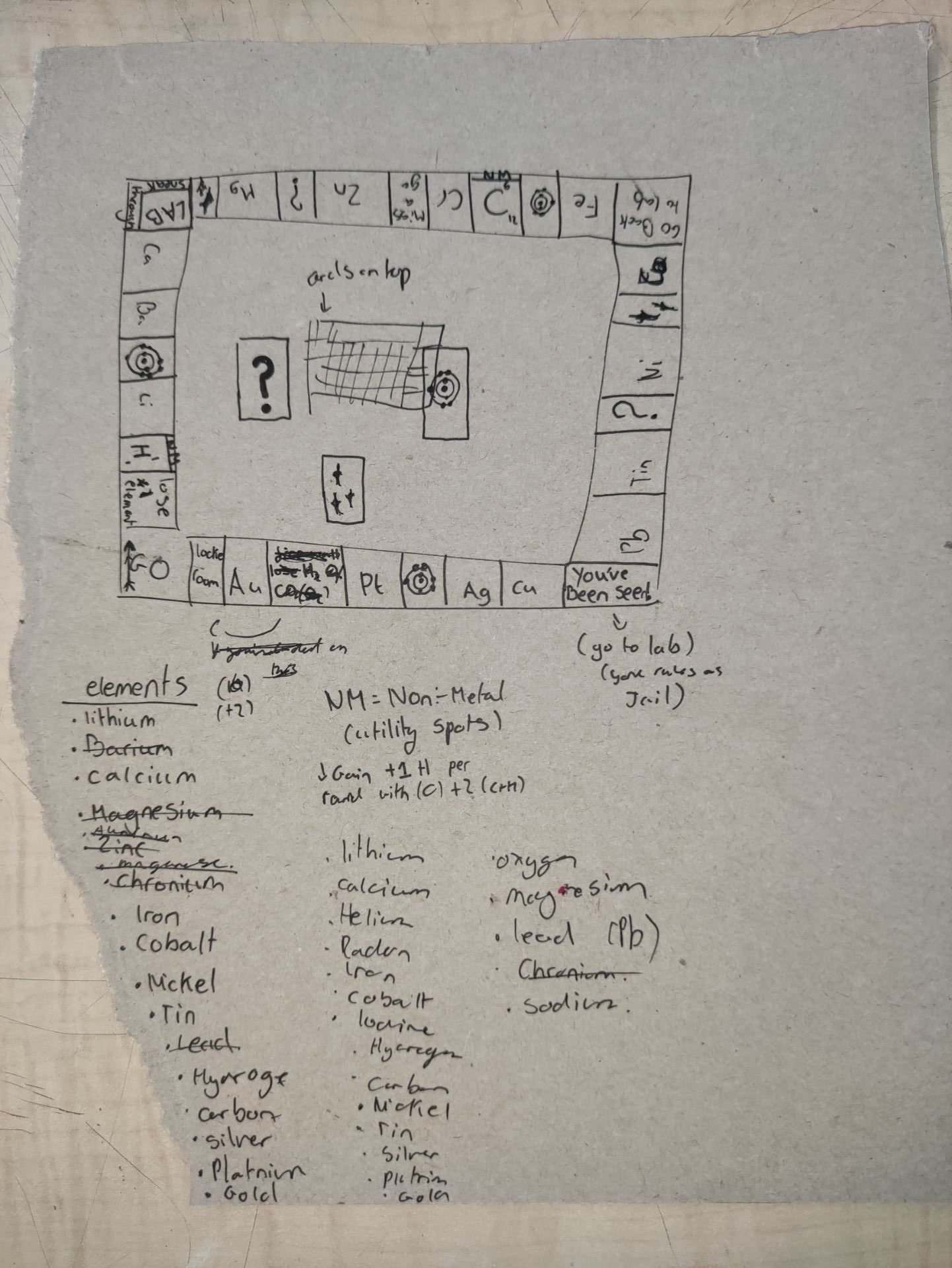
These are the final elements of the game, the board and mini periodic table. The mini periodic table is used to keep a track of how many elements you have (and how many of each) and more importantly which ones you are missing. The board has bases for each element (in the game), atom cards, chance cards, The Lab, Sparkle cards and a special locked room that can only be opened with a chance card.


This is what the board would look like in middle of a game.

Animation

As I was not in during the animation workshop I ended up using the video lectures, the animation brief and other students’ blogs as a guide on what to do. I began by doing some exercises in the video lectures, although I don’t think these were required I found them very useful especially the final steps of adding contour lines to the shapes to create forms.


Before beginning the actual animation I looked into the 12 principles of animation: 12 principles of design


Ixd (group project)

The four prompts our group received were Asian, Adventure, Science and Touch screen. our ideas ranged from an app that explains to you the nutrients/benefits of certain foods to an app that visualizes how foods and other substances make their way through our bodies and how it affects them. everyone in the group contributed equally in this section.

The blue and green post-it notes show the final idea we chose and the most important aspects of it. The idea is a Pokemon style video game based around Chemistry (mainly the periodic table and the way the elements react), as I did chemistry A-level I was in charge of making sure all the information we used was accurate, I chose 11 elements that would show a large range of behavior/properties and appearance (shown on the pink post-it notes and white page listing 11 elements). We used the properties and uses of the elements as inspiration for the designs of the element-creatures and values such as the atomic number, mass number and place on the reactivity series for their stats. The biggest differentiator between our game and Pokemon is the our game presents the player with obstacles out in the open world and they can only be overcome by using the elements collected or combining said elements for example if a fire wall was blocking the players path they could put it out by combining carbon and oxygen to form carbon dioxide, though that is not the only option as they could also combine hydrogen and oxygen to put out the fire with water.

These are the designs made for some of the chosen elements, as stated previously their appearance depends on how reactive the elements are, very reactive elements such as magnesium or copper will look more aggressive than less reactive elements like hydrogen. I designed the elements done in blue marker. at the end the character profiles are typed out, the character profiles give some inworld lore on the elements, their stats, size, name and element symbol.


As hydrogen is the first element on the periodic table we chose it as the mascot for the game, and hinted to the importance of the elements reactivity (and placement within the reactivity series for those that are metals) with the title of ‘The Reactivity Series’ (Designs for the logo done by Tabbs). I helped with the wording and information in the ‘What is it?’ and ‘Gameplay’ section. I also made the customer profile although due to the nature of this game it isn’t targeted to any specific race, gender or age just anyone who wants to learn about chemistry in a fun way. We chose to show the game through a Nintendo DS as this is what would be most familiar to people (because of Pokemon) although this game would be available in a wide range of touch screen devices such as phones and tablets.


This is the flow char, as the game is open world and gives the player a lot of freedom especially in how they over come challenges that full extent of the game can’t be shown on the flow chart however it does a good job at showing the basic idea and some of the options.