I decided to do ‘My desk’ as a theme for the 5 icons. The following images are the photos of my computer set up in my house, followed by an analysis of the most important features of the objects.


The first object is a monitor. My monitor is rectangular and flat, with a circular stand. From my research, my initial thoughts are that the stand can be simplified in the icon and that making this icon may be difficult due to many of the most recognizable features being shared by modern televisions, those being the rectangular shape and stand.

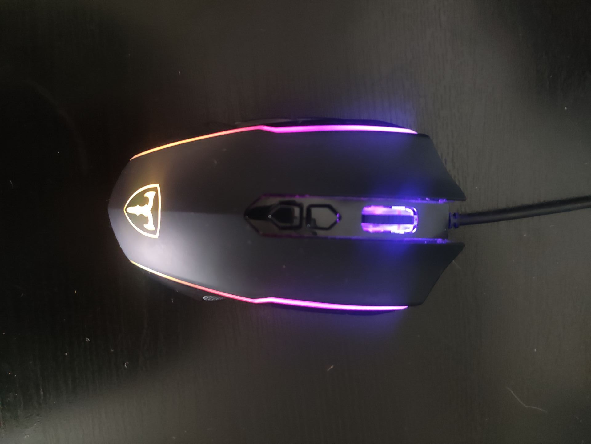


The second object is a computer mouse. The defining features of the mouse are the scroll wheel and it’s hand-sized oval shape. As my mouse is a specific gaming mouse it has a different, curved shape to help with grip, along with extra shortcut buttons and RGB lights, these are features that are not necessary to communicate the concept of a computer mouse in an icon. I’ll be looking into office mice as they are simpler and the most commonly seen type of computer mice and therefore the most recognizable.


The third object I chose is a Web-Cam. Web cameras vary greatly in shape and style however the most consistent features are the small light on the left hand side, that indicates if the camera is active and the circular lens. Similarly to the mouse, I foresee that I’ll likely have to look at older versions of this object as this style is not the most recognizable, older versions have a more unique shape and as they have existed for longer more people are familiar with their appearance.
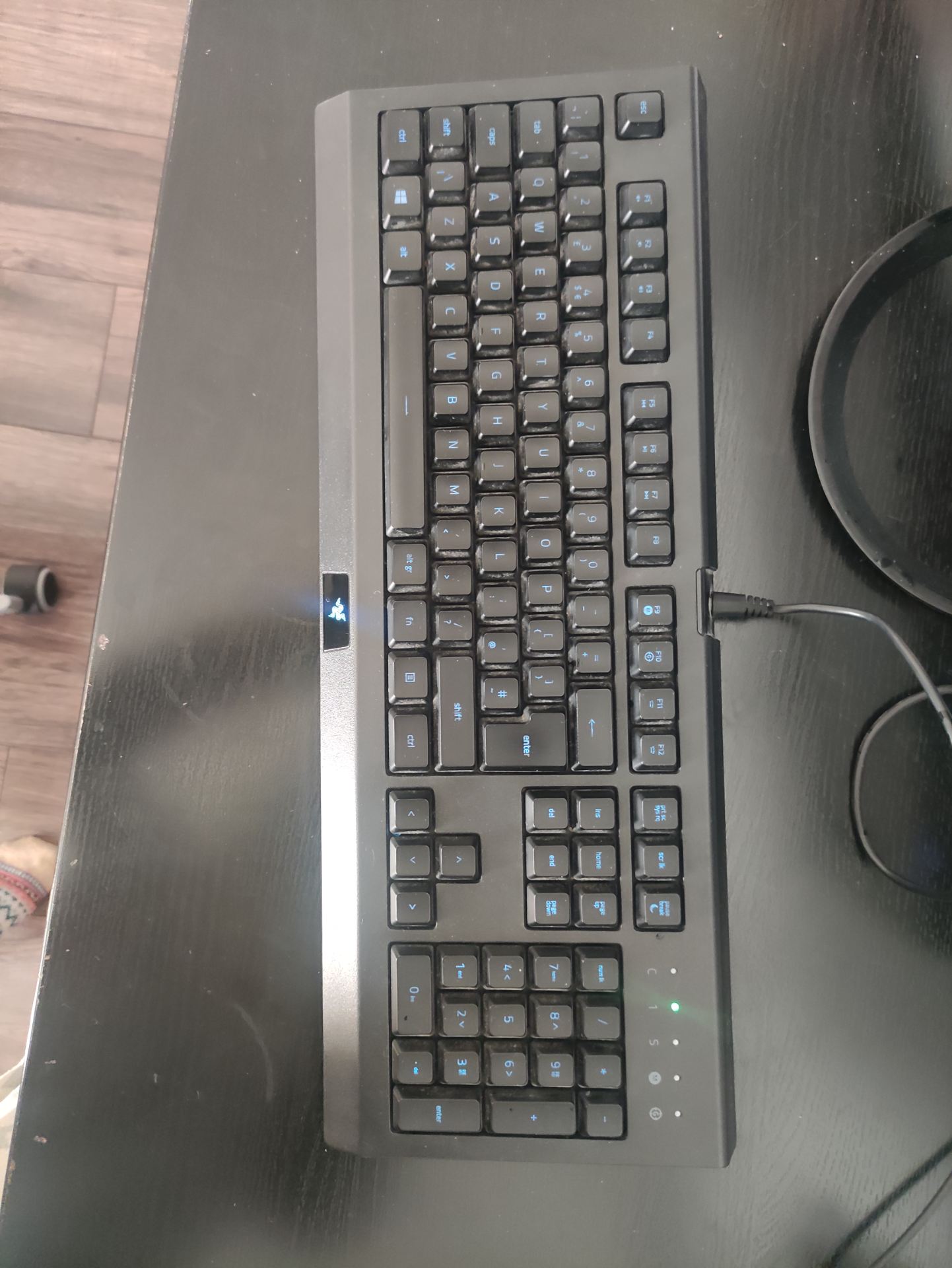


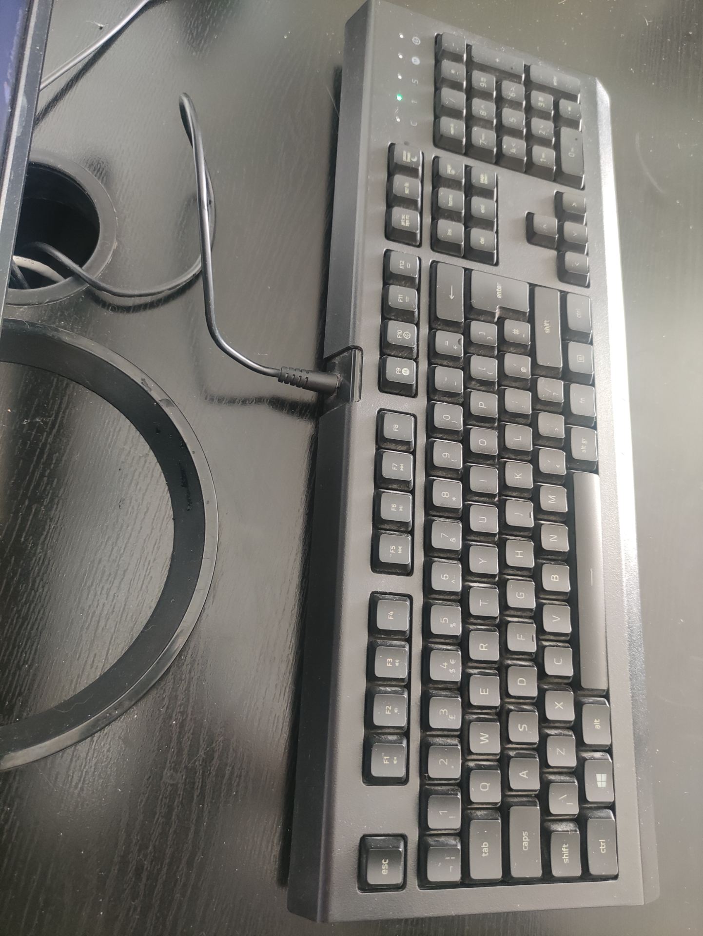
The fourth object is a keyboard. This is a standard keyboard, it’s most recognizable features are it’s rectangular shape and the keys (specifically the space, enter and up/down/side keys). I think I will user the top view for the icon as it is the most simple and the front back or side of the keyboard doesn’t offer any additional information that would make the icon more recognizable.


The fifth object is a headset. The main shapes I see are a semi-circle that makes up the head band and two additional ovals for the ear muffs. although having a mic is not necessary for headphones and could be removed to simplify the icon i want to represent a headset which does include a mic. I like the second image most as you can see the whole headset and mic.