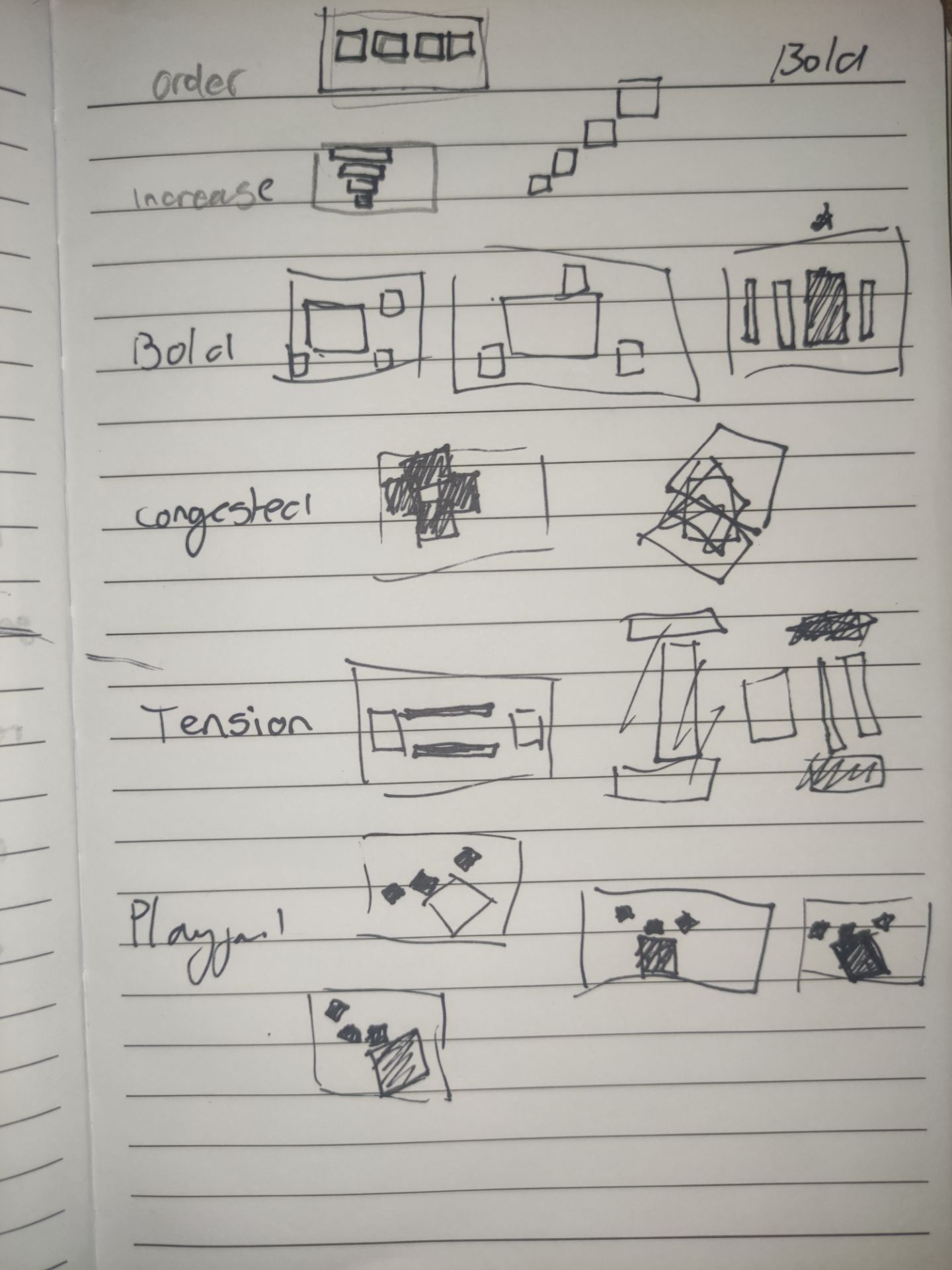
On our first day we did a couple exercises that tested our design skills and made us think about design legibility. In the first exercise we received six words and we were tasked, in groups of 2-3, to represent those words only using four squares.
The six words we were given were; Order, Bold, Playful, Tension, Increase, Congested.
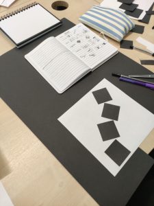
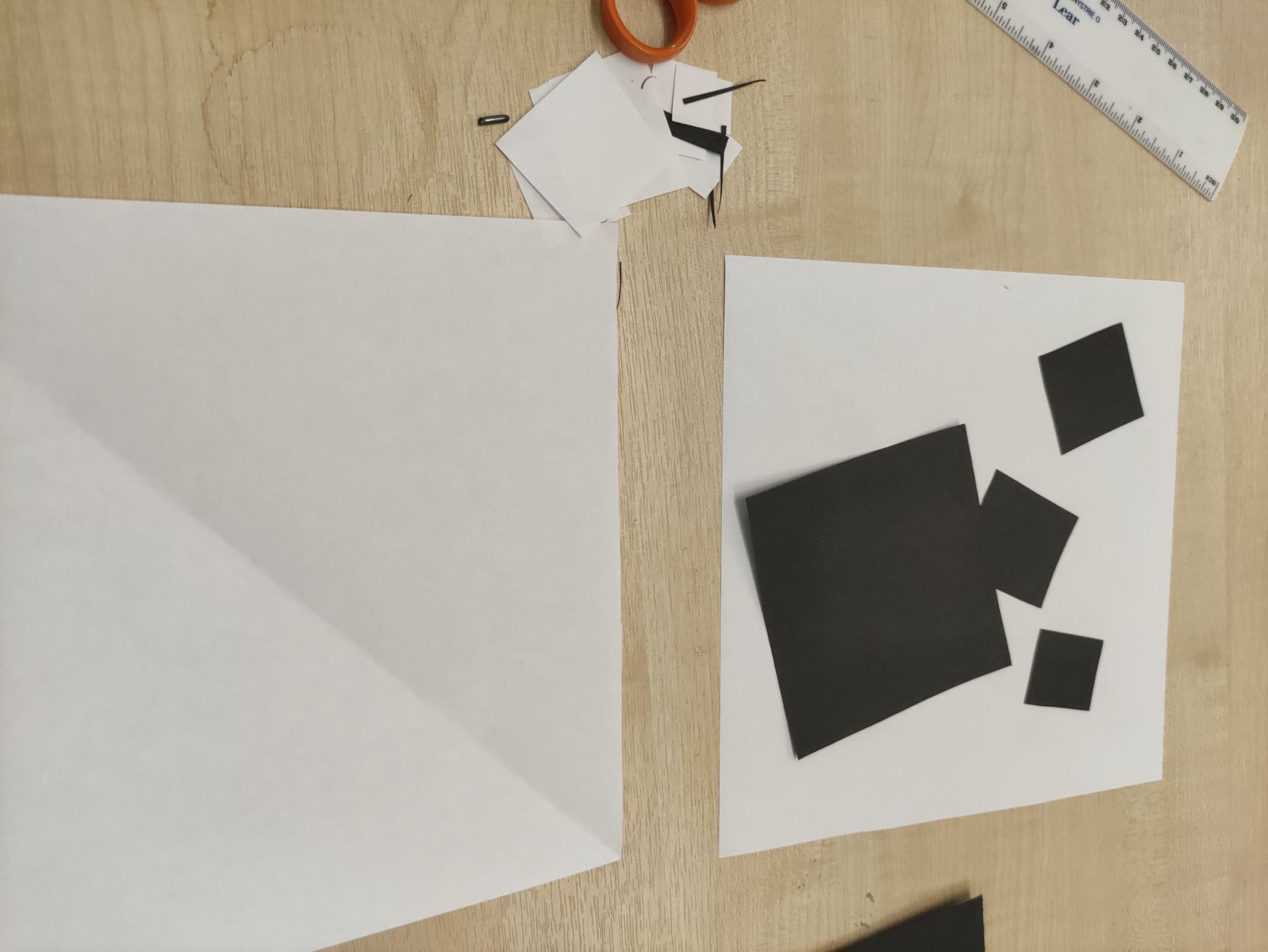
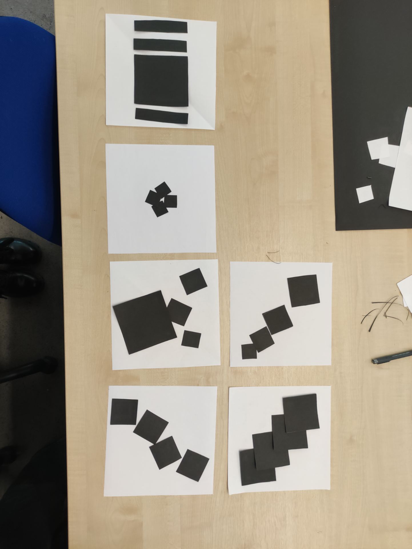
After sharing our ideas and commenting on what designs we thought were most the most clear, we chose two designs from each person in the group and began to cut out the squares for our individual designs. At this step I was paying attention to the size of the squares both in comparison to the page they’d be displayed on and relative to each other.
My designs for playful and bold were chosen. My idea to represent playful was to use the squares in such a way that they resemble a kids play box, I also changed the angle to give them more energy, I also overlapped two of the squares to give the impression that the small squares are jumping out of a box. To represent bold I used contrast between three of the squares and the fourth square, I made three of the squares equal and small while making the fourth square a lot larger but equal to the others in height.
The second exercise was two represent three things using only geometric shapes (in the same groups as before). I suggested choosing an animal and a common object as they’d be very recognizable. Our three ‘things’ were; A mouse, glasses and a boat. I made the glasses and offered designs for the mouse, following the suggestions of one of my teammates I chose to show circular, 3D glasses as they were most recognizable as 2D glasses could be mistaken for dumbbells or goggles and circular glasses are most recognizable because of ‘Harry Potter’.


I was happy with the results of both exercises as both the other teams correctly guessed all the words the images were suppose to represent. These exercises showed me how a couple changes can completely change the message that’s communicated to the viewer and gave me good insight into what I showed focus on for the brief.