Development of Work For Final Assessment

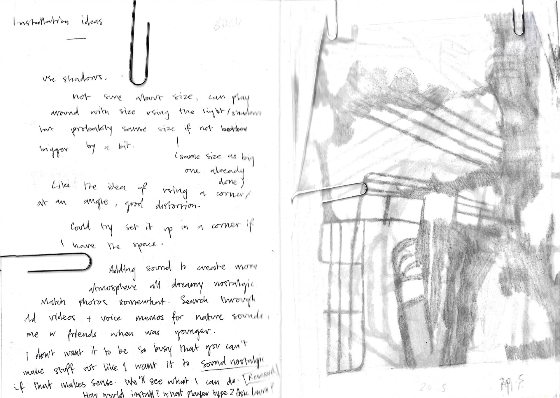
For the final assessment, I wanted to continue making these abstract collages/cut-outs and working with shadows to create an installation. I thought the piece I made that I had bent at an angle was really interesting and wanted to continue looking at this kind of structure further. I began to jot down some ideas for a potential installation for my final assessment (Img. 1.), and considered using sound within it, but ditched this idea because I found the technicality of it a bit difficult, and worried about the sound imposing on other people’s work.

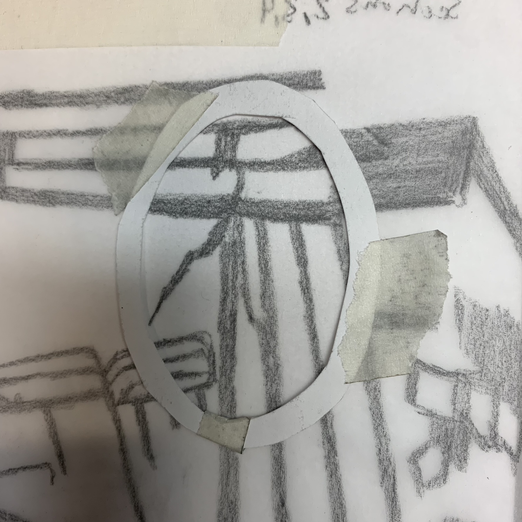
I made a plan of what a ‘successful structure’ would be like (Img. 3.) so that whenever I was drawing up a final design there would be a bit more sense to it rather than me placing parts of images anywhere. Overall I wanted to add more structure to it so that it could potentially stand on its own, so planned to use more landscapes or horizontal images along the bottom, as well as having a lot of the sections connected to ensure nothing could break off. I also wanted to keep in mind while drawing that the piece would fold in the centre, so had to be mindful that any lines stopped before that centre point, and the lines that would stretch across that would be secure.


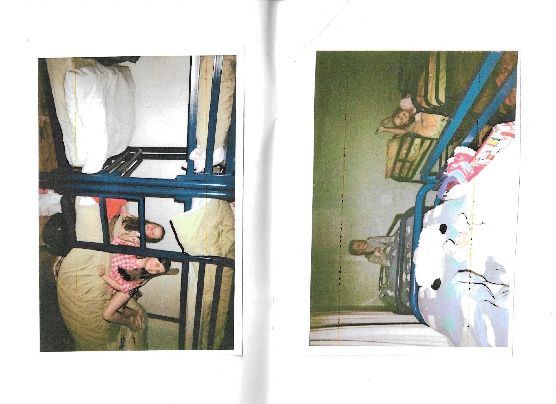
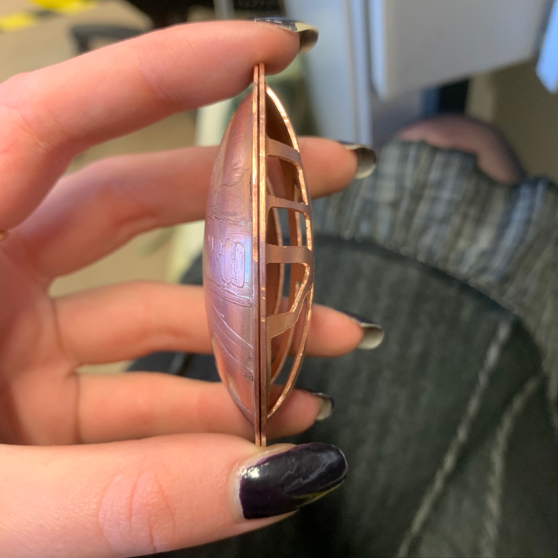
The design that I drew up for a ‘final piece’ features me, or my younger self, at the centre of the structure, and everything extends out from this point- figures, landscapes, and linear forms of the bed frames in our dorm. For these parts, I traced sections that I liked from previous drawings that I had done. I then cut this out of a cereal box, using the same method as before in which I invert the drawing when photocopying it, stick it to the printed side of the box, and cut out the negative space using a box knife. Once this was finished, I folded the piece inwards so that it would sit on its own at a right angle.


I tested the shadows of this piece by placing it underneath my desk and shining my phone’s flashlight toward it, casting a shadow onto the wall behind it. I was happy with this piece because I feel like it has an ok mix of the elements from the photos. Initially, I planned on sticking with the cardboard however it was still quite flimsy just because the cardboard isn’t that strong. I started to think about alternative materials that I could use and thought back to the Bryony Knox workshop and the materials that I was introduced to there. I wanted to use something a bit more solid so that the material I was using could play a part in adding further meaning to my work (a need to solidify these memories before they fade/become too jumbled).

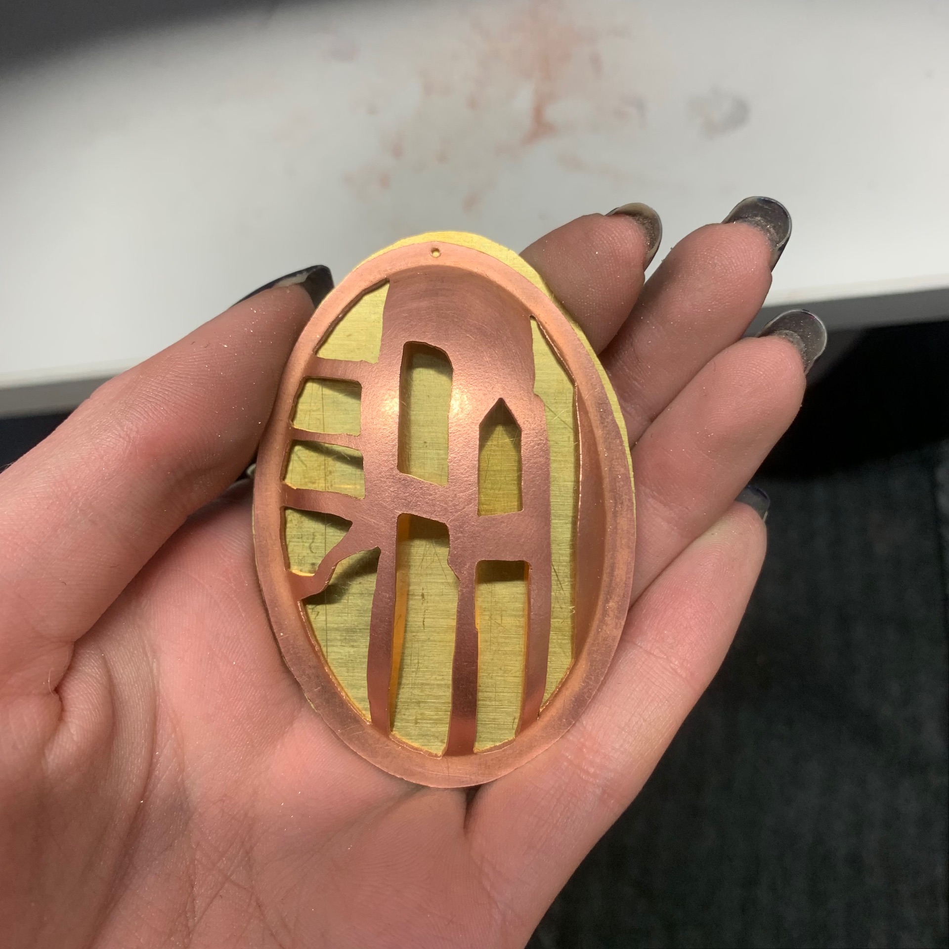
I spoke to the technician in the jewellery and silversmithing department and came to the conclusion that laser-cutting plywood would be the best option as it would give me that structural element that I was looking for, and was also somewhat similar to the cereal box. The technician took my cut-out and drew it digitally using vectors so that he would send it to the laser cutter. The finished laser cut is split into two, just because it would be difficult to bend the ply, but to support the two pieces, and act as a base for the work as a whole, the technician gave me a 20x20cm wooden panel along with the laser cut pieces.

After getting this completed I began to think of ways that I could display this. The main idea was to have this work sit on a plinth and have a light shining towards it so that shadows would be cast on the wall behind it. I was having a bit of difficulty trying to figure out what I would use for lighting, so decided to test what kind of lighting would work at home. As well as this, I was planning what size plinth would work best, and having a think about whether or not I should have something more to my piece because it felt a bit too ‘plain’.

At home, I tried to make a set up that resembled what I had drawn in my sketchbook my placing my work onto a small table against a plain wall and shining a lamp towards it. By doing this I was trying to figure out the position of the lights and what the shadows of the cut-out would actually look like. I tested this with a flashlight as well just to see if a smaller, more powerful light would work, but I think I like the expansiveness/more even spread of light that the lamp provides.


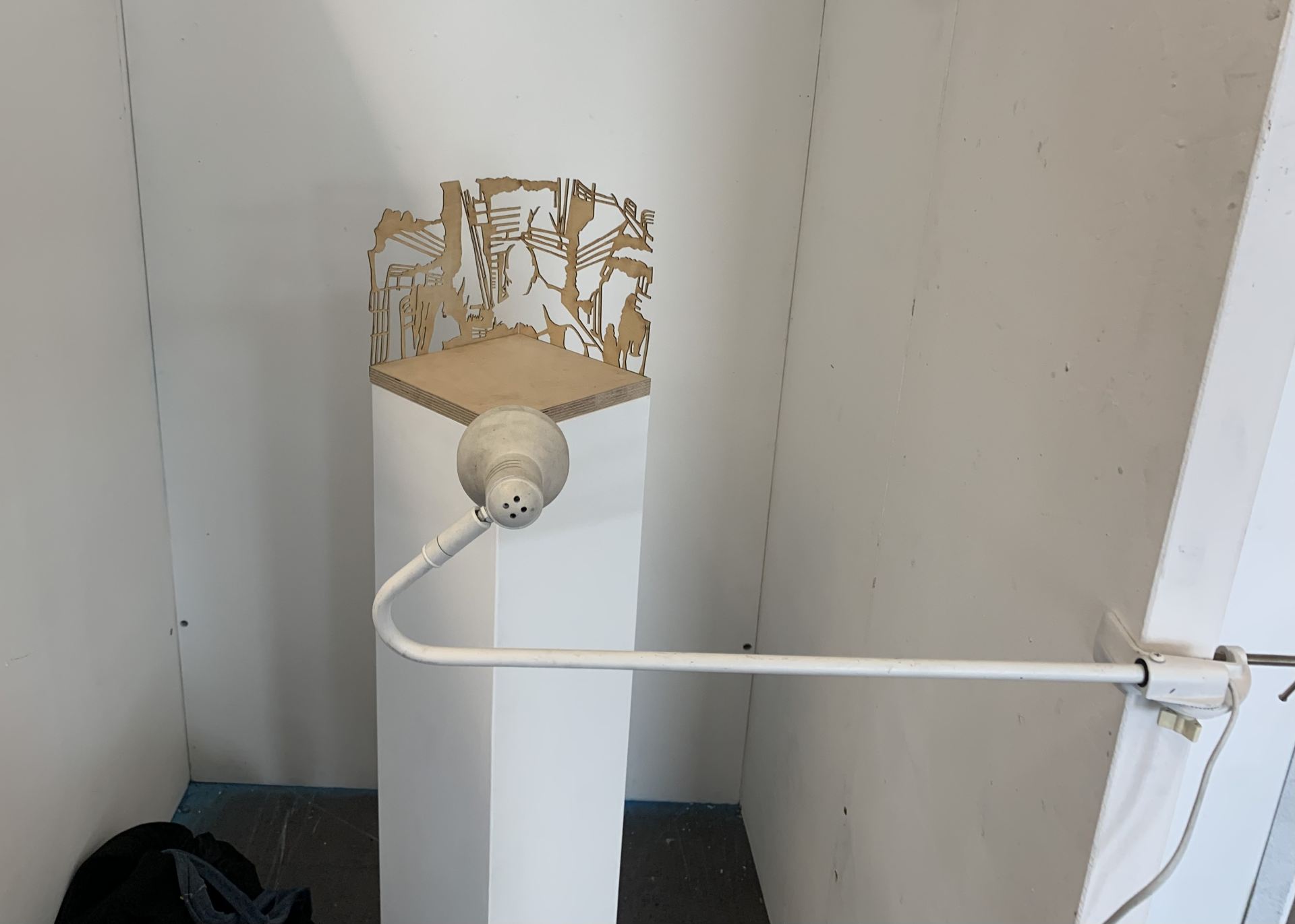
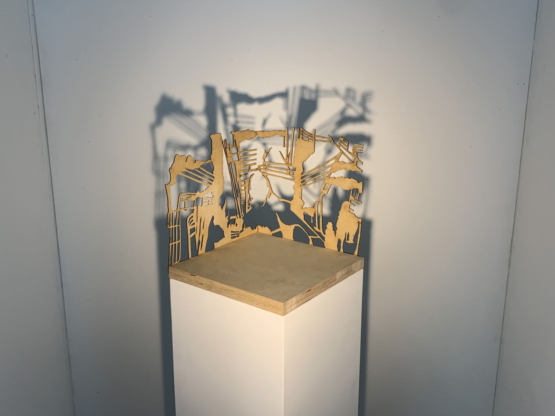
Once back at the University, I collected the plinth that was made to fit my work (20cm(L) x 20cm(W) x 100cm (H)), and glued all the parts of my ply structure together using wood glue so that I could get a clearer idea of what my final presentation would look like and finalise my plans. I painted the plinth white to clean it up a bit, and also to add some contrast to the work as a whole because I felt that the ply structure blended in with the plinth too much and took the attention away from it. This ended up looking really good and definitely brought the work together. My installation is situated in a corner of the foundation space in which there is less light, as I wanted it to be positioned in a dim spot so that I have a higher chance of getting some successful shadows.


At first, I had a bit of trouble with figuring out the lighting for my installation because I wasn’t able to find a 1 metre tall floor lamp which was the option that I was going for, and couldn’t find any smaller lights that I could attach to the side. Luckily there was a number of lights in the foundation art store, and after replacing the bulb I was able to get them to work and begin to think of a new lighting idea in which I could use these lights. To make the installation space more enclosed, my tutor added two more sections of wall onto the right side. With this extended wall, I was able to attach the light to the wall using the clamp on the end of it, and then twist the arm around so that the bulb was facing my work. It took a while to decide on the position of the lamp and plinth, as the closer the work was to the wall, the shadow was more detailed but not very expansive, whereas when it was closer to the light, the shadow was expansive but very blurry. After a bit of fiddling with the lamp head and the plinth itself, I found a good mid point in which was happy with the shadow produced.

Overall, I’m very pleased with my work from the main workshop. I think that my final outcome came naturally out of the work that I had been producing within the seven weeks and I was able to create a piece of work that explores the memories, or the lack thereof, that I have from my trip to Carlingford, and reflects this sense of disjointedness that I feel.

Final display of work:


Exhibition Proposal

Ceramics Workshop [Day 2]

20/04/23

In our second ceramics session, we revised the work that we made the last time and had a chance to use the pottery wheel.

For the first portion of the session, I was working on the pottery wheel. I found it to be far more difficult than it seemed in the demonstration we were given, but I think with practice, I got the hang of it a bit more. My first vessel had quite a narrow base, which resulted in the neck widening and it wasn’t very successful. My second attempt (seen on the left in the image below) also had a wide neck but it was more structurally sound than the first, and I was able to mould the wide neck into a spout of some sort. The third vessel (seen on the right in the image) I made was the best of the three, as I tried to correct mistakes I had made previously, like not having a wide enough base or thick walls. I think if I were to use the pottery wheel again I would know what to do to improve my vessels.

In the second half of the session, I glazed the work that I made the last day we were in ceramics. I just dipped it in clear glaze because I was happy with the design that I had created on it using slip and I didn’t feel the need to add anything using coloured glaze. As well as having the chance to glaze our pieces from the last workshop, we got to glaze the work that we created in semester 1, and I chose to experiment a bit with this one since I didn’t on the last. To decorate this piece I dipped it in a white glaze, and once that had dried I used a paintbrush to apply hot wax on areas where I didn’t want red glaze. To apply the red glaze, I watered some down in a jug so that I was able to pour it over my piece, creating some interesting marks on the places where I hadn’t applied wax, but I did try to cover a lot of the sides.

The glazed pieces after being fired again:

1) Red and white glaze with wax resist.

2) Clear glaze on clay decorated with slip


Anna Gordon Workshop [Day 2]

25/04/23

In today’s session, I finished making the pendant I had started yesterday. In the morning I started by working on what was to be the back of my pendant. Similar to what I did for the front part, I went through my drawings and found a section that I thought would be easy enough to pierce out and that would look nice. Once I drew the shapes onto the back of one of the convex copper plates, I drilled an 0.8mm hole through each of them, so that I could then take a hacksaw and cut out these shapes, filing the edges to make them smooth.

I had originally planned to just have these front and back pieces, and secure them together so you could open it and put something inside it, but Seliena, the jewellery & silversmith tutor, suggested to me that I put a piece of brass in between the front and back to add some contrast. and make the pendant a bit more visually interesting. I thought that this was a good idea and so traced the shape of the front piece onto a piece of brass, and used the hacksaw to cut this out, filing the edges to smooth the shape.

When I was sitting with the three pieces of my pendant I found myself playing with them in my hands, and similarly, I always play with the pendant on the necklace I wear, so I wanted to include this movement/ability to play with it. I already had a 0.8mm hole drilled into the top of each of the sections as I knew I wanted them to connect, but then had to redrill the hole to make it slightly bigger so I could fit the copper wire through it. Using this wire, I made some jump rings by making a tight coil around a small steel stick and used the saw to cut them off. I then threaded each of my pieces onto this jump ring and closed it using a pair of plyers.

To add more definition to my etching on the front, I oxidised the copper and then used a piece of steel wool to slightly rub it away so it still remained in any grooves the acid created, and left the copper a light brown colour. I’m really happy with the pendant that I made as I think it looks really nice, especially with the oxidised copper. I had a really good time working with Anna Gordon and learning some new techniques that I could utilise in the future if I want to work with metal again, as well as testing my design skills.

Anna Gordon Workshop [Day 1]

24/04/23

Today I participated in a two-day jewellery workshop with Anna Gordon. I was looking forward to this as I really enjoyed working with metal when I participated in Bryony Knox’s workshop back in March, and I was interested to learn new techniques and make some jewellery pieces. Our task was to use a convex piece of copper and experiment with it to create a brooch or pendant.

When I was first given the piece of copper and our task, I was a bit lost on what I was going to do, so started by cutting around the oval shape, leaving a small border. After thinking a bit about the shape I was provided with, it reminded me of a Victorian locket, so I started to come up with some brief ideas based off of that. Victorian lockets typically had a design embossed or etched into the front, so I wanted to utilise the drawings on tracing paper I’ve been doing in my studio work to make something that resembled these. I began with the idea of tracing a section of my drawing and piercing it out of the copper, but then found out that I could experiment with some etching, and looked towards that.

I was introduced to two methods of etching onto copper; using an image printed onto acetate (better for more detailed designs), and using a sharpie.

For the method using acetate, I used a design that was already printed out as I was only experimenting. To start I degreased the copper plate using methylated spirits before heating the plate until there was a colour change. For the ink to be able to transfer, I had to quickly take the copper plate off of the heat and place the acetate sheet onto it -ink side down- making sure that I found the short period in which the acetate wouldn’t melt, but it was still hot enough for the ink to transfer. After this cooled down, I slowly peeled the acetate off, leaving the ink. I then taped the back of the plate and taped a piece of styrofoam to the back of it before placing the plate face down in a tub of ferric chloride. I left this piece in for about an hour and washed the acid off with water before using a piece of metal wool to remove the ink and polish the surface. The copper where there was no ink or tape was eaten away by the acid, leaving this etched design behind. I was really happy with the results of this and was surprised at how detailed it came out. I think if I were to oxidise the copper or leave it in for slightly longer I would have gotten better definition because it’s not that deep, but as a first try/experiment the process was really interesting.

The second method that I tried, and the one that I used for my pendant, was using a sharpie on the copper. This method is essentially the same as the previous one, but instead of using heat and an acetate sheet, I drew directly onto the copper, copying a section of one of my tracings. I then taped the back, added a piece of styrofoam, and placed it into the ferric chloride. The third image is a photo of the first piece that I tried – I left this in for an hour and 10 minutes and then used metal wool to remove the ink and polish it (the piece isn’t fully polished in the image). The fourth image is a photo of my second use of this technique, in which I left the copper in the ferric chloride for 2 hours to see how deeper the etching could be. This one came out really well, but I preferred the first try as it was less extreme, and more soft, like a lot of the designs on the Victorian lockets that I was inspired by.


Playing with Shadow and Light

Shadow and Light

I was introduced to the idea of playing with shadows through my tutor mentioning Cornelia Parker’s ‘Cold Dark Matter: An Exploded View’ (Fig. 1.), and I thought that the cut-outs that I was making could be used to create shadows and manipulate the shapes and lines that I was utilising. When researching other artists who have worked with shadows, I came across Julio Le Parc’s ‘Continual Mobile, Continual Light’ (Fig. 2.), an installation in which thin metal plates are suspended vertically on a white wooden panel. The plates move with the room’s air currents, creating shadowy optical effects against the white background. Le Parc’s intention is that the artwork remains in motion, I thought that this was an interesting concept that I could use, especially since I am looking at the idea of disjointed/fleeting memories, I could place one of my cut-outs in front of the window, and as the sun changes positions throughout the day, the shadow the cut-out cast would change, adding to that sense of disjointed-ness that I want to portray.

Figure. 1. Cornelia Parker, Cold Dark Matter: An Exploded View, 1991.


Figure. 2. Julio Le Parc, Continual Mobile, Continual Light, 1963.


Natural Light (Sunlight)

Below are photos of my first use of shadows with one of my cardboard cut-out pieces. I placed it on a white sheet of card directly in front of the window whilst it was sunny, and held the cut-out in a few different ways to see how the shadows would distort. I thought this looked really cool and wanted to develop this further, so brought the cutout home so that I could try making more shadows with a lamp in a dark room.

Artificial Light

At home, I suspended the cutouts between two dressers using string and then pointed a small lamp toward them to project light. I really enjoyed experimenting with shadows here, as I was able to move the light around to change the position and size of the shadow the cut out cast.

IMG_4240

I wanted to look more into how shadows could lengthen certain lines depending on how the light was positioned/the perspective of the cutout. I made another cut out and bent it in the centre to sit at a right angle. Like my previous cutout, I made it so that the plain side of the packaging faced outwards, however, when I went to make shadows with it, they weren’t as expansive as I had hoped (Fig.3.). I ended up flipping it around so that the point was toward the wall. The shadows were more like what I was aiming for (Fig. 4.). I think just as an image (the shadow and cutout together in this positioning) it looks more dynamic, whereas the previous piece was quite flat.

(Fig. 3.)    (Fig. 4.)

Screen Printing Workshop

24/03/23

Mono-screen Printing Workshop

In today’s screen-printing workshop, we were learning to use a printing method called mono-screen printing. It is essentially the same as mono-printing with a plate, in which you create a one-off print by working directly on the plate/screen. When choosing a reference image for my print, I kept in mind that this is a very gestural and painterly method of printing, so I picked a collage that I had done which had a lot of structural lines that I thought I could play around with, as well as some softer shapes and colours in the figures and bedsheets.

To prepare the screen for printing, I used parcel tape to make a border around a space slightly smaller than the paper size and placed my screen into the bed where it was then clamped in so it wouldn’t move about whilst I was printing. The ink that we were using was acrylic paint mixed with medium, as well as some soft pastels/water-soluble pastels.

For my first print, I was trying to be quite painterly, using loose shapes so that I had a general recreation of my collage. Since it’s quite a dark image, I added more bright colours, using pink and red to add some light and compliment the blue lines that run throughout the image, as well as using a mix of blue and green for some shadows. To keep some areas white, mainly the spaces in between the bedframe, I painted the medium onto the screen to act as a blocker of sorts so that when I used the squeegee to transfer the paint to the paper. I like the way that this print came out, especially in the brightness of the colours. The blue soft pastel that I used for the bedframes on the lower right portion of the print didn’t come out as well as I thought it would, as I think I used too much medium when trying to make the soft pastel work on the screen.

For my second print, I reapplied the paint in the same places, aiming to get all of my colours more solid. This didn’t work how I expected it to, as I think any excess medium that was on the screen from the last run stayed in some places and in areas where I had solid colours the last time was more space and vice versa. Despite this, I like this print better than the first, as I think that the blurred colours (which I got by running the squeegee over the screen twice) give it a very dream-like appearance, and reflect the concept of distant/disjointed memories that I am looking at in my current studio work.