Inspiration blog
Within this blog post I will be showcasing the collected pieces of information that I have gathered and created over the coming weeks as inspiration towards my Apollo project. This blog will contain inspiration from images, websites, sources, colours and typography etc. I will be aiming to gather as much primary and secondary research as I possibly can to begin building the picture and idea around where I am looking to go within my narrative storytelling module.
I’m aware that Pinterest is possibly the most common source of inspirational content when beginning any project for digital creators and because of this with this project I am aiming to branch out my resources a little further than what I have done before looking into creating a physical moodboard, scoping out old newspaper articles, magazines, using social media such as TikTok and Instagram, books, dribble etc to focusing on an art direction that I have in mind.
Pinterest:
https://pin.it/6nYtSdq
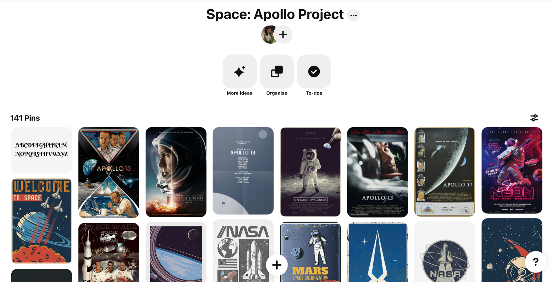
Pinterest is always one of the quickest and easiest options I find out there to source content for inspiration. What I enjoy most about Pinterest is that I can create my boards and add my selected pictures from my phone meaning that any spare time I have during my day I can quickly add my pins and my inspiration quickly into an organised fill and always have a digitised moodboard on me by just going into my pocket.
With Pinterest then I focused on pinning inspirational content that was space/Apollo this included colours, themes, images, logos, graphics, posters, comics, typography, layouts and breakdown of information. I always find this area of research fun as I tend to take this task as a “rabbit in a rabbit hole”, I love getting to dig deeper and further into inspiration the long you search through individuals pins.
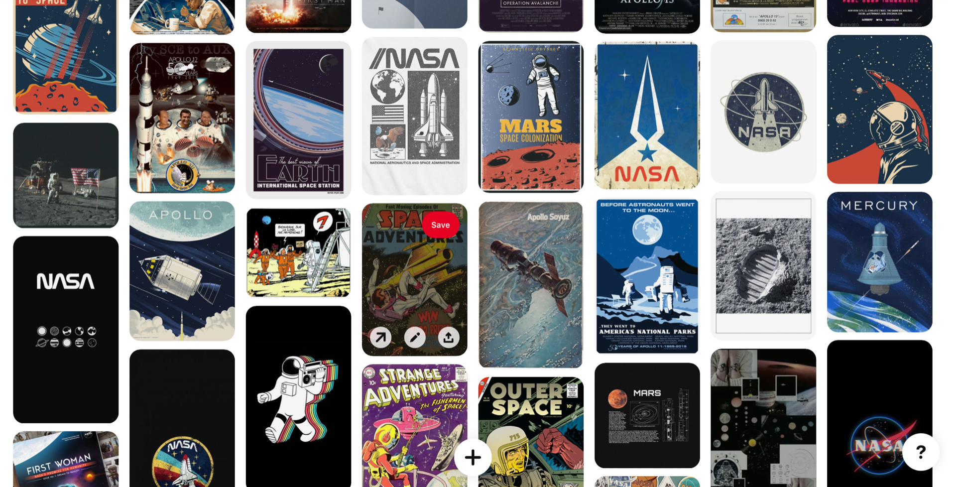
With Pinterest also I created a separate moodboard where I collected some colours palette inspo that I could take into consideration. I found this area of inspiration particularly hard as Pinterest didn’t seem to have very many space theme colour palettes out there so I many stuck with the galaxy images I could find and colours of the sky. I will be looking to add further inspiration in colours that I could take from possible Apollo mission images.
https://pin.it/4VYp7zX
Milanote:
After being happy with the amount of pins added I really wanted to organise what I had found further by separating them into each category and for this then I used Milanote, a tool that allowed me to do just that. I used Milanote to store and organised my ideas for this project that I had found using Pinterest into visual digital boards. This was the first time I’ve used this tool and have quickly fell in love with how easy and useful it is to keep all my ideas in one area.
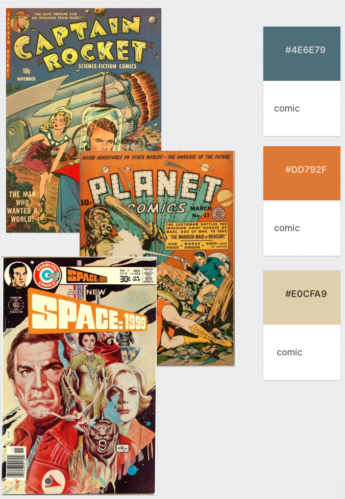
I spilt my Milanote visual board into 1 main inspo sight that included some image pics pulled from Pinterest then 4 other boards that contained all my typography, colours, logo and theme inspiration.
One area of this tool that I really enjoyed was that when I was created my separate board for my colour samples I was able to drag in real life images of Apollo mission like I had mentioned above and colour drop the image to create my own colour palette ideas.




Physical copy of moodboad:

Heading into this new project I have set myself a goal to push my understanding of inspiration and really showcase how I visualise my content and design. And because of this goal I knew from the beginning that I would be aiming to create a physical copy of my moodboard that would allow me to visually see by hand the areas and elements of design that interests me heading through with this project.
Within this copy of my moodboard I wanted to create something that was understood as soon as someone sees it. I done some further inspiration using Pinterest to see how other artist put together physical moodboads and get ideas and tips on the best way to move forward with this area of inspiration. I came to the conclusion that using only images simplified the use of this sort of moodboard because I had already done this digitally three times using Pinterest, Dribble and organising these further on my Milanote board so I decided to bring other areas of ideas to this moodboard to make it more unique to me.
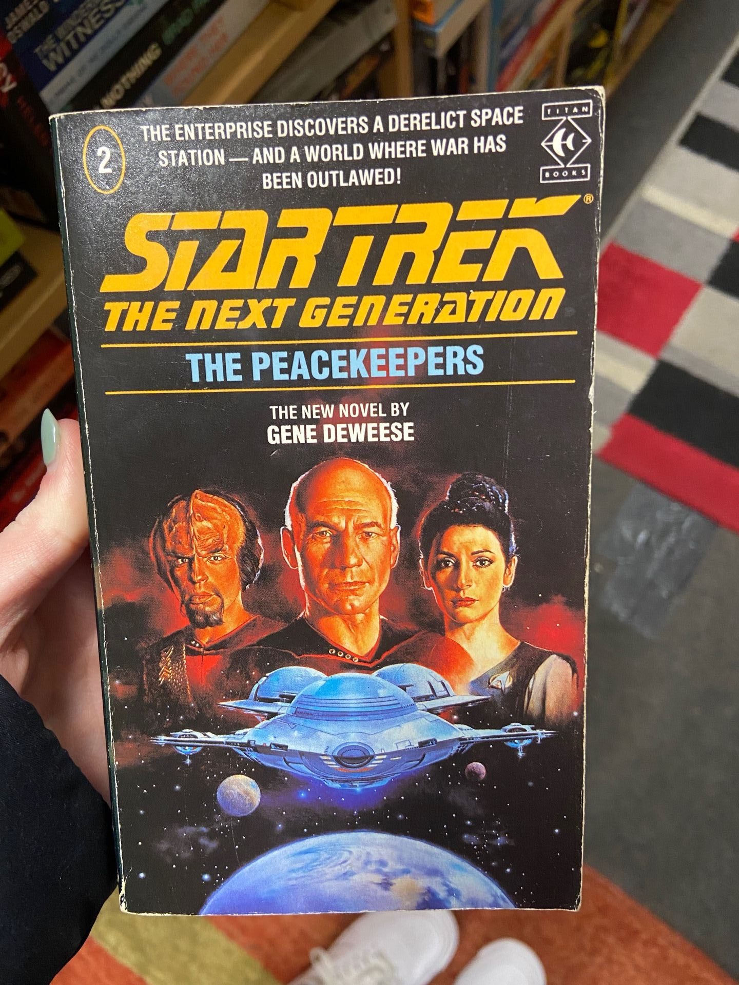
 To do this so far I’ve looked at magazines online and from stores, I’ve visited local book stores and comic book shops to sample pieces of art, I’ve gathered sample pieces of wallpaper from the Noblets wallpaper shop, visited the Belfast library for Nasa, Apollo and space related content in books and magazines and purchased 2 comic books from the comic book store in Smithfield to visualise the layout, colours and typography used within these.

This has been my first attempt at moodboarding and being able to visualise my thought process by hand. I found this a tricky task to manage as I doubted my capabilities in creating a visually appealing and well constructed piece of inspiration. I kept overthinking how to present the pieces and position the layout of my printed images and because of this it is still a work in progress but I am getting there and I’m excited to see the end result. With this I am still on the hunt for further inspiration looking for old comics books at boot-sales, second hand shops and online using eBay, visiting fabric shops for fabric samples I could use for colour inspo and still visiting the library to gather information and inspiration on the breakdown of the Apollo missions etc.
Completed physical Mood board:
For my Apollo project and apart gathering my inspiration I have created two physical copied of my mood boards. Within both these moods boards I allowed me imagination to run wild to allow me too pull a lot of creativity to from many direction and combine onto a physical copy that I have to refer back to when I need motivation or inspiration to complete this projects. The mood boards are as follows:
Mix board
A completed board consisting of a range of imagery, typography, colour palettes and potential art directions I have in mind. To complete this mood board I used my gathered images from my Pinterest and dribble boards and also visits comic book stores to visualise copies of space themed comic books and the wallpaper shop for some graphic and colour inspo I could pull from these.

Newspaper and Comic board
At the moment my two strong and main areas of focus to complete my narrative story telling website is to go down the route of a newspaper or comic book style in the era of the 60’s. For this then to gather inspiration I created a separate physical moodpboard that split both my art directions into two areas of focus. On the lift I used real newspapers to help me find inspiration with layouts and on how I could break up content when it came down to image and context within articles if I was to go with the newspaper idea. Then with this is used some inspirational images from Pinterest of comic books of that time of the Apollo mission and based around space.

Library – University and local (15th February)
I have visited the University library and was able to find a magazine and a book on the library system about space however when I asked the staff for help to locate the magazine that was in the Belfast uni it seemed that someone had taken it without checking out with it before me so I didn’t get a chance to see what this magazine would have had for inspiration.


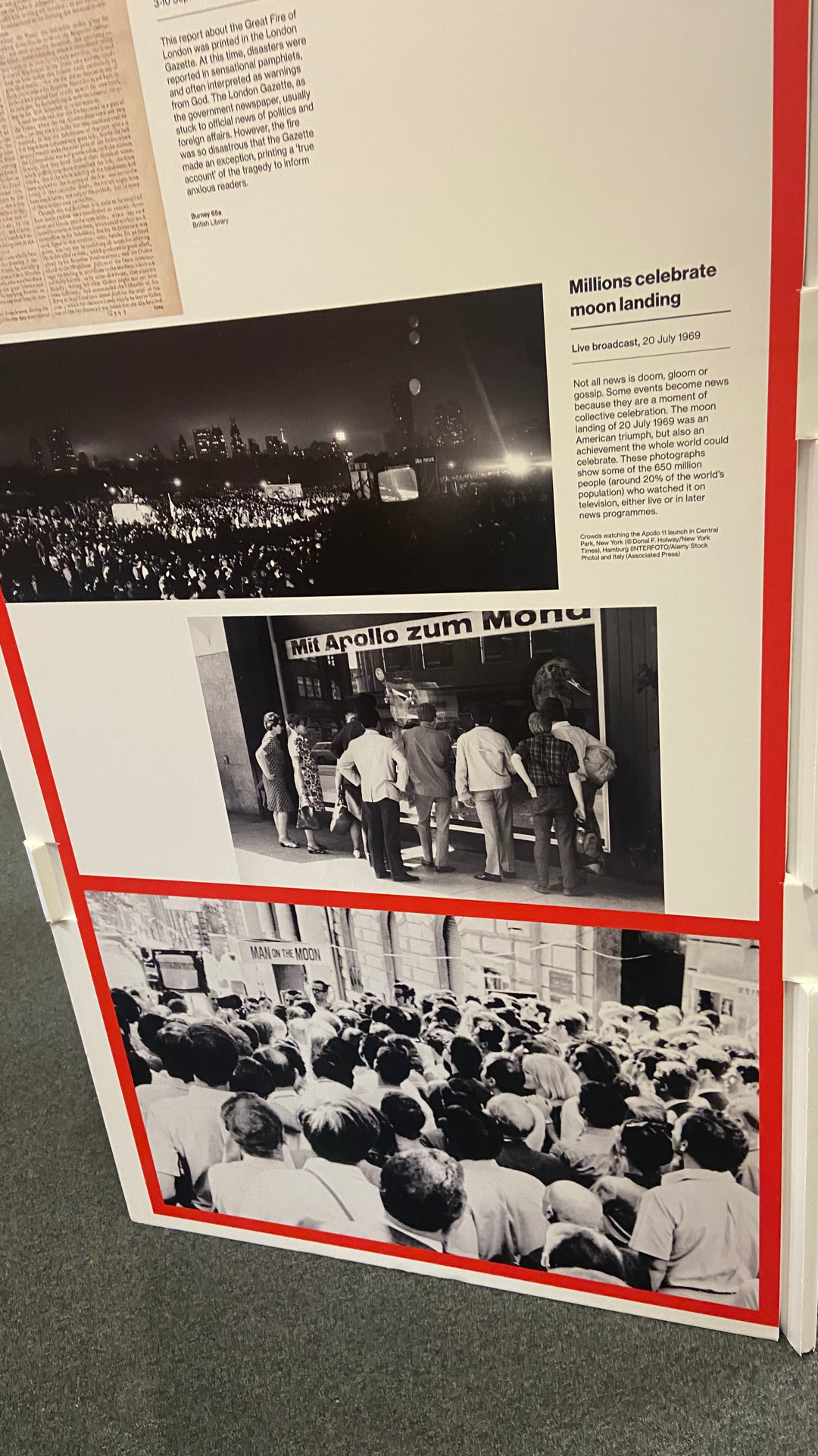
With visiting the Universities library and not being successful I headed over across the road to the Belfast City Library to see if I could get anything useful there. Again with searching through the system and taking a walk round I couldn’t come across any non-fiction books that were specify about the moon landing even after finding the notice board below. I think its possible that I’ve overlooked this visiting this library so a day after uni I will head back over to see if I can find anything further.

Falta – Community of freelancers:
https://www.facebook.com/faltacreators
This is a Facebook page that I came across last semester that I always find interesting to surf through. Mainly this page consist of its creators posting UX and UI design tips and trick to help freelance designers through design elements such as tools, colours and fonts. For this project I’ve benefitted mostly from saving posts that are related to typography styles that I could potentially bring into this project.


Dribble:
https://dribbble.com/slbriers/collections/5494179-Apollo-Project
Dribble I find has a good source of content when it comes to layouts and structuring for design elements and for this then using dribble like I did with my Pinterest I created a collection board and stored my inspirational shots. I looked into searching all areas that were related to space, astronauts, NASA and Apollo, focusing on design pieces, layouts, typography and its placement with images, the usage of images, colours, whitespace and information structuring. I found this a useful source to help me begin developing an idea and build for my project idea.
Inspirational Websites:
Im currently aiming to create a Apollo based website for this project as I feel that the creation of a website would give me more of the opportunity to include various areas of design, information, images and overall allow me to project as much about the Apollo missions as possible as I will have the open space to branch my ideas out on. And because of this then I have decided it would be best to look at other content related website that focus on not only space/Apollo missions but other narrative story telling website to allow me to begin understanding how to structure my content and how others build a story telling website.
Collect Space website –
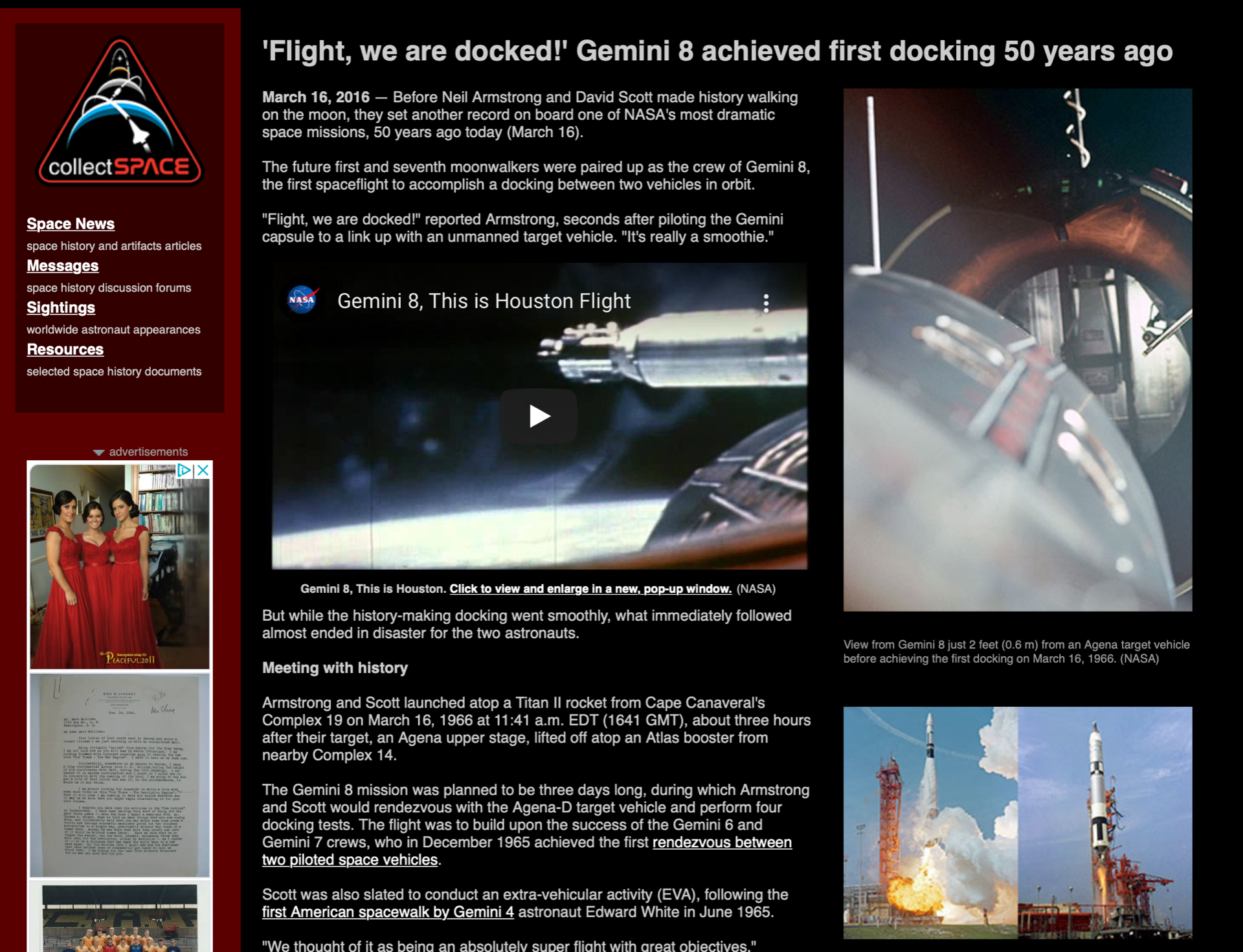
What I could make out about this website was that it was focused only on the Gemini 8 mission. It was an interesting site to come across it used a range of imagery, video links and a breakdown of content data around the mission. This has a pretty clean design overall, there was too much happening in it but it did tell the story of the mission and give a good amount visual expression to go along with the information provided and they also have a strong brand that represent a badge that the astronauts would wear on their suit which I thought was good attention to detail. However, there didn’t seem to be a navigation system to what I could find it was just a scroll through the content. Overall it did provide what I would’ve been looking for as a user if I was in search of Gemini 8 mission information it just wasn’t portrayed in an overly appealing setting which put me off straight away as users.
Collect space website link
Nasa.gov website
The second space themed website that I came across was the Nasa.gov site. I am pretty sure this is linked to the real Nasa website but its a site the has broken down sections for each Apollo mission. I loved how each Apollo mission was represented by their patch badge as this is something that I had originally thought of including in my project in some way and this was an interesting way to see how they incorporated into his site. Overall this site gives you what you need in the simplest form. Each section contains information and images about each mission through a clicking slide. I enjoyed that as a user I wasn’t given too much information and the the imagery give me a picture to build in my when reading the related data being shown. There was a clear navigation system located at the top of the page that linked me further into difference areas of the Nasa site.
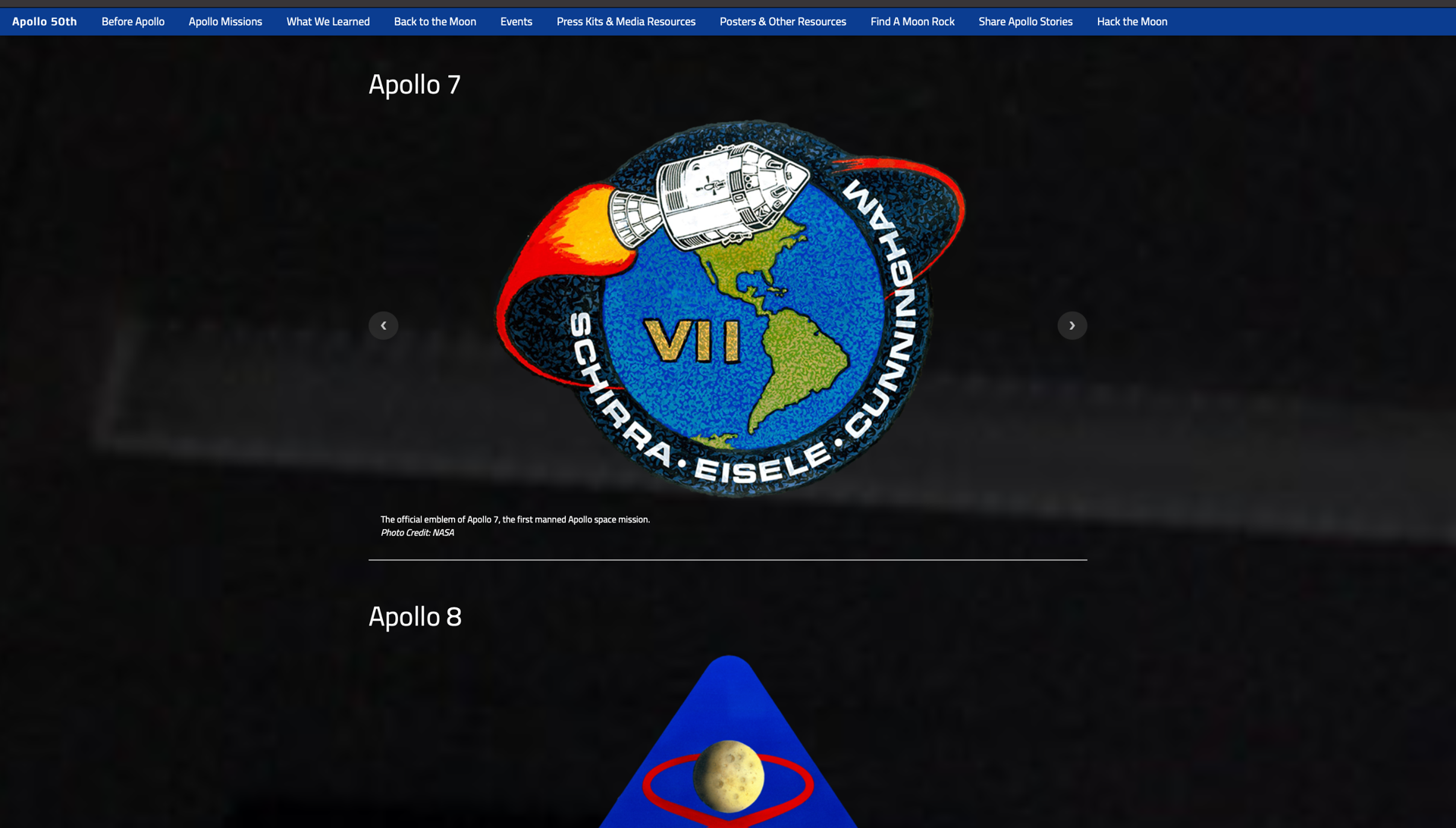

Nasa.gov website link
Layout and design inspiration and other narrative storytelling website:
A website layout is patterns that structure a website when it comes to the information and images. Information and images will be structured in sections that should make it clear and understanding to see and highlight the main features of the site. It should include clear paths of navigation as the user will follow the websites layout to get to where you need them to go. A website layout can be structured in many ways these could include:
1. Full screen photo:
Full screen websites are ideal for photographers or if you want to focus on the visuals of a site. If a full screen photo layout is considered it usually contains little to no content other than headings and maybe links. The key to make a successful full screen photo layout is to use visually appealing images and thick readable text.
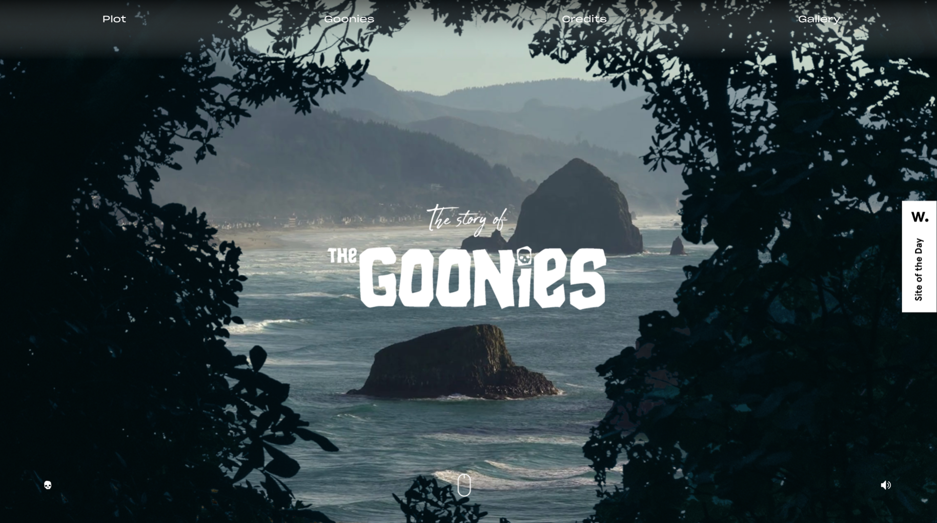
The Goonies website created by Joseph Berry is the perfect example to look at when looking into this layout. This website was created by Berry with inspiration from his favourite 1980 movie “The Goonies”. He’s used this layout as a way of telling the story using a mixture of modern web design and storytelling. One point of this site I would like to include that brought me straight into the movie and the story behind this site is that as soon as the page loads to this site you are welcome by the theme tune of used in The Goonies movie and I thought that was such a smart way to bring the user into this story. Another key point being the transitions that are used through out this site they are smooth and slide your the content.
https://the-goonies.webflow.io/#home
2. Grid layout:
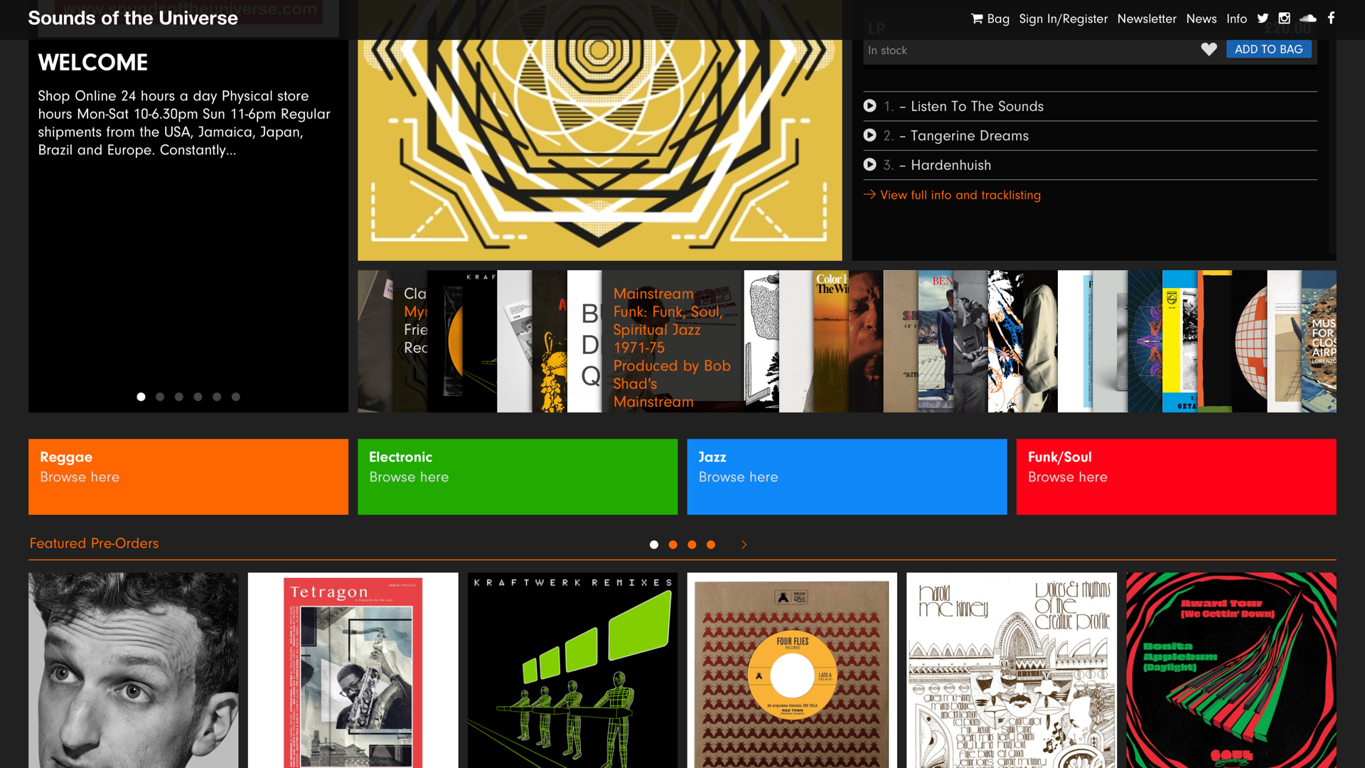
Using a grid layout will allow your website to have a stable and structured layout. A grid layout will allow your information to be structured in vertical or horizontal guidelines which allows space, columns and margins to be included in your website, allowing your content to then become much more organised.
Sounds of the Universe is a digital offshoot of the electric record label Soul Jazz and their website focuses on putting music out there that doesn’t get enough attention. Their website is an example of how using a grid layout can be used within website design but in a very different way as there layout allows you to flick through the records as if you were in a record shop.
https://soundsoftheuniverse.com(https://soundsoftheuniverse.co)

If a websites purpose is focused on showing two pieces of content that are both equal importance and belong together then using the split screen layout would allow this to take place on a website. Using split screen layouts are also highly effective as they can be mobile compatibility and user friendly. Having this layout allows you to get information out to your uses as ways on imagery and text at the same time.
Twitter uses a split screen layout to structure the different products and style they can provide for their users. The use of this split screen layout would make it easier for their users to find their style quickly.

4. Single page layout:
A single page layout is a simple but still attractive website layout to use. This layout will only use one html page to show all of the needed information so there are no additional pages such as about, contact or gallery pages. Using the single page layout would allow users to find their needed information with a few clicks or scrolls. It’s crucial that to make this layout successful that your structure is thought through and you have eye catching designs, combined information and clear understanding navigation systems in place.
The Playground Digital Agency website is designed using the single page layout. On one page as a user I was able to find everything I needed to know about this business from the services available to the contact information that I would need to know as a user by just a few scrolls. Having this option for a layout really makes it much quicker and easier to find information for business like this.


5. Article layout:
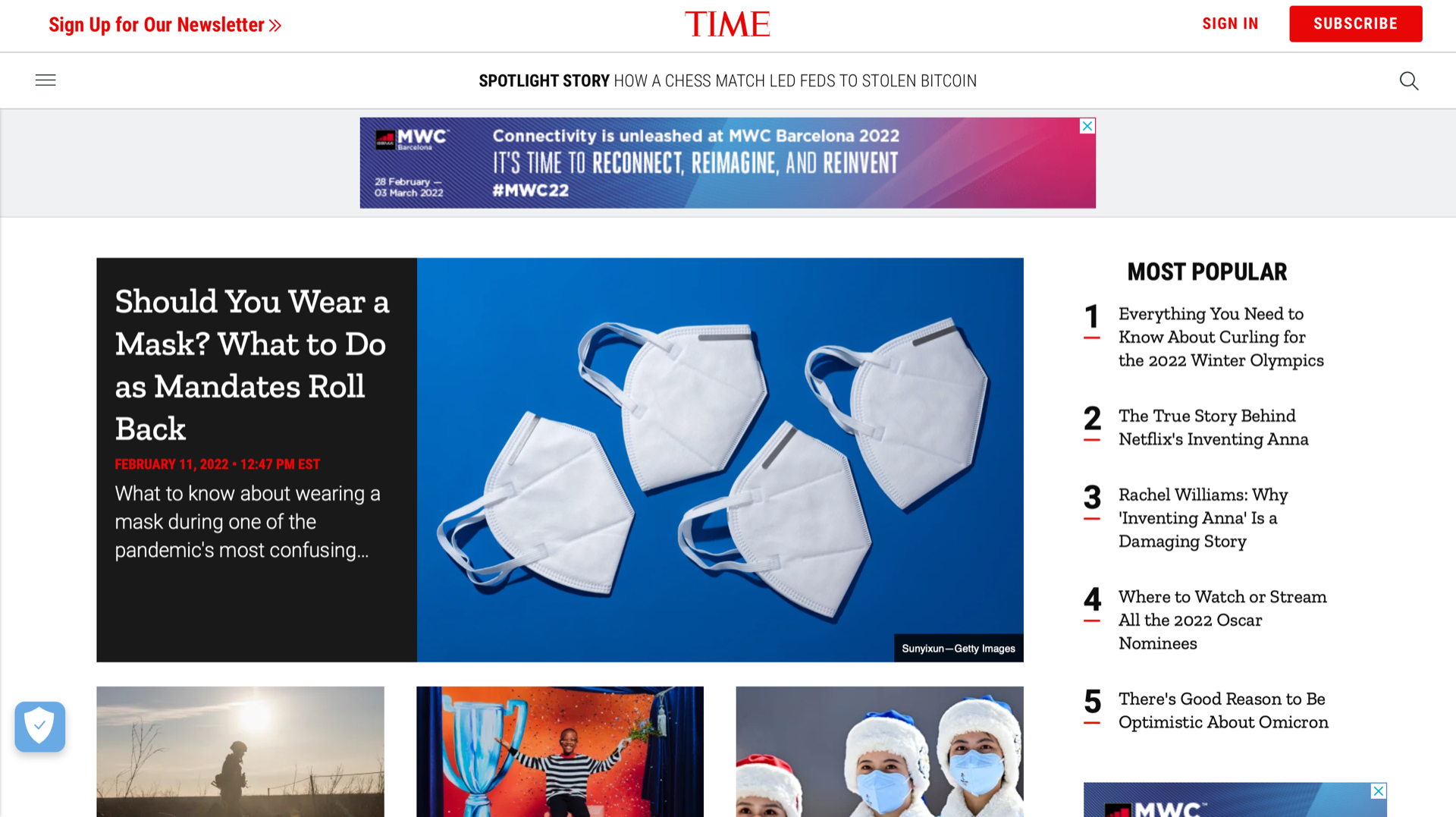
This layout can be a tricky one to get right as it can easily come across as messy and unorganized pieces of text. The Article or Magazine layout is commonly used for news or article websites as this layout gives out more of a realistic feel to the user as if they were flicking through a magazine or newspaper. The layout allows the information such as text, images or videos to be structured in columns like an article would. Its crucial that if this design is created that images and the correct font is used to allow the site to become readable to the user.
The Times is a British daily national newspaper and there website is exactly that but in digital form. The homepage of this website just like their newspapers leans on the visual aspect of the information its showing with imagery or videos related to top news articles. This is a good example of how an article layout should be designed as it keeps structured visual hierarchy without making the overall look of the site cluttered.
https://time.com
6. Zigzag layout:
The zigzag layout is simply just a layout that makes its users scan a website in a Z letter direction from top left to top right to bottom left and onto bottom right. This layout is commonly used on web pages that are not focused on text rather than a site focused on articles for example. Using the Zigzag layout will allow the designer to have the power on the direction they want their users to take when they are using their site.
The Zigzag layout takes place in a lot of websites such as on login or sign up pages that take place on social media sites. Facebook commonly use this layout as it allows the users to scan through the site to see the steps that need to be taken to move forward onto this site. Scanning from the top left to the right to the bottom left to the bottom right you can see from the screenshot below why this layout works for this specific feature.

Name badge creations:
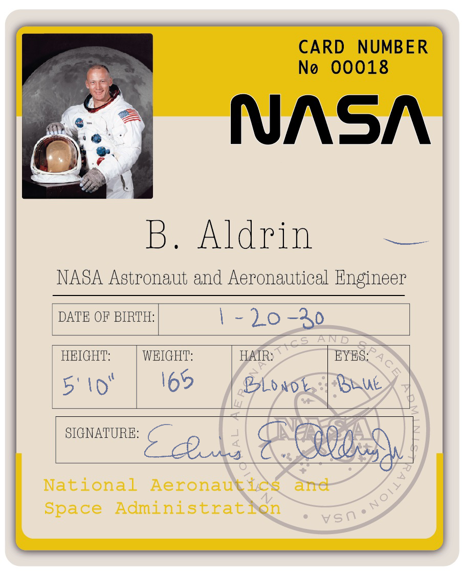
I wanted to create some name badges that would represent each astronaut mimicking what a real Nasa astronauts name badge would look like. To do this I research some Nasa name badge to get the idea behind what these would look like and then tried to search online for Neil, Buzz and Michael real name badges that they used and to my surprise this was harder than I thought.
I sketched some of mu ideas out on how I would present the name badges.

I then found some of the real nasa name badges that the astronauts used.

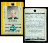
Brought these over to illustrator and completed two mockup designs of my own badges

I then used medical documents and ID cards that had the 3 astronauts very own hand writing on them, discovering these documents on the Nasa website.
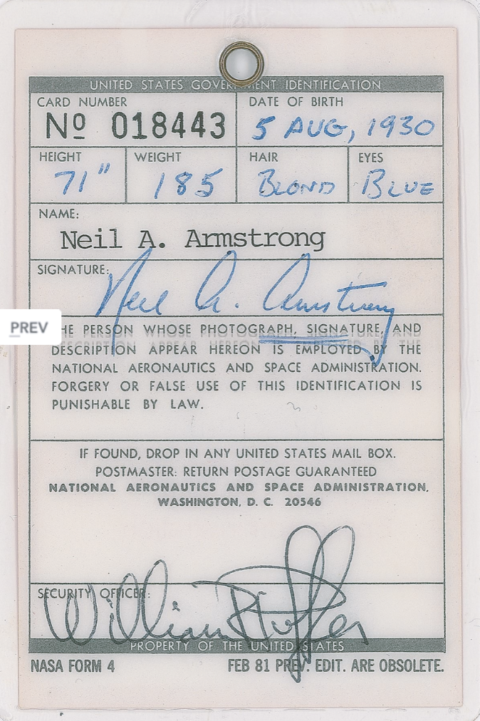
With having some accurate detail like the one above for example I created 3 name badges one for each astronaut and brought my mock up designs over to procreate on my iPad and was able to use the detail that the 3 astronauts place on their documents to trace over their hand writing and place on top of my mock up to create the 3 name badges below.


In conclusion, within this blog I have spoke through my methods of inspiration and how I have gone through sourcing materials both online and offline and presenting these in artistic methods. I have also done some further research on how to layout and structure website which has helped me gain an understanding on how I can present my findings when it comes to creating my website.
