Within this blog I will be demonstrating my ideas and finalised design for my brand for my Apollo project.
Following our art direction lecture with Kyle he tasked us with beginning to create our logo for the Apollo project that would be included in our prototype and our website. Up until now I had really thought much into my brand with still being unsure of the direction I was going down in terms of either a comic or a newspaper.
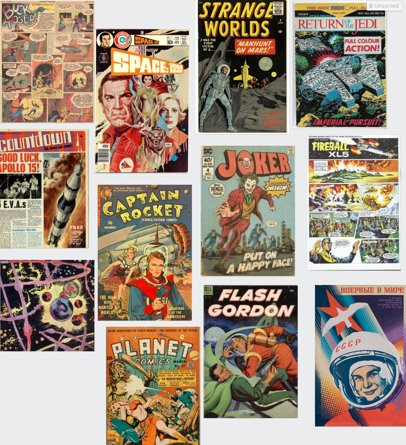
I began with some inspiration that I could use for both ideas by using newspaper and comic books and how they project their brand and I found that this was mainly by text only so I know going into my brand that my typography has to be perfect if this is the route I am wanting to take for my brand.
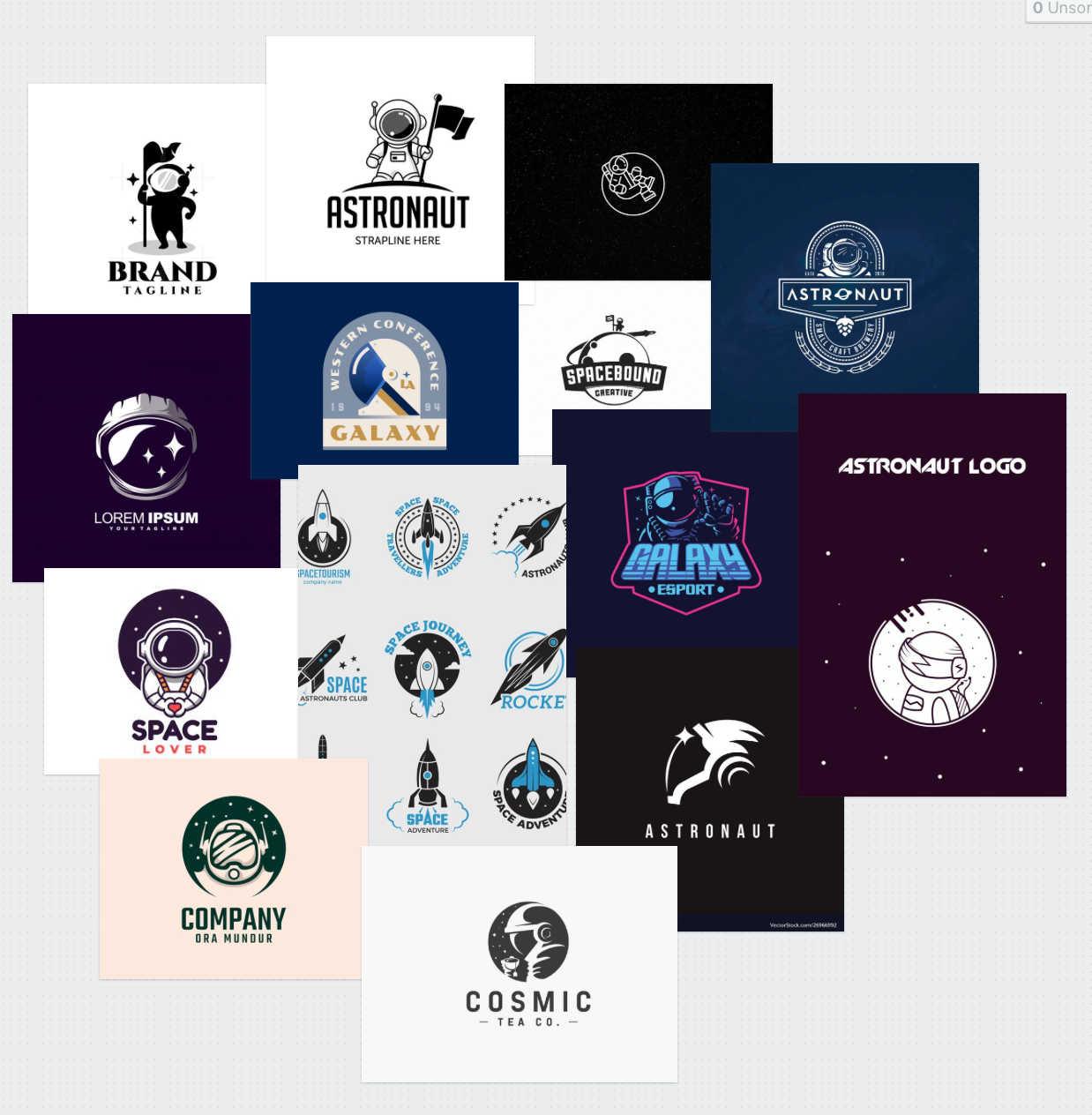
This screenshot is from my milanote board that I created and pinned a board that solely focuses on brand ideas that I had found on Pinterest and Dribble, these typically focused around the moon, rockets, astronauts etc. I also included a pin that I placed some comic book inspiration in just to give an idea behind how brands/logos are presented on a paper based only services such as comic books or newspapers and I found that 9 out 10 times these brands are presented in the form of typography.
And again with newspapers it’s always with typography based brands that make the user aware of the newspaper that they are reading. With this then being the main brand focus on both a comic books and newspapers it would only make sense to scrap the thought process behind a brand on an icon or illustration and put mu focus on creating a brand with typography.


Brand Sketches:
By looking through some newspapers and visiting some local comic book stores I was able to draft up some inspiration on how I would go about creating my brand for the Apollo Project. I know at this point that I will be aiming to create a typography based logo that represent my brand and the website I will be creating. The reasoning behind why I am going with a typography based brand, is because I believed that it is best to try and keep to what my users would area aware of when it comes to newspapers or comic books style brands (depending on the direction I go down). With the research I have been able to gather both of these directions mainly focus there brand around strong and bold typography brands that jump off the page to the reader. They doesn’t necessarily have an illustration but the focus is on the typeface, colour and layout which is what typically makes these brands stand out.
To firstly create my brand then I began mind-mapping some ideas that I had for names for my brand and from here then I moved on to creating the names into branded typography style logos.
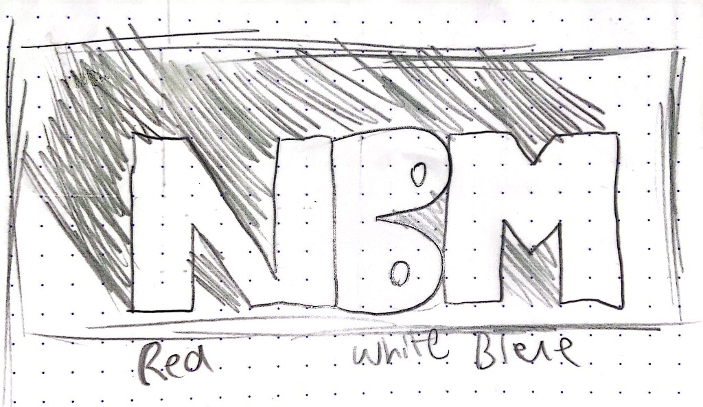
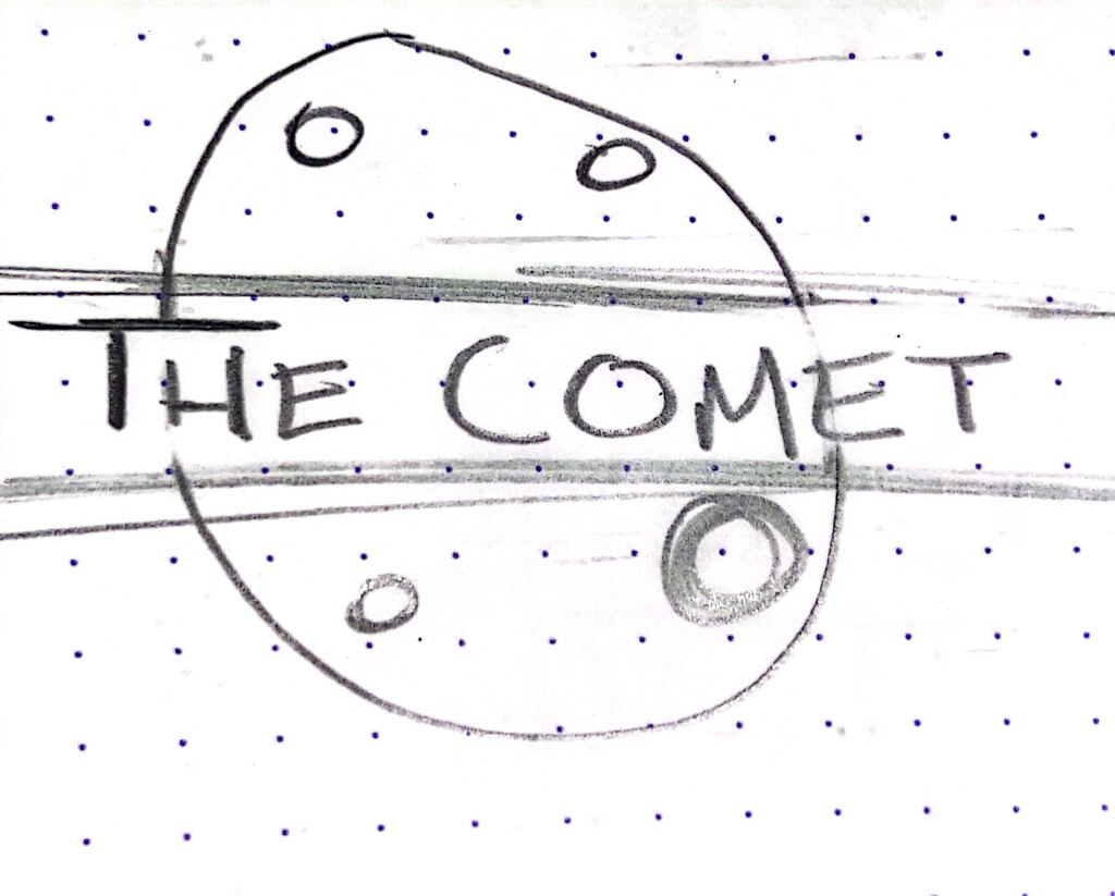
When thinking up some potential names for my brand I knew I wanted to keep it space themed either bringing in topics of space such as ‘The Comet’ or ‘The Orbit’ or focusing it on the project brief such as ‘The 3 Men’, 11 Crew, ‘NBM’ which stood for Neil, Buzz and Michael. With the brand name I wanted it to be short so that it could neatly fit into a header like design and catchy enough to be remembered by my users. I was taking inspiration form the local papers mostly for this which all seemed to start their brand names off with ‘The’ for example; The Sun, The Telegraph, The New York Times. I thought that keeping it as close to a real newspaper as I could was one way of ensuring that I could create this a website that represented a newspaper theme. 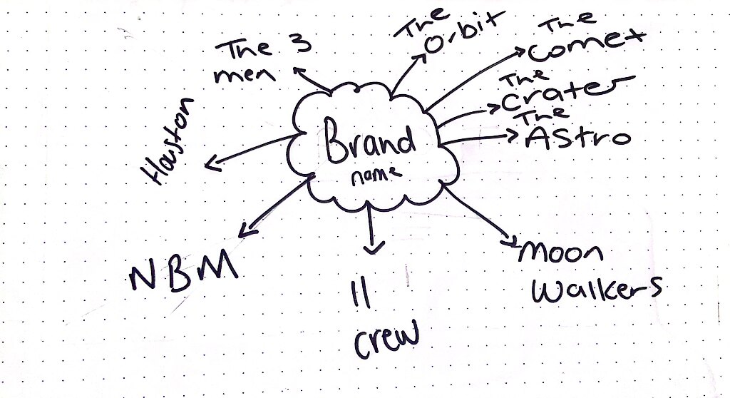
When it came to sketching I won’t lie I hated it. I am a big fan of sketching my ideas and usually this is an area of my design process that I love to get into as I love getting to see the development of ideas as I begin creating, however it just wasn’t the case with this typography style brand. This was because truthfully I can’t draw for the life of me but I can get away roughly with sketches when it comes to illustrations but when it comes to sketching typography I just find it so hard because I have the typeface in my head and I can visualise the idea but I can’t get that onto paper. When I’m focusing on these style of brands then I usually focus more on the layout of letters and the placements of where to place certain text, as the only way I can portray text onto paper is by bubble writing (and not in a good way). Regardless of my skillset of sketching out typefaces I did give it a go as I’m aware of the importance of the step in the process of creating all design aspect and I got a good few ideas down.
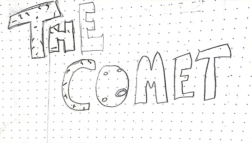

When sketching out I tried to image the brand as if they were headings on a news paper and how these could be presented on a site or in a newspaper or comic. I designed some ideas that I thought I could use for both a newspaper and comic so that when I finalise my idea I still have a strong brand to work with.
Moving to illustrator
Once my brands had been sketched I then moved over to illustrator to digitise my ideas and begin bring them to life. When design I creating the brands into rectangle shaped dartboards to represent the header they would be placed into for the top of a newspaper.
For the comic book style of font I was working with the inspiration I found below. I wanted to try and make the typography jump from the page with a 3D background (superman S)


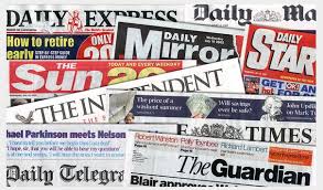 And for a newspaper style brand I looked at mainly the layout and white space that brands such as The Sun or the Daily Star use to represent their newspapers on their front page.
![]()
![]()
![]()
![]()
![]()
![]()

My favourites that I digitised were:
![]()
![]()
![]()
These 3 designs I thought were simplistic and clean to represent mainly a newspaper and ‘The Crater’ gave me cool superhero/comic vibes. Overall these designs I was happy with and at the moment I feel they’re strong enough to use through out my project when I come to the conclusion of my art direction.
*Update*
19/02/2022
With continuing through with my prototype and getting the opportunity to use the 3 chosen brands above throughout my site I have chosen my first finalised brand that I am pending feedback out from Kyle and the class in week 6’s critique.
At this point in the project I’ve came to the conclusion of trying to create both comic book and newspaper style website but I have hit a lot of walls in trying to perfect this theme. I do want to note that at this point I am swaying more toward a newspaper style design because I don’t think I could mimic the style of a comic as a website but I am still moving forward until feedback week to get some further guidance from Kyle.
![]()
This is was I am going with and I got to create some article style designs with this as my brand. This design isn’t perfect and at the moment I’m not in love with it but I have settle on this until I get my feedback. I feel like there’s too much going on with this brand and its clashing a lot with the main page of this site. I really need some help and guidance in perfecting this and I think it might be down to not having my direction figured out just yet. I’m hoping with some feedback with Kyle I can finalise my ideas.

*Update*
07/03/2022
Our feedback class has taken place and got to speak with Kyle over my confusion and lack of direction. Kyle stated to me exactly what I thought he would say that I was trying to work with to many direction and needed to choose one; either the newspaper idea or the comic book. For my prototype I focused mainly on creating a newspaper style design with no comic influence so that feel like a more realistic route for me to go with as I feel I have more of a understanding on how to create this style of design over how I would create a comic book into a website.
Because I have finally finalised my art direction then and with the feedback from Kyle it was time to once again fix my brand. I have numbered it down to two possible design that I feel tidy things up in my prototype, as they don’t over power other areas of the site and also works well with the navigation bar I have created. I feel that they represent a good brand that a newspaper would have and make a bold enough statement to make the user aware of the brand of the project.
![]()
![]()
Chosen final brand:
![]()
This was the brand that I am finally going with. I compared both this one and the one above on an article style background and I felt that this one has more character too it and tells the story behind what I’m aiming to create but still holding back some tension to the users on what content I have to reveal to them. I think the contrast of the colour black used in the text helped bring the moon illustration to life and this brand altogether jumps from the page to attract the users eyes well. In all it works will on my prototype designs and I’m excited to try and work it around my website when inputting into webflow. For this brand I decided that I would place it in between my navigation and centre it to keep it in the users vision at all times. 
Brand 1: