In this week lecture we went through with Kyle about the importance behind Art Direction and how we can use this to allow us to fully in-depth our ideas into our projects.
Art Direction
We first discussed what art direction is and what I took from this weeks class was that art direction happens before a journey begins and is what shapes the journey that we aim to take for a project. And for my Apollo project I looked into creating a mind map of the direction I am aiming to take to begin my journey to complete this project. Using a mind map to breakdown what I want to include in my project showcases to me the range of ideas I have and where I can go with these.

The mind map includes the colours I aim to use, break down of events and data, image usage, animation ideas, who I want to be included in the breakdown of information to give an understanding on who to research, themes of the 60s and others points I would aim to include such as quotes and a timeline.
For my general idea/theme so far with this project I’m aiming to try and design towards the 60’s era which is the time around the Apollo mission and the idea of reaching space really took off. My aim for this theme is to try and take inspiration from typefaces, colour used in relation to the space race in that time, breakdown of article and coming book usage. I really want to try and bring this era to the digital screen and challenge myself to create a comic book or newspaper style site that looks like it came from that time.
Other methods to use to begin developing an Art Direction for this project includes:
- An idea collage
- Style Tile
Idea Collage:
I have began creating an idea collage board on Pinterest and Dribble and this has moved onto me creating a digital moodboard using Milanote. This is a tool that allows me to create categories of subject of interest and ideas that I have gathered from my sources and organise them into files such as my colours, typography, image usage etc. With my digital mood board with this project I am also aiming to create a physical copy of my moodboard by printing out my images to showcase my direction of ideas so far.
On my collage work and how I gathered my inspo I have created a separate blog in
relation to my inspiration and the process on my art direction so far, here
Style Tile:
Creating a Style Tile I find to be a fun and enjoyable process and a clear method to conclude all finalised features to any project as this gives me the ability to present my design concepts before I head to my Hi-Fi mockups. However, I haven’t solely settled on an idea or full direction just yet on whether to go down a comic book or newspaper direction or to try and incorporate both. So by creating a style tile at this moment it isn’t possible as I don’t have any solid ideas to set my colours schemes or typography ideas on just yet. I will aim to have my style tile complete for weeks lecture alongside my Lo-fi mockups and have this include in a separate blog linked here.
Whats included in a Style Tile:
- Typography – A headline (H1), A subheader (H2), Body copy, text link (If someone were to click on a hyperlink), experiment with different weights and sizes (16px minimum is standard for body copy on the web).
- Colours – 3–6 colors for your palette, shades, hex numbers.
- Button shapes, sizes, colours – Primary, secondary, and “call to action” buttons, button shapes – checkboxes, dropdown menus, sliders, selected or unselected, opened or closed, on or off.
- Brand attributes – logo, size, B&W variations.
- Icon and symbols – Navigation is selected (for example it might show a different colour).
- Patterns & Textures- Background colours of the web
My aim:
Kyle took us through Phil Conffman’s “Strategy behind execution”.
Art Direction for the web
Design is the how. It’s the foundation of all communication, the process and production of typography, color, scale, and placement. Art direction is the why. It’s the concept and decisions that wrap itself around the entire product.“Outside of this, it’s involvement, perception, and politics.”
—Jarrod Riddle, Sr. Art Director, Big Spaceship

This is a screen shot that was included in the article I found on Phil Conffman’s “Strategy behind execution”. It breaks down the approach that should be taken when taking on an Art Direction and design. I just think this would be helpful to include and remind myself how to break up Art Direction from the Design to allow them both to work in unison.

I read through this article I found online which talks through Phil Conffman’s “Strategy behind execution”. I found within a section of this article a topic that spoke on the updated version of the New York Times and because this is one of my possible art directions I thought it would be useful to put into this weeks blog.
This article spoke about how The New York Times’ website has the same art direction as it had in 1997: minimal and unobtrusive, their aim is to allow the reader to objectively interpret the stories with little influence from the visuals. They asked NY Time Design Director Khoi Vinh about the direction and he stated:
Once a month, once a week, even once a day is a rate that humans can sustain. That’s not the case anymore; digital publishing happens as quickly as it can, as often as it can, constantly. That’s not a human schedule, that’s a machine schedule, and it makes excessive art direction economically untenable.”
– Khoi Vinh

By reading through this short section of this article has allowed me to understand that if I was to go down this direction of a news article style design, that I have to think as not only a reader of a physical newspaper but how I would want this content to available to me in a digital format. I would have to focus as the design on the way the header and body text has been designed and structured, would I want it presented to me as it would look in my hand? How important layout and structure? Is my aim mostly on information or visuals or both? Do I want to showcase more information over visuals? These are all questions I hadn’t overly thought into up until now but if this is my art direction then looking into Newspaper style sites such as the NY times and how they distribute their content is going to be crucial.
Article Link
Andy Clark – Art Directing Web Design
A book recommendation from Kyle was to look into reading, Andy Clark’s Art Direction for the web. I couldn’t find a free copy of this book which I was disappointed about as it seems like a really good read that I would benefit from. However, I was able to find Andy Clarke’s talk on Art Direction for the web on Skillshare and with already paying my subscription for the month I got to listen and take notes on his 1-hour chat through what art direction is, why it matters, who can do it and how it applies to the web. Alongside this I also found a talk that Andy Clark took on Youtube that he spoke on how “art direction can make designs that are visually distinctive and more effective by using design to communicate the essence and purpose of our our content”.
Shareskill link
By listening to this skill share video it help be understand further how my brand is a big influence on the direction I am taking as this gives the user the insight into what they are about to experience and I was able to begin understanding the importance of how I want my users to feel when visiting my website for example with my comic book or newspaper idea of direction I would want my users to feel as if they are reading and experiencing the feeling of reading a real comic book or newspaper.
One subject of this Skill share video that I found most helpful was when Andy Clark spoke on how art direction can influence a users experience when they are using a product or a website. In this point Andy Clark made the following points to answer:
-
What’s the outcome you want
-
How we want an individual to feel
-
The characters
-
The backstories
-
The aim we want with the product or website.
I thought that by answering the above questions in relation to my Apollo project might help me determine further of the direction I am aiming for. At the moment my strongest idea that I’ve got is with my Newspaper idea as this is where most of my current idealisation has came from.
1. The outcome and feeling I want from my users-
For this project the main outcome for my project would be to ensure that my users feel as if they are reading through an article in a newspaper or taking in the content from a comic book. I would want them to feel that the content they are being given is the same as it would be in physical form. I want my users to take in the information as they would with an article from a newspaper or from a section of an old comic by each page given them new content intriguing them further through the story of the Apollo 11 mission. I want to give my users the experience of becoming informed of the content given and give them a further in look of the men behind the moon landing and not just sole content on getting to the moon.
2. The Characters
The characters for this project is represent by the users of my site and for this point I’m still not certain on. I want my site to be informative for all not just focused on one specifics target age or gender. I would want individuals like myself (female, age 23) that have general knowledge on this topic to want to visit my site to feed their interest but I would also want to aim to reach out to individuals like my dad (male, age 47) that enjoy the knowledge of history and space and also enjoy getting their information and news from newspapers such as the Sun or the Telegraph daily. So to conclude currently my target audience aim is to reach out to those that have a interest in the area of space and have a some what amount of knowledge on this topic and would be interested in seeing this content distributed in a unique sense of design.
3. The Backstories
I decided to right a backstory on my dad as I have spoke through this project with him a few time and he has demonstrated a lot of interest in my ideas and has helped me with my inspiration by watching through some movies and given me recommendations for documentaries to watch through this project. My dad has a general interest on all things in history and enjoys learning further into topics that he has a sense of knowledge about. This being the influence for this backstory.
– Paul is a 47 year old, father of 3 who spends the majority of his time outside his supervisor job role on his iPad or phone surfing through his social media accounts or watching Sky and BBC news for content on the latest news of the world or playing Clash of Clans.
Paul regularly watches the History channel on topics of the war and has keen interst in British and American History or reads non-fiction books on the history of Northern Ireland and its conflict. Regardless of Paul’s topics of interest his range of history knowledge is wide and he enjoys involving himself and his knowledge in all topics to do with the past and encourages his family to do this same. Paul has somewhat of a range of knowledge with handheld devices but would rarely use a laptop for his scope of interest unless this is for Youtube purposes.
4. The aim we want with the product or website for Paul
Paul is in conversation with his daughter who has a project around the Space Race. Paul’s daughter has little knowledge on this topic and Paul takes this opportunity to direct his daughter down the correct path. Alongside showcasing documentaries and movies based around this content. His daughter becomes interested in how the news was presented to individuals in the 60’s and how the world watched this ordeal take place. This leads Paul and his daughter to search through local newspapers on this topic at the time using their local Telegraph website to find articles on the news a this time. With being from Northern Ireland in the late 60’s however most of the news at the time is present in articles focused on other local issues which leads Paul to scope out further information coming across a site that focuses on the moon landing. This site is designed to mimic the layout of a newspaper and issues information interactively which Paul’s believes would keep his daughter interested in learning further on her project.
This has been a really interesting method to further develop my direction. Taking on this challenge set by Andy Clark has allowed me to focus in on who I want my website to be aimed for and how they might come to discover my site. I feel that the newspaper idea is strong one to go with now with the breakdown this challenge however I think this might be a hard design concept to mimic and I’m unsure if I have the design ability to create this idea fully but I do feel this is a strong and informative way to breakdown the content to my users.
In this Skillshare video Andy Clark showed an example piece called Wheel Man that he created to help describe how to art direct design for products and websites. This is an app for booking a fast car and getaway driver plus a companion website and the direction of this project was around some famous murders around London and how they got away from the scene of a murder. I thought this was a really interesting concept to create an app for the user to be the murderer looking for a getaway car and then. having a separate website to direct them down the reasoning of the app in a fun and informative way with image and text.


Good idea’s Grow off Paper –
Kyle quickly went through with us the importance of getting off the laptops this week and trying to get some of our inspiration from what we have by hand instead of always jumping to Pinterest and Dribble to gather ideas. Kyle advised us to begin looking for inspiration all around us and visit libraries or museums to just get a better and much clearer vision to where we can go with are art direction.
I really do want to out source a lot of may materials for this project and I will include what I have discovered and outsource in further detail in my inspiration blog here.
- To help my art direction my aim is too:
- Visit both the university library and the Belfast city library in the city centre
- Use Ebay to purchase comic books/Newspapers from the 60’s era or around the Apollo mission
- Visit the Armagh Observatory and Planetarium
- Visit some comic book stores
- Visit the local book shops for space related content
Task
Kyle set us a class task this week which I really enjoyed and couldn’t wait to get stuck into. He tasked us to create the words “Apollo Space Program” and give it an Art Direction. This was just fun task to help us test out how to visualise an art direction and didn’t have ti be our final decision.

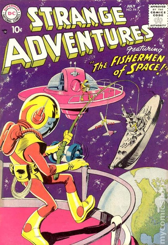

So for this task I wanted to go with a comic book them because I have been gathering some comic book inspiration and thought it would be a fun poster like design to create. With looking through comics I wanted to try and make the typography of my poster the highlight and main focus and for this I used Youtube video to mimic how to create coming book style font using Adobe Illustrator.

I ended up with this finalised design above and really enjoyed the use of colour that I went for. I found inspiration from some of the comic books I had saved on my Pinterest board and tried to bring the writing off the page. Overall I enjoyed getting the opportunity to go down this art direction and kept me thinking how I could bring the life of a comic to the web.
This weeks lecture gave me an insight further into a subject that I hadn’t really heard about prior and thus not overly understanding. However, after this weeks content and further researching the topics stated above I can understand the importance of knowing where I want my project to go not only with the Apollo project but with all going forward.
For next week my focus is to determine my direction and have a finalised idea to where I want to go with this project whether this is going to be down a comic book route of with a newspaper type of design. I will also then aim to create create a style tile, complete my Lo/Mi Fi mockups, consideration for my brand and aesthetic, type, colour, illustration style and visual grammar.