The final countdown is on!!!
This week with Kyle was the beginning of our final countdown for our completion of of Element project. This week we all individually got to showcase our designs and prototype of what we have came up with, with our Element project. Kyle used Miro once again for this weeks class to allow us to upload our Figma links for us in class and for himself to view. From here then we all got to explain our concept and ideas for our design while others in the class were able to leave us feedback using the post-it tool on Miro. Compared to my first time showcasing my work with the website project I felt a lot calmer and confident in the work I have produce the past few weeks knowing that these critique classes work to my benefit in producing my best work. I was excited to finally get what I have designed out to others to see to hear their opinions and ideas on how I could over improve on what I have created so far.
My feedback:
Up to this point I have all my screens designed for my application and have the home page linked to my main digging page and from here I have 5 elements designed throughout this screen for the users to find and discover as they scroll through the main page. From this point then the user is expected to click on an element that’s underground which leads them to another page that includes further information on that element such as atomic number, weight, facts and a button that overlays a design of the element and its information that would be provided as if you were looking at the periodic table. I prototyped just the Oxygen element to its linked page to demonstrate to Kyle and the class of my currant idea to see what their opinions were on how I was presenting the information. I thought it would be best to ensure that how I prototyped this section of the application was understood before I continued on with the other elements to save me time with any adaptations I would receive from the feedback.
User clicks on Oxygen element (cloud) > links them to information and facts page and the play button opens access to elements card.


Elements card

Class feedback:
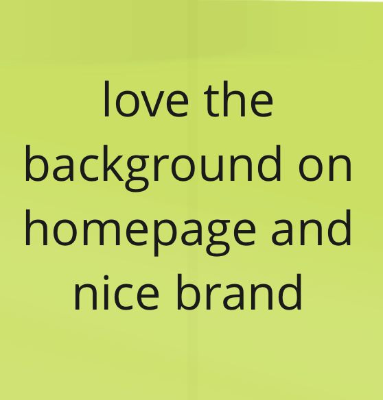
The class gave me some really good and constructive feedback after I had showcased my designs and got to explain my meaning behind my idea and the overall design. The feedback shown below demonstrates their understand and opinion on what I have created so far and got to show them this week. I appreciated all the kind responses on what they thought about what I have designed allowing me to feel confident in the direction I am heading on what I have produced. I got some point to consider in terms of instructing the user to what exactly has to be down to interact with the game and this will be my main area of focus to take from this feedback and will work on in the coming weeks.


Kyles feedback:
As the class gave their feedback on the Miro board Kyle talked through with me his opinions and ideas on how to improve my application further. I made sure to note down all of Kyles points to refer back to when I get to completing my designs. Some of these points included:
1. Padding on my main buttons on my home page – For this I made the text within the button smaller to ensure there was more white space within the button to separate the boarder of the button from the text.


2. An introduction to my professor character – For this I thought I would design a new page that I aimed to be like a welcome page to just introduce the user to the application and what they were to do to learn their elements. Once they click the “Get Digging” button shown above this will be their following page to instruct them then from here I included a play button and a home button to navigate the user to where they were looking to go.
3. Fact sheet made smaller and simplified – The design of my fact sheet that I had created I was unsure about and was wanting as much feedback on this as I could get because overall I wasn’t happy with how I was designing the layout of this section. I had designed all of the illustrations using my iPad in procreate and wanted to create a carousel and as you drag or click the arrows the next fact slid into place of the fact prior to it but I found what I had created to be basic and knew I needed advice on improving this area. 

To improve this then after the feedback I took the concept of the carousel and fully redesigned the idea behind this. I kept my illustration designs and focused on redesigning how I would present the facts. I reshaped the outer white box to be more round and placed resized the while design of the 3 box to ensure I could a main box in the centre but also have the other two in view on the left and right side of the centred box as shown below.

4. To remove the arrow on the fact sheet – I decided against this piece of feedback to remove my arrow that I had designed to allow the user to click through the other fact sheets because when I was prototyping on Figma the drag/swipe interaction wasn’t always working and I could guarantee that with a clickable button option as well as the drag/swipe that my users to navigate through my facts. I did however change up the look of the arrow moving it from the site to the bottom of the fact box and changing the colour to represent the colour I had chosen for the element, for this instance I created a pink button to match the pink I had used in my design for the information on oxygen.
5. To reconsider my typography on my brand – This is still an area I will be revisiting in the weeks to follow. The feedback given demonstrated that I had 3 strong typography around my application and to reconsider the font I used within my brand to the other two I had used throughout my application.
Once again I found this critique class to be more than useful and gave me plenty of point to reconsider and work on in the coming week to the completion of this project. I am happy with the imporvoenti have made currently taking on the feedback that I have been given and feel fairly confident in the application I am currently creating. I aim in the next following week to have this project fully designs and interactive for my users to navigate their way through what I have designed and prototype. In the coming weeks prior to the completion I will aim to have some testing complete with user of my chosen age range to ensure that everything is workings it should and that they can can demonstrate full understanding of what they have to do in order to gain the benefits of my application.
