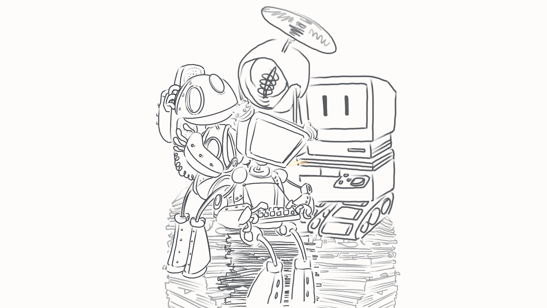
Final Animation, Including portfolio link:
Art Station – Lip Sync Animation.
Animation for the Creative Industries – Beginning Lip Sync Assignment
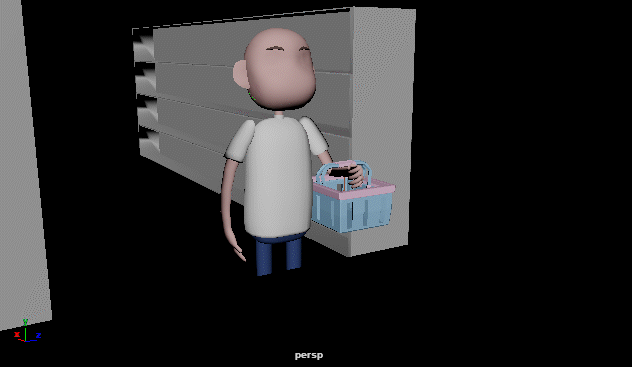
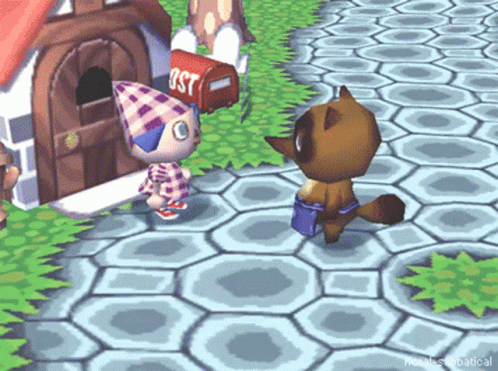
Lip Sync Animation – Mixing up lip sync audio, preparing timing for lip syncing.
Lip Sync Animation – In between frames, cleaning up timing, line art
Self Reflection:
I was pretty determined to get audio that fit the two characters that I am using for my animation assignments this year: I was really excited and had a pretty clear idea of what I was going to go for when I heard the audio I used. I am extremely grateful to Alec for giving me the idea of the office drone segment, and for suggesting I add her throwing the battery over her shoulder, as I believe that these changes solidified the narrative I was aiming for.
Over all, I’m happy with how this turned out – this was my first attempt at lip syncing, and I gave myself almost double the amount of seconds to animate for the assignment – I believe this came out well, I worked incredibly hard on it. I like the movement that I applied to both Ali and Gigabyte, I feel that I managed to portray acting in their segments. Additionally, I was determined to use more of a range of software to complete this animation, and I jumped between Adobe Animate, Rough Animator, and used Procreate only for clean up and I’m really pleased that I stuck with that. I’ve found using Adobe Animate very challenging, but much more effective.
That being said, there’s a lot I want to improve upon: I think that the lip sync itself could have been much better. I found myself struggling quite a bit to keep the lip sync movement in good time with the character’s acting movements, I think the lip sync itself suffered as a consequence. I should have animated the mouth movements on different layers. I’m also pretty unhappy with how flat and un-dynamic everything feels, I would love to spend a bit more time next time focusing on camera movement, more interesting camera angles, as I feel very self conscious about how simple and flat my animations feel over all. I also don’t feel that my drawing is particularly strong in these animations.
In conclusion, I feel a little self-conscious about my abilities with this one, however I’m pleased with how far I’ve come since first semester and proud of this first attempt at a lip sync animation.