Frank Chimero: Typographic Hierarchy
“A clear understanding of hierarchy result in more beautiful, meaningful, and communicative design.” Frank Chimero
Frank Chimero having over 20 years in the design community, reveals the importancy of typographic hierarchy. Chimero at the start of this blog highlights the importancy to why are use a hierarchy system. It reinforces a clear and commutative design and help steer attention of the user.
Chimero puts his advice in Hierarchy into layers as the more of the elements that are discussed the, more complex the typography hierarchy becomes.
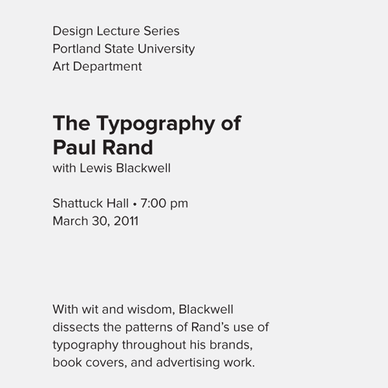
This is the first example given.

With Chimero’s first example, no emphasis has really given on the hierarchy, so as a user our minds will automatically play a sarky with the reading the text in the order it is given. Since there is no size difference or a weight on any of the text given, this layout as Chimero puts it, “isn’t realistic for most design work.” It is very basic and should be at the starting point for design one beginning hierarchy.

The next example given, Chimero starts to show hierarchy with separating the text i’m creating space between the content; this establishes a more organised view, but without the weight, the user would again start where they think they should start. With the emphasis of weight on the ‘The Typography of Paul Rand’,The order of the hierarchy has changed from the first example, however the bold weight does help navigate the user on what should be the first thing they read.
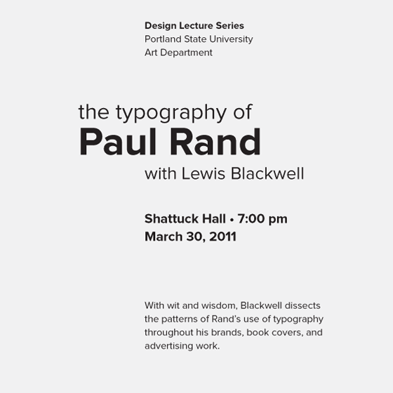
With more editing on the next example, there come a size change,The information that is displayed on the top no longer is the hierarchy of the content as our eyes are drawn to the two graphic devices that are used for the hierarchy: weight and size. The descriptive content of the piece, a ‘Design Lecture Series’, “serves as an umbrella for the content below.” Its placing does start the content, but it isn’t as important to what is being highlighted.
adding more elements to the typography hierarchy, alignment and spaces have a big impact to how we read the text as our eyes will tend to read what is the most emphasised along with the text that start closer to the page. This has now achieved contrast in the content which leads to the sub ‘servant content’, to gradually diminish.

This is the completed example with the content involving most elements that highlight the hierarchy. This example includes a colour pallet of blue, grey and black while including lines and shapes that help divide the content up. This helps the users attention jump to different content due to the devices working together.
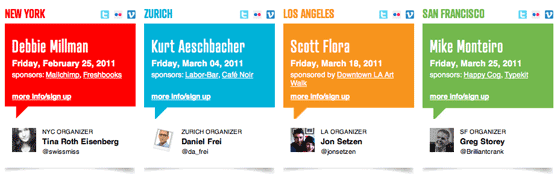
With Chimero’s very clear understanding of how typographic hierarchy is presented, Chimero then looks into three websites that display a good example with hierarchy within their content. Out of the three websites I was mostly drawn to the ‘Creative Mornings’ website. This website mainly involved all the devices that were shown to create hierarchy. The content is put into four sections, each are colour coded; establishing a sense of clarity in the website. There is a weight and a size element that is presented but helps us direct with each section of the website. The use of the white space is used to help amplify what is trying to be highlighted.
With my clear understanding of hierarchy, I decided to look through a website I frequently use and tried to highlight the devices of hierarchy. I chose the website Beauty Bay; a make up and beauty product website that is used in the UK. Similar to that off ‘Creative Mornings’ Beauty Bay uses colour as a way of sectioning off the information displayed on the website. The bright neon green get the users attention with what is in that section. The use of weight emphasis on the subtitles shows hierarchy and the order of content. The use of whitespace de-emphasises the content around the main body of text , to highlight the important information. The use of size with the ‘20% off’ shows hierarchy as it could be the first piece of information because reads.
Links
https://blog.typekit.com/2011/03/17/type-study-typographic-hierarchy/