Typography 101
“Web Design is 95% Typography”
Oliver Reichenstein, 2006
When Looking through the IA.net website, I was very captivated by the comparison to that of a 1700s typographer that uses printing materials to publish information, to that of a contemporary wear designer. As removing the word print and replacing with online, relates to the description of a web designer in the 21st-century. The statement that web design is 95% typography shows how important the focus of written word is to your design as the assertiveness tone and statistics alone amplify that statement.
What is Typography?
Typography is the primarily focus to how the typeface is presented whether that be in the font, text size and spacing. Looking At these elements to typefaces help overall to create a form of art that web designers what to achieve in their web design. But with any designing elements, there are rules that apply and when used it will help you create a successful and clear typography.
Through my own research, I found that the most important rule for web design would be Text Hierarchy. Including this rule into your design will help grab the attention of the user and it is this element that will effect the users first impression of the web design. The text hierarchy should highlight the most important information you want to display in your website. A web design that uses text Hierarchy, is a web design with great navigation and is visually Pleasing.
Other elements to be aware of is choosing the right colour as it too grabs the attention of the user while also be aesthetically pleasing. Another element would be considering the text which means you should go over the information that is given for the web design and get a grasp of ideas on how you can portray this content. An inappropriate typeface can leave a negative impact on the users or customers, effecting you as a designer.


“Treat text as a user interface”
As a designer, you need to focus on the users needs when it comes to web design. With an Web design, the text needs to readable, the correct spacing along with the overall aesthetic’s of colour and white space. Websites that embed this technique will lead to success as the design is clear and really has taken the consideration of that user.
Exercises
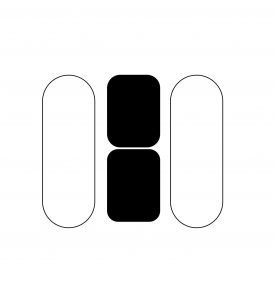
Manipulated Letter exercise 1
For the first exercise we did in class we started off with by creating the manipulated letter which involved creating a selected letter into a variety of different size in different perspective. This is presented in a nine square box.
When doing thus first task, I decided that I will just experiment at first and try placing the letter H random in the square and look on what I can improve from what I have created. My favourite squares are the ones where the letter H still looks like the letter even though It is not fully displayed. Overall I liked it as the variations of the letter H together look visually pleasing and got my creative process starting to increase.
Manipulative Letter exercise 2
The next exercise, we then took a letter and made the letter using shapes, lines and space to create that manipulative Letter. I did about five examples of these to experiment which one I liked the most.


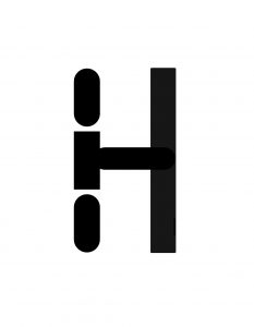
I found the process of manipulating these letter to be quite satisfying as changing and constantly editing these letters made it fun to create more than one example. My favourites are the 4th and last design as they are more simple but clearly present an H in my opinion. When I found the bases to start the process became easier for myself, however, when trying to create ideas at first can be challenging as there is so many outcomes I could use but don’t seem as great of design overall.
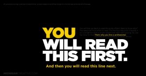
Exercise 3 Ant Middleton
Using information that was given about a random artist, are next task was to create a marketing poster that would promote the tour, “ Mind Over Muscle.”
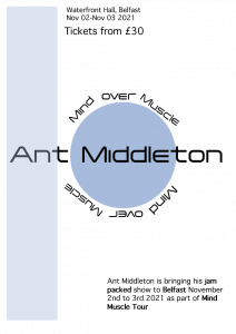
when creating this, I wanted to create a very simple colour palette and put the mine focus on the name of the artist and the name of the tour. I also put weight in certain words to emphasise key words that would attract people to buy tickets.
Exercise 4 Quote about Design
We had to choose a quote about what good design meant for us and I chose the word innovative as a way to describe what good design in to me.
