There are many factors on the anatomy of a typeface that I was never aware off and it is interesting that in my research, I came across a quote that describes typefaces of having, “personalities, moods and styles.” Describing a typeface like it is living adds on more of a interesting out look to how I view specific typefaces; it brings on a sense of humour/ childish nature to it.
What are the Elements of Typefaces?
There are so many counterparts that make up a single letter and the more I look into the internal parts, the more of an understanding I have for what goes into a typeface.
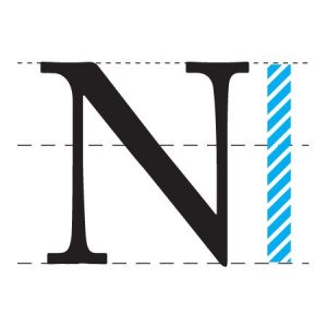
The Cap Height
This is the measurement of the height of capital letters, with the most accurate measurement we can receive would be flat bottom letters such as E, H it L. Capital letters that are that are the same typeface, will have the same Cap height.
Stroke
This is your main vertical diagonal line that runs through in the letter. These are letters such as A, W,Z.
Ascender/ Descender
A vertical stroke that expands up the x height. A descender would be the opposite of this as the vertical stroke would go and expand downwards , below the x height.
Swash
A fancy curve that becomes decorative to be a terminal or serif in any capital letter.
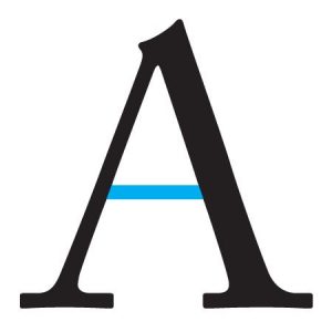
Bar
A horizontal line that runs through the letter, examples would be A, H and F.
Serif
A short line that is added to the start and end of strokes. This element is what makes a typeface either serif or sans serif. Sans serif are a form that don’t include any strokes attach to its typeface.
Terminal
When there are no serif in placed on a letter, the end of a stroke like lowercase t, is called a terminal.
Bowl
A stroke that produces an enclosed space with a curved line. Examples would be D, O, B. The counter is just the same as it is also created by bowls
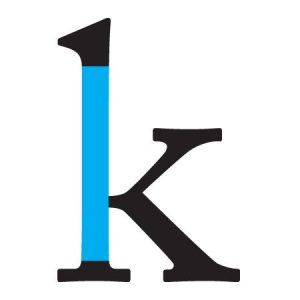
Stem
The main vertical line that goes upwards on the letter. The first diagonal line in a letter is also called stem.
All of these different elements that are within a typeface, are what shows the personalities that they display. It’s how we can view a letter and manipulate a typeface to create a balanced and clearer view to the user.


