Golden Ratio
Our first principle we looked at the Da Vinci’s Vitruvian Man that featured a sequence called the Golden ratio; a mathematical ratio that makes a very aesthetically pleasing display. What is interesting about the Golden ratio is that it is a sequence that’s been used within art and design for hundreds of years, with many art historians debating if the Egyptians used this ratio sequence when building the pyramids.


We can also see this sequence through nature as well with examples like flowers, snail shells, beach shells and are weather such as hurricanes or tornadoes.


When looking at the ratio it is very closely related to the Fibonacci sequence. The Fibonacci sequence is as follows: 0,1,1,2,3,5,8,13 and 21, etc. Both together, the Golden Ratio and the Fibonacci sequence can be displayed in rectangle which clearly shows a multiplied sequence that creates a visual and balanced design. With this sequence, we had developed the Point, Line and Plane using the ratio and creating designs using the rules that should be applied.

When doing this, I struggled at the start as I haven’t been too familiar with the Fibonacci sequence and the Golden Ratio, so when trying to figure out I looked to some of my peers to help explain the rules of this sequence. However, when I did get on track with what I needed, I really enjoyed embedding the sequence into my work and I found it very satisfying when I created my designs as it was so pleasing to the eye.
Moving on from using the Point, Line and Plane, we then moved onto our Manifestos and applied the sequence within the quotes we chosen in our work. This made me look into a different approach when using letters or creating design in general because the Golden ratio has improved designs visually in my opinion.

The Rule of thirds
Coming off the Golden Ratio, another visually pleasing method in web design is the Rule of Thirds. It is a grid guide to help designers indicate how to avoid negative space and create a design that is automatically pleasing to the eye just by the position of the design. Overall, the thirds is separated into nine equal sections with two lines going horizontal and two going vertical; this created a very symmetrical design and layout. We see this rule applied mostly in cinematic and photography as but can also be found in websites or paintings, but why is it important for web design? For Web design this allows a designers to create balanced designs and images much more pleasing visually and the more it is visually pleasing to the designers audience, the more this designers work is viewed.


The Gestalt principles,
The word Gestalt is a German word for shape or form and the Gestalt principles are Elements that try to show how people would perceive certain designs when different elements are applied. These elements were created in the 1920s by German Psychologists as they where trying to connect why certain elements affect how we visually perceive a design. There are seven elements in the Gestalt Principles.
Proximity
In design this element allowed related designs to be grouped together. These designs are closed placed together along with white space in the background; it allows the user to identify what is related together and what is unrelated. It is a much more faster navigation type for the user.
Similarity
Like Proximity, Similarity also helps group designs that are related to each other either that be through colour, size or pattern. The designs have similar visual characteristics and with this element it allows the layout to be organised and simple for the User to navigate.
Continuity
The element continuity helped with grouping design that follows a continuous line which help direct the user to movement and direction within the design. This helps the user go easier through the design and strengthens the aligned elements of grouped information.
Closure
This is a group of elements that aren’t fully finished and makes the user create the finishing outline with their mind. These incomplete designs make our brain jump to its own conclusions and with using this principle we can make a more simple design that allows us to convey a design with decreasing visual noise.
Common fate
Any elements that follow the same line of the direction are considered to be related or grouped, regardless of the size and space of the design. This principles helps the user a lot to identify grouped information, it grabs their attention a lot more quickly and helps establish the difference between the information that is given.
Figure and ground
This elements allows the user to identify separate shapes in the background of the design instead of highlighting the main design. This makes a design much more complex in a very minimal design and be very fun or interesting to the user.
Focal Point
Compared to similarity, the element focal point uses a different take as it is a design that is purposely unrelated to other grouped elements to make that element alone stand out. For a user, this helps point their attention straight away and could help alert danger. With focal point, you need similarity to be there for this element to work.
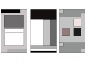
This is an example I created while using some of the Gestalt principles.
With all of this information on each element, I looked up some Gestalt principles I could find in nature or the outside world.

