Guttenberg and Movable Type
This week’s lecture looked at the impact of the printing press and its influence on the spread of knowledge in the western world. We also picked out some of the pioneers of type design, looking at how improvements in the printing process helped shape the design of type.
The discovering of printing:
Printing was originally invented by the Chinese as early as the third century, with a method known as block printing, which made use panels of hand-carved wood blocks in reverse. Woodblock printing was also used in Japan and Korea at the time, and metal block printing was also 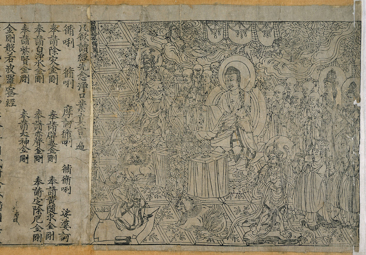 developed at some point during that period. Eventually movable type was introduced by Bi sheng, who live around 970 to 1051 A.D. With a movable typeface you could use individual letters, instead of a panel of them made of wood. The first moveable type was carved into clay and baked into hard blocks that were then arranged onto an iron frame that was pressed against an iron plate. Wood printing in fact made a comeback in 1297 when Ching-te magistrate Wang Chen printed a treatise on agriculture and farming practices called Nung Shu. Wang Chen came up with a technique that
enabled the wood to become more durable and precise. He then created a revolving table for typesetters to organize with more efficiency, which led to faster output in printing.
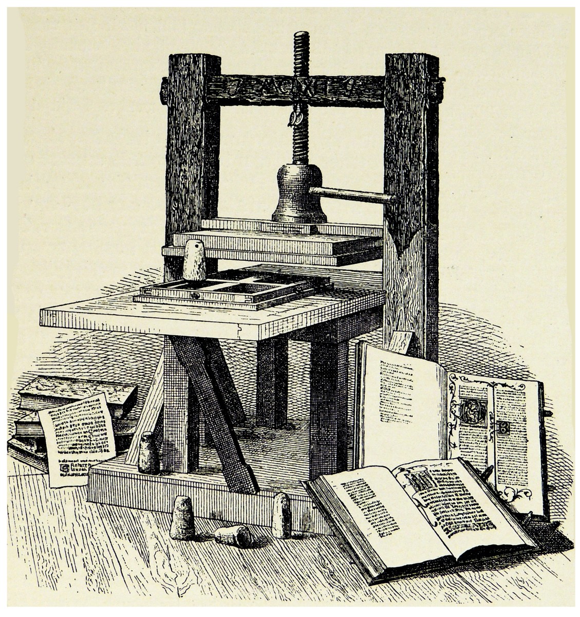
However, as the printing press as we’ve come to know it didn’t appear until 150 years after Wang Chen’s method. Johannes Gutenberg, who was a goldsmith and inventor, seemingly brought all the techniques and formats which made up printing at that time together, encapsulating them into one unit. Gutenberg was in political exile, when he began experimenting with printing in Strasbourg, France in 1440. He returned to Mainz, Germany years later, by 1450, he had a printing machine perfected and ready to use commercially: The Gutenberg press.
What was vital to Gutenberg’s design was the decision to replace the wood with metal and have the printing blocks be each letter, essentially creating the European equivalent of a movable typeface. Gutenberg borrowed money from Johannes Fust to fund his project and in 1452, Fust joined Gutenberg as a partner to create books. They started by printing calendars, pamphlets, and other ephemera. But it was in fact the bible that Guttenberg had his sights set on. Due the extremely religious nature of the time, bibles were a smart market to target in terms of printing. As this was a time where being able to read and write was not seen as a necessity, most people went to church, to hear the priests read out the bible. But as people started to get education, they wanted to read the bible for themselves, and Gutenberg was able to fill that market. This eventually fell threw however, as Fust and Gutenberg had a falling out, which resulted in him losing his equipment to Fust in a lawsuit. Gutenberg did however invent the adjustable mould which allowed the person casting metal type to adjust the width enabling a narrow or a wide character to be locked in preparation for casting.
This meant an artisan could replicate a given character many times over and it also established the principle three centuries before it was widely adopted by the print industry of interchangeable parts, the basis of modern mass-produced products. However due Gutenberg’s innovative work with bible printing, this snowballed into the catholic church becoming weakened and realised that there were lies being spread by the church in terms of what the bible says. This then led to a seismic shift, called the ‘Reformation’ which challenged the Roman Catholic Church, and eventually lead to the development of Protestantism. In 1455 there was no printing presses in Europe, but 1500 presses were operating in 245 cities. As well there being no printed text in Europe before 1455, but again, by 1500 over 20 million books had been printed. Printer’s marks appeared almost immediately after Gutenberg revolutionised printing, they were placed in the title page or at the end of a book and let people know which printing houses the publications came from. These mere eventually replaced with publishers’ marks, these in fact could be seen as the first signs of branding, where print houses placed their mark on anything they produced to immediately let the public know where the book or print came from.
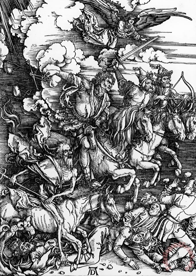
One German artist of mention would be Albrecht Dürer, he was one of the first truly famous artists of his time. As he used many printing techniques, namely woodcuts, to get his work out there. He was famous for his AD monogram, his trademark to which he branded his work. In 1498 Dürer published Latin and German versions of his series of woodcuts called ‘The Apocalypse’. His work was so innovative and dynamic, thanks to the woodcuts, that in began to influence the art created during the Italian Renaissance period. I found Dürer’s work to be rather eerie, yet beautiful as well as being relatively visually packed to look at. Which was hard to believe he achieved this due to his woodcuts and copper.
Industrialisation
We were the in introduced to Industrialisation, which arrived by the 19th century, where it brought new and different innovations, one of the most notable being the induction of typefaces. We started to see the introduction of typefaces like sans-serifs, slab serif fonts, and square serifs. Typefaces of this era were made with the intention to be big and bold, as now they would be displayed in newspapers and magazines which were quite condensed with the amount of type they displayed.
Understanding typography
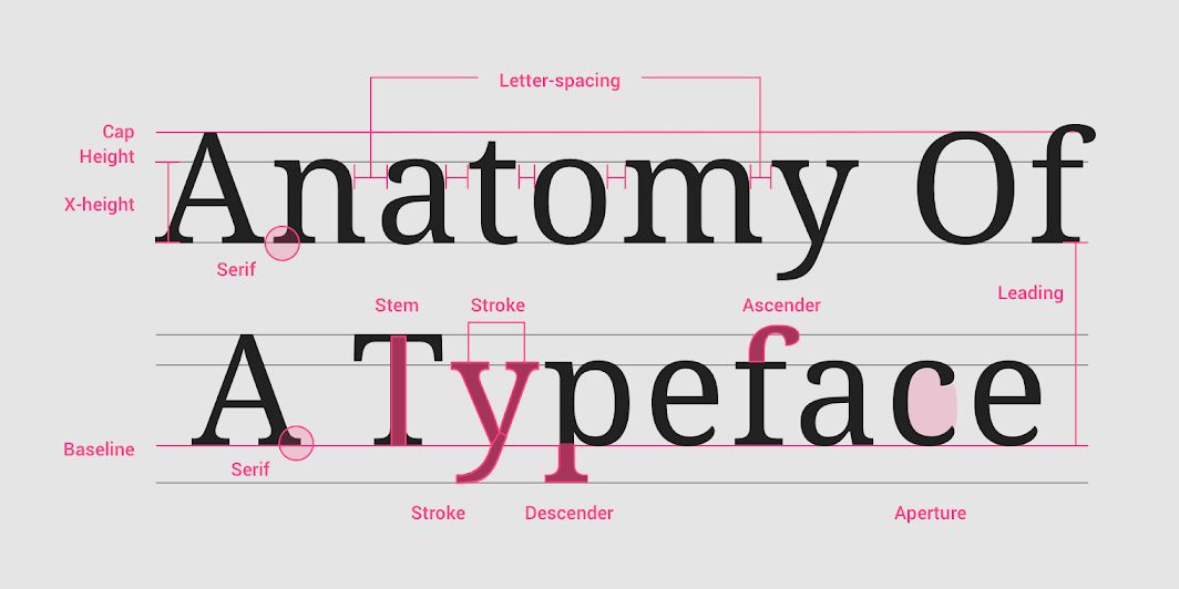
Our lecturer kyle then went onto to discuss typography and how to understand and interpret it. There are many factors that make up a typeface, type properties, that can help distinguish it from other typefaces. For instance, we were shown the difference between serif and sans- serif typefaces. Serif typefaces have a decorative stroke that finish off the letters stem, while a sans-serif typeface will not have any lines of stokes on the end for decoration. Essentially, they are two categorises which typefaces fall under, Serif fonts are normally seen as formal and classical, while sans-serif fonts are seen as more modern and simpler. We were also introduced to the anatomy of typography which is used to keep every letter even and inline when using type, features like:
- Baseline – where the letters are aligned evenly on a straight line at the bottom
- Cap height – This is for capital letters
- X – height – This for height of lowercased letters, to make sure they’re all even
- Descender height – This is for lowercase letters like y and g to make sure they’re even and don’t overlap with letters on the line that might be underneath.
- Ascender height – The ascender height is the exact opposite of the descender height, but instead for lowercase letter that have upward vertical strokes like b and d.
- Weight – This is essentially just the thickness and boldness of the letters.
In terms of the varying types of typefaces you can get, I already previously discussed sans- serif and serif typefaces, but the others we covered were:
- Monospace – which are typefaces that have characters made all in the same width
- Display – This is a typeface intended for to used at large sizes in headings, instead of chunks of texts.
- Handwriting – Are typefaces that use a purposefully natural handwritten visual style and feel.
Kyle then went on to discuss readability, essentially how well the typography can be read regarding aspects like letter spacing and smaller type sizes. Letter spacing, alternatively known as tracking, touches on uniform adjustment of the space between letters in a piece of text. Kyle also mentioned how larger type sizes, mainly headlines, use tighter letter spacing to refine the readability an reduce unnecessary space between letters. On the opposite end, when it comes to smaller typefaces, its better to have the letters have wider letter spacing for good readability. As more space between characters allows for a clearing view of letters, and therefore a higher likelihood of being able to make out words, especially from far away. Text in all caps, even at small type sizes, has improved readability because of its added letter spacing.
Line length is another equally important factor for readability, when it comes to bodies of text it’s important that the line length stays within 40 – 60 characters. However, for the likes of desktops with wider screens, the line length can go up to 120 characters. The reason why line spacing should be within a certain range is due the brain losing interest as your eyes reach a certain point in while reading across a line of text. Therefore, its more efficient for a designer to make the decision to stay within a certain when it comes both line length and letter spacing. As it will make for a better viewer experience and therefore make them likely to return back to view an webpage, app or poster you’ve design. Paragraph spacing also needs to be considered as well as type alignment. Type alignment means where the text is placed such as right aligned, left aligned and centred aligned.
Pocket Profiles
After discussing typography and the certain language and rules it houses, he then introduced three designers to us, take note of their name and do a goggle search on them. That being John Hicks, Jakob Nielson and Tim brown.
John hicks
John hicks is an English graphic designer, who famously designed the logo for the Firefox browser, as well as being the owner of his own studio, ‘Hicksdesign’. His Firefox logo was apparently based on a concept by designer, Daniel Burka and a sketch by Stephen Desroches. His website which showcased previous works, his studio had taken up over the years. His studio has been around for quite a while since 2002, and in fact has some pretty justifiable projects under his belt. Like Skype, Spotify and Canva, so this certainly made me see him in a different light, that he certainly has the skills. His strength seems to, be in icons and logos, he’s even wrote two books regarding icons ‘ The Icon Handbook’ and ‘ The go-to-guide for all things icon’. The areas that Hicksdesign covers is: Web & Product design, Brand Identity, Iconography and Print. He seems to favour a more flat, simplified design style, which luckily is very popular right now in terms of graphic design. Flat pastel colours seemed to be what most clients and business owners favour for their colour schemes, which is proving to work hicks and his business partners. His visual style is very illustrative and humble which is probably why he’s designed for so many social networks like Spotify and Skype.
Jakob Nielson
Nielson is a Danish web usability consultant and a prolific interaction designer, he established the “discount usability engineering” movement for fast and cheap improvements of user interfaces and has invented several usability methods, including heuristic evaluation. He holds 79 United States patents, mainly on ways of making the Internet easier to use. He holds a Ph.D. in human–computer interaction (HCI) from the Technical University of Denmark in Copenhagen. He rose prominence from an American technology company, Sun Microsystems, selling computer components and software. He was brought on to make heavy-duty enterprise software easier to use. He spent his time there defining the emerging field of web usability. He was the usability lead for several design rounds of Sun’s website and intranet (SunWeb), including the original SunWeb design in 1994. He created with his friend, Don Norman both came together and made the Nielsen Norman Group, uses to help interaction designers with UX research. Nielson has been called “The King of Usability” by Internet Magazine and “The guru of of Web page usability” by the New York Times. So, it would seem Jakob Nielson certainly knows how to create an enhanced user experience with regular simple technology, which makes it’s accessible to a wider audience.

Tim Brown
Tim Brown specialises in typography in terms of graphic design, so much so that he has been the Head of Typography at Adobe. He’s been working in typography since 2003, so its probably safe to assume that he knows what he’s talking about when it comes to typography. In fact, he’s so knowledgeable in typography that he’s even wrote a book about it ‘Flexible Typography’. Where he explains typesetting, preparing text and code, selecting typefaces, Shaping Text Blocks, Crafting Compositions and Relieving Pressure. He helps people find, gather, organize, and use fonts. He very much deeply thinks about the role of typography in design and truly believes that an improvement in typography will greatly enhance your designs. Whither that be for interfaces, posters, and infographics, he showcases this all on his website tbrown.org wear he explains in detail why typography is so important.

Web Typgraphy
Lastly for this class, kyle explained what web typography is, and by what he said web typography seems to refer to how you can pull a typeface straight from the internet. When I first heard this, I initially thought that kyle meant that you can get typefaces from the internet by downloading them and using it in software like in Figma or Illustrator. But as he further explained it seems that your able to get typefaces off sites like Google fonts and Adobe fonts and use the codes, they provide for the utilise their typefaces for your own website. Which how far technology has come in terms of how we can access different typefaces. To see how we went from printing press to type kits is truly fascinating. As well as looking at all the designers that have contributed to the ever-evolving field if typography and how we make use of it. Whither it’s for promotion, information providing or just simple communication, typography will always remain a key part of graphic design.
Bibliography
https://abookapart.com/products/flexible-typesetting
https://en.wikipedia.org/wiki/Apocalypse_(D%C3%BCrer)
https://en.wikipedia.org/wiki/Jakob_Nielsen_(usability_consultant)
https://en.wikipedia.org/wiki/Jon_Hicks_(designer)