Deliverable 02 – Design History of Presentation
Pioneers of Postmodern Graphic Design
With this project we are split into groups and tasked with delivering a presentation based around the based around design history. After being split into groups, much like the first project, we are given a list of topics to choose from to research and deliver information on:
- Bauhaus and the New Typography
- Design Systems for the Olympic Games
- The Influence of Modern Art
- The Modern Movement in America
- Pioneers of Postmodern Graphic Design
- Pioneers of Web / Digital Design
At first my group and I agreed that ‘Design Systems for the Olympic Games’ would be a fun topic to research and present, but after realising that two other groups in our class also had the same idea, we felt that it was probably better to choose a different topic that no one else in the class would cover. To both avoid comparison and have our own unique topic that only our group would discuss on the day for presentation, while not wanting to have the presentations become redundant. Therefore, we decided to choose ‘Pioneers of Postmodern Graphic Design’ as no one else was covering the topic, and it would also be a good opportunity to better inform ourselves and the class, on an art movement that can be rather confusing.
To explore the graphic designers that helped pioneer postmodern design, my group and I need to research and define what postmodernism is. Postmodernism, simply based on its name’s sake, came after modernism. Modernism itself was a reaction to commercialism, new inventions lead to machines mass producing a plethora of items. Modernism’s intent was to criticize the social order of the late 19th century, it was somewhat meant to construct a coherent world view, through analysis and science. This was also the era in which scientific fact was starting to over-power religion. Abstract thought was coming into fashion, this resulted to a lot of art (Modernism vs. Postmodernism, 2019). Designers of the era of Modernism laid out a strict, structured grid system with emphasis on negative space, as well as the use of clean sans-serif type. The idea was to create strong graphics that were against commercialism, greed, and cheapness. Postmodernism, started to come up during the 1940’s, almost solely due to the cynicism that resulted due to World War 2. While modernism was based on idealism and reason, postmodernism was born of scepticism and a suspicion of reason. It challenged the notion that there are universal certainties or truths. Postmodern art drew on philosophy of the mid to late twentieth century and advocated that individual experience and interpretation of our experience was more concrete than abstract principles. Postmodernism had a rather tongue-in-cheek nature to it, presenting their art in a confrontational or controversial way, while also being portraying a self awareness with its use of popular style and media (Postmodernism – Art Term | Tate, 2021). Sarcasm seems to be the remaining occurrence throughout most descriptions of postmodernism, both in and out of design. Postmodern graphic design can be loosely categorized as moving in three major directions: The early extensions of international typography style by Swiss designers who broke with the dicta of movement. New wave typography, which began in Basel, Switzerland, through the teaching and research of Wolfgang Wiengart. The exuberant mannerism of the early 1980s, with significant contributions from the Memphis group in Milan, Italy and from San Francisco designers.
Post-Modern design started to get it’s roots in the late 1960’s, it was conceived and had gained popularity in the US. The movement was a spearheaded by a newer generation of open-minded people who were free thinking and creating completely new radical ideas that was against modernism which they found to be a boring, simplistic approach to design. They also wanted to ridicule ideas of anything political, in a sense like the Dadaist approach but with less of a shock factor.
The typical conventions of postmodernism were an idea and an object with a satirical quote or photograph used to depict said subject with the use of typography and collage together. It is practically in a way neo-dadaism, it used photo collage, broke text, splattered colours, black and white photos with colourful splashes of text, use of bright colours and dramatic layouts. To put it into simpler terms, post-modernism uses geometric shapes going against traditional conventions of symmetry and structure. There’s no grids, just messy design.
![]()
One major pioneer of note is April Greiman, who often gets credited with being one of the first designers to take on computer technology as a viable tool of design. April Greiman was most notably known for her dynamic typographic innovations and colourful compositions and montages. She was also a frequent collaborator of another notable designer, Jayme Odgers. The two have collaborated many times through-out the years, notable examples being a cover for ‘WET magazine’ and the poster for the 1984 Los Angeles Olympic games. Odgers influence on Greiman is very notable as he is a photographer, and a significant amount of her work encompasses some sort of photographical elements. Greiman gained a inspiration for art style primarily while studying at the Basel School of Design (Schule für Gestaltung Basel) in Basel, Switzerland. While there she studied under another pioneer of postmodern graphic design, Wolfgang Weingart, it would seem he taught her the ideas and philosophies of new wave typography (Flask, n.d.). While also picking influences of international style and new wave, which moved away form a modernist approach to design. Hence why the era where April Greiman rose to prominence in the design world, along others showcased on the presentation, is called postmodernism. As mentioned before, April Greiman is credited as being one of the first graphic designers to embrace computer technology as an outlet for design.
While many contemporaries assumed computers and digitalization would compromise the International Typographic Style; instead, she adopted pixelation and other digitization “errors” as integral parts of digital art, a position she has held throughout her career. Something of note, April Greiman in fact finds the term ‘graphic designer’ too limiting and would rather be called a ‘Transmedia Artist’. On a personal note, I’ve noticed that April Greiman seems to be constantly challenging herself throughout her career, with the many styles and movements she has drawn from and experimented with, like New Wave and Typography. She consciously positioned herself firmly at the forefront of the movement to computer technology for graphic design. I feel there are two pieces of her work that perfectly capture both quintessential styles, as well as how innovative April Greiman has been throughout her career.
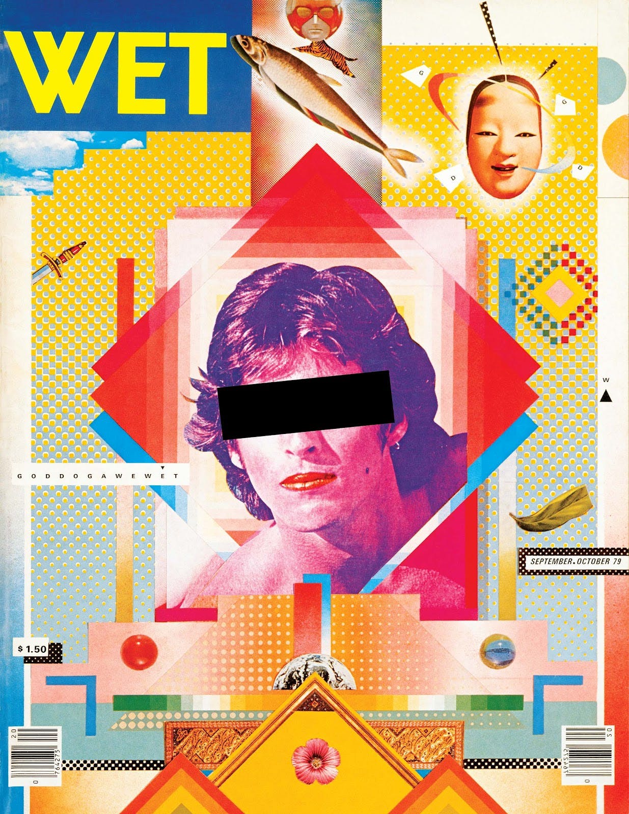 That being the WET magazine poster she created with Jayme Odgers, and a poster entitled ‘Your Turn, My Turn’. The magazine cover she did for ‘WET Magazine’ is structured with layering. It has a photo in the middle of a person’s face with a black rectangle over their eyes. There isn’t much text, but lots of imagery and patterns. The playful colours go together nicely as they all have the same tone and are shades of the primary colours making it work well as a magazine cover, likely to be bought by the public. It perfectly encapsulates postmodernist conventions, the use of geometric shapes, collage of images and strong contrast. WET Magazine was self – describes as ‘The Magazine of Gourmet Bathing’, It was known for its inclusion of cultural issues and graphic art. The magazine was an earlier promoter of New Wave and Postmodern and covered a wide range of stories the captured what some people called a Los Angles attitude. Which coincided with April Greiman’s west coast postmodernist approach to design.
Greiman’s other piece of work ‘Your Turn, My Turn’ is a poster she designed in 1983 for a symposium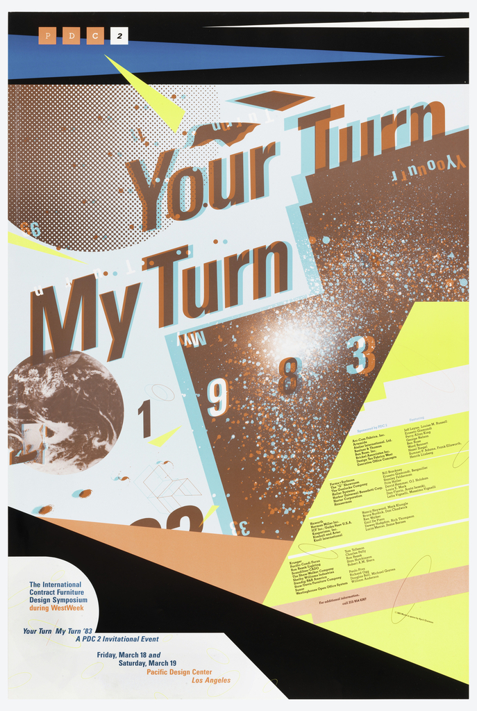 in Los Angeles. The purpose of the conference being discussion on the role of artists, designers, and architects in the design field and possibilities of collaboration with other disciplines. It seems like the reason for this event matches the values of Greiman, innovation and the freedom to explore new practices and break the ‘rules’ of the design field. ‘Your Turn, My Turn’ was created with unusual incorporation of irrelevant elements and the overlapping effect created a sense of 3D. The vibrant neon colours and expressive compositions evoke the fast pace of pop culture and psychedelic art that originated in California. Illustrations of a planet, chair, and random shapes circle around the typeface. The typeface in use is sans-serif with the 3D effect again in use, by a duplicated layer of the text, one in cyan and another is magenta. The planetary imagery and neon colours, evokes the visuals of a sci-fi movie that viewers need to wear 3D glasses for. The paper’s cut shape indicates a collage effect, in a sense marrying the traditional physical graphic design with digital. Your Turn, My Turn offers a realm in which individuals can connect to the artist, the ideals of the symposium, and each other through its fusion of visual and experiential elements (April Greiman – A trans-media artist, 2019).
My other group members have been researching into their own pioneers of postmodernism, we’ve been having meetings on Microsoft Teams where we’ve been repeatedly discussing on how to go about presenting the information we’ve gathered in a concrete and digestible way for our classmates. While remaining within our time limit of ten minutes, we were told by our lecturer that we could be out a minute or two from our limit but not much more. Admittedly, there was a bit of struggle when we first were meeting up on teams, particularly on my part. As, my microphone on my laptop for some reason, was not working and the struggle to fix it was eating away at our meeting time. While also limiting my contribution to the meeting, which was incredibly frustrating as there were many things I wanted to discuss and add-onto what my group members were discussing. I opted to use my iPad instead, which solved the microphone problem, which lead me to have an actual input to the way we should deliver our presentation. We tried to avoid the typical format, in which students go one after the other, as our lecturer expressed the type of format to be boring and somewhat lazy. So, we worked out that each group member would get a slide of the presentation to discuss at the beginning, for the introduction to postmodernism. Then we would each individually discuss the pioneer we had personally selected and researched from the postmodern design era. Obviously, mine being April Greiman, we also thought it best to tailor the slide which displayed the designer and their work in the designer’s art style. This would be a way to keep the slides from getting visually boring, as our lecturer also let it be known that he didn’t like it when in a presentation the presenter would just read off the text displayed on the slides. We tried to make a conscious effort to avoid that by trying to add in visual elements from some of the designers we found from our research. We wrote our speaker notes in bullet points, to keep them short and concise to stay within the parameters of our time limit. The speaker notes contain info on each of the four designers we individually researched. Since this was about pioneers of postmodern design. Our notes focused on how they contributed the postmodern movement and why their work was effective. We had been practicing going over the presentation, by speaking aloud and timing ourselves. When we did this, it was noticeable that my section was too long and we were a good bit over the ten minute time limit. So I and one of my group members, Katie, tried to significantly cut down my speaker notes on April Greiman. We eventually concluded, to where the notes we both informative and short, only keeping key points on April Greiman and a slight analysis on two of her works. Once attempting to practice again our presentation fit perfectly int o the ten minute mark, so therefore all that needed to happen was to practice saying our notes aloud and wait for the due date for the presentations to arrive.
Here is a link to my group’s (UX) Design History Presentation:
https://docs.google.com/presentation/d/1DwF-tixcQvIbjyXOygseJ6Yhnlfk8XgBw6czBPytesw/edit?usp=sharing
Reference list
Flask, D., n.d. April Greiman : Design Is History. [online] Designishistory.com. Available at: http://www.designishistory.com/1980/april-greiman/ [Accessed 6 November 2021].
Youtube.com. 2019. Modernism vs. Postmodernism. [online] Available at: https://www.youtube.com/watch?v=f8EfyhIv72I [Accessed 8 November 2021].
Tate. 2021. Postmodernism – Art Term | Tate. [online] Available at: https://www.tate.org.uk/art/art-terms/p/postmodernism [Accessed 8 November 2021].
JM’s Universe. 2019. April Greiman – A trans-media artist. [online] Available at: https://jm9universe.wordpress.com/2019/08/02/april-greiman-a-trans-media-artist/ [Accessed 9 November 2021].
Bibliography
https://en.wikipedia.org/wiki/April_Greiman#cite_note-8
https://www.youtube.com/watch?v=f8EfyhIv72I
http://www.designishistory.com/1980/april-greiman/
https://www.webpages.uidaho.edu/engl_258/Lecture%20Notes/modernism_vs_postmodernism.html
https://www.history.com/topics/art-history/history-of-modernism-and-post-modernism#section_5
https://www.tate.org.uk/art/art-terms/p/postmodernism
https://jm9universe.wordpress.com/2019/08/02/april-greiman-a-trans-media-artist/