This week, Paul had talked about dark patterns.
But what are dark patterns in UX?
Dark patterns are tricks used in websites and apps that make you do things that you didn’t mean to, like buying or signing up for something.
Often, these things are hidden in fine print. As in, you didn’t see this stuff until after you had already agreed to it. It’s unethical but it’s usually done to make money. There are many examples of dark patterns, but here are a few:


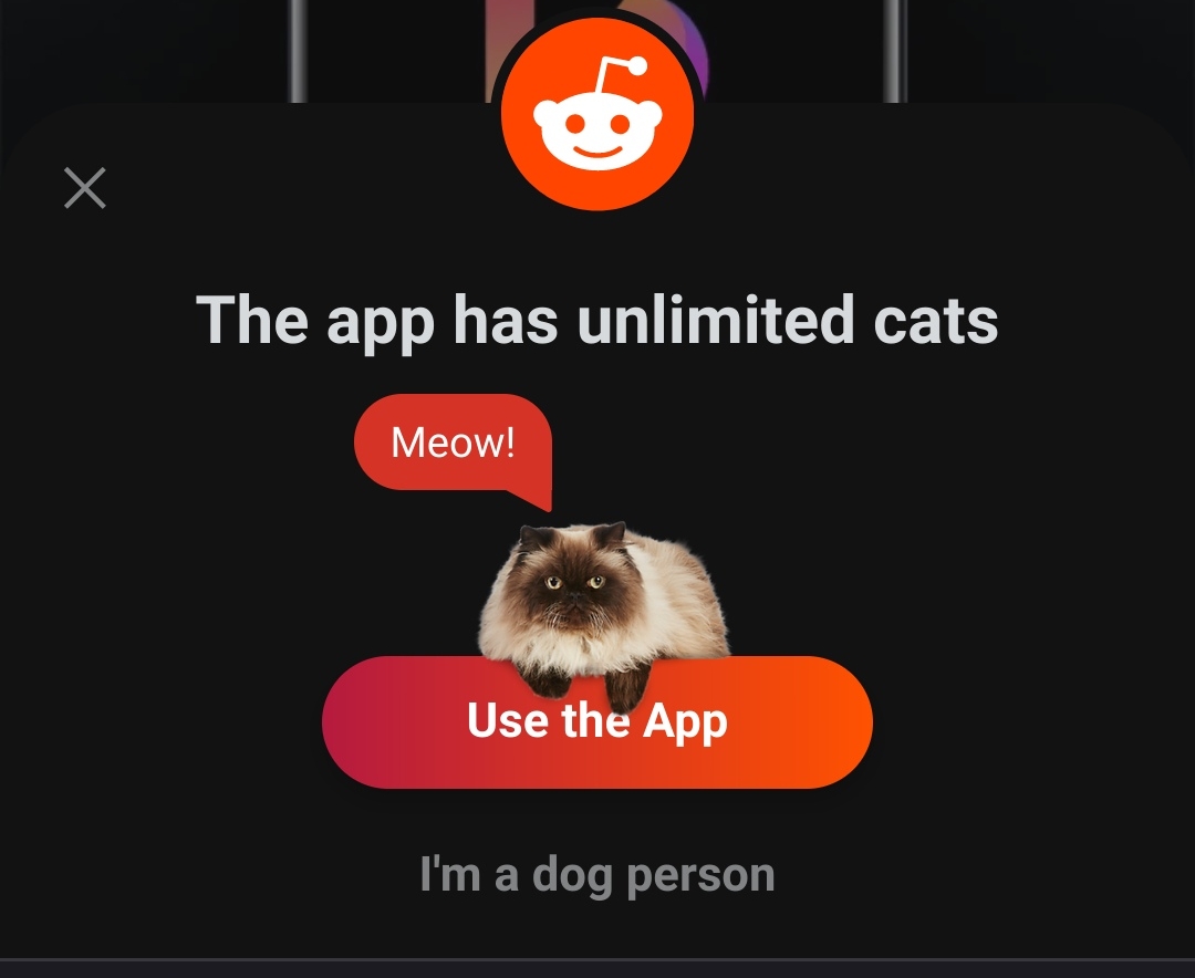
A more subtle example is Reddit continuously pushing users to use their mobile app. An annoying cats vs dogs popup window interrupts their web experience.
Types of dark patterns
Trick questions: When filling in a form for a site, you may be asked to answer a question that appears to say one thing, but actually says something else.
Sneak into Basket: Items appear in your shopping basket that you didn’t order when checking out. Probably because you didn’t uncheck something on the previous screen that was selected by default.