In this weeks lecture of Content Design with Paul we covered:
- Everything is Content
- Brand Dictionaries
- User Journey Map
- Touchpoints
- Lessons from Trailblazers
The four main types of content in web/digital design include:
- Text
- Imagery
- Video
- Data
Text
95% of web content is text which means it is so important to get it right when it comes to digital design. To prove this, Paul demonstrated to us that a mock up copy of text using ‘Lorem Ipsum’ is pointless when showing what a completed product is going to look like meaning that it is important that content is planned and included from the beginning of the design process as it gives everyone a much better idea of what your product is about from the start.
Laws of UX- Peak-End Rule
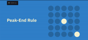
When we think about a past event we rarely remember all of it; instead, we tend to focus on an emotional peak and the end, regardless of whether they were positive or negative. In other words, we remember our life experiences as a series of quick snapshots instead of a detailed timeline of events. Our feelings during the most intense moments and at the end are the most prominent in our minds and heavily influence how we assess the overall experience.
This observation, known as the peak–end rule, strongly suggests we should pay close attention to these critical moments to ensure users evaluate an overall experience positively.
A Summary
- Pay close attention to the most intense points and the final moments (the “end”) of the user journey.
- Identify the moments when your product is most helpful, valuable, or entertaining and design to delight the end user.
- Remember that people recall negative experiences more vividly than positive ones.
Example- Watching a Movie
If the peak and the end are good, people will conclude that the entire experience was good. But if the most emotionally-intense part was negative and the end was unsatisfying, people will conclude that the entire experience was bad.
Psychological Concept: Cognitive Biases

Cognitive biases are systematic errors of thinking or rationality in judgment that influence our perception of the world and our decision-making ability. These mental shortcuts increase our efficiency by enabling us to make quick decisions without the need to thoroughly analyse a situation.
Whilst this can be good for making quick-fire decisions and stops us from over-thinking everything we do, it can also distort our thinking and perception, ultimately leading to inaccurate judgment and poor decisions.
The peak–end rule, also a cognitive bias, is known as a memory bias because it impairs the recall of a memory. We remember intense events more than boring events, effecting how we perceive an experience. we don’t remember everything we felt throughout the experience, just a overview of how we felt during the peak emotional moments and at its end.
How we should use this in UX
We should aim to be aware of the most intense points and the final moments of the user journey.
people remember more negative experiences in comparison to positive ones. This is super helpful to know when creating a product as it is vital to meet the target audience’s needs to create the best and most positive experience for them.
Journey Mapping
A journey map is a visualisation of the process that a person goes through in order to accomplish a goal.

A customer journey map is designed to provide insights into the customer’s journey. It is not designed to represent a 100% real experience with lots of variation.
A great way to start this process is by creating user personas.
The Importance of User personas in Journey Mapping
What is a User persona?
A user persona is a semi-fictional character based on your current or ideal customer. Personas can be created by talking to users and segmenting by various demographic and psychographic data to improve your product marketing.
Creating user personas can help designers step out of themselves and recognise that different people have different needs and expectations. By thinking about the needs of a fictional persona, designers may be better able to work out what a real person might need.

How to Start a User Journey Map
- Start with a seed idea of what your solution could be.
- Start by writing a simple 1-2 word headline of the most core moments of engagement for your user on a Post-it.
- Now, write down the name of any other key moments on separate Post-its.
- Place the Post-its in an order you think your user would likely experience them.
Touchpoints
A touchpoint is any time a potential customer or customer comes in contact with your brand– before, during, or after they purchase something from you.
Physical vs Digital Touchpoints
Each touch point in the customer journey map will take place in the real world as well as digitally.
- EG-A physical channel= through word of mouth.
- A digital channel= through Facebook advertising.
Real Content drives Real Design
Nielson Norman Group published a study in 1997 saying People rarely read online, they’re far more likely to scan than read word for word. This hasn’t changed in 23 years and has substantial implications for how we create digital content today.
Eyetracking
A 2008 study concluded that, on average, only 28% of the text is read. Eye-tracking visualisations confirm that users often read website content in an F-shaped pattern: two horizontal stripes followed by a vertical stripe.
![]()
The top-left corner gets the attention first.
When users land on your site, their eye path starts from the upper-left corner and moves down and right from there.
According to an eye-tracking study by Eyequant, these areas get the most attention:
The Gutenberg Diagram
The Gutenberg Rule is used to show a user behaviour known as reading gravity, the western habit of reading left-to-right, top-to-bottom.
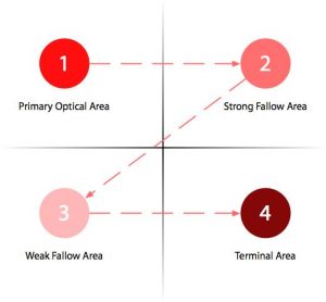
1.Primary Optical Area
The higher left portion of the page is the user primary focus, it’s where the eyes will automatically focus regardless if the user is searching for something, wanting to read or just doing a quick scan on the page.
2.Strong Fallow Area
The second stage of the reading habit is moving to the higher right portion of the page. It’s not a good idea to break the reader’s experience created from the starting point. Meaning that if you have a call to action the user will stop at this point and act.
3.Weak Fallow Area
The lower left portion is the blind portion of the Gutenberg Diagram, although readable the user will not give much importance to content in this area of the page.
4.Terminal Area
When the user reaches the lower right portion of the page there is a break in the reading or “page scan” process and the user will need to take an action. This is the perfect spot to insert call-to-action such as buttons, links, forms, video, etc.
By understanding the reading patterns of the users who visit your website you are able to place the most important content in the areas where they will be most effective.
Visibly bigger introductory paragraphs improve attention.
Make introductory paragraphs in boldface or a larger font size. When test subjects encountered a story with a boldface introductory paragraph, 95% of them viewed all or part of it.
Users want to be captivated by your site immediately, and if not, they will not continue to scroll through your site to try and find what should really be at the very top of your site. This further emphasises the importance of including the most important things the user should know about your site at the top.