Our next task for developing our brand is to create our own visual marque. This should be something that represents the persona of our brand. Many global companies are primarily recognised for their visual marques before their name or wordmarks EG Starbucks.
Pictorial symbols are non-abstract symbols and are iconic in nature. They convey a stylised version of something EG a fruit, like the Apple logo, a mythical creature, like the Starbucks logo, an animal, like the twitter icon.
A pictorial logo may be preferable when your brand name is a bit abstract and the public cannot immediately tell what your brand entails. Pictorial marks can be very effective if your brand name lends itself to a specific image EG Apple or Jaguar can use their pictorial mark instead of having to include their actual name.
I began designing my visual marque by creating a mind map based on my brand’s identity to see if there were any words that stood out to me that I could create a marque out of.
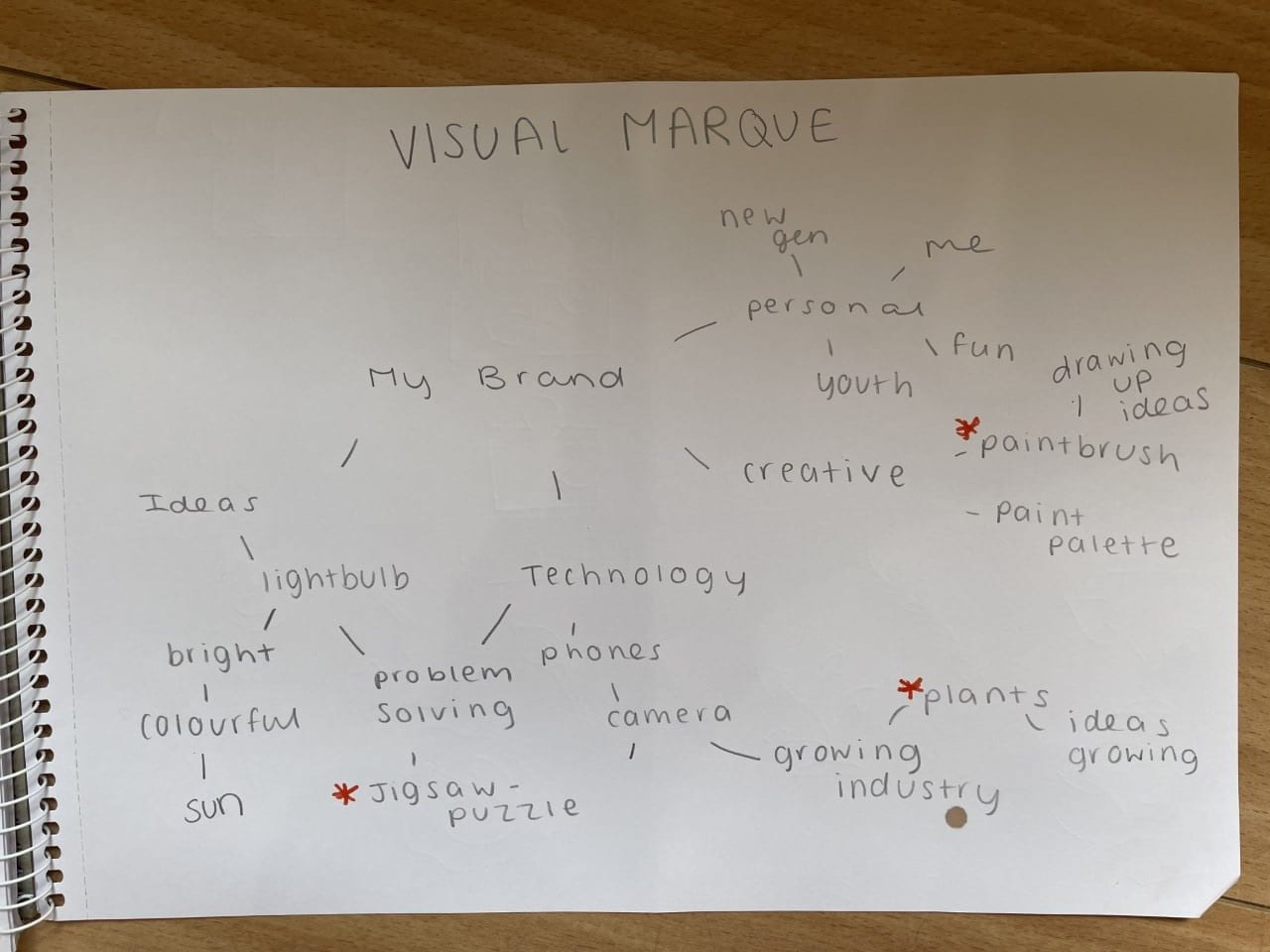
The three words that stood out to me were:
“Jigsaw” as it resembles the developing process to creating a project and all the small steps involved. It portrays the problem solving steps involved in creating the perfect final outcome for your brand’s project and shows that I don’t go for my first idea, I try all options to find the strongest.
“Plants” as it resembles the growth of my brand within this ever-growing industry. It shows that I am growing as a brand and as a interaction designer and how my skills will only continue to get stronger as I only strive for the best and highest quality work.
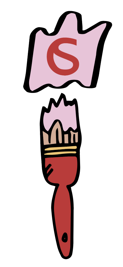
“Paintbrush” as it resembles the creative side of my brand and fits in with my bright, bold colour scheme. It portrays the design side of the industry as the work field involves a lot of designing and use of colour and the freedom associated with that.
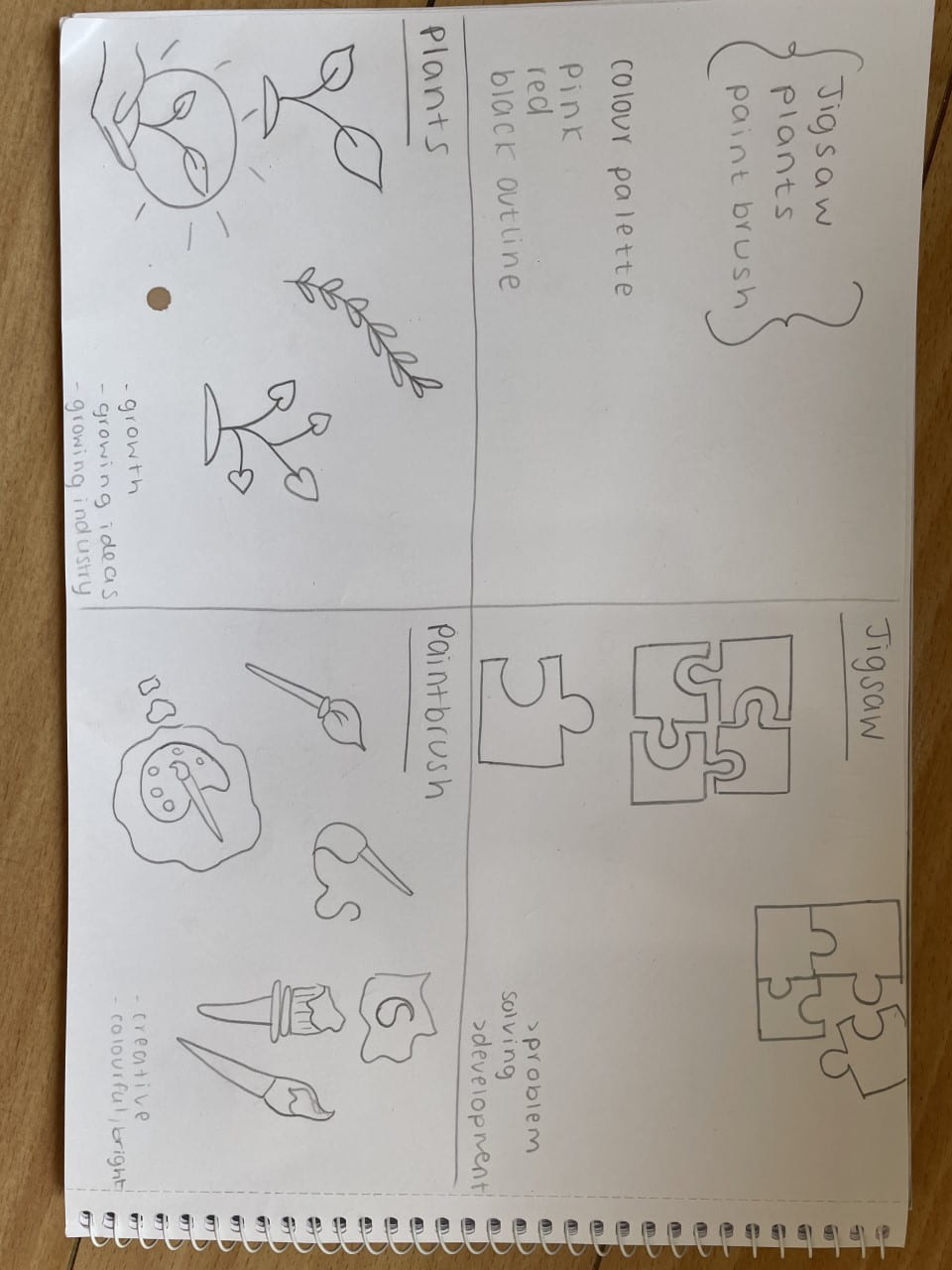
I then went and digitised my favourite sketches of each of these words on Adobe Illustrator to see which designs were the strongest.

Overall, I am extremely happy with the outcome of these sketches as I made sure to include my brand’s colour scheme so that it accurately fits in to the rest of my brand work. I really like how I managed to include my monogram in one of the paintbrush sketches however I think it is too busy and I would personally prefer a more minimalistic approach to a visual marque.
I much prefer the simplicity of either plant design as I love that they resemble the passion I have for this industry as I have always wanted to create new things to benefit as many people as possible.