What is a brand’s visual identity?
A brand’s visual identity is all of the imagery and graphical information that expresses who a brand is and differentiates it from all the others EG their logo or website design.
How you create an impression through the visible elements of your brand is very important. Images are a powerful form of communication, specifically because they do not communicate with words. They speak on a primal, emotional level and are therefore more influential at first glance.
Brand Identity
Brand identity is the collection of all elements that a company creates to portray the right image to its consumer.
Your brand identity is what makes you instantly recognisable to your customers. Your audience will associate your brand identity with your product or service, and that identity is what creates the connection between you and your customers, builds customer loyalty, and determines how your customers will perceive your brand
Brand identity includes the choices of your typography style, your colour palette, your web/social media design, your logo, as well as any packaging or physical touchpoints EG phone cases, clothing, accessories etc. it is very important to make sure these are kept consistent so that your brand becomes recognisable on all platforms. It is also important that each aspect fits your brand’s tone of voice EG to make sure your physical touchpoints match with what your brand story is about.
EG Headspace
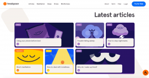
The meditation app Headspace features a cheery colour palette that brings joy and therefore successfully delivers on the mission of their meditation app promise of “less stress, more joy”. The identity extends to their site, app, and even their Instagram. With inspirational quotes and charming illustrated characters, they ensure a consistent experience with every piece of content.
Colour scheme
The main colour that can clearly be seen throughout their website is purple which is very fitting to their brand’s identity as purple possesses calming and stimulating properties which benefits us greatly as it puts us in the right frame of mind. It also have psychological links to being able to decrease blood pressure and heartrate because of its bluish undertones.
This was a very smart choice to make their main colour throughout their website, app, and social media as the colour palette helps to calm their audience whilst their browse their sites to find a meditation video to relax to. The colour palette is also very successful in terms of the majority of people tend to use the Headspace content before going to bed so the purple will help to soothe and relax them before they even realise it.
Headspace Instagram
Whilst Headspace still includes lots of calming blues and purples on their instagram, their also include lots of bright colours such as greens, pinks and yellows.
What does green symbolise?
Green is a cool colour that symbolises nature and the natural world. Due to its strong associations with nature, green is often thought to represent tranquility, good luck, and health.
Green is also often used in decorating for its calming effect. For example, guests waiting to appear on television programs often wait in a “green room” to relax. Green is thought to relieve stress and help heal. Those who have a green work environment experience fewer stomachaches.
What does yellow symbolise?
For many people, yellow is seen as a bright and cheerful colour. Advertisers may use it to not only draw attention but also to evoke a sense of happiness. It is also seen as an invigorating colour. It stimulates our nerves, glands, and brain, making us more alert and energised. Yellow boosts our memory, and it encourages communication. It’s a colour that promotes activity and interaction.
What does pink symbolise?
Pink is thought to be a calming colour associated with love, kindness, and femininity. Since the colour lives between red and white, it takes all the passion and energy of red and combines it with the purity of white, leaving the colour of tenderness and affection.
Pink has also been linked to toning down aggression, and its use in holding cells for violent criminals has been quite effective. Some sports teams have even painted opposing teams locker rooms pink in an attempt to reduce aggression. Pink is such an effective mood regulator that too much of it can by physically draining. Dark pinks have effects similar to red–heightened emotions, while pale pinks are more soothing.
These are all very positive colours which will help to lift peoples moods and calm them without them realising whilst they scroll through their social media page. They also post lots of empowering quotes on their page to lift peoples moods and help them to see the positives in situations, leading them to be successful in their brand as their purpose is to calm people.

