When beginning a new task, it is always crucial to start on paper. I separated a page into 12 desktop-shape grids and began making quick, undefiled sketches of any webpage design I could think of. I purposely made these grids quite small in size as it forced me to focus on the main shapes I wanted to include on my type screen and not get side tracked on the minor details. This method of sketching was really beneficial to me as it allowed me to get my ideas down on the page as quickly as possible so that I could explore all my options and then decide what design I want to go with out of each idea.
![]()
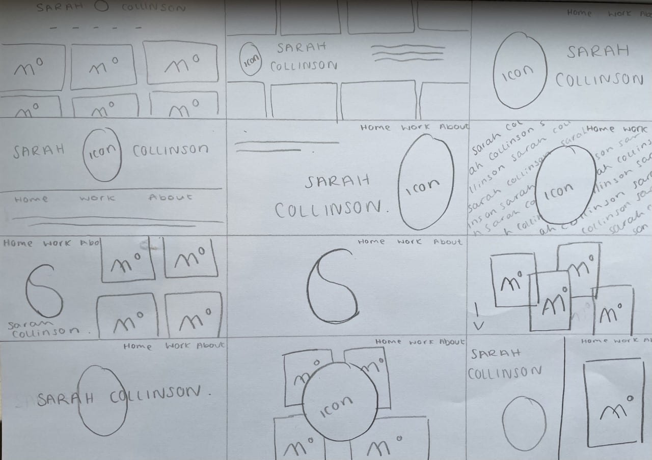
I kept each wireframe as basic as possible by only using a pencil to sketch which was also very helpful as I eliminated the option of incorporating any colour into these sketches which would have disrupted my design flow. Through this wireframe sketching method, I managed to produce 12 frames that are very different to each other and helped me see all of my options to then digitise.
I then chose my 4 favourites and sketched them in more detail to get a better idea of how I would lay them out.

Digitising Wireframes
After I had finished sketching, I took a few of my favourite frames onto Adobe Illustrator where I began to digitise them.
I knew I wanted to keep my colour scheme consistent with my blog, business cards and monogram so I used a variety of lights pinks to tie them all together which worked well in my opinion as it is a young, fun colour that isn’t too bold and fits my desired brand personality perfectly.
To further make my portfolio as personal and unique as possible, I created a digital illustration based from a photo of myself via Adobe Illustrator and created an icon-like stamp for my portfolio which I think is really fun and helps to let future clients see what I look like on a very simplified scale.

I also created my own font using my own handwriting which I scanned onto my computer to keep the very personal feel of my portfolio. I personally really like how this turned out as subtle touches like these help to keep each designer’s portfolio different from the rest and helps to further convey your own unique personality which works well when it shines through your brand’s tone of voice.
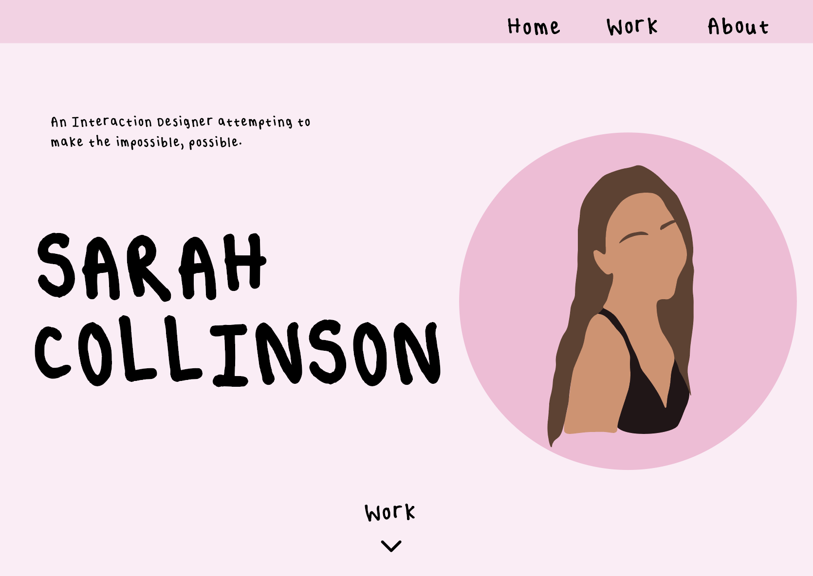
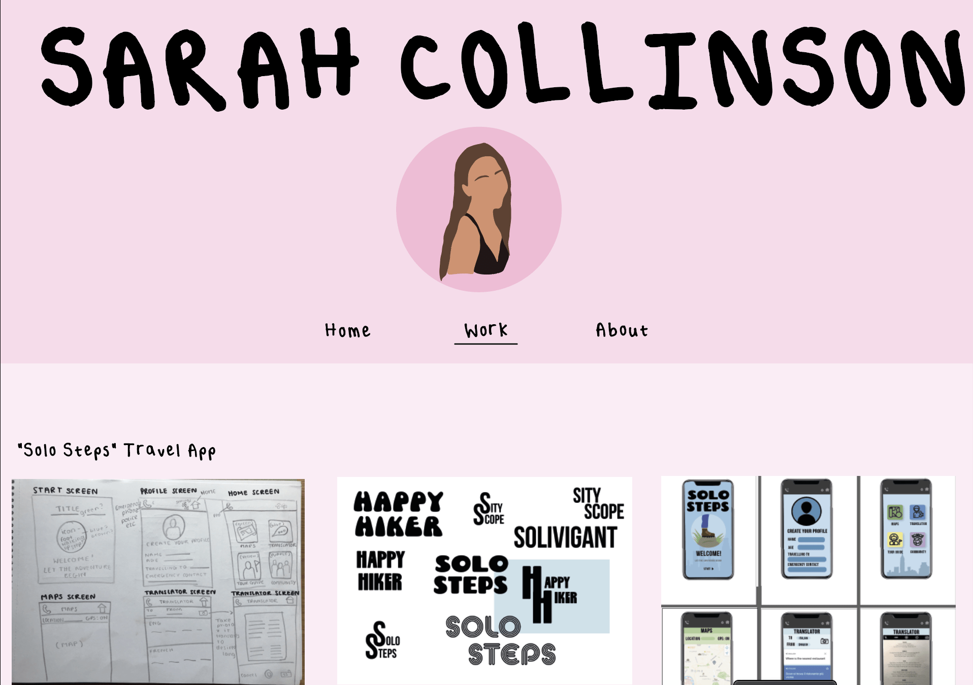
I created a few styles to see how I want to layout my home screen as I want it to be lively without it being cluttered. I personally really like the layout of the first screen as it includes all the important icons and information which would then follow into the next screen of choice EG the work section in the second image. I really like that these two screens work hand-in-hand together and are equally bright and fun without being too cluttered and in your face.
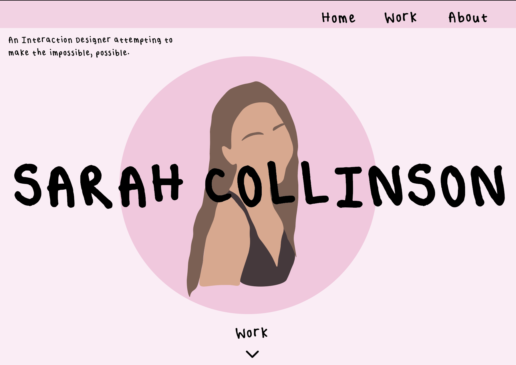
I then copied the first screen and changed the font to Bodoni 72 which is a pre-downloaded font on Illustrator. Although I thought this font also worked well with my brand’s tone of voice, I just felt it wasn’t as personal as my own handwriting being used as the font on my website.

It may be a bit tidier as all the text is the same hight and level, I feel that my own font helps any future clients see me as more of a real person and not just a website.
I will continue to further develop these prototype screens before I move on to coding them to make sure that I am completely happy with the layout and the colour schemes to make it as perfect as possible.