James Round
James Round is an independent graphic designer and illustrator who has collaborated with clients to create compelling data visualisations that are bold and eye-catching. He has worked with clients such as the BBC, WIRED Magazine, and BAFTA.
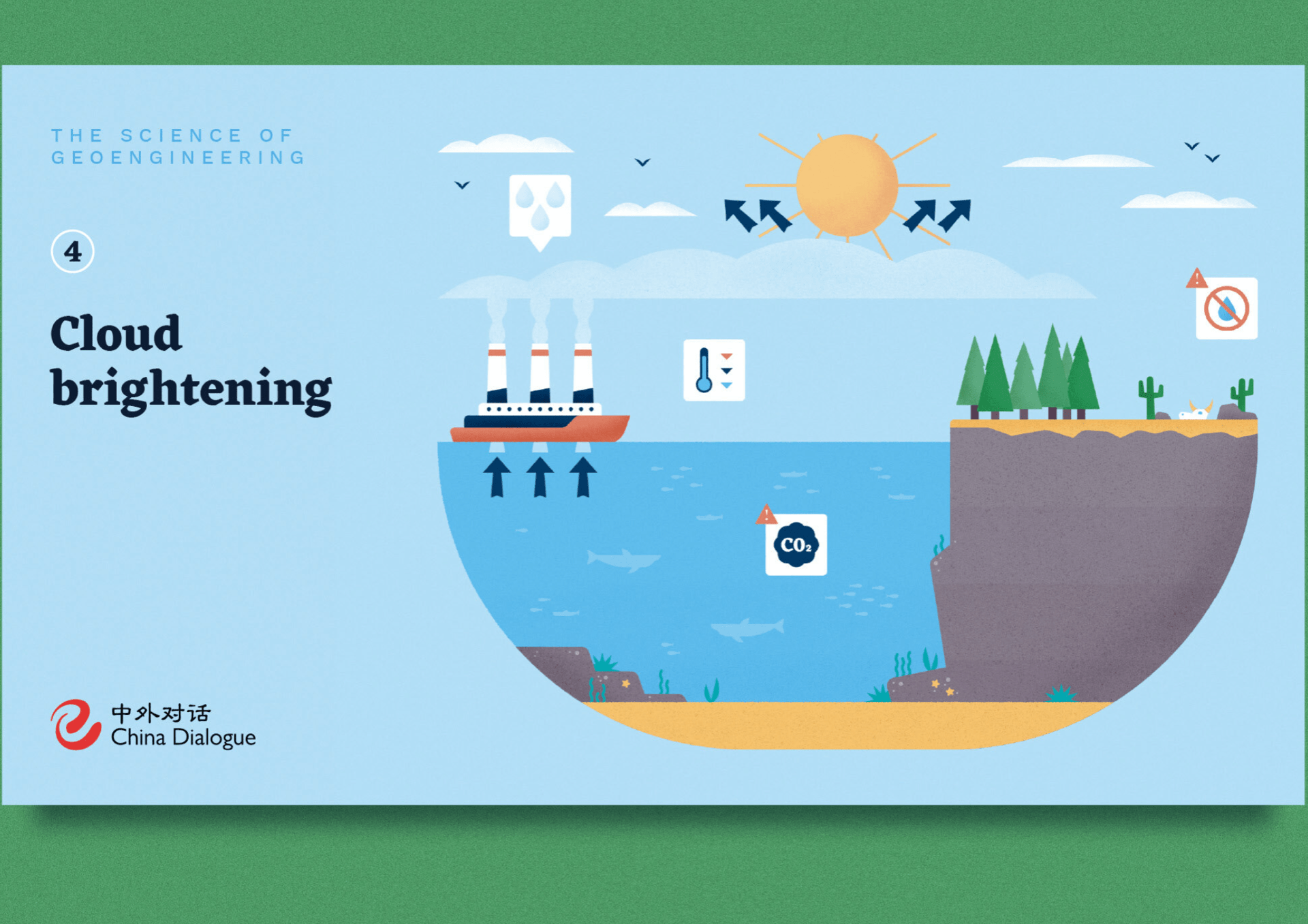
Round creates bold, impactful artwork about things like science, space and the environment. He has also produced illustrations for clients like Tesco, the Financial Times and Quanta magazine.
I was really fascinated with Round’s work when I first came across him whilst researching infographics as I think the subjects of the work he creates is very important. He also uses a lot of illustrations in his work which I personally feel is very important when creating infographics as the images are what captivates the audience to begin with.

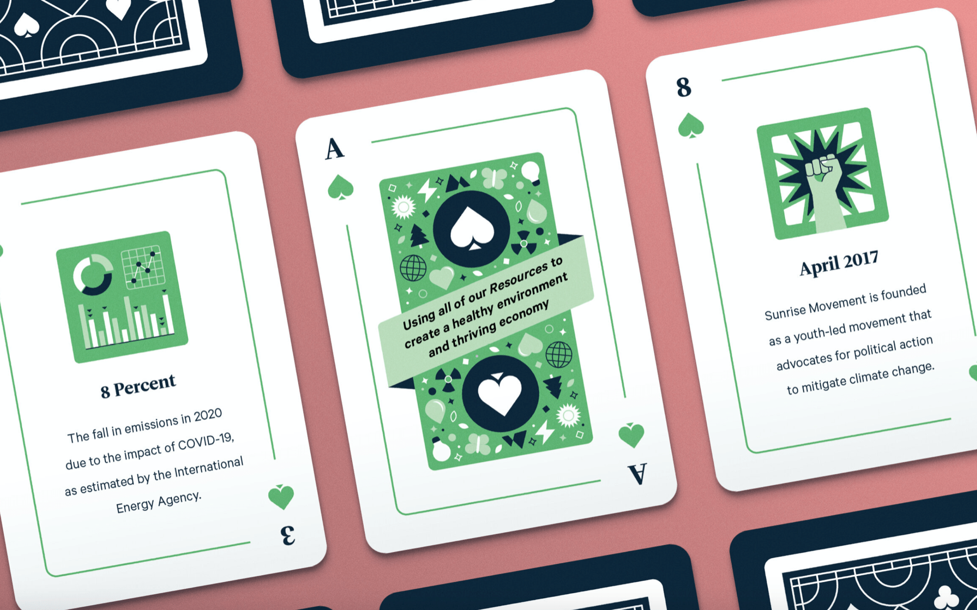

Another thing about his work which really captivates me is that each project he works on is designed completely differently EG his “A Walk in the Dark” infographic is of a completely different style to “Earth Day Playing Cards” infographic. I really love this as I feel it keeps his work full of character yet also full of mystery as the client will not know what exactly his finished project will look like yet he is of a high enough credibility so they know they can trust his chosen direction. This stops his work from getting mundane as he doesn’t stick to one continuous style plan for each infographic which some other infographic designers tend to do.
His work is also very full of colour and illustrations, however is still not considered to be too crowded because of the thought out layout which keeps everything spaced out and legible. This is extremely important in infographics because if it is too crowded then it becomes very confusing to read and understand.
Through looking at Round’s work, it has helped me to see what a successful infographic designer’s work looks like which the helps me come up with ideas for colour scheme and layout for my own infographic. It Is also useful to see the ratio between illustrations and text on the poster as it can sometimes be difficult to decipher how much text is needed on the infographic. I will definitely take all aspects of his work into consideration when designing my own work, especially the bold use of colour in his illustrations and bold backgrounds as that is what instantly drew me to his work in the first place.