Giorgia Lupi
Giorgia Lupi is an information designer who is also a Partner at Pentagram in New York.
After receiving her master’s degree in Architecture, she earned her PhD in Design at Politecnico di Milano and In 2011, she co-founded Accurat, which is an internationally acclaimed data-driven design firm with offices in Milan and New York. She is also co-author of Dear Data and of the new interactive book Observe, Collect, Draw -A Visual Journal.
Giorgia is also a public speaker, her TED TALK on her humanistic approach to data has over one million views. She has been named One of “Fast Company’s” 100 Most Creative People in Business in 2018, when she also joined MIT Media Lab as a Director’s Fellow.
Her work is part of the permanent collection of the Museum of Modern Art, where in 2017 she was commissioned to create an original site-specific piece.
Giorgia has also had the privilege of working with major international clients such as IBM, Google, Bill & Melinda Gates Foundation, Starbucks, United Nations, World Health Organization, TED, Target, and Columbia University.
Data is considered to be impersonal, boring, and clinical, but her work proves the opposite.
She uses data as a lens to better understand our human nature and every aspect of our society. By distilling our personal experiences EG our activities, thoughts, behaviours and relationships into data, and expresses them with her skills as a designer and artist. She seeks to humanise this data because, in her opinion, this is the ultimate goal of any design work, especially with data.
Happy Data
“Hopeful views of the world through data and drawings”
Giorgia and her team at Pentagram have felt overwhelmed by the events of 2020 like the rest of the world has. With difficult news arriving almost daily, they decided to focus on the positive and started working on “Happy Data”, which consists of a series of hopeful views of the world through data and drawings.
The visualisations combine hand-drawn type and infographics with photo snapshots taken by the team, using information as a lens on current events.
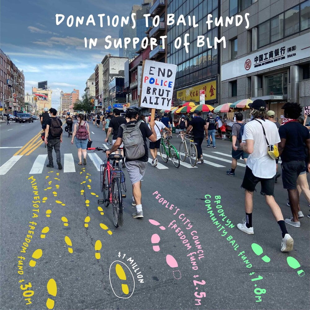
The self-initiated project was created in response to the global pandemic of Covid-19, which required the world to go on lockdown and set off the worst economic recession since the Great Depression; and the killing of George Floyd and the epidemic of police brutality against Black people in the USA, which resulted in massive protests supporting the Black Lives Matter movement.
“When Covid-19 hit my native Italy and then the US, we team found it nearly impossible to escape thinking about the pandemic. Everywhere we looked, they were reminded of the virus’s painful disruptions. As they continued to self-isolate at home, we found ourselves daydreaming out the window, imagining what the future might hold.”
Like much of Giorgia’s work, the project utilises the principles of “data humanism”–using data to uncover the human stories behind the numbers and statistics, and to challenge the idea of data as something that is impersonal and intimidating.
“Heart-warming, surprising, encouraging- we hope these numbers brighten your day and help you cope with this unprecedented moment.”

As soon as I saw Giorgia’s work I instantly fell in love with it. I have never seen an infographic like her work before and found it extremely eye-catching. I absolutely love the way she incorporates real images beneath her very colourful, illustrated information.
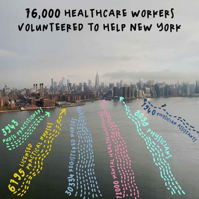
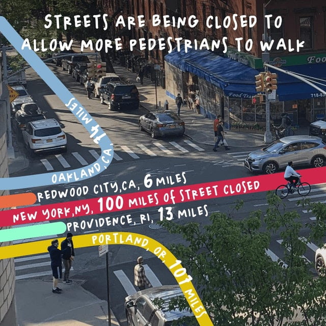
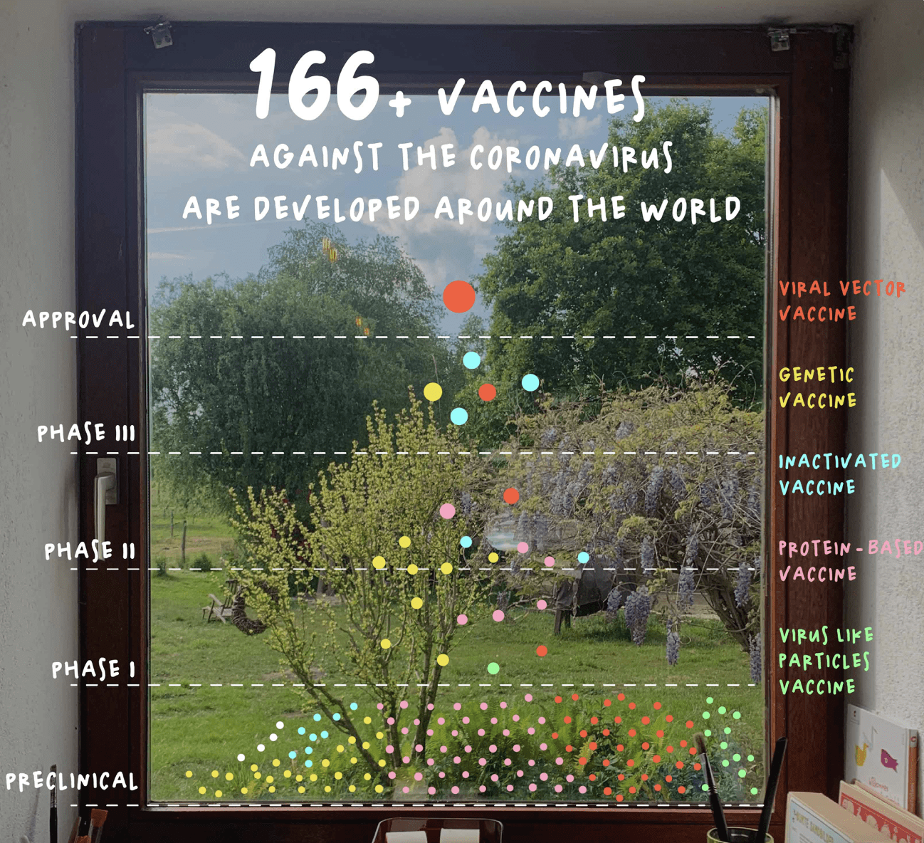
whilst these infographics are based on two very heavy and important matters in the world right now, her infographics are very positive and colourful. Happy Data helps people see the brighter side of things and reminds them that better days are coming, which is very important during times like these.
her text is placed very smartly EG in line with the ocean current or the road lanes, causing us to move in the same direction as the picture beneath and really causes the infographic to come to life. The hand-written style font is also very eye-catching as it goes perfectly with the personality of the rest of the infographic, making it a happy, positive atmosphere where people want to stay and therefore read more about these important matters.
Girogia’s work has really opened my eyes and made me give a second thought to how I want to create my own infographic. I love her style and will definitely be using her work as inspiration when coming up with what style I want to use when creating my own.