Once I had done more research on different layouts and colour schemes, I fell out of love with my original three final designs and made three more.
these designs are much more. minimal and more colourful and I am much happier with this outcome.
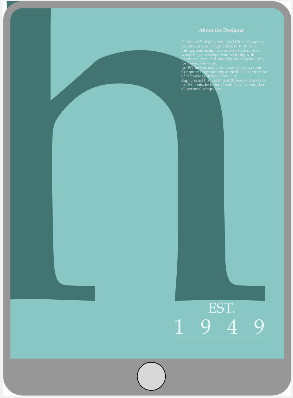

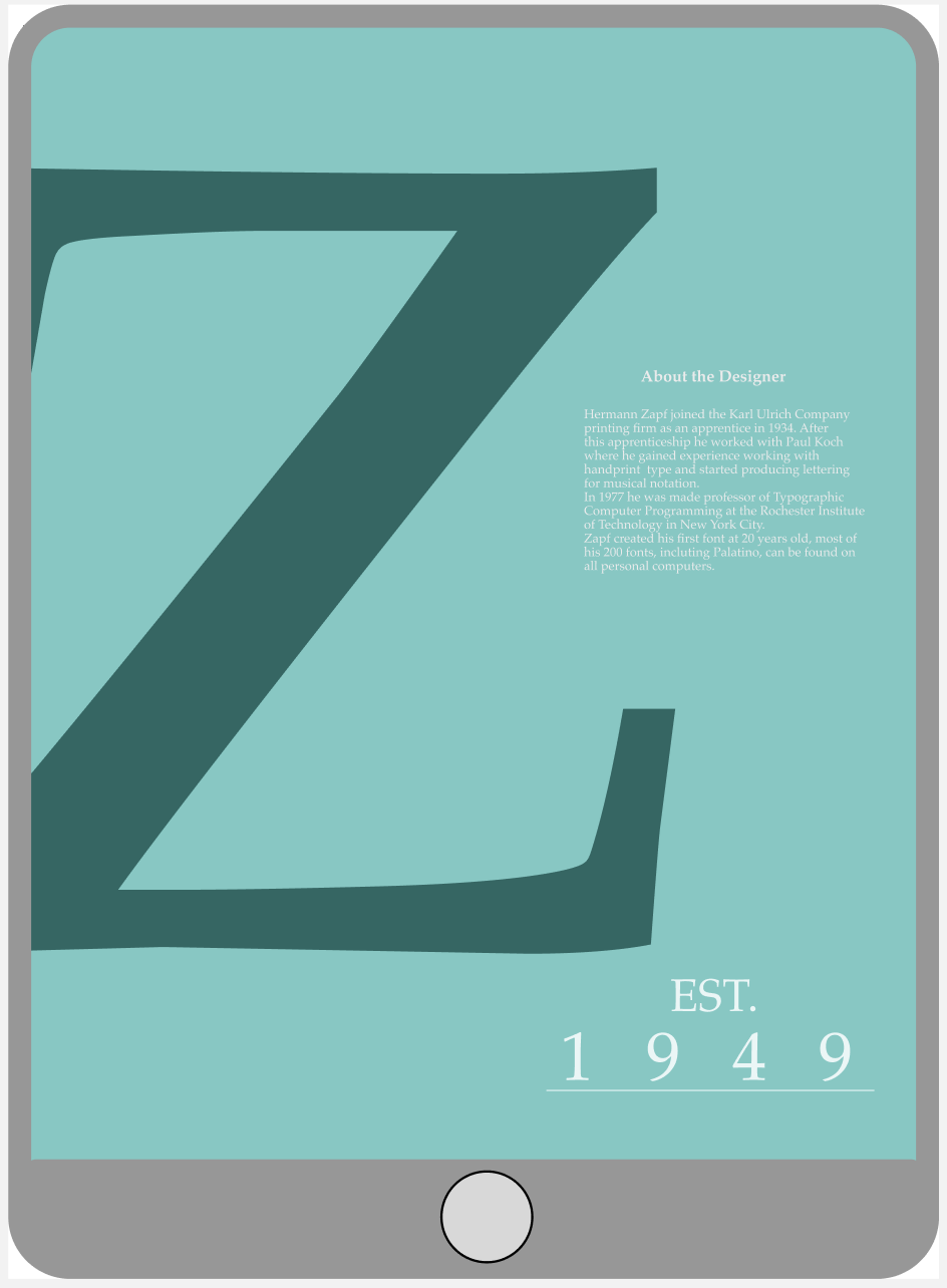
I chose to use the letters H and Z, after Hermann Zapf, the creator of the Palatino font. the letters are all very zoomed in and blend into the background colour which I really like. there is a lot less happening on the screens which I think works better as the screens are not as busy.
the other text is in white which I am very happy with as it is legible however not initially noticeable so therefore does not take away from the main focus of the specimen screen.
Overall, I think this screen is my favourite as the H is the most zoomed in, still legible, however most of the letter has been cut of the page. the body paragraph is also overlapping with the main image, causing the screen to look a bit more exciting to look at.
I am much happier with this colour palette and think it looks much better than the previous final three designs.