What’s my brand?
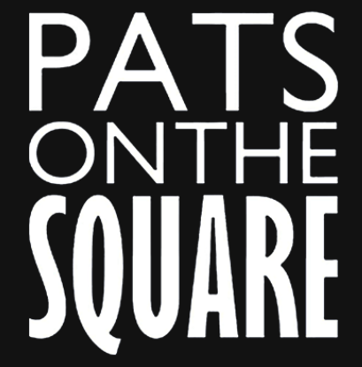
For this task I went a pre-existing and familiar (to me) brand, Pat’s Pizza in Donegal. So far Pat’s has three locations in Donegal. Two of these are casual takeaway Pizza places but the other, Pat’s on the Square offers a more high end, expensive, classic Italian dining experience and its branding differs from the others to try and reflect that.
With that said I thought, what if they opened a new location and this new location was going to provide a different dining experience to the others and so they wanted to brand it a little differently to reflect that, just like Pat’s on the Square.
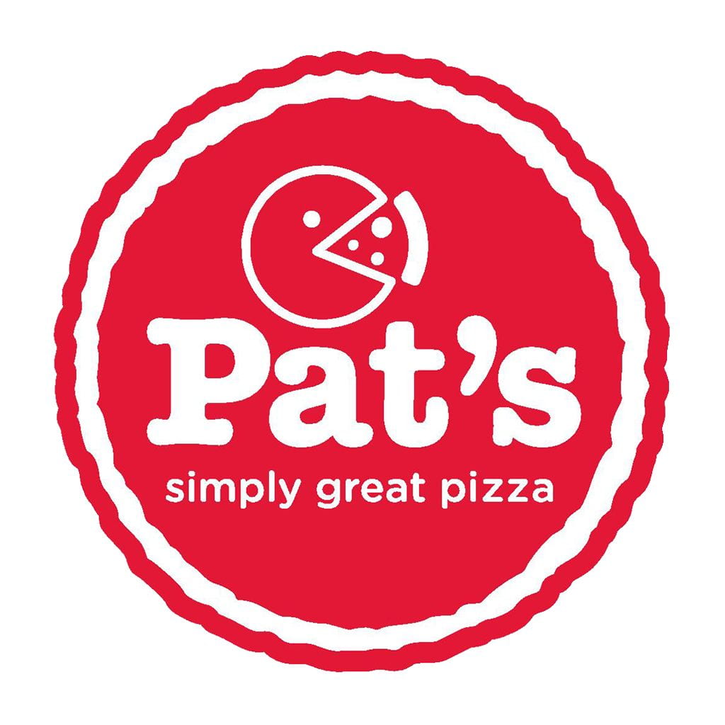
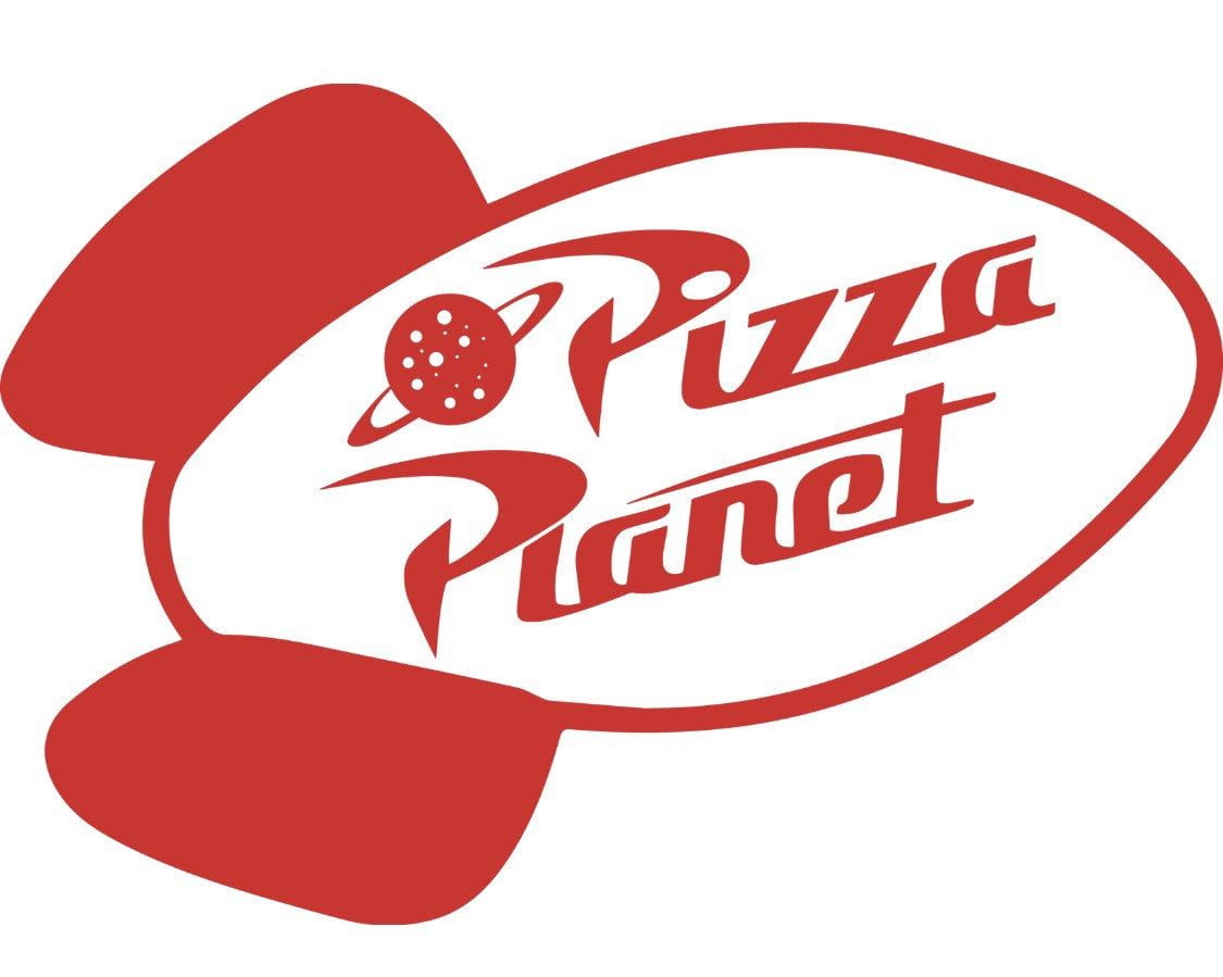
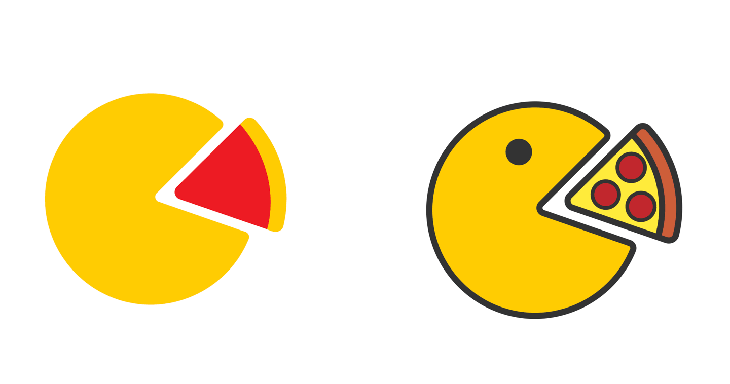
There’s a little pac-man eating a slice of pizza in the main logo. This gave me the idea of this hypothetical new location being a combined pizza place and arcade kinda like Pizza Planet in Toy Story.
It might seem like I’m over complicating things for myself by not just doing a rebrand of just regular Pat’s Pizza but this way I get to design for something that’s a little more up my ally than just regular Pizza place.
Research
Pat’s Pizza
To start I need first see how Pat’s Pizza currently brand and describe themselves so .
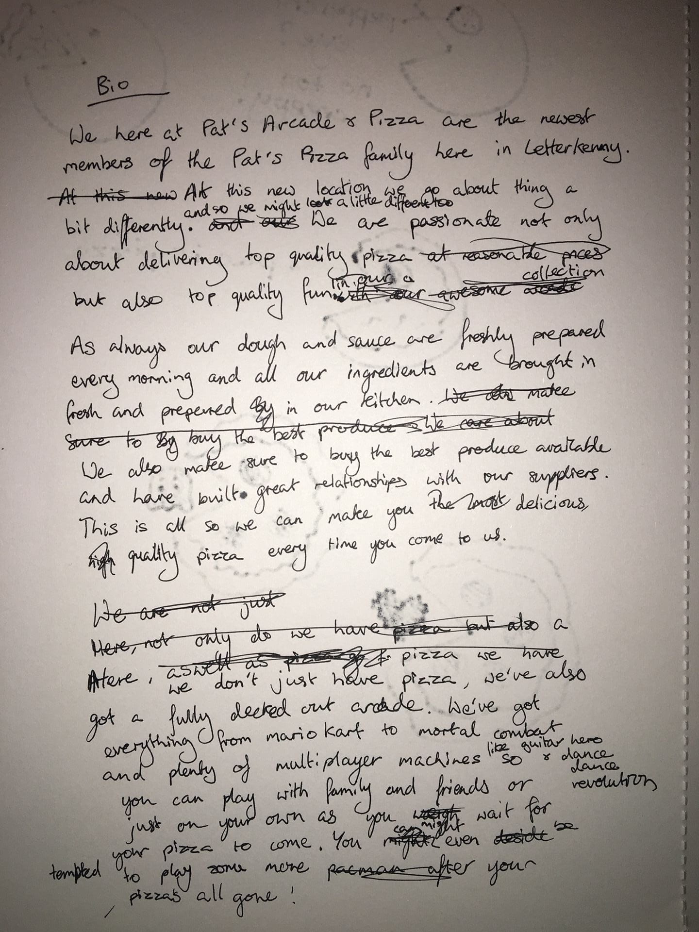
On their website they have an about page that states “Our concept in Pat’s Pizza is to deliver top quality pizza, at reasonable prices, in an unpretentious and casual setting. Our pizza dough is freshly made every day using just 5 ingredients, 00 Italian flour, fresh yeast, water, olive oil and a little salt.
Our pizza sauce is also freshly made every day by our chefs in Pat’s on the Square using just tomatoes, garlic, herbs, and a little salt and sugar. All ingredients are bought in fresh and prepared in our kitchen. We buy the best produce available and have excellent relationships with our suppliers, some of whom we have been dealing with for the past 30 years.” They are clearly very focused on quality but aren’t stuck up about it. On social media they mention awards and commendations they have received to really emphasis how delicious and good quality their pizzas are.
In the about page they also give some info about the history of Pat’s and how they started in the market square in Letterkenny in 1984 with just a counter, household oven and one of those old cash drawers that pinged when you opened it. They’ve certainly come along way since then. They pride themselves on being a long-standing business in Letterkenny and even refer to themselves as “serving Letterkenny’s favourite Pizza since 1884” on social media. They try to source ingredients locally which shows they care about the local economy and are known to support community and voluntary efforts of the locality, which isn’t something you could really say for a lot of the big corporate pizza chains out there.
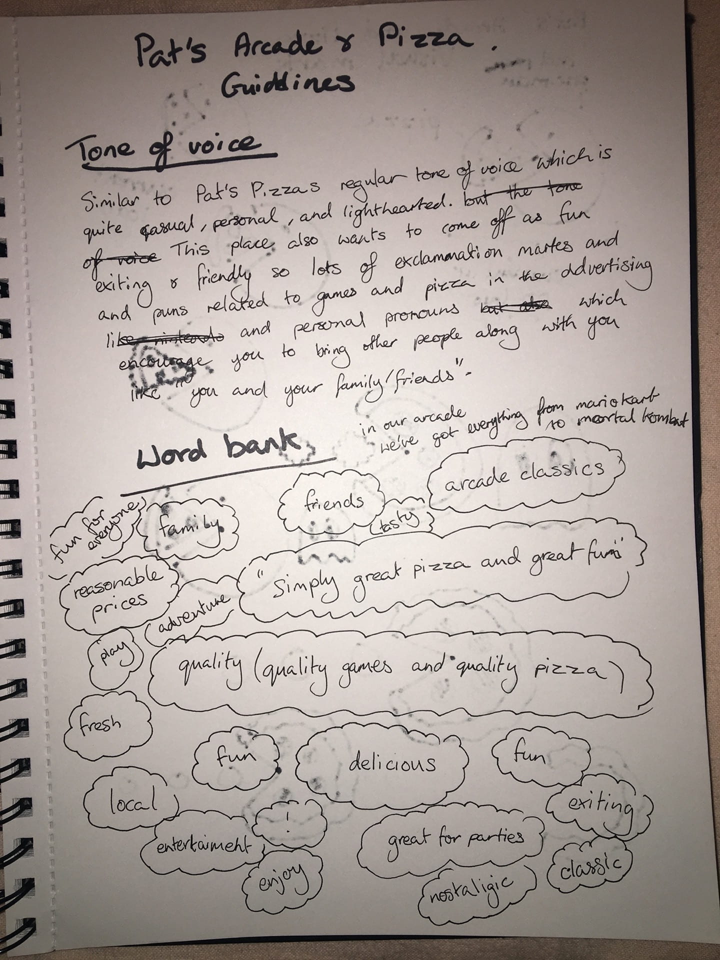
The slogan they seem to be going with is “simply great pizza”. From looking at their online presence I’d say that things like ‘quality’,’reasonable prices’, ‘simple’, ‘great’, ‘delicious’, ‘fresh’ and ‘local’ would all be part of their word bank.

The main colours they use in their branding are white and red. White could signify they are calm, unpretentious, timeless and trustworthy. The red other than pizza sauce or pepperoni, could signify that they are enthusiastic, passionate and determined about making quality pizza.
I’ll be altering the ton a voice for this new more fun exiting location but what I’ve noticed from their social medias is that their current tone of voice is quite casual, light-hearted and personal.
Now that I feel as though I have a good understanding of the Pat’s Pizza brand I should look at the main competitors in the area.
Benchmarking Competitors
There are only two places in Letterkenny that I could see in competition with Pat’s Pizza and Arcade. These being Dominos and Arena 7.
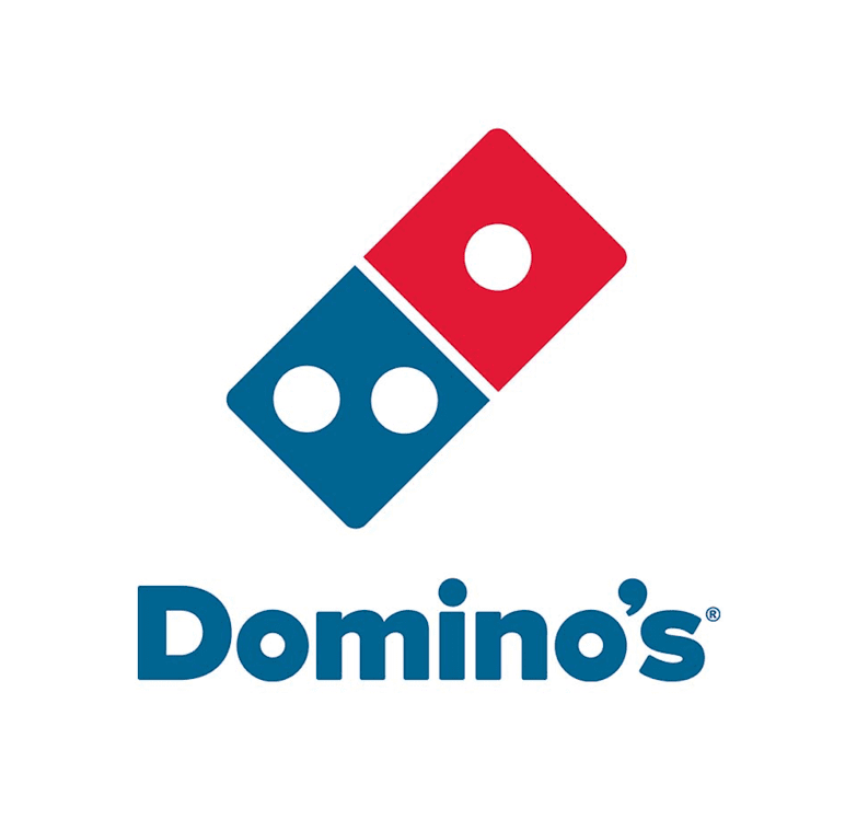
Domino’s the main pizza place competitor to Pat’s in town. Domino’s is a worldwide fast food chain where as Pat’s is only in Letterkenny and so has a long history and deep connection with the town. Domino’s doesn’t have the same level of familiarity and nowadays it’s getting more popular for people to support local businesses they know and trust rather than cold corporate ones. This is why I think it is important to remind people of this in the bio for this new location. Even if it’s a new location it is still a part of Pat’s family in Letterkenny.
Another thing is that Domino’s in Letterkenny is strictly for takeaways and delivery, they don’t provide any sort of dining in experience. With that said, I think it is important to inform people in the bio that this new location doesn’t just offer those things but also a dining in and entertainment experience as well.

Arena 7 is the only place in town I could think of that has arcade games and food, among other things like bowling and laser-tag. Arena 7 does have quite an array of entertainment but what could set Pat’s Arcade and Pizza apart from it is cleaner branding. Let’s face it, I love Arena 7 and have lots of fond memories of childhood birthday parties at the place but the logo is hideous. As well as that their online presence could be much better and there’s no real overarching theme to their presentation.
There is a restaurant in the place that does great food but there’s a clear separation between the place and all the entertainment so I think making it clear that at this new location the arcade and pizza are equally important and great quality parts of the experience is key.
The Arcade Theme
Since this will be as much of an arcade as it is a pizza place it’s important that I infuse and arcade theme into the branding. I made a sort of arcade inspired mood board on Pinterest in the hopes that it could give my inspiration for my logo design and word mark typography. Here’s a link to it: https://www.pinterest.ie/laurabfoy/pizza-arcade/

Development
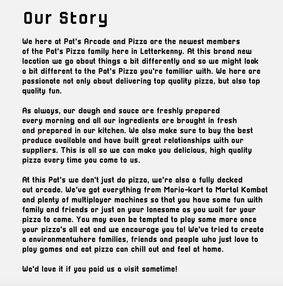
Brand Story
Before writing this I went to my sketch book and tried figuring out the right tone of voice and assembled a word bank that I felt fit the Pat’s Arcade and Pizza brand.
With this everything I learned about Pat’s Pizza and their values earlier I started writing a bio. I especially just imagined myself as an owner or someone in management who’s really passionate about this new location. With that I tried to sound as authentic and in keeping with the values and tone of voice as possible.
Logo

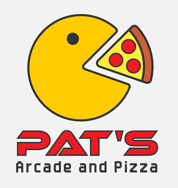
Although the original Pat’s logo isn’t actually intended to be pac-man eating a slice of pizza, you can’t deny the resemblance. Since that’s what gave me the idea for the pizza arcade, I can’t not include pac-man in the logo. He fit’s with the arcade theme and it would be a nod to the main logo. I started sketching ideas for the visual mark with a sharpie in my sketch book.


I had two main ideas, one being a pac-man made of pizza with a slice cut out. I felt that this concept would read arcade as much and it didn’t really look right so I went with the other idea I had instead. This was similar to the main logo but with a yellow pac-man eating a coloured pizza slice. I decided to go for a more cartoony, illustration style for this with bright, solid colours and black outlines (which I made sure were consistent in width).
For the word mark I looked in lots of different places to find type that was fitting for an arcade.
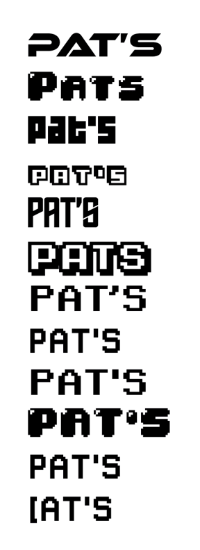
After some experimentation I decided on a couple fonts to use in the word mark. I initially had the one font (EthnocentricRg-Bold which I think I got from Adobe Fonts) for both ‘Pat’s’ and ‘Pizza and Arcade’ but I showed it to my sister who said it was too much and I agreed so I changed the ‘Pizza and Arcade’ to a simpler Arcade themed type.
Here is what I ended up with for the logo:
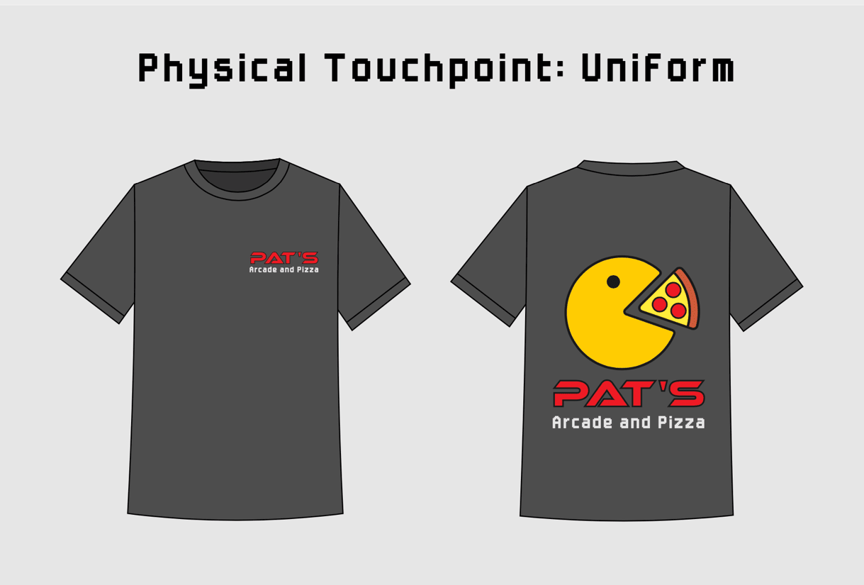
Physical Touchpoint
For the physical touchpoint I decided to do a simple uniform mock up. Since it’s a casual setting and the staff can’t wear heavy fabrics since the oven makes the kitchen really hot, I decided that a t-shirt would be the most best option. Here’s the mockup:
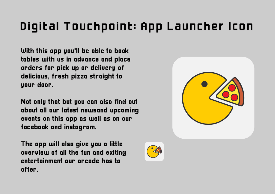
Digital Touchpoint
I was running tight for time at this point so I decided to make an app launcher icon for the digital touchpoint as well as write a description for the app. Regular Pat’s Pizza has an app so I based the concept for this new one off of it.
Final Result
Here’s the pdf link to my 3 pages: pat’s arcade pdf
Final Thoughts
I found this one week branding task really enjoyable to work on, but also a bit stressful. I think there was a lot more I could have done if I managed my time better but I’m taking this as a learning experience so that I’m more on the ball if a real branding project like this falls on my lap in future. Overall though, I had fun working on this task and I feel like I learned bit more about what’s entailed in the process of branding.