For our next move in creating a brand identity we were tasked with creating a visual marque for our brand. Many large successful companies rely on their visual marque to capture attention and present familiarity such as KFC, Nike and twitter to name a few. So in this case it’s very important to make a strong, unique and consistent visual marque for my brand.
To stay consistent and relevant I must choose a visual marque that represents my personal traits, artistic style and my brand values such as:
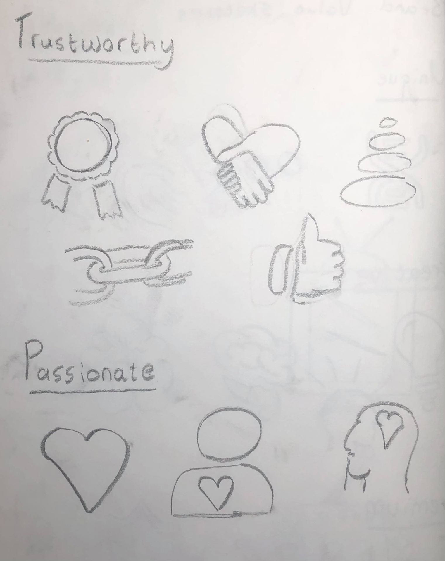
- Luxurious/Premium – Medals, crowns
- Innovative/Creative – Brain, ideas, lightbulbs
- Passionate – Heart, human emotion
- Unique – DNA, stars, odd one out, finger prints
- Trustworthy – Human connection, achievements, authority
To start I decided to sketch all things that I feel these words represent. I am also keeping in mind my artistic style, in which I want the wordmark to be as simple and abstract as possible:

For the next step I have gathered a Pinterest board of other similar visual marques to gain inspiration and see how they present their work:

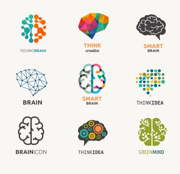
I decided to stick to my most positive trait; creativity/innovation as I feel like this most strongly represents me and my brand the most. I really liked the below image of multiple brain logos showing the visual representation of all the neurons zapping around the brain representing a sense of overflowing creativity and ideas.
![]()
Once I had the general idea of my visual marque direction, I decided draw detailed sketches and map out all the different ways I can artistically create a brain as simple as possible.

I really enjoy all these sketches, although I like 6 the most because it is more abstract and simplistic than the rest. The left side shows a brain and the right shows a neuron. I am overall happy with with the final sketch and how I maintained abstractness yet still retaining vital information. I will now begin to digitize the sketch.
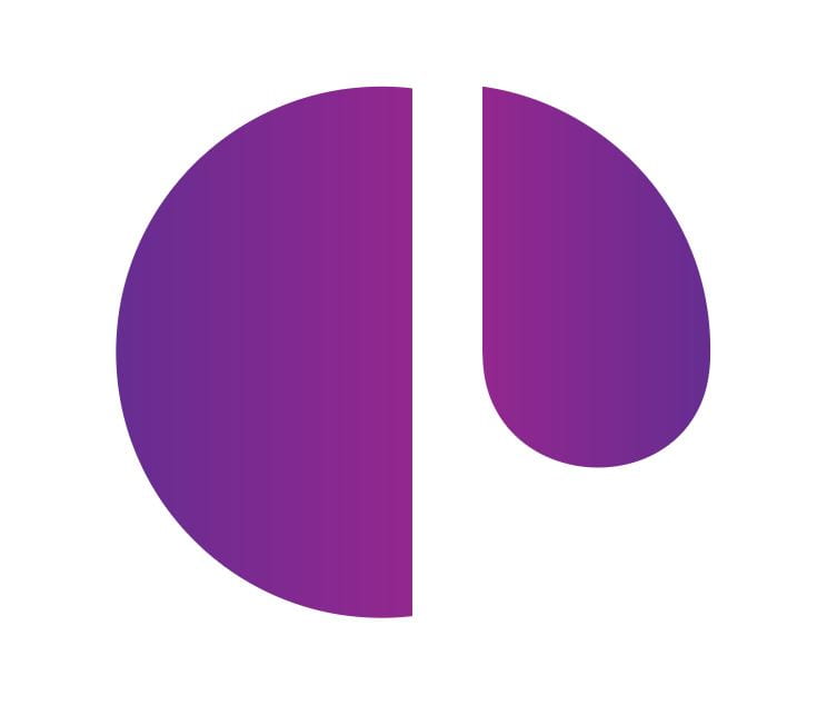
Feedback / Final
During Week 7 critique class Daniel pointed out various problems with my visual marque such as it’s hard to understand or visualize it as a brain and it can also be mistaken for letters p, a, etc.
After carefully planning and deciding the fate of my wordmark I decided to ditch the old design and pick a new one. I created a new brain which is a little more clearer than the last one. I really like how the new brain design has turned out as it’s eye-catching, consistent with my wordmark and monogram’s artistic style and shows all the pathways in which ideas can take.
