As discussed my plan now is to change the layout of the e-book to more of a comic book theme, I have began to do this to put into my presentation for IXD301 for Kyle. Below are the images of the pages I have began to edit and change, this is still a work in progress as I really feel they are not done yet, but this is what I have been experimenting with.
Developed pages


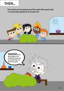
What works?
- I feel the speech bubbles and intro block ‘then’ really work, the white really brightens up the pages
- I also think the large text in areas work for example ‘NOOO’ in bold and larger lettering works well and stands out
- I like the middle page layout with the panels, I feel this relates to comic books more and is fun to read
What does not work?
- The black lining for the panels on some pages doesn’t work, some panels are too large and it does not really look like a comic book
- The text in some ares is still to squished and it is hard to read
- The spacing is wrong in some areas – there is too much or too little
- There is too much text in one speech bubble at times – this does not work
- It still feels unfinished
Reflection
So the next step for me is to keep experimenting with this comic layout style, I am not happy yet and feel there is still lots to do but I am glad I have made some progress with this approach. I am going to continue working on Figma to try and complete this e-book/comic and also test it out for research and to see if it has been successful. I like the development stages of this process because I like the process of saying what works and what doesn’t, I feel I am a very self aware designer and am not afraid to admit when something isn’t right or finished. This is something I feel is not complete and I can create a better layout for.