Week 3 – Portfolio mockup critiques
This week we had a small class critique were Kyle gave his thoughts and advice on our portfolio website mockups. I had to have at least three pages to show and I uploaded my mockups to the class Miro board, where my whole class posted their work, below I included the work that I posted for the critique.
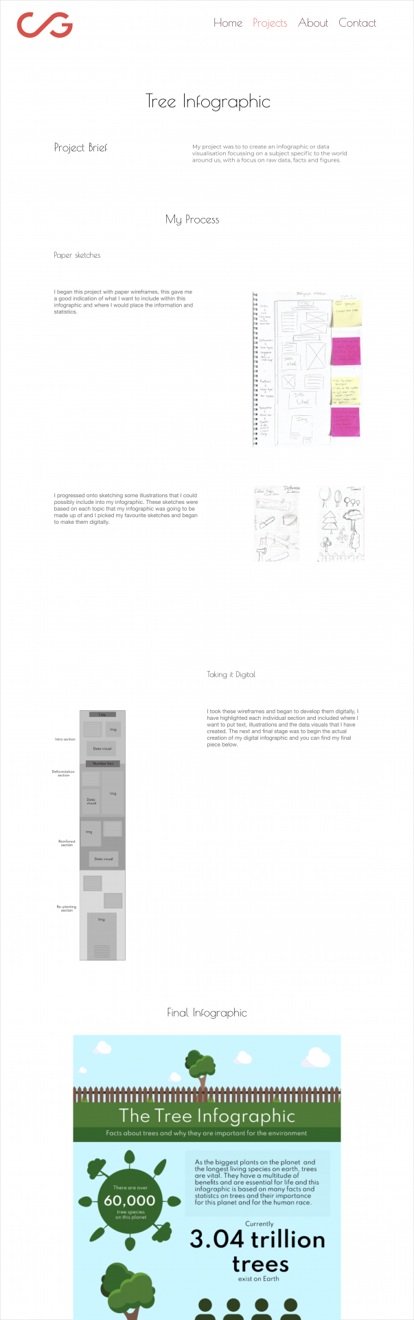
My mockup screens-
I made these mockup screens on Figma.
Home page options
I couldn’t decide what homepage to chose from so I included 4 different designs.


Portfolio page

About me page

Case study page
Miro board-
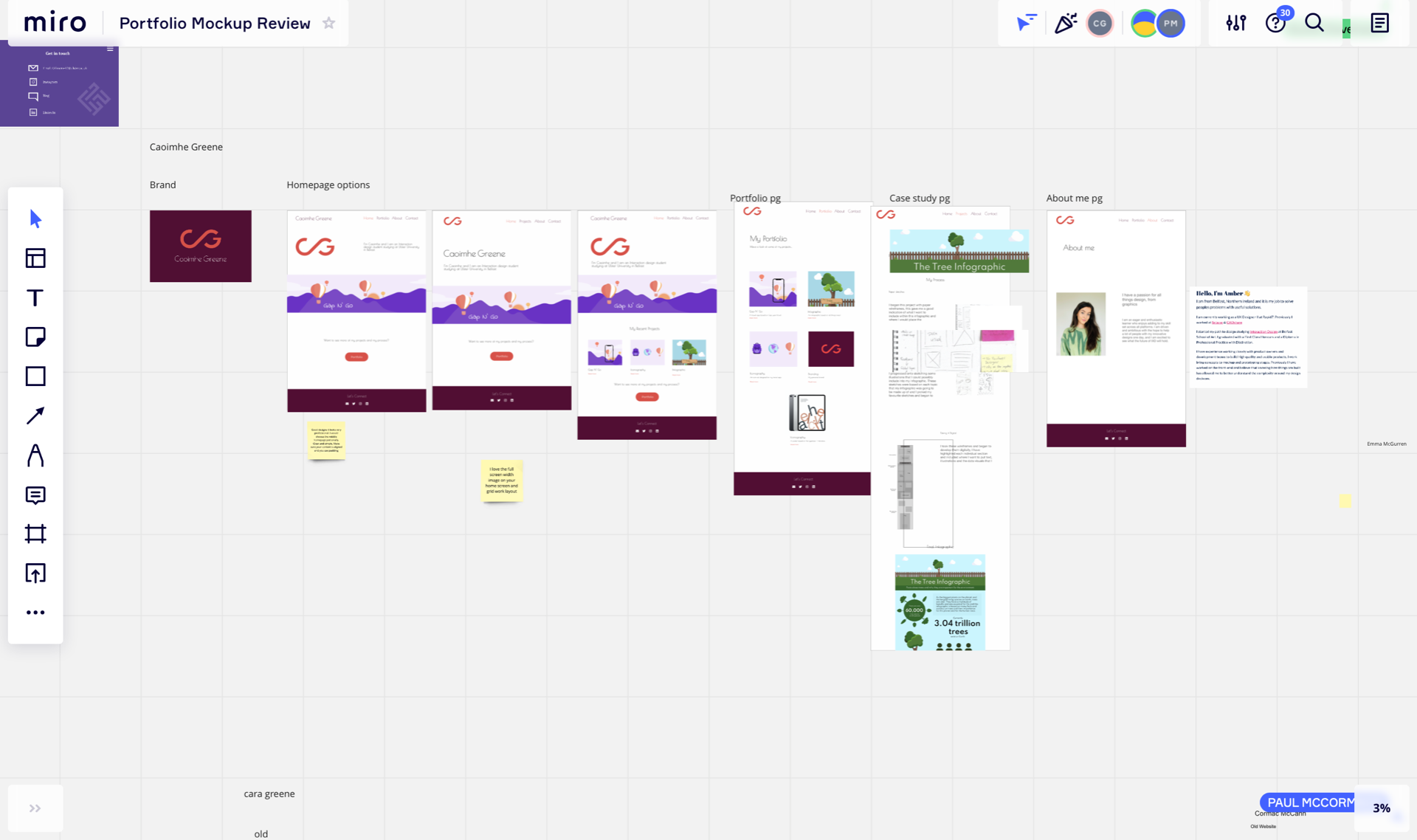
Kyle and Paul both gave their opinions on aspects they liked about my mockups and they also advised me on things I need to look at again and elements of my mockup that I need to change in order to get a better more successful portfolio design.
Things I need to look at again:
- homepage layout- the preferred the homepage with my work mark above the banner
- remove portfolio page and put all of my work on the home page
- add more to about page
- add more detail in case studies- e.g. text and sketches
- ensure everything is aligned
What is next?
So moving forward from week 3 I need to take the notes on board from Kyle and Paul and begin to build my website. I will use Webflow to create my website and this will give me the ability to add in all of my desired features and content. Before taking it to Webflow I want to do some more sketches and wireframes with the suggested changes to see how they will look, I will update my blog with all of this progress.
Reflection
I enjoyed seeing my peers work and hearing Kyles and Pauls thoughts about their portfolios and the work we have all done as well as my own. It was a beneficial task and I learned a lot from listening to the other critiques, it was also beneficial to provide my own opinions to my peers using sticky notes. I feel much more confident in my approach now and I feel as though I am ready to begin building my site and create a successful portfolio.