Information is Beautiful by David McCandless
I wanted to get some first hand research for my infographic project and what better way to do so than with a book! In one of our lectures Paul recommended that we read Information is Beautiful by David McCandless so I decided to give it a read.
About this book
A visual guide to the way the world really works every day, every hour, ranging from television, from newspapers and from the internet. This book us into graphs and maps that anyone can follow at a single glance. it is said to be the ultimate book for visual thinkers.
My thoughts and some of my favourite visuals from this book
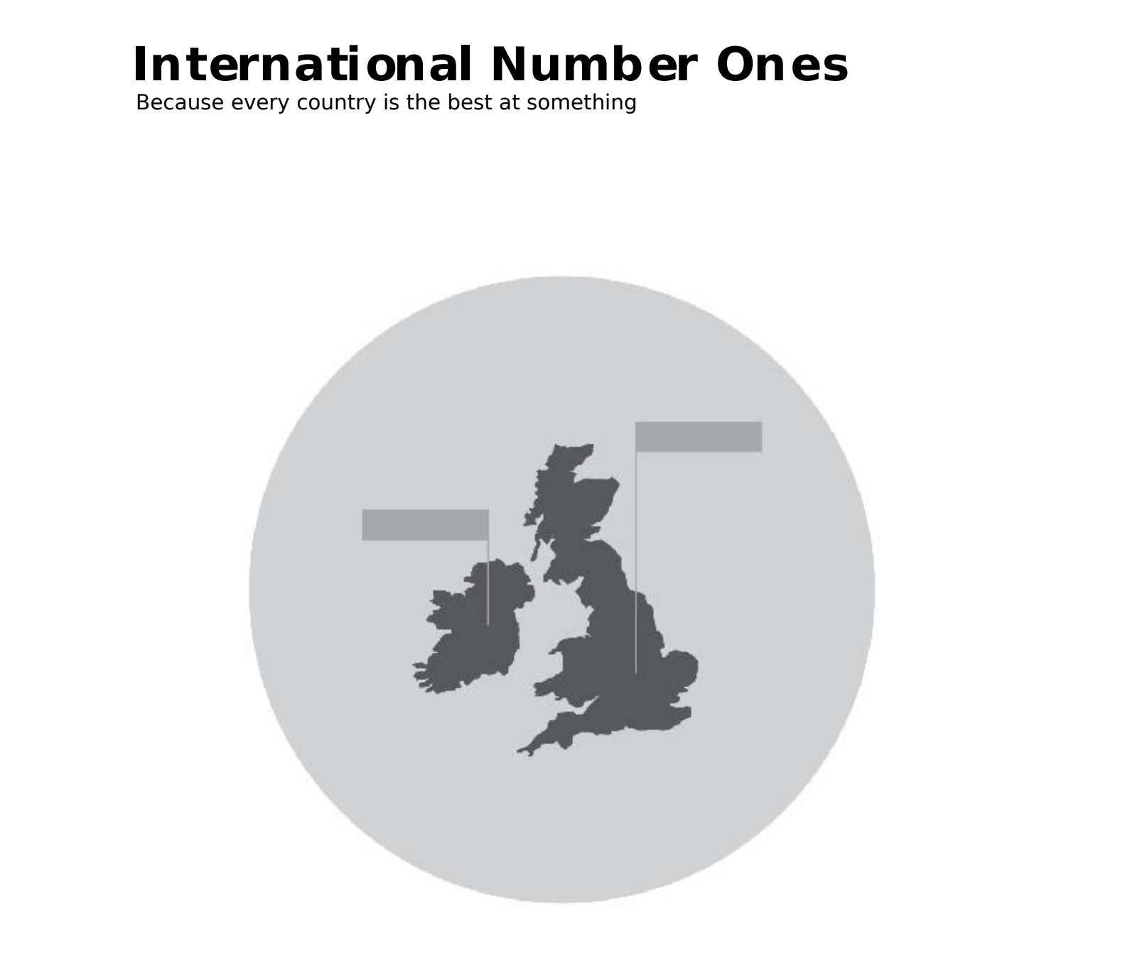
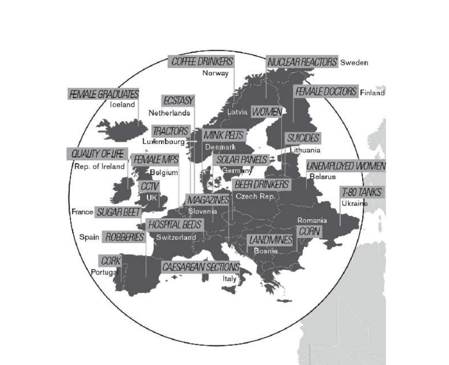
International Number Ones
I really enjoyed reading this section I thought it was fun and interesting as it describes what each country is number one in, some of the data was absurd and random while others more serious, e.g. Mexico is number 1 in televisions while the USA is number 1 in Serial Killers. The down side to this particular visual is that I would have preferred more colour in the illustrations.
The true sizes of the continents
I found this section also very interesting, McCandless shows here the real size of the worlds continents and I actually was not aware of their real size and land mass of some parts of the world. This shows me that information can be misleading but data visuals can present facts in simple and easily understandable ways! I love the colours here in this visual also.

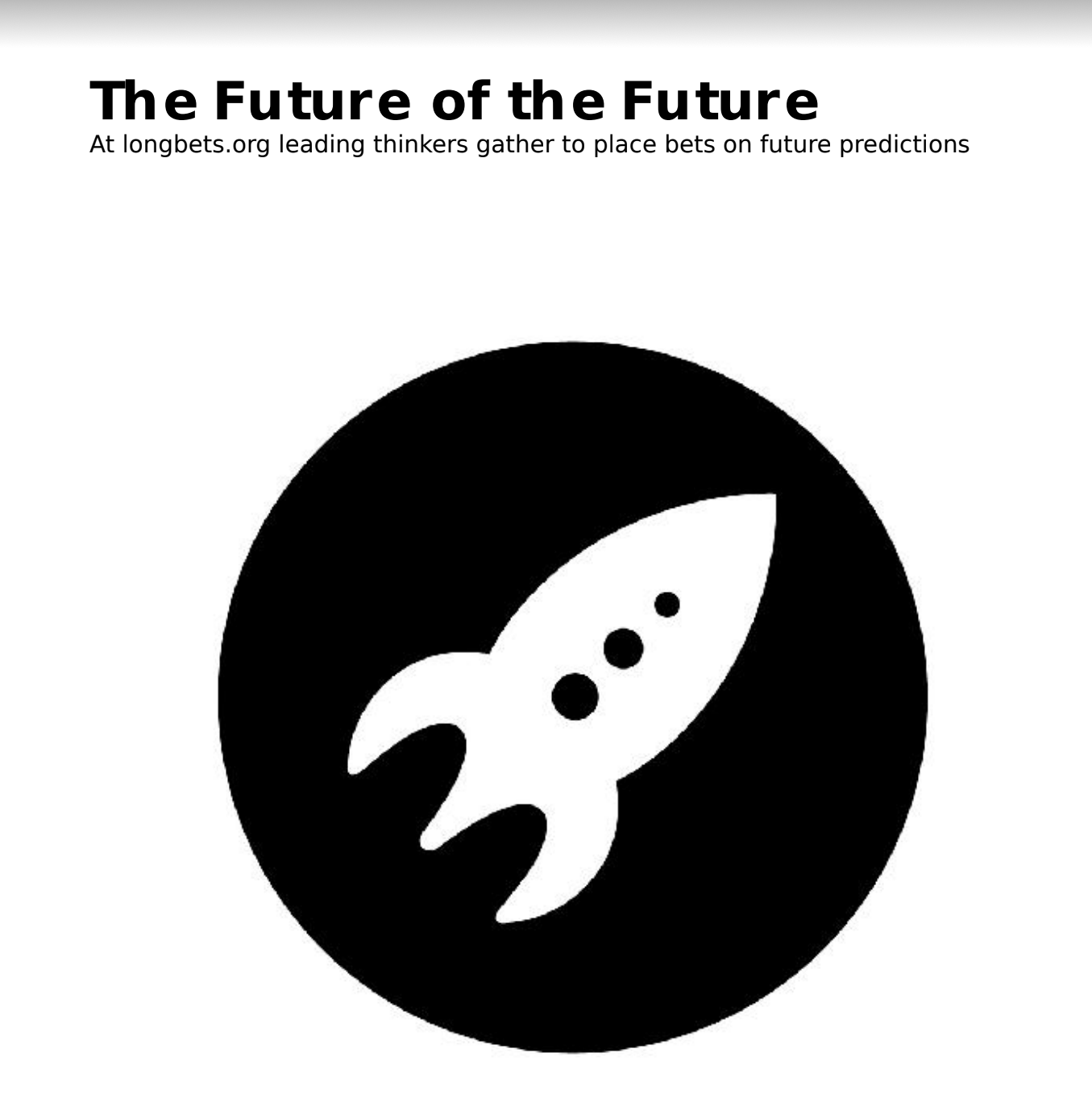
The Future of the Future
I found this section the most intriguing, it was interesting to see their predictions for 2020 in regards to space and now we are actually in 2021 and most of their crazy predictions didn’t come true. This got me thinking about the future and in this section McCandless has predictions that go up to 2100, so who knows if any will come true…

Types of information visualisation
I found this information below at the end of the book, I think this will be very helpful when it comes to designing my own infographic and I reference back to this and I will consider using some of these techniques to create diagrams for my data and facts. This will give me some a good range and some variety to separate out information.

What did I learn?
From researching this book I have learned a lot about random facts from all across the world! I really enjoyed reading this book and observing as a I am very much a visual learner, each data visual was quick to read and easy to understand. I learned some very interesting and random facts which made me laugh, while other data and information made me stop and think what I had just read. I enjoyed the ease of this book and how he structured it, it didn’t feel like I was reading and I liked how different data was presented in a range of different diagrams and visuals including bubble charts and word clouds, which I will definitely revisit when I come to designing my own infographic. Maybe the illustrations could have been a bit more exciting and colourful to match some of the absurd and random data. In conclusion David McCandless really does showcase that information can be beautiful!