Don’t Make Me Think is a book by Steve Krug about human–computer interaction and web usability. The overall goal of the book is that a good UI should let users accomplish their goals and navigate the website/ software as easily and quickly as possible.
within the first couple of pages he explained that when designing a website, its easy to assume the user reads everything on the page carefully, taking in all of the information before clicking. However, the reality isn’t true. Users will instead glance at each new page, read some of the text, and click on the first link that catches their interest or vaguely resembles what theyre looking for. There are almost always large parts of the page they don’t look at.
He used a great analogy of that we should be imaging the users going past the website at 60 miles an hour rather like a billboard rather than someone reading great literature or looking at art.

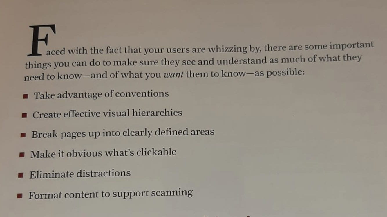
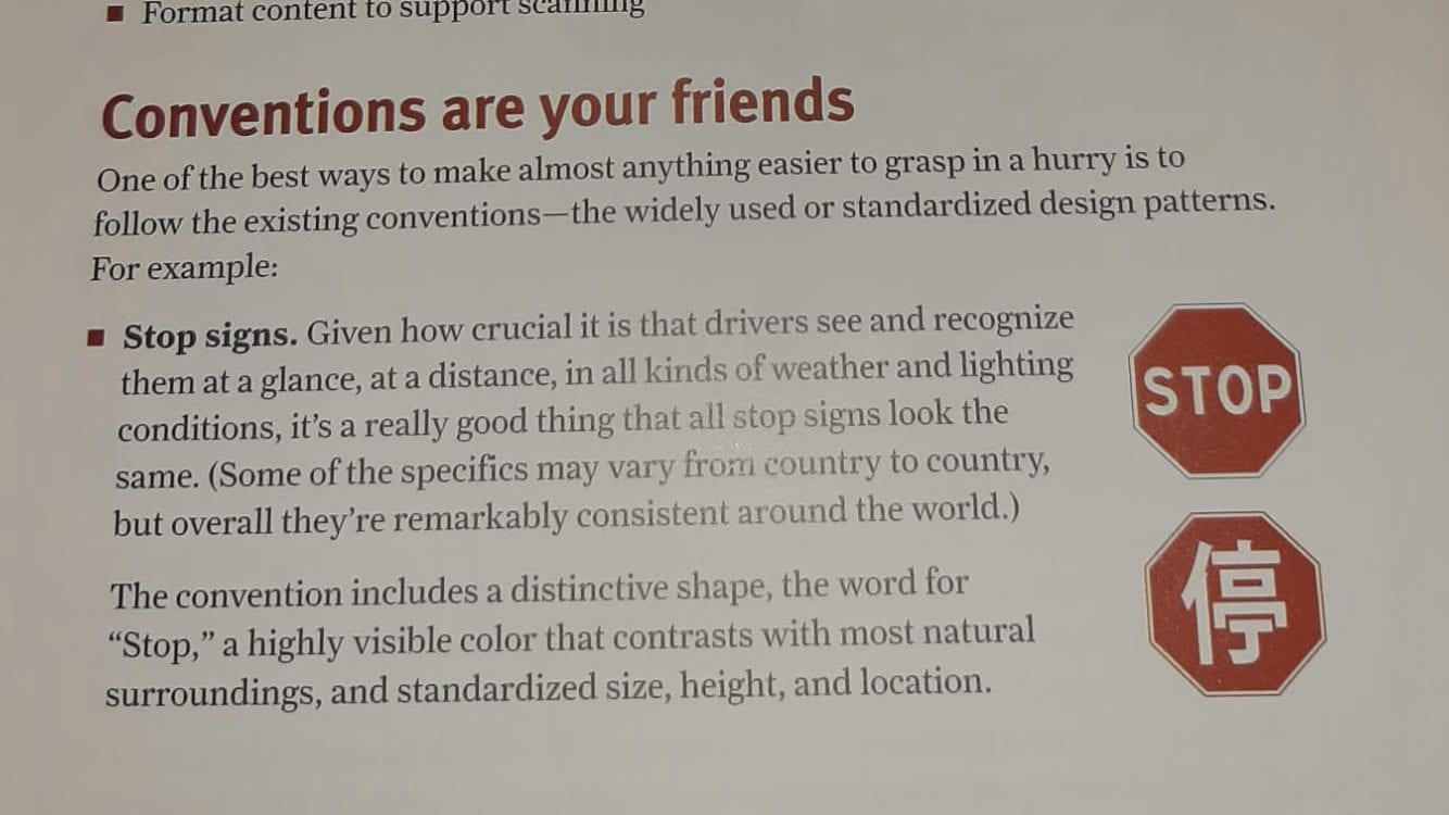
He drew attention to the fact we need to be using visual hierarchy in designs and using headings to accommodate for their scanning of information, and how certain buttons should be similar to road signs in order for the user to see them as quickly as possible:
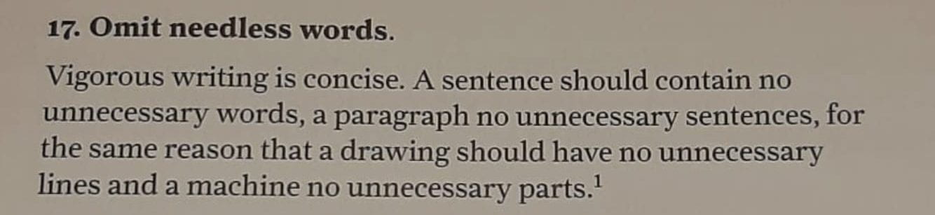
Krug draws attention to the fact that too many words on a webpage will drive the user away from using it again, this is because it will take the user a longer time to find what theyre looking for.