My chosen song:
“Weight” – Brockhampton
My chosen lyric
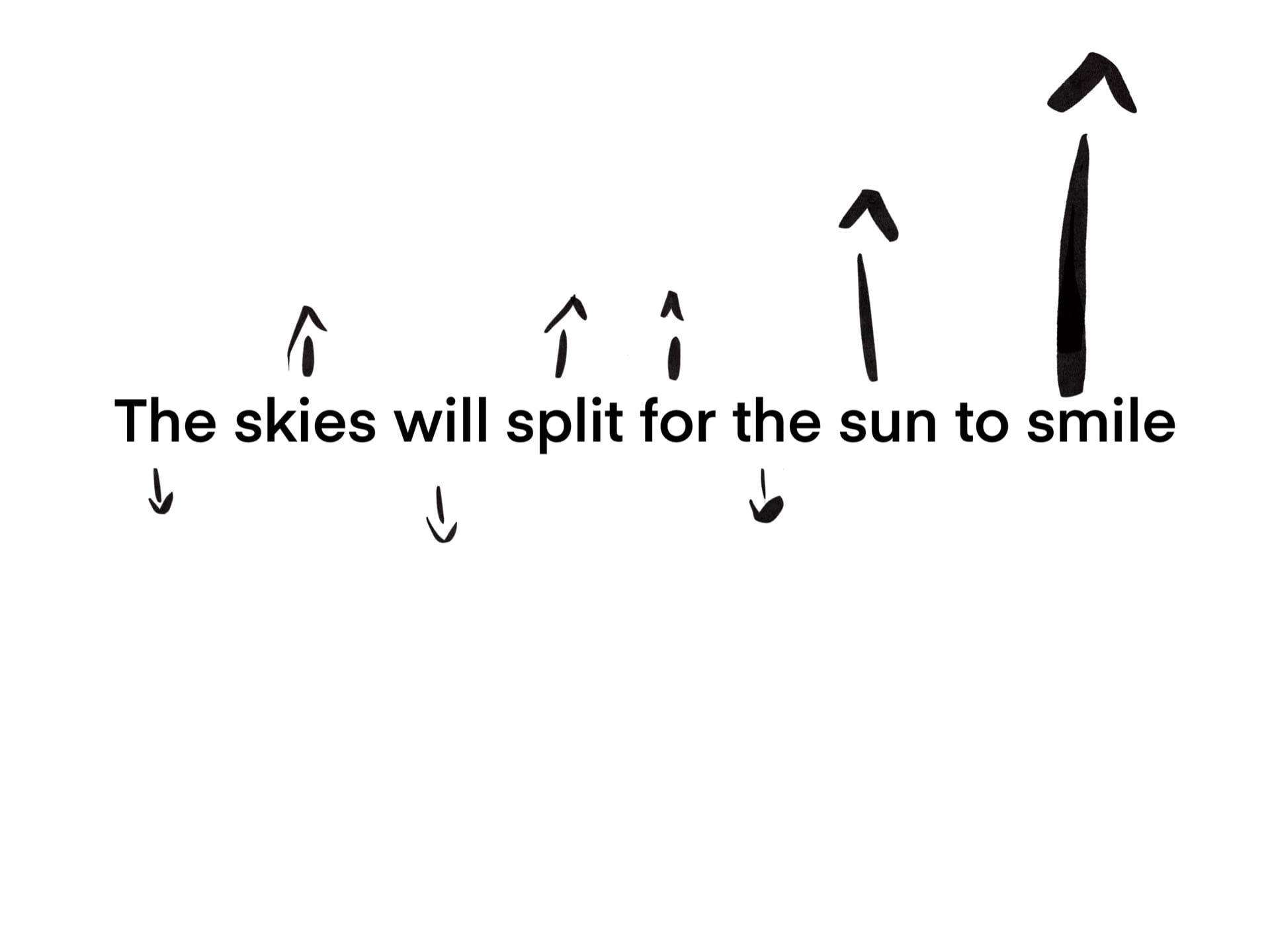
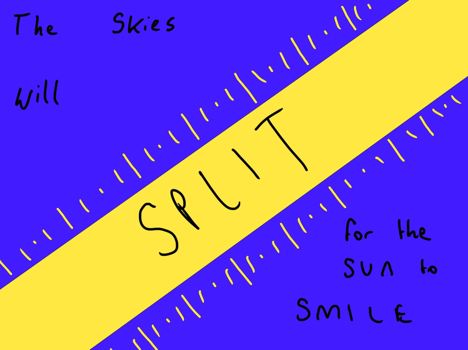
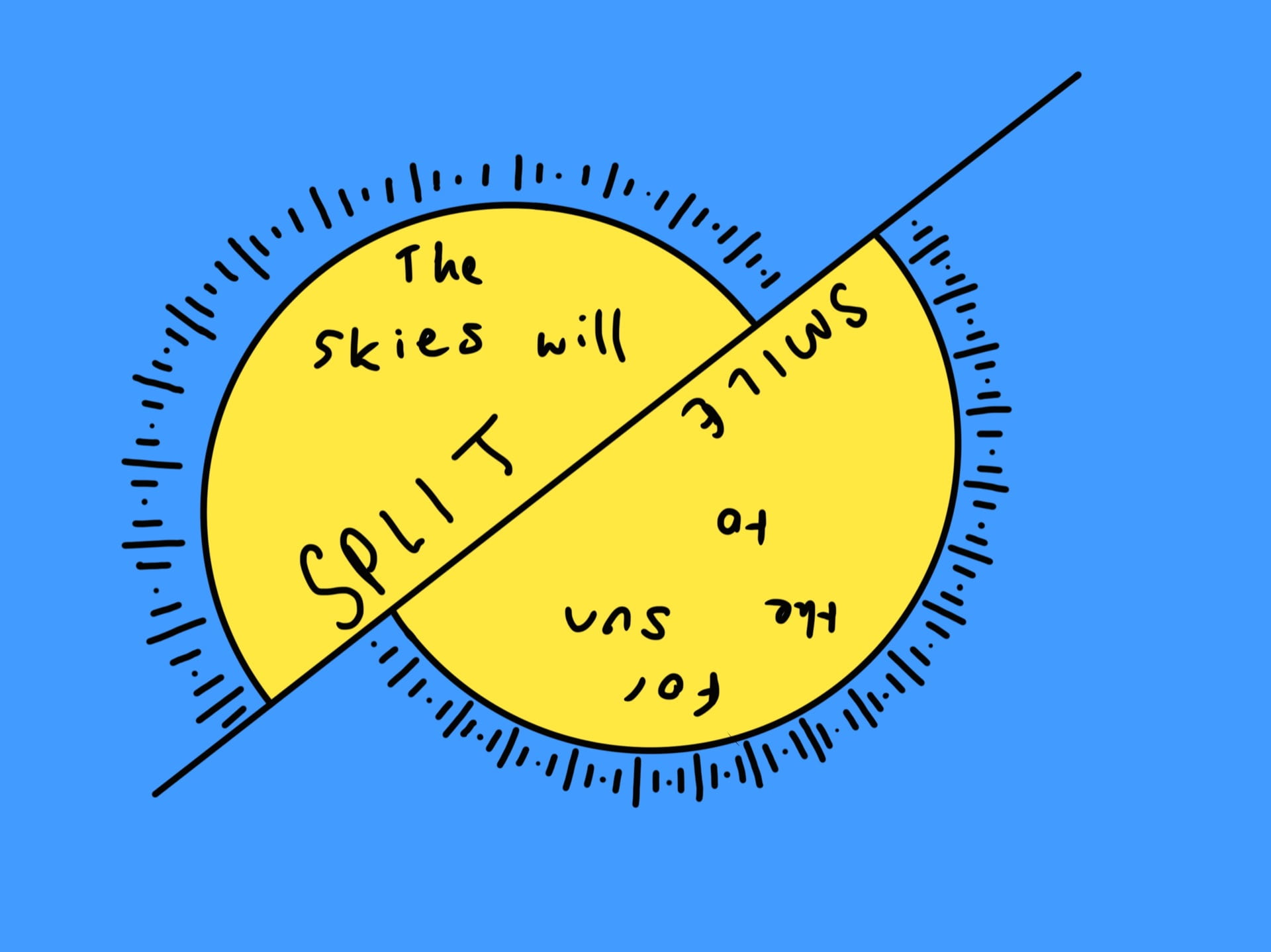
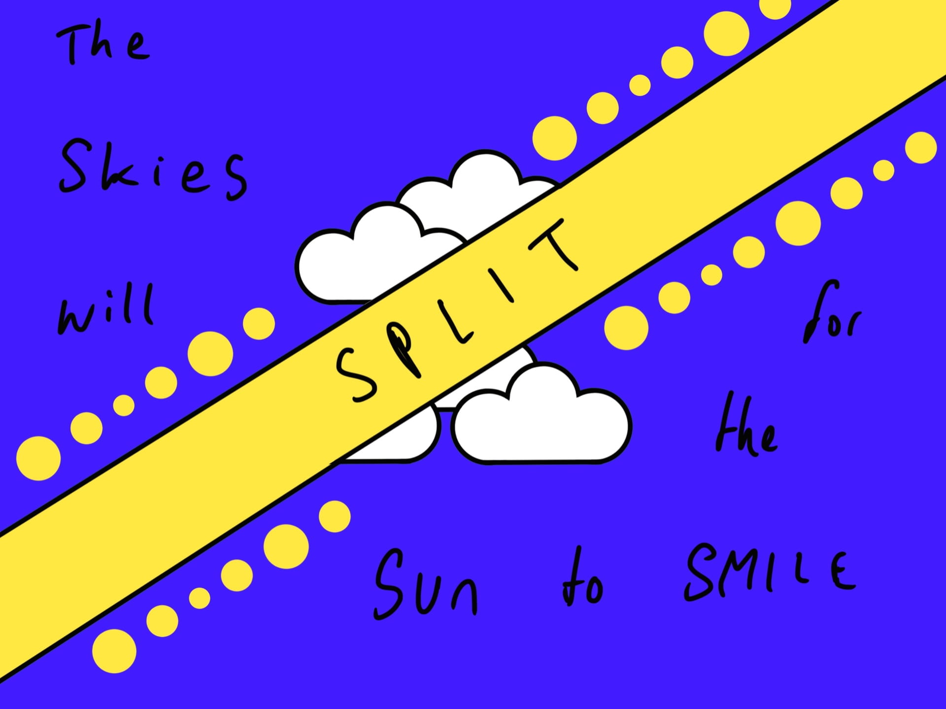
“In due time, the skies will split for the sun to smile”
Brainstorming possible imagery with a mind map:
Establishing key imagery:
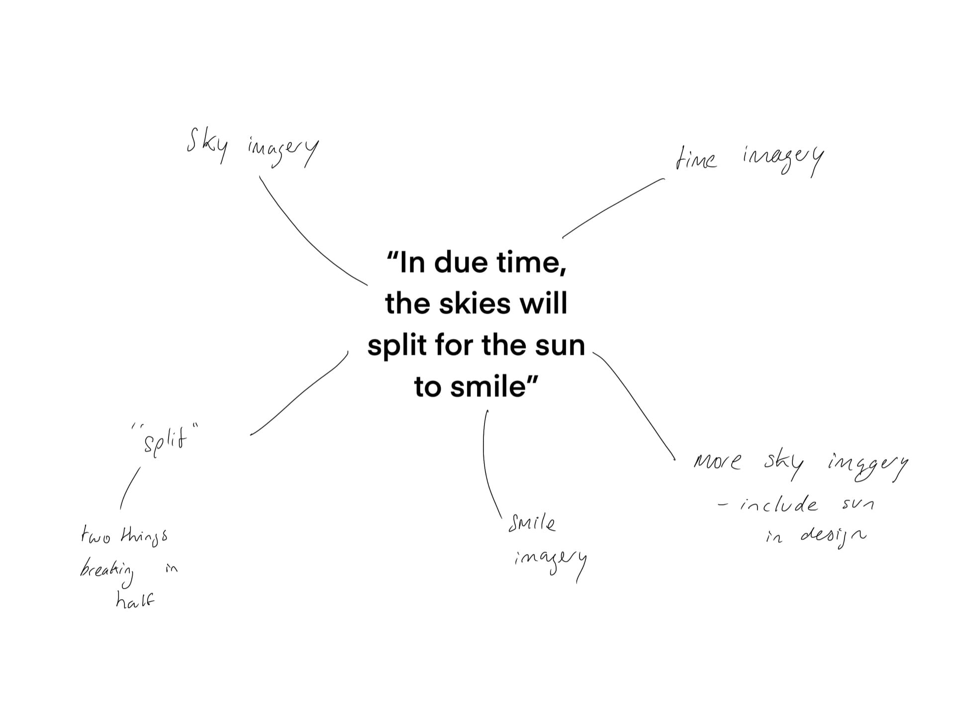
Drawing from that:
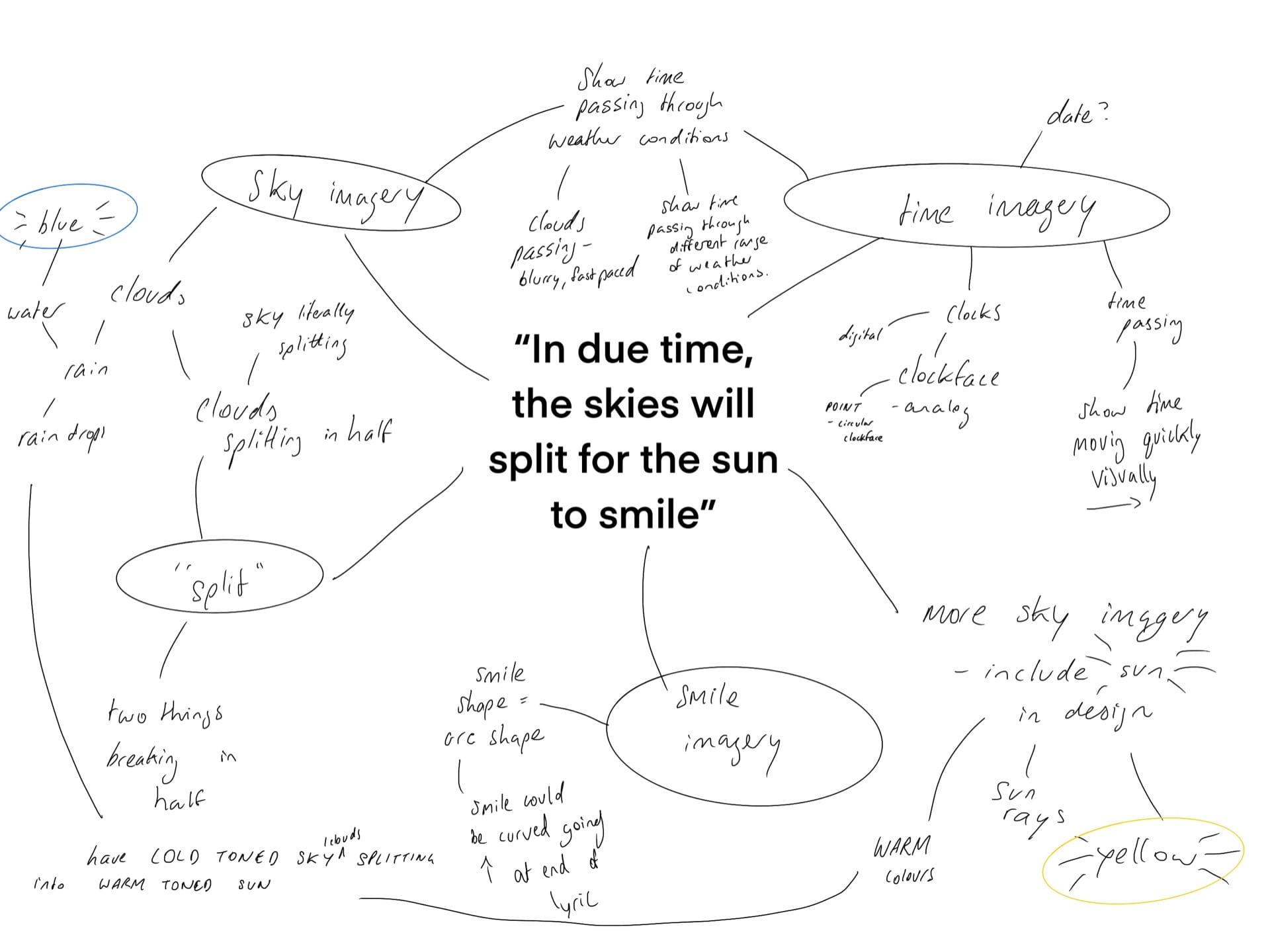
Establishing imagery:
imagery idea #1
Include yellow and blue/ warm tones and cold tones for the contrast between the bad time period and the good which will eventually come with time
imagery idea #2
Clouds/ the sky splitting in half – have cold toned sky and warm toned sun rays peaking through it
imagery idea #3
Time imagery – show passing time through a lot of different weather conditions or else blur the clouds to show speeding up time
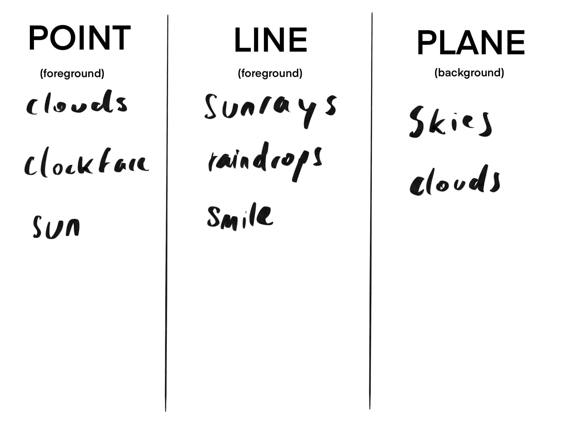
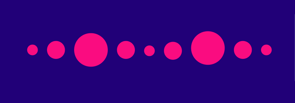
How point, line, and plane can be incorporated into the imagery:
Skies: plane
Clouds: points
Clockface: point
raindrops: line
smile: line
sun: point
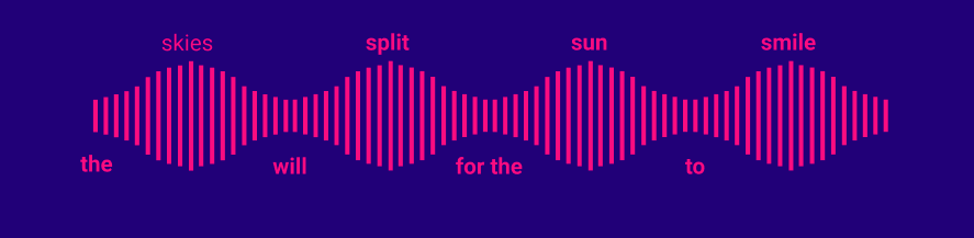
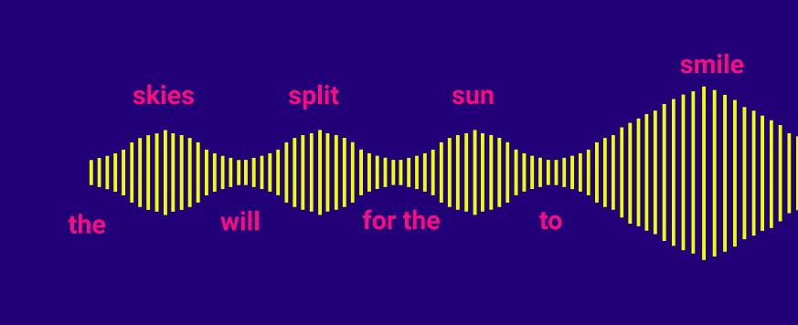
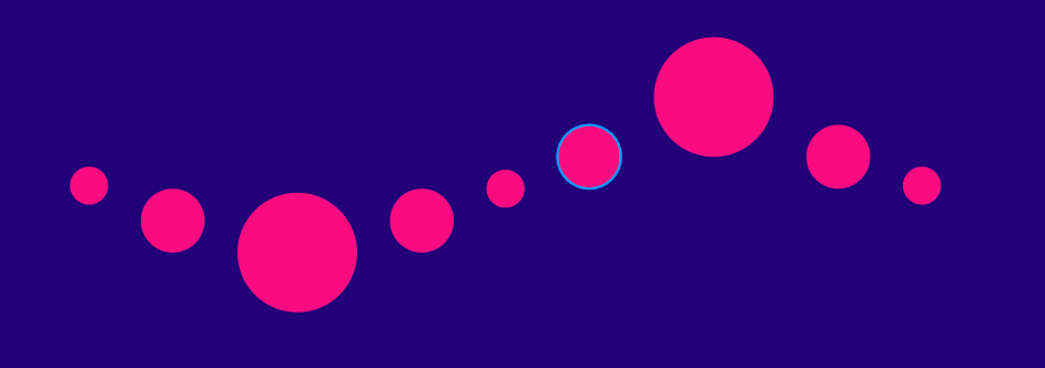
Analysing the pacing of the song:
Overall the song has a sad tone but also with hopeful undertones throughout. However as it progresses the singers speed up and themes of hope are explored. I think lyric represents this very well as his pitch goes up and down before eventually coming out on top with a high, positive note on the word smile.
Employing typographic hierarchy // Methods of emphasising certain words
The fact that the words go up at the end makes me think I could include some sort of imagery around “smile” to add emphasis. The way the words go up and down in pitch leading up to the end could also be drawn in some sort of wave shape or I could use typographic hierarchy to make the words going up appear bigger and the ones going down to be small and more understated.
I really like for example how Paula Scher uses many different methods to create emphasis on certain words in these pieces of work: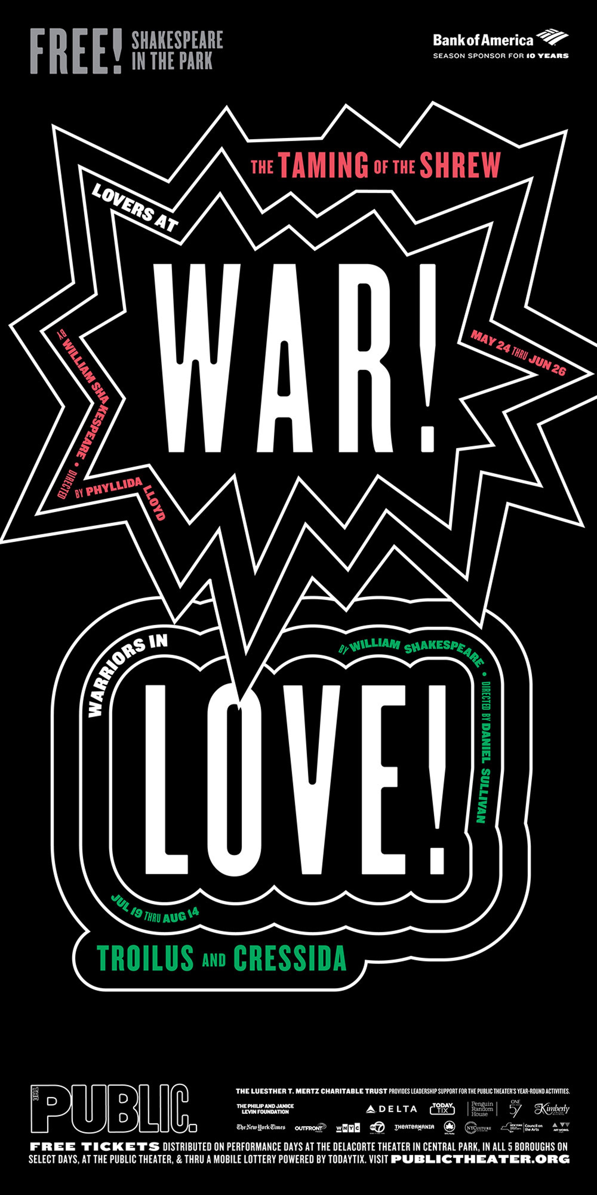
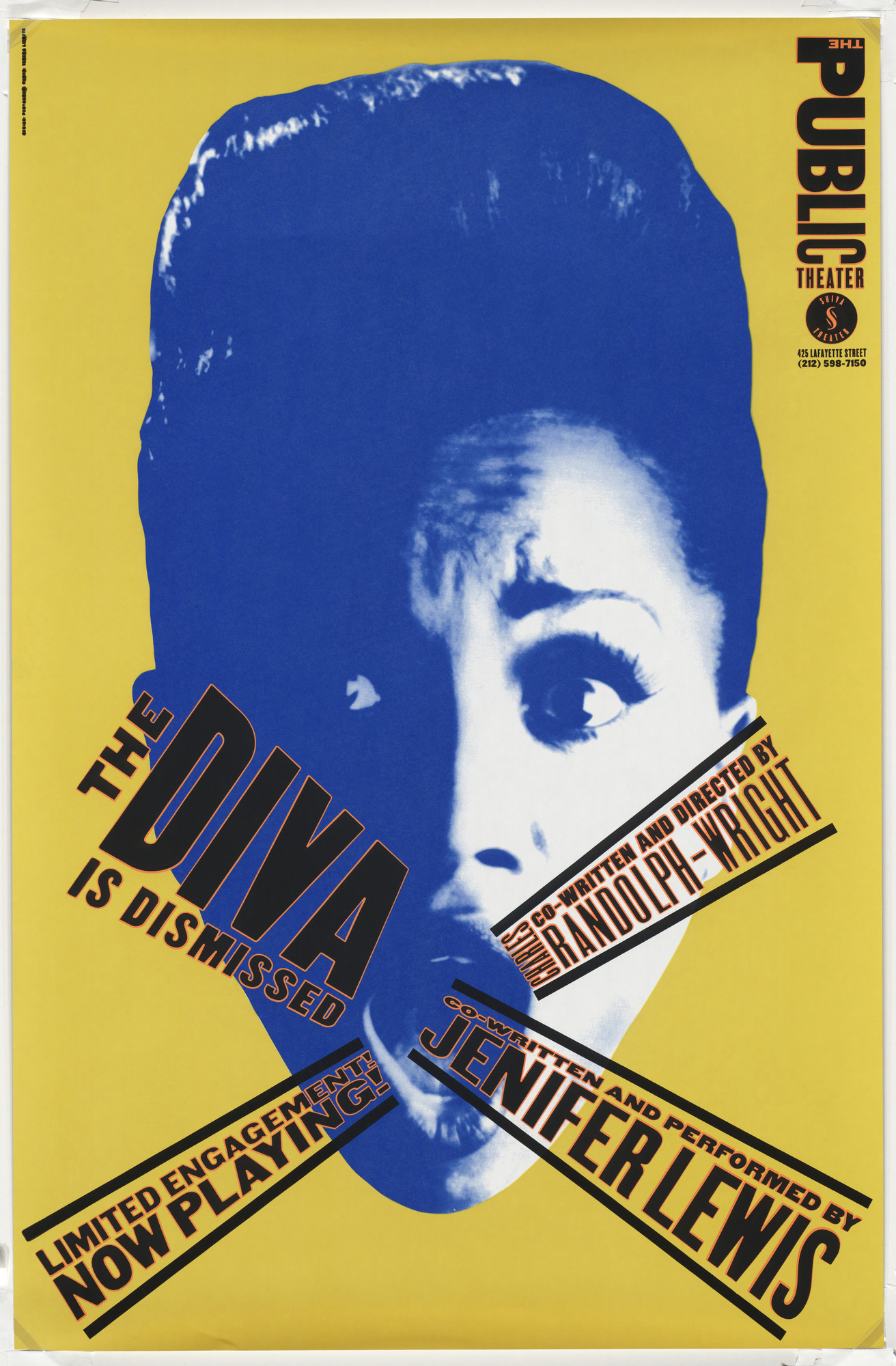

In her “The taming of the shrew” poster she uses simple, repeated outlined shapes to create emphasis in the centre, and in this second poster she extends the width of certain words to add emphasis. In the final 3 posters I’ve attached she has created emphasis by stretching certain words to fill the page from left to right and keeping other words very short and squashed.
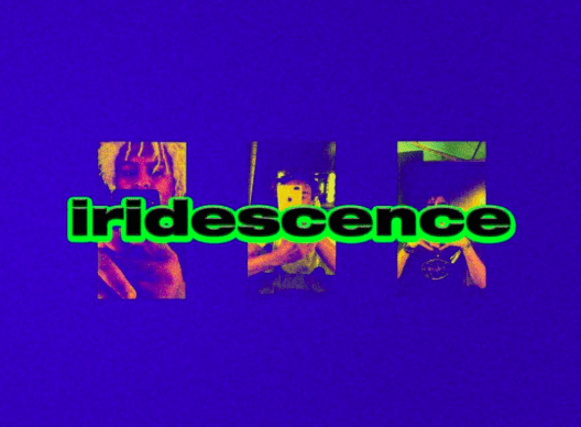
Understanding Brockhamptons visual identity:
Brockhampton have a very specific style of graphic design for every album that they release. I thought ut would be useful to analyse how they make up this specific aesthetic of their third album “Iridescence”.
Moodboard:
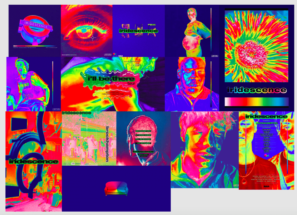
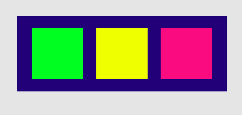
I gained a sense of what colour theme I should be using by creating this mood board. On reflection I found that they mostly use a dark background that ranges from, royal blue to indigo. The main element colours will range between neon pinks, greens, yellows and cyan and there is a very high level of contrast. They create a heat camera effect on all of their photographs used- however I’m going to try and use mainly illustratory shapes, making use of point, line, and plane elements in my own poster which I think will be a challenge.
Colour scheme:
Experimenting with point, line and plane in order to portray pitch and rhythm:


Sketching out layout ideas:
Typography used by Brockhampton:
very thick, chunky sans serif typography is used in their graphic design style. in iridescence a thick stroke is used around the letters too:
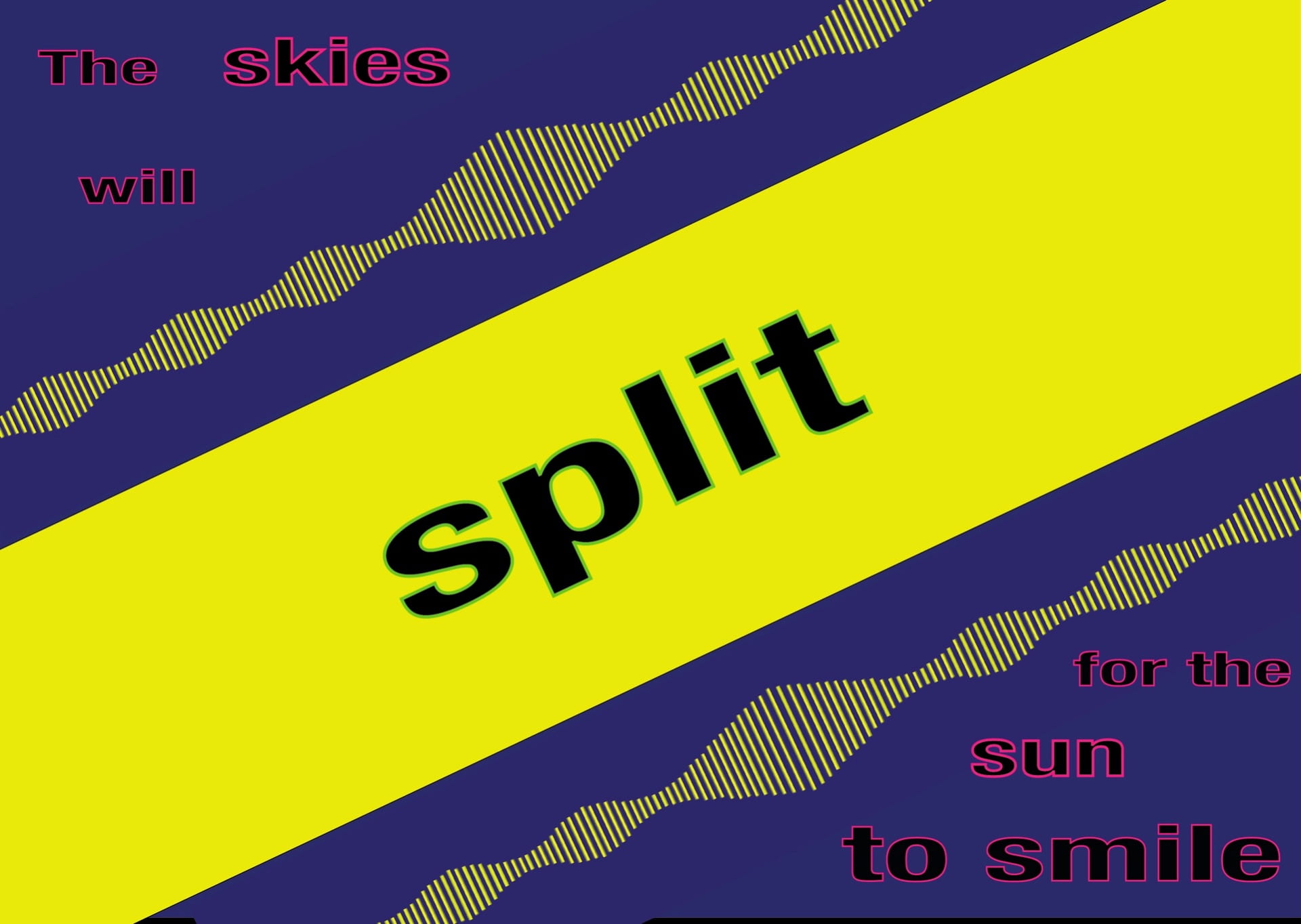
My final design: