Experimentation with typography in Figma:
In Mondays class we were given the task of changing characters appearance by adding or subtracting material from them. I chose a capital B and R for this exercise:


He also showed us how to change the shape of the letter itself by turning it into a shape and then altering the edges. In order to do this on Figma I turned it into a graphic by clicking outline stroke and then double clicking the letter:


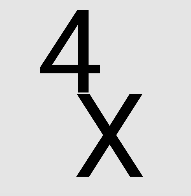
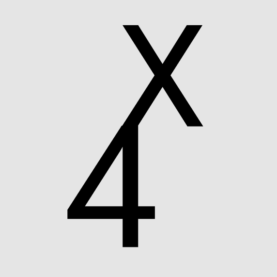
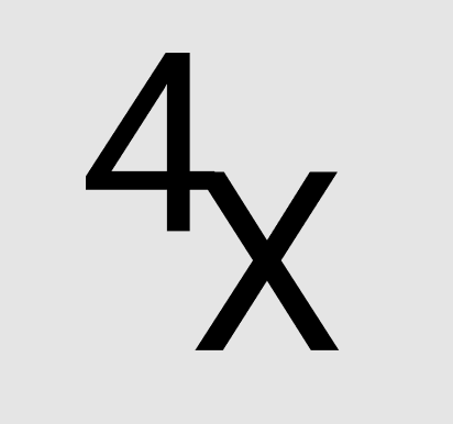
The next exercise using Figma was influenced by the work of Kunz and Weingart; we were asked to combine two letters or numbers in six different ways:


Typographic hierarchy:
During this lecture we also learned about how certain text should be given more emphasis depending on how important it is (using sizing, weight, typefaces, alignment, colour, spacing, and order in which its placed in). Reading the article – “typographic hierarchy” by Mandy Brown helped explain this even more, and I now understand the order to follow when implementing it.
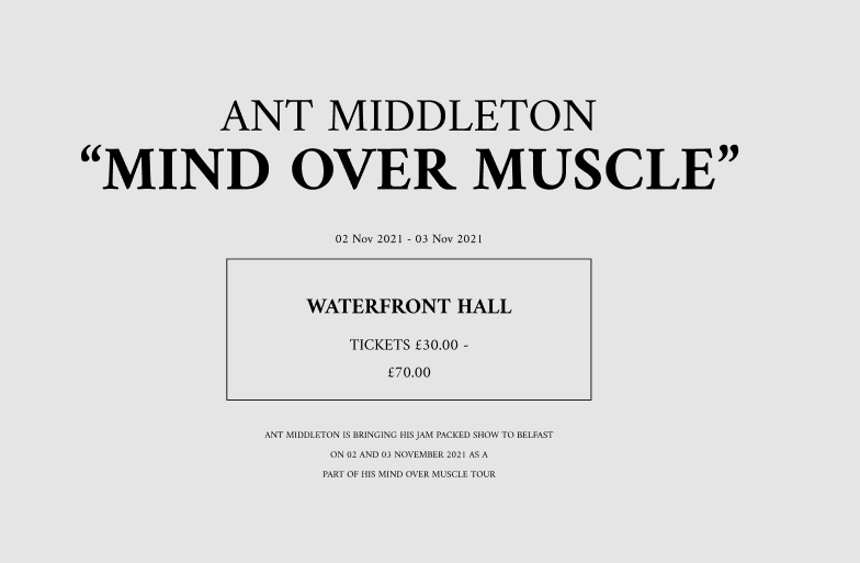
Pauls third task was for us to implement typographic hierarchy with the text from a tour poster:
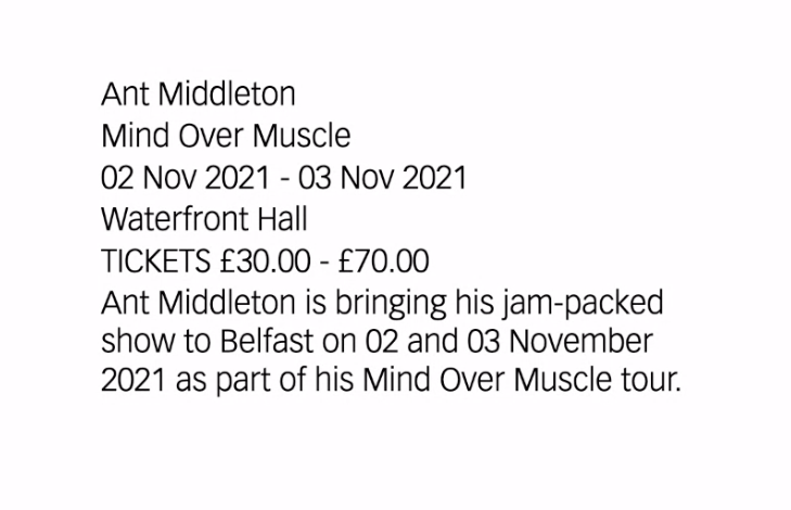
I felt that the artist name as well as new release title should be the things to draw the most attention and catch the audiences eye. The place as well as the ticket price to me were the second most important in the poster as they were informing the audience of how to purchase the tickets. If people are interested in the event and the artist they have the choice to look further into the poster at the date as well as the description.