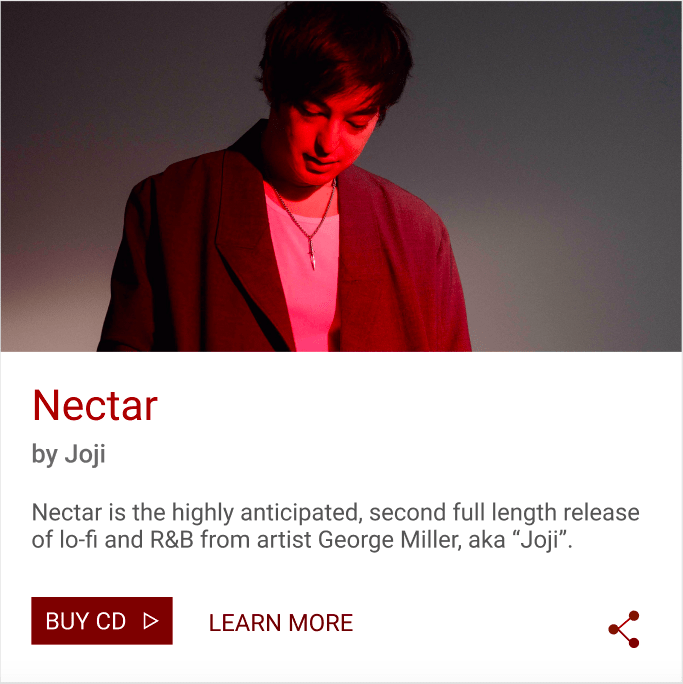
(My own UI card)
In Mondays lecture we were given the task of creating a simple UI card in Figma with the purpose of advertising a Spotify artist. During this exercise we were encouraged to stick to a specific layout and maintain the same measurements, line weights, alignments, and font sizing/placement as the example UI card Paul created. The only way in which they were to differ was the colour theme (we were encouraged to make use of the colour picker for this part), the description text, the icons in the bottom right, and the photograph.

(Pauls example UI card)
We used the “Material Design” website (material.io) in order to better understand how cards worked. I found this website to be really interesting and I think it might prove to be very useful in the future as an interaction designer. It’s a design website created by Google to help teams build digital experiences for Android, iOS, Flutter, and the web.
In this case we were using Material.io to learn about “cards”. I learned that they contain “content and actions about a single subject.” and that elements (like text and images) should be placed on them in a way that clearly indicates hierarchy. Their purpose is to convey a small, summarised description about a subject/ person/ company.
Layout and what’s included in a card:

1.) The container – The container holds the cards elements and its size is determined by the space they occupy.
2.) The Thumbnail – Cards can include thumbnails to display an avatar, logo, or icon.
3.) Header text – Includes things like the name of a photo album or an article.
4.) Subhead – Subhead text can include text elements like an article byline or a tagged location.
5.) Media – Cards can include a variety of media, including photos, and graphics
6.) Supporting text – text like an article summary or a description.
7.) Buttons – Cards can include buttons for actions.
8.) Icons – Cards can include icons for actions.
Content blocking:

To summarise: different content in a card receives different levels of emphasis depending on how important it is. this comes in the form of where it is placed, its size, whether its bold, italic, or underlined, or even its colour and how dark/ light it is.