Communication
Semiotics is the study of symbols, signs and icons, their use and how they are interpreted. Signifiers are the physical forms of signs such as a word, image or sound used to communicate the idea and the signified is the concept that a signifier refers to. From here, the signifier can be broken down in to 3 main features:
- Icons – An icon has a physical reference to the signified.
- Symbols – A symbol is the opposite of an icon, symbols are learned culturally or something learned over time.
- Indexes – An index describes the physical connection between a signifier and the signified. (E.g. smoke cannot exists without fire.)
Within semiotics there are also the principles of denotation and connotation. Denotation is the meaning of a word and connotation represents the social, cultural or emotional meanings linked to a particular sign.
Nike is one of the most recognisable business logos of the 21st century and is a brand that offers athleisure wear and equipment. It was created by a graphic design student, Carolyn Davidson, in 1971. The logo named ‘Swoosh’ represents a curved tick but more than that it represents an arc of movement and motion, symbolising speed. Nike dates back to Greek mythology and was the winged goddess of victory. This could be interpreted as bringing victory to the athletes that wear the brand. In Ephesus, Turkey there is a stone carving of the goddess Nike that I had the luck of visiting a few years ago and the placement of the form is in this arch.
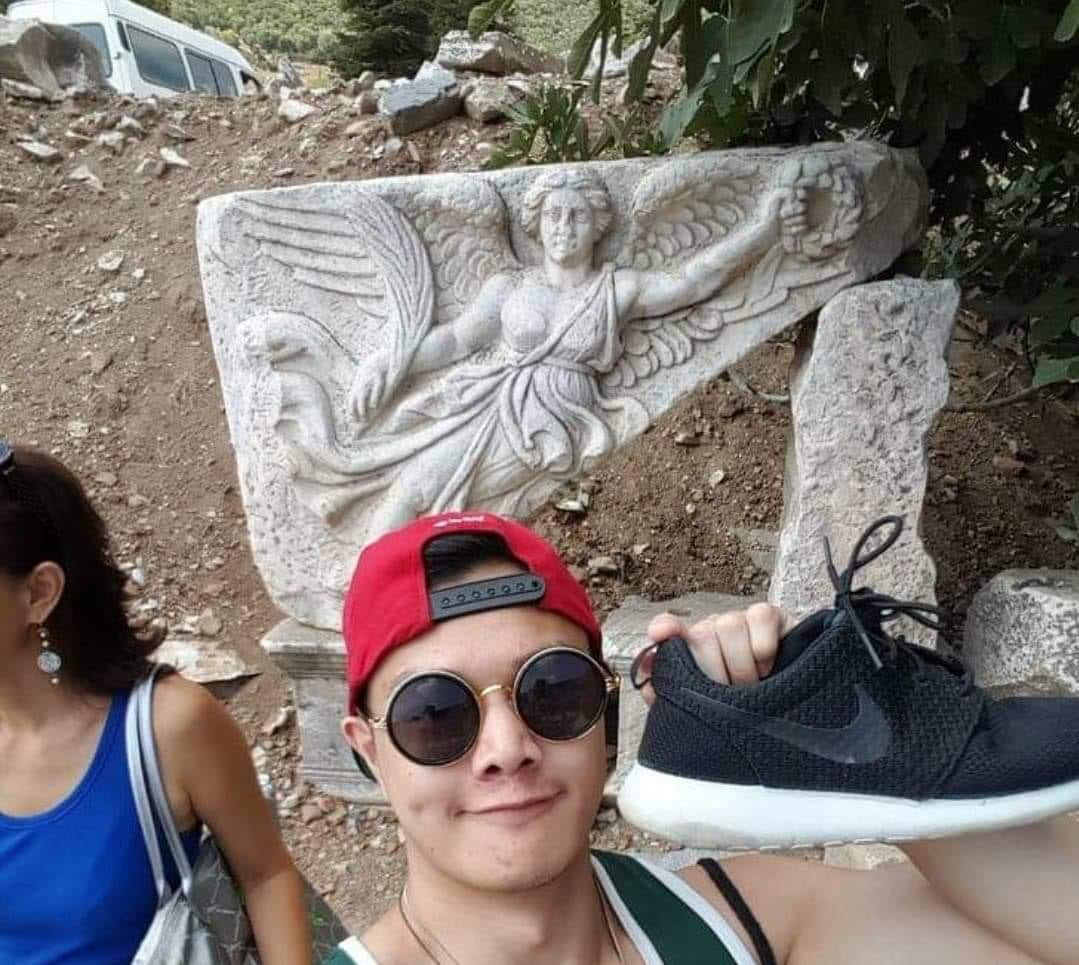

The signified logo was originally red, conveying passion and energy moving to an orange background with white tick then finally becoming the black tick and white background its known as today. The signifier aspect of Nike is its slogan ‘Just Do It’, which inspires their customers with motivation to do what they must and to reach the goals they’ve set for themselves. Although the symbol is very simplistic, it is complex in its meaning, history and the message it conveys to the consumer.
Creating my own logo
When i think of communication, I linked it with togetherness and that’s what I tried to convey with my icons and logos with rise referring to how the mountains rise and how the sun rises every morning but also people rising together. Tied 2 could be an app that gets the tailoring community together with tips and tricks for new sewers. The same theme applies with Conekt which could be a messaging app. The crossing of words conveys this idea of being connected. I’m not sure which logo I would choose but i like the simplicity of Rise.

What is Semiotics? [online] <https://youtu.be/R7VA95JdbMQ> Accessed 16th February 2021.
The Logo Creative. n.d Nike Evolution. [online] <https://medium.com/@thelogocreative/nike-logo-evolution-the-35-swoosh-54bea24fee43> Accessed 16th February 2021.
Visual Hierarchy Blog. n.d. What does the swoosh stand for? [online] <https://visualhierarchy.co/blog/the-nike-logo-swoosh-what-the-symbol-means-and-who-designed-it/> Accessed 16th February 2021.