Susan Kare
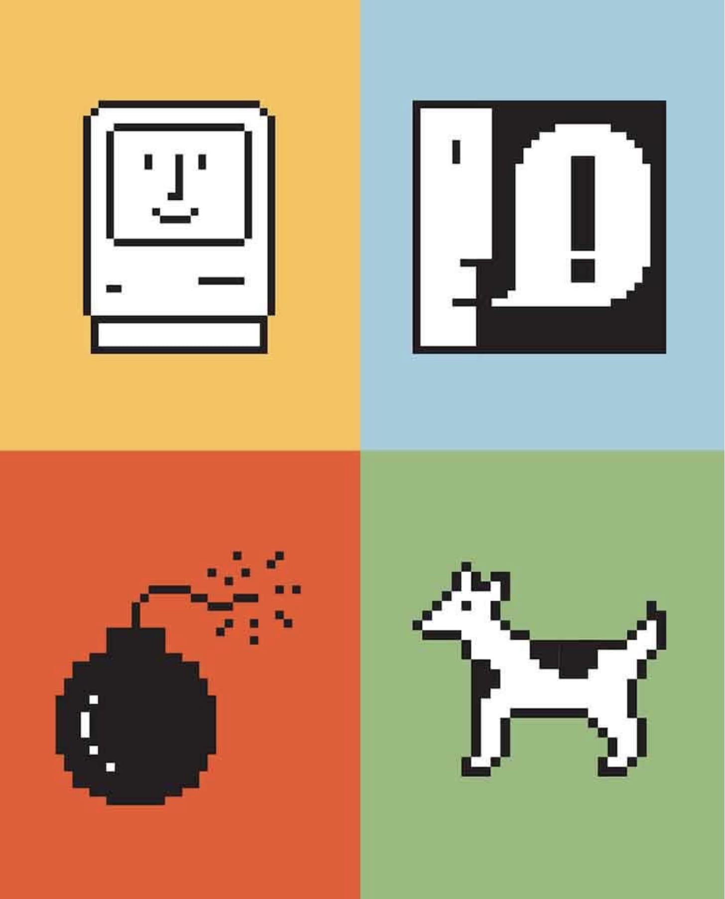
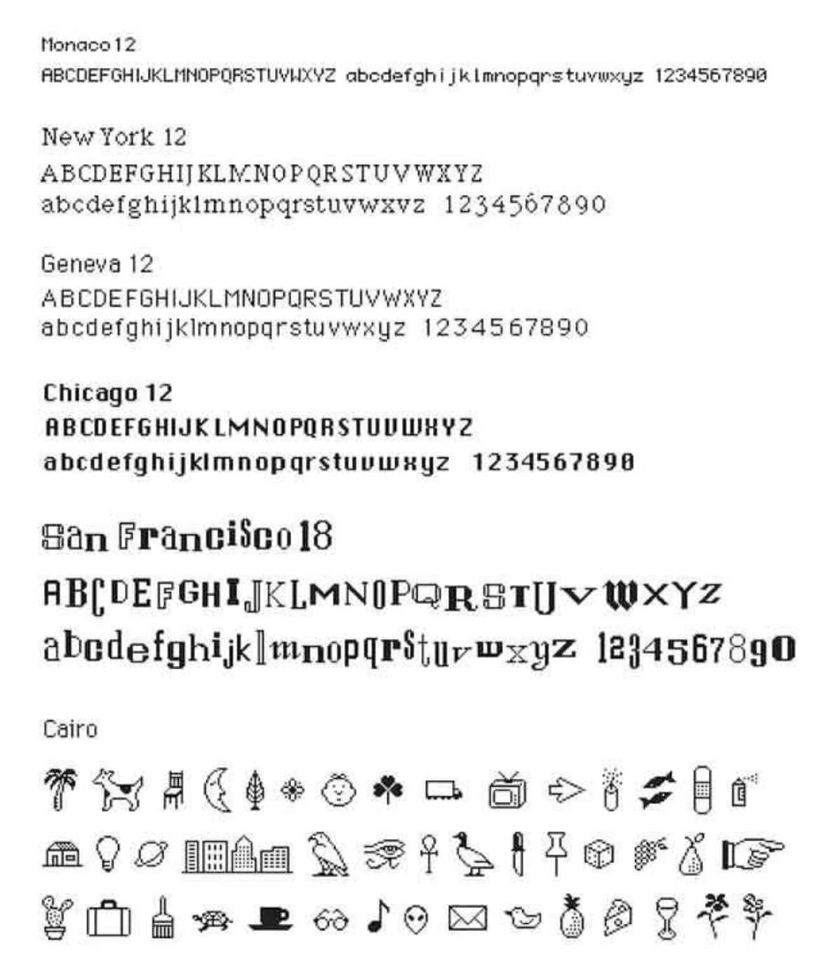
Susan Kare is a graphic designer that created the pictorial symbols for the Macintosh computer interface which allowed inexperienced users to operate the computer. She joined Apple with the task of creating typefaces and icons and started with creating the Chicago font in 1982 which was designed using a 32 by 32 square grid. This grid was used in the development of many of her icons but she was able to move away from graph paper because her co worker and lead software developer for Machintosh, Andy Hertzfeld, programmed an icon editor where each square cold be made black or white. She explains that even though it was quite a simple programme, ‘the ability to design on screen seemed amazing. For the first time, she was able to undo or redo with just a click.
In an interview Susan stated that the experience of learning counted-thread embroidery from her mother is what aided her in creating the icons. Kare is known as ‘the woman who gave macintosh a smile,’ and during her time at Apple she created icons and graphics that are commonplace in many of the digital applications we use today, such as the floppy disk and trash can.
Apple wanted to create a more user-friendly computer after the Mac 2 was considered intimidating to inexperienced users. This is were Kare wanted to implement icons with a whimsical feel to help users feel more relaxed and enjoy the experience. During the mid to late 80’s, icons and images replaced lines of code on computers, universally understandable and easily recognised. However, as technology has progressed, the monochrome icons have changed into colourful and sometimes even more realistic versions, but with the Karen’s core designs in mind.
Skeuomorphism and Apple

Skeuomorphism is when a design references a past incarnation of the object or tool its trying to replicate. This helps users to understand intuitively how to use the application based on your previous experience of what exists in the real world.
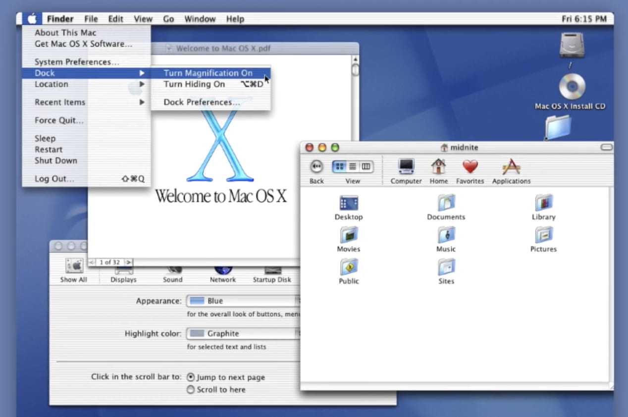
Within Apple, implementing real skeuomorphic icons started with MAC OS 10. Scott Forstall was in charge of creating a new design language for Mac OS and this led him to develop ‘AQUA’ in 2001. The interface elements and buttons where glossy and jobs famously said ‘when you saw it you wanted to lick it.’ Drop bars and windows could layer on top of each other, with shadows behind each layer giving the system a sense of dimension and depth. The icons he developed looked realistic, being almost perfect copies of the real life counterpart with the addition of perspective, lighting and texture. The realistic application of the user interface was supplemented with brushed metal, reflective surfaces and fabric textures with each Mac OS 10 update.
![]()

Fast forward to the development of the IPhone, Steve Jobs again, put Scott Forstall in charge of the UI design and just like before the interface had gloss, texture and wood. The apps were created to resemble and operate like the real world counterpart like the notes app which was designed to look like a notepad and even the typeface resembled handwriting. The contacts app looked like a spiral notebook and Forstall maintained this visual metaphor even as the device was turned to portrait mode as the book would not fill to the full height because this would make it look less realistic.

Using skeuomorphic design, especially during the early 2000’s, is a way of trying to convince people that the app or programme you created will be able to replace the analog things we use day to day as well as being intuitive and easy to use. This was the same task that Susan Kare was set with the first Macintosh, creating a interface that was easy for new users and didn’t scare less technological people from using the device.
In 2011, 70% of Apples revenue came from the IPhone which was a indicator that whatever Forstall had created, was working.

Skeuomorphic designs can also reference a previous version of the design, rather than just the real life object. The floppy disk icon is used today for the save button but as an actual object, floppy disks became obsolete many years ago, with the recent generations probably never even encountering one. With this in mind, how do you create a design based on something that doesn’t exist in the real world while still trying to convey the use of the application?
Smithsonian Magazine, How Susan Kare Designed User-Friendly Icons for the First Macintosh, David Kindy, 2019 [online] <https://www.smithsonianmag.com/innovation/how-susan-kare-designed-user-friendly-icons-for-first-macintosh-180973286/> Accessed 20th February 2021
Interaction Design Foundation, Skeuomorphism, 2018 [online]<https://www.interaction-design.org/literature/topics/skeuomorphism> Accessed 20th February 2021
John Markoff, Computer History Museum, 2017 [online] <https://computerhistory.org/blog/creating-magic-a-conversation-with-original-iphone-engineers-software-team-lead-scott-forstall/> Accessed 20th February 2021
Bloomberg Business Week, Scott Forstall, the Sorcerers Apprentice at Apple, Peter Burrows, 2011, [online] <https://blogs.ulster.ac.uk/b00822829/wp-admin/post.php?post=523&action=edit>