While working in groups for the past two years has been fun, I decided to work alone this year in order to show what I can do using my preferred media. I will be using 2D to create a story driven short animation.
The idea occurred to me while I was walking my dog and I was lost in thought. I thought about how a game about anxiety would be really interesting, but while I worked on a game last year, I don’t really have experience coding. I then considered an animation that focused on a main character with anxiety and we follow their day to day life. At first, I had it so that the MC went to school, came home, walked the dog and had a moment to herself in her room where we can see her calm down from the day. I figured this could be too long though – it seemed like a lot of work for one person with a deadline of six months. So, I cut it down a tad, and the story played out slightly differently.
The protagonist would wake up and go about getting ready for school, brushing her teeth, putting on her uniform and so on and so forth. She would then be in her living room waiting to go to school. She grows quite anxious while waiting, and we see her anxieties morph into a cute demon that rolls about. I was diagnosed with anxiety and depression when I was 15, around the beginning of my GCSEs, and back then, I used to be so frustrated with myself for having anxiety, but now, I see anxiety more as a thing I have, rather than what I am. It doesn’t define me, and when I took on that mindset, it got less scary and I didn’t have to be ashamed of it. I wanted to show that through the demon – anxiety isn’t something to be feared, or embarrassed about, it’s something to handle. Through the demon’s actions, I want to show this. The demon will try to “save” the MC from situations she doesn’t want to be in, and while she grows frustrated with it, she tries to ignore it.
It will then cut to her giving a presentation in class. Growing up, talking publicly was always difficult for me, and when it was a marked presentation, it was made worse. One instance I remember was a presentation in English Literature about The Scarlet Letter. It was only in a room of four people, yet I struggled immensely, and had a panic attack mid presentation. I remember being so annoyed too because I worked really hard on it, and had really interesting notes about Babylonian symbolism within the novel. But because I had issues speaking, I was unable to share these. When I went home, I told my parents what happened, and they said they don’t understand what I feel, which is reasonable. Another reason I went with this theme and story was because I want people to understand what it’s like for people with anxiety. The protagonist will have a panic attack in the middle of her presentation – she’ll be sweating, shaking, fidgeting and in the background you will hear a rapid heart beat. But during this panic attack, she doesn’t realize that she finished her presentation. She sits back down, breathing out a sigh of relief only to notice that the demon beside her has grown in size. It will then cut to her room, showing her winding down. She will have another mini breakdown in the bathroom, asking why she can’t just be “normal,” which is a thing I always asked myself when I started feeling that way. After, she will realise the demon is beside her, and has grown in size once again.
There will be a moment of reflection, in which she breathes, calming herself. She will embrace the demon, and it will shrink to a more manageable size, where she will smile and carry on with her night.
It was only after I was writing the plot that I realised, again, that this would be way too long. So, I decided to focus more on the presentation aspect of it, as that was what I struggled with the most growing up. The presentation alone would be more manageable for myself, and it will allow me to go as eccentric as I want.
The story remains the same, only the reconciliation will happen during the presentation within the girls own head. I drew a lot of inspiration from the song Hikari Yo and its PV, as it has similar elements to my animation. But most things I added with purpose in order to convey as much as possible what anxiety is like
With a story in mind already, I began considering character design. There would be only two characters, with some background ones, so I wanted to make sure I dedicated as much time as possible to them. The main characters are the focal point of the story, after all, and everything within the story revolves around them.
The main character would be easy enough to design, as I was mostly basing her off my own appearance from back in secondary school. I was a nervous teen, and wanted to convey that, so I gave the main character eye bags and frizzy hair, to show that she’s a tired and anxiety ridden student. Her uniform took inspiration from my old school with some modifications. I wanted this to be as close to my own firsthand experiences as possible.
Though I had this vision in mind, I did end up experimenting with unique styles and designs. I tried a design with her hair mirroring Anxie’s horns in order to show the connection between them. I tried a more anime-esque art style before deciding that, while I have experience in drawing anime, it wasn’t the best style choice to convey the story. This was a dark, hopeful, story and I thought a more ‘cute’ style would fit better. I tried using a style inspired by Tim Burton, and the Drakengard 3 Sisters DLC, but scrapped it as well. This was my story to tell, and I wanted to use my own style.

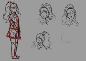
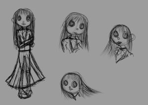

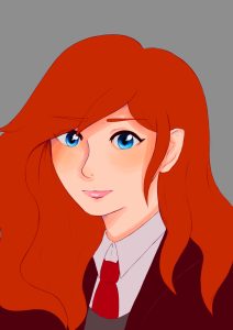
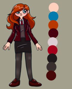
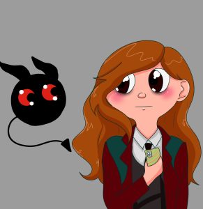
I ended up preferring the red colour scheme with heavier line weights and blue eyes. It was more vibrant and contrasted nicely with her eye bags. I also preferred her fluffy her hair is compared to the other designs.
The main character decided, I moved onto the demon design – arguably the most important one. They would have two forms, one big and scary and another small and manageable. Personally, I think demonic imagery is quite cool, so I looked into incorporating that into the design. For one of the designs, I took inspiration from Baphomet, a Sabbatic deity usually depicted with a goat skull as a head. Baphomet maintains societal order, and I thought that suited quite well with the concept of the demon. Mental health issues never really go away, and it’s a battle trying not to let them interfere with our daily lives.
However, I realised that animating the goat skull consistently would be a struggle and too time consuming. It would be best to stick to a simplistic design. I went with a dark silhouette and played with colours and horn shapes. I wanted to them wispy, as I thought it would be cool to show movement where there otherwise was none, but also to show that they are not of this world. The demon is a manifestation of her true self, a product of overthinking. I wanted to show a disconnect between the real world and them. But then, I ran into another issue – the first form and second form were so vastly different it didn’t look like the same character. I liked the juxtaposition of the big demon and the MC, but if the demon didn’t look like the same character in both forms the reveal wouldn’t have the same impact.
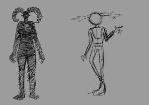
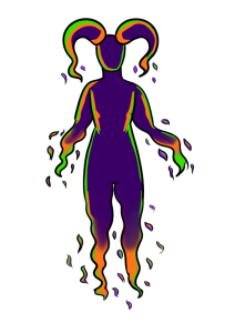
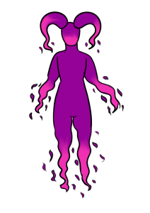
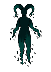
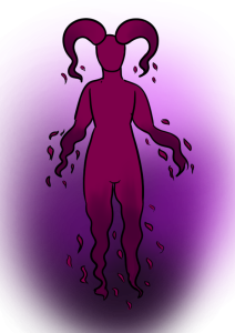
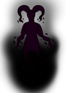


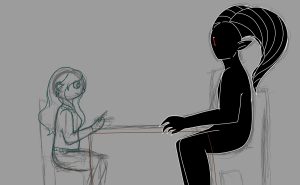


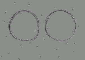
In the end, I changed Anxie so the art style was more like the established one, with wide eyes and small dots for pupils. I actually ended up liking that design much more, because they looked like they embody anxiety – like they also struggle with it. Building upon the wispy affect, I decided to colour them in with sketch lines, as they would move and would be a good way to convey jitters. I kept the wispiness as well in the horns, but also because I wouldn’t be confined to making the same horn shape every frame.
During this, I was also working on my storyboard.

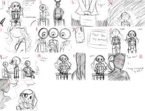
Originally, the animation would have had three scenes – a morning scene, a presentation scene and then a reconciliation scene within the MC’s room, however, feedback from the tutors told me that would be too much to animate. I knew them to be right, but I was still a bit disappointed that I would have to cut out one of the two scenes since both held significance. The first scene was close to my own morning routine, and the second was based off one specific experience. I liked both, but in the end decided to cut out the first scene – the second scene could be made into a more cohesive storyline with a beginning, middle and end. I didn’t make a new storyboard for this however, and just started making the animatic.
This animatic was done with the intention of including all three scenes, before I scrapped it.
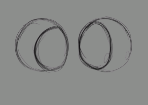
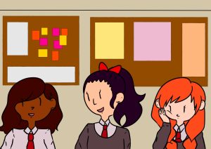
Originally, the classmates were going to be seen as eyeballs, mostly because I just liked the imagery and I could have fun with tracking the MC’s movement with them. Feedback however, said that I should try to make the disconnect from reality and fiction more distinct. The world wasn’t very well defined as it was, so I had decided to use a transition of sorts. It would split the animation into two parts – one in the real world, and the other in the mind along with whatever comes after. The background characters are not that important in the long run, so I didn’t focus on them too much, but they were the only indication of what mindset the MC is in.
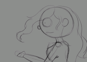
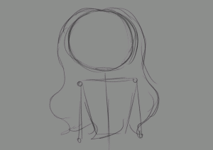
Animatic practically sorted, I moved onto animating. I thought it would be best to animate the characters on a PNG file, then put them over a background separately, mostly because I thought it would be easier as well. First order of business was to begin the rough drafts, but then I realised I have a very backwards method of working – I had began working on the shots before I made a list for said shots, and I kept going back and forth on different shots. I would work on one section before deciding to work on a different one from scratch – it was quite frustrating because I knew, logically, it was best to work on the technically hard shots first then work my way up to the easier ones. I’ve always had a difficult time with management, and it shows in this project, unfortunately. I was unable to finish this project – I could not tell the story I wanted, and as such, these shots are unfinished. A couple of breakdowns later, I decided to make this into a portfolio submission instead; the main reason being that I was struggling to animate the whole thing on my own, but also because it felt right for me as well. I want to get into character design and concept art, since I really like drawing. I could draw for days, and I figured that this should be beneficial for me. It’s my opportunity to show my strengths, which I believe lie in concepts.
 (Shot 3)
 (Shot 7)
 (Shot 8)
 (Shot 9)
 (Shot 10)
 (Shot 11)
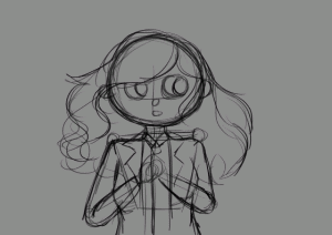 (Shot 16)
 (Shot 17)
 (Shot 19)
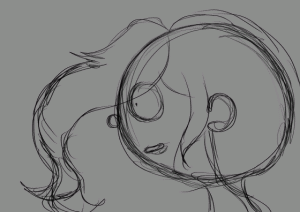 (Shot 21)
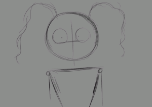 (Shot 29)
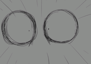 (Shot 33)
 (Shot 38)
 (Shot 39)
 (Shot 45)
 (Shot 47)
 (Shot 48)
 (Shot 50)
 (Shot 52)
 (Shot 56)
I had 56 shots to animate, outline and colour, and when I looked at it like that, I started to panic just slightly. Knowing I already struggle with focusing, I was worried I would struggle especially since I also had a job. I did try to keep up, but eventually, I just fell way too far behind on my schedule and I couldn’t bring it back.
Eventually, the shots began to feel more like experiments – like I was trying different techniques with no real destination in mind. I knew I wanted to finish the project, but I lacked confidence. I didn’t have confidence in myself or this project, and I think that’s when the struggle started. I was so excited to start, but as time went on I began to think it wasn’t good enough. I found myself more confident in character design and the like, so I did focus most of my energies on that, but I didn’t stop animating.
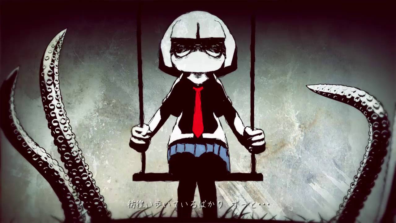
Anxieties aside, I took to experimenting more. There is a scene with tentacles, so I had a look at animating them, mostly taking inspiration from ‘Hikari Yo.’ At first, I tried animating them as waves, but it wasn’t making much sense to me. Instead, I animated a ball bouncing and then followed the trajectory while adding wriggles. This unintentionally would have been helpful as the tentacles in the animation were going to have eye balls attached on the ends of them. I did look at how lightning is animated, but again, I found it difficult to actually do it so tracking the trajectory of the ball was preferable.


 (Hikari Yo, Kikuo)
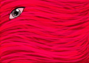


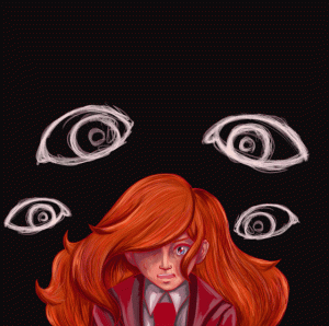
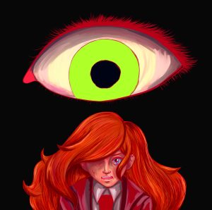
Another major part of my story was the eye imagery – I always found eyes creepy. Personally, a major part of my anxiety was due in fact to feeling like everyone was watching me at all times and I had to maintain perfection. Eye contact and being watched is unnerving, so I wanted that feeling to come across in the art. I wanted to make the eye look sickly and contrast to the red colour scheme, and I had chosen red as my main colour because I figure it would convey the idea of heat the best. I was also inspired by the game of Drakengard, which uses red to signify the end of the world. I decided to do a painterly piece as well in a different art style, mostly to show I can draw in multiple styles. I did like the rolling eyes, but I started to think the ball on its own looked a bit goofy. It looked much better when it appeared to be apart of someone’s face.
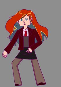
When I wasn’t working on the main project, I practiced and studied different styles. A vital part of a character designer’s skillset is being able to adapt to varied art styles with consistency. I looked at Studio Ghibli and Drakengard 3 mostly, but I also experimented with shapes. Most of my character designs are round, but I realise that this doesn’t allow for a variety of body types. The blocky art of the MC wasn’t really inspired by any specific thing – I just wanted to experiment with colour theory and try to create something more striking.

![Drakengard 3 Two's Chapter Verse 2 [DLC] - YouTube](https://i.ytimg.com/vi/0ISsekP9xhc/maxresdefault.jpg)
Though fan art, I studied the Drakengard 3 art style and was able to convey two known characters in a completely different art style. I liked the storybook aesthetic, and for a while, considered using it for the project. However, Drakengard doesn’t animate them – they are still shots – so I wasn’t sure how the mechanics of the body would work. They would end up moving more like puppets, probably alike to South Park.
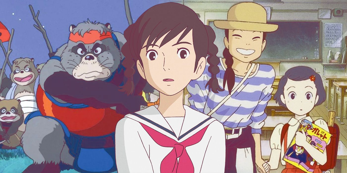


The Studio Ghibli style was a tad bit harder to replicate. There’s something quite special about this art style; it captures nostalgia even without context. I don’t think I did the art style justice, but I had fun trying it out for myself. If I had time, I would have liked to animate a scene from a Ghibli movie for practice. I found studying the two different styles helpful, even if I didn’t go into as much detail as I could have.
I also did do some figure drawing to practice proportions. For character design, I feel like it’s important to understand how and why the body works in order to exaggerate certain features. Some artists choose to exaggerate stomachs, ears, even hands. I think Brad Bird in particular is good at exaggerating body parts to show diverse body types. Ratatouille is one of my favourites, where the human characters look so vastly different from each other while maintaining proper proportions. Each character functions, and it’s believable. 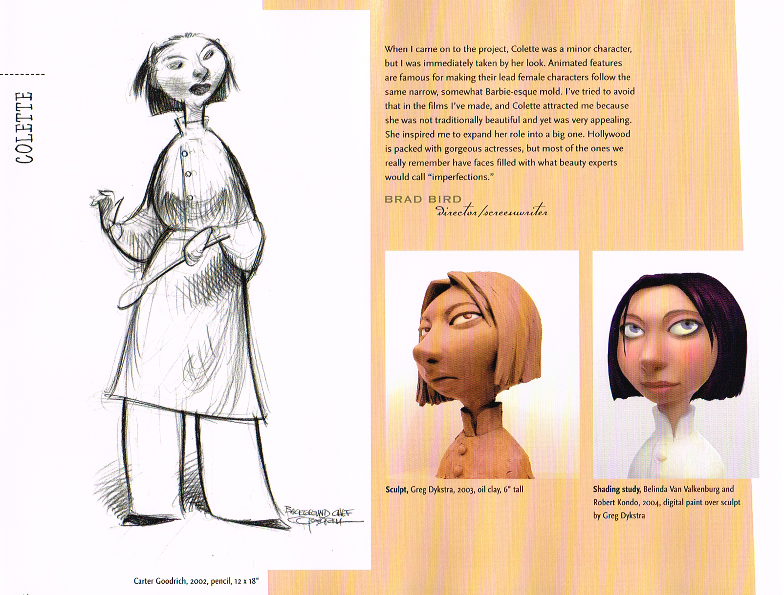

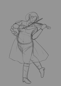
I still have trouble drawing feet/shoes mostly, but I have improved upon the upper body.
To conclude this reflection, even though I never did end up finishing what I set out to do, I was able to build upon my own style and improve it. It allowed me to step out of my comfort zone, to attempt new techniques I wouldn’t have considered before. My lines used to be very thin, but now I choose to use thicker lines in order to make the characters stand out more. Although this project was good as it helped me improve, it’s made me realise I’m probably more suited to concept/individual work. My methods are out of line with the current pipeline, and I think I work better alone, even if the project remained unfinished. My interests mainly lie in character design and concept art, especially since I like drawing rather than animating. All in all, I found this experience to be quite fun (when I wasn’t panicking) and very helpful, and I hope to use what I’ve learned in my next personal project.