

Planning
Encompassing the project planning stage, during pre-production, critical elements of the game’s concept, vision, and design are decided, including the genre, target audience, art style, character design, game mechanics, and narrative. Although not required for this assignment, proof of concept is also discussed during this stage, which determines the cost of producing the game, the resources needed, and how the game will be funded and monetised (Magic Media, 2024).
Already aware of the timeline for completion and having been provided with the list of style options below, the team met up for an initial brainstorming session.

Although willing to discuss all of the available options, given the complexity and the time required to create AAA realistic 3D characters and assets, I felt making a game in this genre would not be feasible within the 12-week timeframe, and that a simpler, more achievable root style, such as ‘Saturday morning’ friendly cartoony, would be much more practical. As I had recently read American cartoonist Scott McCloud’s book, ‘Understanding Comics: The Invisible Art,’ I was also drawn to the ‘Comic book-inspired fantasy’ style option. However, when discussed, the team as a whole were happy to move forward with the more practical ‘Saturday morning’ friendly cartoony style, and the knowledge I’d gained through McCloud’s concept of ‘Amplification through Simplification’ and that cartooning is more than just a way of drawing; it’s a way of seeing, would prove useful further down the line during the character development stage.
Game concepts, provided by the Games Design team in the Miro board below, included a dinosaur era jungle adventure, a mountain climbing adventure from an animal’s perspective, and a game set in the 2000s where, as a metaphor for better times, VHS video tapes found in different locations within an escape room context, provide an insight into how the location appeared in the past, and provide narrative and clues on how to progress.
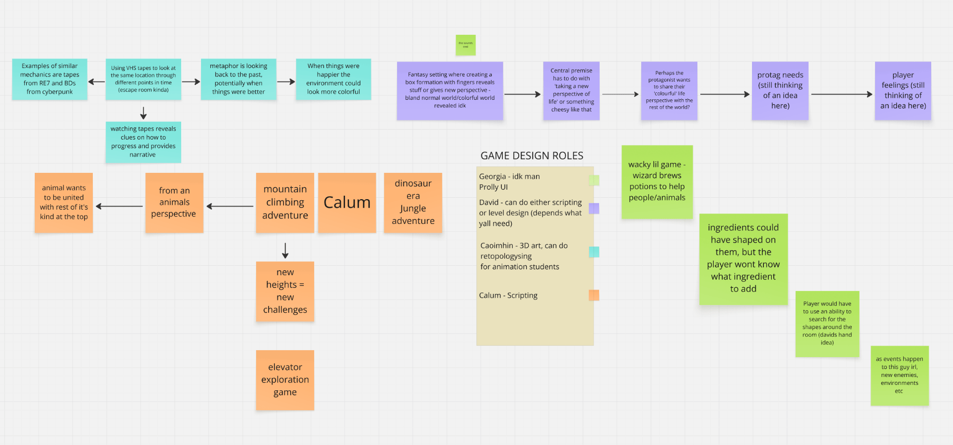
However, although the least developed, the team loved the premise of a wacky wizard potion-making simulator from Georgia, with a theme of self-growth. The antithesis of ‘The Monkey’s Paw,’ a 1902 short story by W. W. Jacobs, and later a 1948 B-Horror movie, where a magical monkey’s paw grants three wishes, but at an enormous cost to the owner, the unique selling point of our game would be that customers come to an apothecary requesting potions they want, such as a beauty potion to alter their appearance, but ultimately, following a narrative journey where the customer initially returns dissatisfied, will be given the potion they NEED, such as self-confidence. This idea also opened up a raft of exciting artistic possibilities for stylised and simplified environmental assets with which to decorate the apothecary, such as ingredients for the potions, potion bottles, and fantasy creatures who would become the customers – all of which could be used to communicate the mood or feeling of the game to players.
There was, however, some debate within the group about the intended target audience. A few team members felt that catering to children at the top end of the demographic and having a PEGI 12 rating, the game could explore deeper themes such as moral decision-making and include some mild innuendo. However, with the style options provided giving examples of games catering to a much younger audience, and research suggesting that unfortunately, similar to the topics we were aiming to address, children as young as three years old experience body image issues (familydoctor.org, 2025), and that a pattern of poor body image at an early age can trigger eating disorders in later life (ABC9 News, 2015), that focusing on this younger demographic, our game should perhaps have a PEGI 3 rating.

In the end, allowing us to address meaningful topics while keeping the content accessible and engaging for the traditional Saturday morning cartoon viewer aged five to twelve (krcu.org, 2023), a compromise was reached where the game would still explore more thoughtful and introspective themes, such as anxiety and self-love, but in an age-appropriate way.
Art Style Guide
While over the following week, the Games Design team members would flesh out the storyline, game mechanics, layout, and level design, the priority for myself, and my fellow Animation students, Heather and Sam, would be to work together to research our chosen art style, and begin developing a coherent, and specific art guide for the project. The art style guide should enable team members to produce all assets, visual effects, characters, and animations, alongside key observable features that make the art style unique from others. Additionally, technical guides should also be included, containing tips and tutorial links that assist the entire team to maintain the same style.
Straight out of the blocks, I began collecting reference images and colour palettes in a PureRef file that could be used to shape the creative direction of the project and help achieve the overall game aesthetic. However, shortly afterwards, Heather created a collaborative Pinterest board where Animation and Games Design students could contribute by adding any visual references they felt appropriate. Containing both my existing PureRef compilations and many new images, the board quickly became a valuable means of providing inspiration that would guide our concept art and create cohesion throughout our art style guide.


After reviewing online industry guides and art style guides from past student vertical slice game projects, for reference, and to spark useful conversations around the characters, mood, tone, and environment of our own game, I shared an example from the 3D murder mystery game ‘Knives Out’ with the rest of the Animation team.

Team roles were also assigned at this time. I, myself, took charge of character concepting, designing both the main player character and NPCs. With experience in this area from a previous course, Heather chose to develop the game environment, while Sam focused on prop design, colour palettes, and texturing, and it was agreed that creating the required technical guides would be a shared responsibility.
A guided art style analysis exercise, where each Animation student evaluated a distinctly different game, TV series, or animated movie/short, also proved extremely thought-provoking and helpful when creating our final style guide.

While during the group workshop I had already researched and analysed the ‘Animal Crossing’ game franchise in some depth, with another group member keen to cover these games and specific art style within out art style guide and presentation, although it meant some additional work, to maintain a positive group dynamic I instead offered to explore another game renowned for its distinctive, cartoonish style and bold artistic choices: ‘The Legend of Zelda: The Wind Waker.’
With both presentation time and space within our final art style guide limited, an abbreviated version of the ‘Wind Waker’ art style guide can be seen in the slide below; however, the full, unabridged document answering all the above questions in detail can be found via the following link:

To kickstart creative discussion, aligning with the game’s magical and whimsical theme, and that our customers would be based on fantasy creatures, inspired by a visual reference of Thoth, the Egyptian god of magic, soon after module launch, I created the two character concepts below.

However, while well received by our tutor, in the following days our combined research revealed that a simpler aesthetic and a more cohesive approach to character design would be required. Providing inspiration which would assist the creation of the character designs that followed, as part of the evolving narrative, David, a Games Design team member, had created names and backstories for potential non-player characters (NPCs).

Inspiration, too, was drawn from a wide range of research and sources, including iconic game franchises such as ‘Animal Crossing,’ and ‘The Legend of Zelda,’ the award-winning American animated series, ‘The Owl House,’ and studios such as Disney, Pixar and DreamWorks Animation who share a simplified, expressive aesthetic in their animation (van Rooij, 2019). Creating outcomes which, although simplified, still appear realistic and relatable within their frame of reference (i.e., the apothecary shop setting), utilising Scott McCloud’s concept of ‘Amplification through Simplification,’ character designs were stripped down to produce a more cartoon-like effect. Also, aligning with our research, and removing the need for more complex animations, exaggerated proportions, and key characteristics, including oversized eyes, were intentionally used to enhance the expressiveness and emotional impact of the characters.
Additionally, given we all make assumptions about a character based on visual cues, in keeping with the chosen ‘Saturday morning’ friendly and cartoony art style, and target audience demographic, mainly rounded shape language has been used throughout. Adopting these natural, rounded forms not only maintained visual consistency across the designs but subliminally encoding meaning, suggested positive character traits, such as friendliness, innocence, and warmth (21-draw.com, 2022). However, as in any project, ideas are sure to evolve and change; if needed, this rounded shape language can also suggest that the characters are pliable, gullible, or easily manipulated, or, like seed imagery, can grow and evolve to become something bigger and better than their original state (YouTube, 2020). Rounded forms were also chosen for their simplicity, repeatability, and ease of modelling, and because they facilitate the creation of cleaner, readable designs that more easily relay a character’s personality and make them more memorable (Blair, 1994; Lee, 2024).
Character concepts can be found below for Kale, a low-class and socially inept orc seeking a potion to provide charisma or cosmetic change, and Wilfred, an aged dwarf and local blacksmith expert in his craft, who is seeking a youth potion with which to regain his ailing strength.


Other NPC character concepts based upon the fantasy/fairy-tale creatures theme, and the backstories provided, included:
- Brighthelm, an upper-class, confident, and assertive character, seeking a ‘skill’ potion to excel in archery, as currently, despite their bravado, they lack the confidence and skills to succeed.
- A cyclops seeking an invisibility potion; however, the results are not quite as they envisage, in that they are still visible, but everyone acts as if they do not exist.
- A villager asking to be able to fly, but the outcome is not as anticipated, for example, sprouting large wings that continually get in their way.

To ensure cohesion, the agreed colour palette was used in all designs, with silhouettes also checked to test readability, and to ascertain if, without detail, the characters would be memorable and could be easily recognised by their overall form.

In a playful twist on the classic ‘Fantasia’ storyline, where with disastrous effects, Mickey Mouse uses Yen Sid’s magic hat to complete his chores, endearing the game to both young and old, the plan for our game, now named ‘Brewtiful Therapy,’ was for the player character to be a villager, who on entering a cosy apothecary, stumbles upon a magical hat, and transforming into a wizard, brews potions to assist the various fantastical shop customers. Given this brief, Heather has sketched the wizard concept below, which was then updated to reflect our more cohesive character designs.

Given the tight 12-week deadline, with multiple 3D characters to create, a method of simplifying the modelling process and ensuring the team consistently achieved the same cohesive results was also required. Remembering feedback from my tutor, Alec Parkin, during my Year One Animated Narratives module, that to streamline industry production processes, creative artists often share assets, I suggested the use of simple ‘base meshes’ that could be then modified to reflect the features, vibe, or clothing of each NPC design.
Inspired by the character customisation options in the ‘Animal Crossing’ franchise, and clothing ideation from ‘The Legend of Zelda’ games such as Link’s iconic belted tunic, boots, gloves and leather wrappings, I created both a practical art style development/modelling guide, and the 3D base meshes to facilitate the creation of a range of NPC archetypes from a limited number of ‘reusable’ assets for our game. Working as a team, Sam then combined the design principles, concept art, and character designs from my Canva slides into the succinct, one-page document below.

To ensure consistency across our character designs, the guide outlines the key visual principles needed to maintain a cohesive style, including references for body proportions and a unified colour palette. Major stylistic focus, too, is placed on the use of large, expressive eyes paired with matching eyebrows, which, if later animated, can be used to effectively convey emotion. To reinforce visual continuity, hair is also designed with similar hairlines and created using simple geometric shapes. Quick customisations can differentiate characters to low-poly base meshes, such as here, where to trial the concept, boot examples from the guide have been reproduced in a matter of minutes, and additional detail introduced through simple accessories such as gloves, wrist straps, and belts, which can be subtly varied with small modifications to buckle shapes.

Finally, inspired by Aldin Dynamic’s immersive VR game, ‘Waltz of the Wizard,’ I developed a technical guide containing tips, tutorial links, and references to support the team in consistently producing stylised animated and visual effects that could be used during the potion-making process.


Standing us in good stead for our art style guide presentation, as can be seen below, the animation team completed an incredible amount of research, and when the time came, by being well-prepared, I feel we all spoke confidently and knowledgeably concerning the topics covered.

The feedback received was incredibly encouraging, with our tutor commending the team for creating a well-defined and coherent visual style. However, a few suggestions were made, most notably that while we could experiment with cel-shading, if not executed well, it can prove visually distracting. There was also some playful caution around potentially being sued over similarities in the staff design (likely a subconscious by-product of researching so many ‘Zelda’ games), but more importantly, elements from our earlier concept that personified the wizard’s hat and gave it character and charm, should be reintroduced. Taking this on board, both designs were refined, and the game narrative moved forward with the hat as a sentient character in its own right.
References:
21-draw.com (2022). Why is Shape Language So Important? [online]. [Accessed: 6 February 2025]
Available at: https://www.21-draw.com/why-is-shape-language-so-important/
ABC9 News. (2015). Study: Kids as young as 8 Self Conscious of their Bodies. [online]. Siouxlandproud.com, 29 July. [Accessed: 27 January 2025].
Available at: https://www.siouxlandproud.com/news/this-morning/study-kids-as-young-as-8-self-conscious-of-their-bodies/
Blair, P. (1994). Cartoon Animation. Tustin, Calif.: Walter Foster Publishing, Inc. [Accessed: 6 February 2025].
familydoctor.org. (2025). Body Image (Children and Teens). [online]. [Accessed: 27 January 2025].
Available at: https://familydoctor.org/building-your-childs-body-image-and-self-esteem/
krcu.org. (2023). Telling History: Saturday Morning Television’s ‘Golden Age’. [online]. [Accessed: 27 January 2025].
Available at: https://www.krcu.org/show/telling-history/2023-11-27/saturday-morning-televisions-golden-age
Lee, B. (2024). Shape Language for Strong Character Design! | 21 Draw. [online]. [Accessed: 6 February 2025].
Magic Media (2024). The 7 Stages of the Game Development Pipeline. [online]. Magic Media Studio, 5 September. [Accessed: 2 February 2025].
Available at: https://magicmedia.studio/news-insights/the-7-stages-of-the-game-development-pipeline/
van Rooij, M. (2019). Carefully Constructed Yet Curiously Real: How Major American Animation Studios Generate Empathy Through a Shared Style of Character Design. Animation, 14(3), pp.191–206. [Accessed: 3 February 2025].
Available at: https://journals-sagepub-com.eu1.proxy.openathens.net/doi/full/10.1177/1746847719875071
YouTube, (2020). How to Use SHAPES to Create Character Designs: Shape Language Tutorial – Chelsea Gracei. [online]. [Accessed: 6 February 2025].
Available at: https://www.youtube.com/watch?v=GbG45s1EZvo
YouTube (2024). The 9 Elements of Video Game Art Style – Lighthoof Dryden. [online]. [Accessed 3 February 2025].
Yurchenko, A. (2024). ‘The Ultimate Guide to Video Game Art Styles,’ [online]. iLOGOS, 16 December. [Accessed: 6 February 2025]
Available at: https://ilogos.biz/video-game-art-styles/