Hicks Law
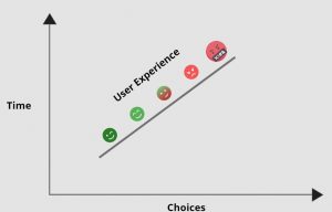
Hicks Law is the time it takes to make decision.
The more options the user has; the longer it take for them to make a decision.
This means that it is the designers job to eliminate most of the options so that the user is left with only the most important and relevant options to choose from in hope that this means they will be able to make a decision quicker. This is vital because if the user is given too many options then they are more likely to become frustrated and therefore make their experience on your app or site an unenjoyable one.
Hick’s law has been created as it successfully helps users simplify their decision-making process but at the same time not completely remove it. A common example would be arranging the drop-down items under a tab in a systematic manner to help users reach their desired destination faster.

Hicks law is extremely important for us to know, especially for our IXD303 healthcare project as if too many options are given in the healthcare sector, patients will get fed up super quickly as they are already in a high-stress environment and so just want to be given only the necessary options so they can make educated decisions so much quicker than if they had to go through 10 options that they may not have the time for.
When creating apps or sites for high-stress environments, it is vital that your product is as easy to use as possible in order to make the process the least stressful as possible.
Cognitive Load
Cognitive load is the act of simplifying products so that it can be easily used by all age ranges.
An example of this is the Amazon Firestick controller as it has simplified the standard remote and taken away all the unimportant buttons and only included the vital buttons. This means people of all ages will be able to use the controller as they don’t have as many button options to press so therefore don’t spend as long figuring out how to work the remote.

Onboarding Process
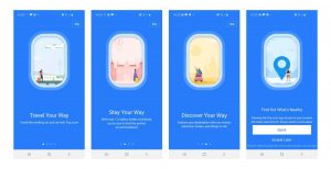
This is the ‘signing up’ section of an app or site before you get to use it properly. A successful onboarding process is a pleasant, quick process that explains what the app does and gives you options about what you want it to do eg push notifications etc. This process should not take long and it should be easy to fill out. A weaker onboarding process is confusing to fill in and is very long and boring to read through. This creates a bad first impression of your app because if your onboarding process is boring and confusing, the user will naturally presume the rest of your app is boring and confusing which may not be the case.

Offboarding process
The process of deactivating an account is equally as important as the onboarding process. a successful off boarding process would be the likes of being able to quickly and easily delete your account with as little pop ups to stay as possible. A weaker off boarding process would be where it is very confusing to delete your account and doesn’t really give you the option to and instead fires loads of deals and action windows at you in an attempt to stay.
User Personas
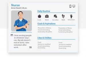
User personas are made up characters that represent a person who is a target audience for your app. A full description of the person is created such as name, age, profession, why they need your app, and painpoints etc. there are normally a few different user personas per each new project; all from different ages or backgrounds so you feel better prepared and have more solutions to as many problems as possible.

The Problem with User Personas
User personas can be seen to be biased by the designer creating the app and lacks individuality as they are not based on real people. although it is always vague common problems that are included on the personas that people would need solved in the app, people feel they could be more personal and could make the persona character more personal then the overall persona would be considered more reliable to the potential user as it feels it appeals to them individually instead of a broad crowd which feels very impersonal.
Jobs to be Done
- Identify jobs customers are trying to get done
- Categorise the jobs to be done
- Define competitors
- Define the Jobs to be done opportunities
- List the jobs to be done