With week 11 starting, the animations got underway and I was able to take time to fully commit to working on the animation, with the time I had, I wanted to work on scenes that would allow me to use After Effects to create the movement in my animations, meaning I wouldn’t need to draw a lot of different frames and could use my current knowledge to its fullest. With this,
I took the backgrounds and the assets from the previous week, with the quickest to produce being, scene 2, Where my character pokes his head above the table, and scene 4, where he grabs the pool cue.
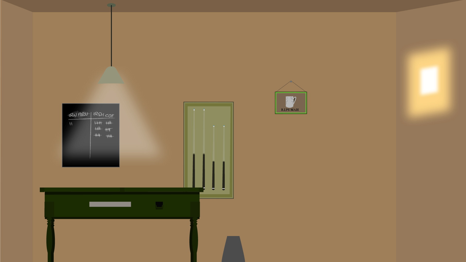
I then took these scenes to my tutor, who would be reviewing our work so far. He appreciated the work I had done so far, and I told him what I had planned for the future, he gave me a list of what to look out for:
- Have a look at Guy Ritchie’s way of editing his freeze frames, split screens- Be aware of your framing for each shot
- Persona opening- Freeze frames
- Have Espresso pull the bucket off-screen/cut on action
- Animate him stand up onto the bucket
- Be careful of your speed
- Look at reference for the vertigo effect
- Video yourself for reference of espresso about to hit the cue ball
- Change the ball to left to right or show him hitting the ball
- Add a little more detail to the background (Scoreboard) and add more depth to the background
- A little more depth to the close up of the pool table
- Be aware of arm anatomy when he’s picking up cue, and arm to cue scale
- Pull cue from rack rather than the floor
- Have Espresso react when his head pops up, maybe roll his eyes, give him a little more life
With this feedback, I got straight to work with improving the animation, one of the things I knew I wanted to change was the hand-drawn arm, and I managed to change that shot within a day.

I also went about changing the backgrounds, trying to make them more lively!


One of the ideas that we had as a group was for each character to have their own logo to introduce them, I was tasked with creating them, I quickly mocked up a few and showed them to my group.

However some of them needed re-done due to spelling errors
For each of the characters I wanted to convey their personality and their design into the logo.

For Sty and Paula, I knew colours wouldn’t be overly important due to them being styrofoam cups, and I wanted to give that feeling of blandness in the font choice, Arial being a normal font that isn’t overly interesting, but I managed to sneak in some colour in their names, having Sty be a blue and Paula be a pink so show gender.

Frappuccino, who’s a very bombastic character, ingrained in show business, needed a bold font, and a bold banner, something that screamed “look at me” so I wanted to add in the classic Theatre lights, having the light illuminate name and show off the name.

Cold Brew, was meant to look like a cold brew, describing exactly what he is, but the use in darker colours gives it a look of Guinness, which relates to a bartender and his relation to the customers, being almost like a cold brew, something to keep coming back to for comfort.

Clear mug, is an inconspicuous character, so I wanted something that matches his personality, someone who wants to remain clear cut. The use in Italics drives home this point, as it can be used as both a way of highlighting a word, and also making it more mysterious.

Espresso was my own character, so I knew what I wanted for him to be almost fully represented in his animation, So for this, I wanted to have the logo appear physically shorter than the rest, as he is a smaller character, the same went for the font, having it scrunched up reminded me of his pent up anger.

China white was up next, she’s an older character which is why I wanted a font with Serifs in it, harkening back to her old fashioned ways, I also wanted to include the pattern in the back to give her a fancy and almost regal look.

Irish Coffee was next, and he was the easiest to design for, with him being in a waistcoat, I knew I wanted to keep the Serif font in, but I also wanted to keep it modern enough, so made his logo a representation of the Irish flag, with a slant.

Chip and Joe were last up, and seeing as they appear in the same scene, I gave them somewhat matching logos, having Chips, bold logo with several chips in it showing his unhinged nature, as well as the bold red colour showing his anger.

Whilst Joe’s purple shows his background as a crime boss, in somewhat royalty, and his name being bunched together gives him a close-knit feeling, as if he tries and keeps himself to himself.
By the end of this week, I had completed another part of my animation, the drawing of which took a while, I was unable to draw it without a reference:

accessed at: https://www.dailypost.co.uk/sport/other-sport/decision-time-who-greatest-snooker-14385508