Author Archives: mcculloch-m

Week 7 – Animation Introduction.

TASK 1
Animate 3 (or more) bouncing balls of different weights.
  • For example a Tennis Ball, Ping pong ball, bowling ball, etc
  • Look for reference videos or film your own references for timing

For week 7, we were asked to create a short animation of 3 different bouncing balls. When I was set this task I started to panic slightly as we were told it would be best to use Adobe Animate, and I’d never used it before, however we were provided with a video tutorial on Blackboard on how to use it. As well as this video, I used a YouTube tutorial.

After I had decided that I wanted to animate a bouncy ball, a basket ball and a bowling ball, I had to figure out how each of these balls behave when dropped from the same height. I used these videos from YouTube as basic guidelines for somewhere to start.

Image 1 shows the measurements and markings I used to show how high each ball would bounce. For example, considering the bouncy ball would bounce the highest and longest of all three, I wanted to make it bounce three times. After the first drop, I made the pink bouncy ball bounce back up to the 75 mark, then after the second drop it would bounce back to 50 and after the third it would bounce to 25, eventually rolling off screen. This is similar to what I did for the basket ball bounce, but since it isn’t as bouncy and rubbery as the first ball, it only went up to 50 after the first bounce and 25 after the second. For the bowling ball, I only made it jump back up once to 25 and then roll off as this ball would be much heavier and wouldn’t bounce more than one time.

I’m really happy with the overall outcome of this task. The animation turned out exactly how I wanted it and more importantly i learn the basics of Adobe Animate and I’m really excited to be using it throughout my course.

I hope to come back to this animation and maybe add shadows and details to the basket ball or the bowling ball to make them look more realistic. Below is an animated GIF showing my work. (click GIF to preview)

TASK 2
Read chapter 4 ‘Advancing backward to 1940’ from Richard Williams Animator’s survival guide.

After reading chapter 4, my first thoughts were that I regret not reading this before completing task 1, as in this particular chapter, Richard Williams explains how to animate a bouncing ball properly and I’ve now released that I should have used his method. I hope to come back and correct my version using these instructions.

I’m also going to try and take the advice Williams gave to his readers and that is to not listen to music while animating as it can be a distraction and I do have a habit of putting on music while I’m animating. I am aiming to refer to this book when working more often as (evidently) its full of great advice.

TASK 3
Meet with your groups to plan the order of your chain / linking animation – Chat with the team member on either side of you in the order you chose to discuss how you want to coordinate the transitions at the start and end of your animations.

&

TASK 4
Write down the description / simple script of what you’d like to animate within 5-8 seconds and start a rough storyboard from this.

This week, I switched from group 2, forest world to group 5, constellation world, so i was really only catching up with the members of my new group and discussing new ideas with them. We’d talked about style inspirations to give each other a better understanding of what kind of theme/world we wanted to create together. I suggested that we use ‘Avatar: The Last Airbender’ (2005) as part of our inspiration.

We had also discussed some things like creating our own alphabet (which we decided would be too hard), our main character, Orion, and creating a map for our world.

Lastly we decided that we should aim to make a story board to show how we want our final 30 second sequence to look. This was our first draft idea:

1. Zoom into eye/starry sky with constellations
2. Constellations/stars fade into map sequence
3. Zoom into map to show off environmental shots (ends with mountain)
4. Characters on mountain – Ground shakes
5. Centaur emerging from clouds (possibly just a silhouette)
6. Zoom into eye (loop)

After this was agreed on, we assigned each person in the group to a part to begin animating our 5-8 seconds towards our first rough animatic. I volunteered to create part one and we made a few discord channels so this way it is easy to communicate with whoever was on either side our part of the animatic. This is the list of who is creating which part.


1 – Mary
2 – Alisa
3 – Darren
4 – Megan
5 – Samantha
6 – Fionnuala

Lastly, I would like to mention that I’m excited to work with my new group and I cant wait to see how our animation is going to turn out.

Week 6 – Studies Advice (One to One Tutorials).

One to one tutorial on advice on our current work with our lecturers.

This week, we were given the opportunity to talk to our lecturers about our progress and any concerns we had about the course. From this I was able to voice any concerns I had and I was given some great advice that I’ll definitely be taking into consideration from now on.

As we weren’t set any physical homework this week, I decided to use this time to familiarize myself with Adobe Animate and use the tutorials provided through the software. (I plan to upload any personal work to a separate category on my blog at some stage)

Week 5 – Character Design.

TASK 1
Character Descriptions – consider the factors in your world, character back-stories/descriptions, personality traits, or other practica; elements about your characters that impact your design choices. 
&
TASK 2
Design characters for your world – fill 2-4 pages of different character design ideas or if you’re focused on just one or two characters then fill the pages with different iterations on the same character.

This week I had to come up with ideas, taking what I had agreed on with my group into consideration, and create some character designs for our forest themed world world.

Image 1 is my design and description of ‘Grumpy Frogs’, they are more of a background character at the minute but so far its my favorite one.

Image 2 is the design and description of my groups main character. We haven’t decided on a name yet, so were just been calling him ‘mushroom boy’.

Image 3 shows a character design and description of the character ‘Max’. Max is a cat-like creature that ‘mushroom boy’ finds after falling into the crystal caves.

Finally, image 4 shows some ‘crystal butterflies’ I designed. These are just background character but they will be seen flying around the crystal caves.

Image 5 is a ‘stained glass moth’ design, an early idea, similar to the ‘crystal butterflies’.

I created each of these images using Adobe Photoshop and I’m quite happy with how they turned out. These are all only rough, early character designs and I plan on updating them if needed but I hope we all agree to use at least one of them.

Week 4 – Colour.

TASK 1
Complete Exercise I : Colour Schemes

In the video provided explaining exercise 1 (image 1), I was asked to start experimenting with colour in my work and create a coloured version of a thumbnails from previous weeks. I was only to use monochromatic, analogous, complementary, or triadic colour schemes.

Image 3 is a thumbnail created in week 2, which I have tried to recreate in image 2, using Adobe Photoshop. . I decided I wanted to use a triadic colour scheme, which means that each of the colours I’m using are same distance apart around the colour wheel. (I’ve included images 4, 5 & 6 to explain this with the colours I used in image 1.)

I wasn’t very happy with the way this thumbnail turned out so I decided to try again and experiment with a monochromatic colour scheme in a different thumbnail.


Here is how my experimentation with a monochromatic colour scheme. As you can see in image 1 I decided to use the colour pink, simply because it’s my favorite colour. I used another thumbnail that I’d created for week 2 (image 2). The third image is an example of a pink colour scale I was about to set up in Photoshop and this is what i used to create my monochromatic environment.

I’m happier with the outcome with the monochromatic one over the outcome of the triadic schemed thumbnails as it just looks better and I’m glad i took the time to experiment further on this exercise.


TASK 2
Complete Exercise II : Colour and Emotions


For this exercises, I had to experiment with using colours in my work to portray emotions within a scene. I wanted to create a new thumbnail for this instead of using one I had made before, image 2 shows the outcome.  I tried to use some of the examples provided by the video tutorial (image 1), those examples being colours of hope, happiness and whimsical. To create this I used Photoshop and the colour palette i used can be found in the bottom left corner of image 2.

I was quite happy with the outcome of this thumbnail. I think I managed to capture each of the emotions I was try to portray while still in keeping with my groups forest world theme.

From both of these colour exercises I’ve realized that colours in a scene are much more important than I initially thought and I’ll definitely be taking all of this into consideration when animating in the future.


TASK 3
Consider looking into different artists styles of how they work with colour

When doing research on colour schemes and palettes, I wanted to take a look at how some artists use the colour schemes that I didn’t focus on, such as analogous and complementary.

I also decided to look into artists who use colours to portray emotions I didn’t consider when creating my thumbnails (e.g. fury and sadness).

This way, I’ll know for next time I’m creating a coloured environment how to use each colour correctly. Not only will I be able to make my animations aesthetically pleasing to watch, I will easily be able to use colours to display the emotions of the environment too.

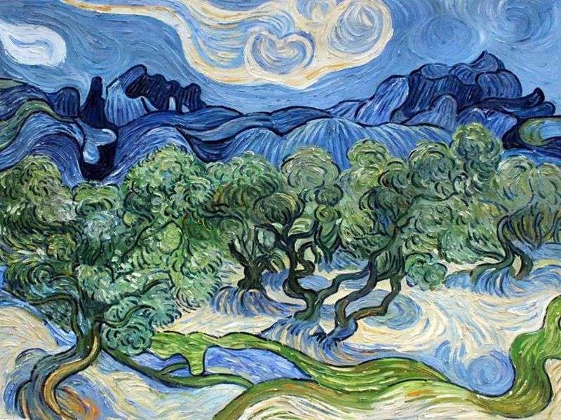
Olive Trees by Vincent Van Gogh

This is an analogous painting called “Olive Trees” by Vincent Van Gogh

This is an example I made of the colours used in Van Gogh’s painting.


Weingummi II

this painting is called “Weingummi II”. It was made by Kay Kurt from complementary colours (green/red).

An example of the colours used in Kurt’s painting

Fairest City - the anger for enemies - Nicholas Roerich | AllPainters.org

This is “Fairest City” painted by Nicholas Roerick in 1914. As you can see, the main colour palette used is shades of red, the colour of fury.

La Période Bleue | Picasso blue period, Picasso art, Pablo picasso art

This was one of the paintings created by Pablo Picasso in “La période bleue” a.k.a “Picasso’s Blue Period”. He uses shades of blue in this painting, and others like this one, to portray feelings of sadness.

Week 3 – Tone & Value.

TASK 1
6 thumbnail value studies in your world. Pick your favourite thumbnail study and illustrate a larger / longer focus study combining composition & tonality.

Here are some thumbnails I have created in the theme of our ‘enchanted forest’ world. I tried to incorporate everything my group and I talked about e.g. mushrooms, tree houses and bridges. I created each of these through Adobe Photoshop and honestly they took a whole lot longer than I thought. I decided to use colour in these thumbnails compared to the previous one in week 2 as I thought it would be easier to portray the whimsical and fairy tale theme that we want in our animation.

I also experimented and played around with different gradients and colour for the background/sky and i think they turned out pretty well.

My favourite of all 6 thumbnails was the fifth one, which is why I chose it to illustrate it larger and in more detail and I had a lot of fun drawing this scene, I hope my group will consider using it for our final edit.

TASK 2
Continue to design, sketch, and iterate on characters/creatures/props/landscapes within your world.
Continue to gather visual references for your worlds to help assist your designs.

Here I have included photos of some of the character designs I had cretaed based off what my group and I have been discussing in the last week.

Image 1 is my version of our ‘mushroom’ character, an example of what we want one of our main characters to look like.

In image 2, I was experimenting with our idea of plant people and how i think they would look.

Image 3 is a rough example of an “enchanted forest” eniroment.

Finally, image 4 is a drawing of our ‘candle man’ with an example of what he would look like normally and what he would look like when the wax he is made of has melted. I personally really like this idea and I think it wouold be an interesting charcter to animate, however this idea was cut as it didnt really fit in with our desired theme.

I have also included some reference photos my group and I were able to discover and they perfectly capture what we are aiming for, in my opinion.


Week 2 – Composition & Perspective.

TASK 1
Trace 3 – one & two-point perspective draw overs from your favorite animations.

For this task, I had to watch through some of my favorite animations and pick out some of the scenes to study their perspective points.

Before I began studying and drawing over them, however, I had to do some research on how to find the different perspective points. For my research, I used the videos from my lecturer, provided on the blackboard.

The images I used have come from 3 separate animations, image 1 is from ‘The Amazing World of Gumball’ (2011), image 2 and 3 are from ‘Adventure Time’ (2010) and I chose ‘Spongebob’ (1999) for images 4, 5 and 6. When it came to placing the lines to present the perspective points of each scene, I used Adobe Photoshop.

You may have noticed that image 6 differentiates from the others as it has 4 perspective points rather than 1 or 2, that’s because I decided to experiment and see could I find the points within a four-point perspective scene, however, I think my example is incorrect.

Overall, this task was tough but after research and practice, I was able to get the hang of one and two-point perspectives.

TASK 2
12 thumbnail drawings of composition studies based on your world theme. 

Here I have attached 12 monochromatic thumbnail drawings I drew based on the theme of our group’s animated world, that theme being ‘forest world’. My group and I had decided we wanted our world to look like a forest/rainforest so I tried my best to visualize some of our ideas.

I created these thumbnails using Adobe Photoshop and I decided not to use colour as I wanted to keep them simple yet detailed enough to present what we were going for.

I’m pleased with the outcome of each of these thumbnails. The only thing I found difficult was coming up with 12 different scenes, without making it look like I was repeating any.

TASK 3
Start to concept and ideate your world theme.

This week was our first week as a group so, apart from the thumbnails shown in task 2, we were just discussing ideas and creating rough mind maps of what we wanted to achieve. we knew we wanted to set our animatic in a rainforest type world and we had also discussed what animals/creatures we wanted to create. we agreed on including rainforest animals, mushrooms, and plants as the main attributes to our animatic.

I’m really excited to work with my group and I cant wait to see what we can come up with together.

Week 1 – Form and Shape.

Practicing studying and drawing underlying forms.

Taking my 3 favorite animated characters to study and re-pose their character forms.

(The three hand-drawn photos are photos of original work. I decided to re-draw them digitally as the photos were bad quality.)

This homework was very straight forward and so fun. As you can see in the pictures attached I chose to study the shapes and forms of “Mike Wazowski” from Monsters Inc. (2001), “Buttercup” from the Power Puff Girls (1998-2005), and “Baymax” from Big Hero Six (2014).

I had a lot of fun with this activity. It has definitely given me a better insight into how easy it is to develop characters from simple shapes e.g. cylinders and cubes, and I can confidently say that this will help me with designing characters in the future.

Week 0 – Welcome Week.

Welcome week mini project. 

Creating a short stop-motion animation or video about myself.

For this assignment, I had to create a stop-motion animation about myself. I began by planning and writing out what I was going to say in the voice-over, that way it was easier for me to follow a basic structure when creating my video.

Next I had done some drawings of what I was going to be talking about in the video e.g. me, my car, my cats etc.

Whenever my drawings were all colored in and cut out it was time to start shooting.

Throughout filming (aka taking many, many pictures) I had been moving my phone and the drawings to maintain continuity/story line flow.

Overall, I had a really fun first time experimenting with stop motion. I definitely learned a few things from this activity and it was a great way to start off the course 🙂

(p.s. I have only included a small clip from the full film)