TASK 1
Complete Exercise I : Colour Schemes
In the video provided explaining exercise 1 (image 1), I was asked to start experimenting with colour in my work and create a coloured version of a thumbnails from previous weeks. I was only to use monochromatic, analogous, complementary, or triadic colour schemes.
Image 3 is a thumbnail created in week 2, which I have tried to recreate in image 2, using Adobe Photoshop. . I decided I wanted to use a triadic colour scheme, which means that each of the colours I’m using are same distance apart around the colour wheel. (I’ve included images 4, 5 & 6 to explain this with the colours I used in image 1.)
I wasn’t very happy with the way this thumbnail turned out so I decided to try again and experiment with a monochromatic colour scheme in a different thumbnail.
Here is how my experimentation with a monochromatic colour scheme. As you can see in image 1 I decided to use the colour pink, simply because it’s my favorite colour. I used another thumbnail that I’d created for week 2 (image 2). The third image is an example of a pink colour scale I was about to set up in Photoshop and this is what i used to create my monochromatic environment.
I’m happier with the outcome with the monochromatic one over the outcome of the triadic schemed thumbnails as it just looks better and I’m glad i took the time to experiment further on this exercise.
TASK 2
Complete Exercise II : Colour and Emotions
For this exercises, I had to experiment with using colours in my work to portray emotions within a scene. I wanted to create a new thumbnail for this instead of using one I had made before, image 2 shows the outcome. I tried to use some of the examples provided by the video tutorial (image 1), those examples being colours of hope, happiness and whimsical. To create this I used Photoshop and the colour palette i used can be found in the bottom left corner of image 2.
I was quite happy with the outcome of this thumbnail. I think I managed to capture each of the emotions I was try to portray while still in keeping with my groups forest world theme.
From both of these colour exercises I’ve realized that colours in a scene are much more important than I initially thought and I’ll definitely be taking all of this into consideration when animating in the future.
TASK 3
Consider looking into different artists styles of how they work with colour
When doing research on colour schemes and palettes, I wanted to take a look at how some artists use the colour schemes that I didn’t focus on, such as analogous and complementary.
I also decided to look into artists who use colours to portray emotions I didn’t consider when creating my thumbnails (e.g. fury and sadness).
This way, I’ll know for next time I’m creating a coloured environment how to use each colour correctly. Not only will I be able to make my animations aesthetically pleasing to watch, I will easily be able to use colours to display the emotions of the environment too.

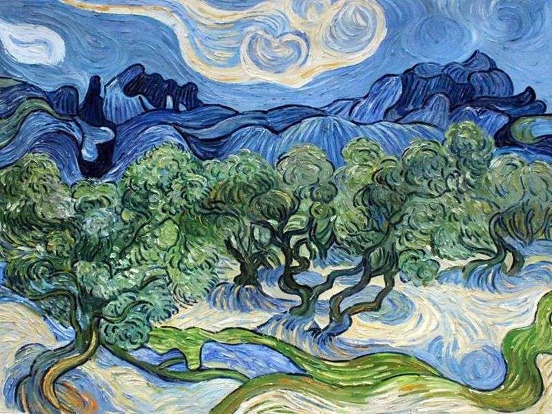
This is an analogous painting called “Olive Trees” by Vincent Van Gogh

this painting is called “Weingummi II”. It was made by Kay Kurt from complementary colours (green/red).

This is “Fairest City” painted by Nicholas Roerick in 1914. As you can see, the main colour palette used is shades of red, the colour of fury.

This was one of the paintings created by Pablo Picasso in “La période bleue” a.k.a “Picasso’s Blue Period”. He uses shades of blue in this painting, and others like this one, to portray feelings of sadness.


