This week, we were asked to take all or part of the Apollo Program content and experiment with different typefaces.
I haven’t decided exactly what I will focus on for this project so for this experiment I took the content on the Apollo flights. I started by marking it up and deciding the size and look of headings, subheadings, body copy, etc.
Before:

After:

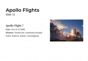
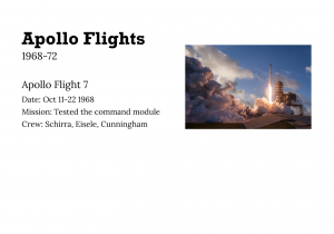
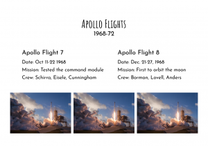
I then took this content and tried different font combinations to see what worked well. I also added images to see how they would look beside them:


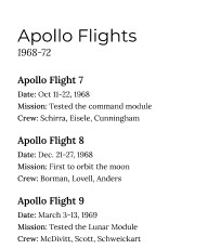
Out of these, I like the first one the best. This uses the typeface “Montserrat” for the heading and “Lora” for the body copy. I think they complement each other well; they are both easy to read and are simple. They are also both variable fonts which enabled me to experiment with bold and italics to make important information stand out. This will be very important for my project. For example, the date is in italics and the subheading and “date” “mission” and “crew” are in bold.
