Journeying Immersively
This week, we learned about macro and micro-interactions. Macro interactions are the bigger interactions a user has with an interface. These are something we are all familiar with such as, going from page to page or section to section. However, I wanted to look deeper into micro-interactions as I think they are very important and can often be overlooked.
Micro Interactions
These are all the small interactions between the user and the interface. They often occur after a trigger; this could be from the user or a change in the system state. They provide feedback to the user and can prevent user errors. They are communicated through changes in the interface and are usually visual.
Examples:
- Scrollbar
- Buttons
- Swipe animation
- Notification
- Pull-to-refresh animation
Why are they important?
- They encourage engagement: If everything was static, it would be boring for the user, and they wouldn’t receive feedback.
- Display system status: It gives users an idea of what is going on.
- Error prevention: If the user knows what is going on, they are less likely to make mistakes. For example, exiting a page that is loading information.
- Communicating brand: small interactions can tie in with the brand’s tone of voice.
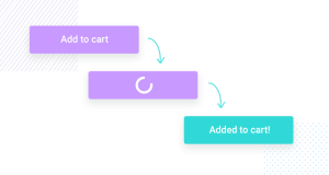
I think these small interactions are very important in making an interface more enjoyable. Gaining visual feedback makes the user feel like they are using something correctly and it can give them satisfaction. The examples below show users that their action has worked.


After learning about these, I want to put more thought into the micro and macro interactions in my products as I have seen how important they are when communicating with your user.