For this assignment, the games students and ourselves brainstormed ideas for a videogame that links to the theme ‘Isolated – Connected’. My main roles were within art direction and character modelling. We agreed that we wanted a shooter game which worked in a similar way to Doom. I was nervous starting this project because I wasn’t very knowledgeable about videogames – growing up I was very much a Wii warrior, so I wanted to educate myself on them. I was happy when Doom was mentioned- I was aware of its influence in pop culture so I was excited to learn about the origins. Zack had an incredible backstory for the game which put us in a great position to get started on the project.


DOOM 1993
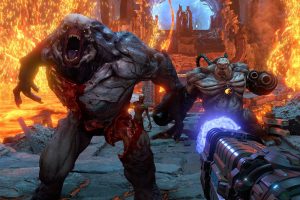
I watched gameplay videos on YouTube of the early DOOM game to better understand what everyone was visualising. We were going for a first person shooter that focused on gaining points by killing enemies. The game is very low poly due to its age, but stylistically we thought this could be fun to experiment with.


The enemies through the decades are half monster, half robot. I liked this concept as it offered many opportunities to experiment with emission, mechanical animation and different sculpting techniques.

![]()

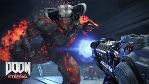
The UI design for this game is a display of different stats about the player’s health, ammo and armor etc. that runs along the bottom with an emote in the center. We thought having lots of numbers on display would be great for keeping the player engaged.
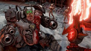
A low poly style requires more effort to achieve, and the most recent Doom games provided a better example of what we wanted to be inspired by. We (animation students) liked this decision as it meant there was more freedom for texturing, and we could make more detailed sculpts for characters.

The ‘Halo 3 -Blockout Map’ was mentioned in regards to the level design. This allowed me to better understand what a ‘sandbox’ level meant.


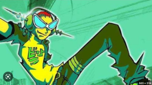
Once the idea was laid down for how the game would work, we began roughing out what the characters might look like together before we each chose one to focus on. A style hadn’t been decided on yet, so I was referencing suggestions that were being sent into Discord. Ellie suggested the game style could look like ‘Lost in Random’ which I liked because the characters in it are made up of both natural and robot-like parts. I tried designing the ‘slagger’ based on Ellie’s and Odhran’s designs but with arms that would come down and spin.
Ellie Odhran


The design was too cute and also it looked like ovaries. I loved the concept of D3 being a sentient rogue and I had fun drawing him.

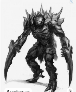
Zack sent this image into the discord as an idea for the Tank. The Tank is a chunky alien-robot that is more difficult to kill. I really like this reference image because of its glowing parts. I began some rough sketches for The Tank based on this and I was happy to model the Tank.


After getting feedback on the design I understood the head was very stylised and that a gun arm would be needed, I also thought the arms and legs were too long and simple.

I changed the head to look scarier and added more details to the legs, along with a gun arm. I drew lots of glowing parts and wires to try and fit what was being talked about.

I thought the tube-leg idea made the character look too top-heavy, and solid legs would make it appear sturdy and solid. We agreed the green colour fed into the alien aspect of the Tank. I still wasn’t happy with the legs of the tank as they were too rounded and long.

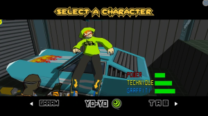
After our presentation, we talked bout how we would act on the feedback we were given. We were advised not to follow too closely with the Doom inspiration – that the game had to be unique and avoid becoming rebrand of the Doom game. I suggested cel-shading to make the game more cartoonish, as I thought it would relatively require the least amount of changes to be made to the actual game since it could be achieved through shaders and would separate the game from Doom while keeping what we had been working on. I looked at Jet Set Radio (2000) and BombRush Cyberfunk (2023) as they use cel-shading, and I liked the focus these games seem to have on presenting characters with emotes and UI design.


BombRush Cyberfunk (2023)


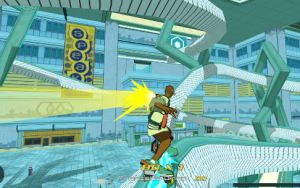
It wasn’t what we were going for stylistically, but it’s an idea I’d like to explore for myself in the future as a fun way to present a character.
We needed designs for the environment to get a feel for what the game might look like. I Looked at the reference videos of gameplay from YouTube being sent into Discord from the games students and the character designs and assets I had seen from Ellie and Mate and based a sketch on them. At the time I was making this I was more focused on designing the Tank – in the future I would like to make multiple thumbnails for the environment.

I think neon lit walls could be modular assets placed around the environment to make it more interesting without having to make detailed textures.
We needed an asset list, so Maté and myself stayed after class and compiled a first draft list of all the different assets we might need to populate the levels. I typed this out and sent it to the Discord chat where it was added to and changed as needed.

I was excited to make assets as it was my favourite aspect of the cinematic assignment last semester. I started making a vent in Blender. I had seen models that Maté had built and textured already, and I knew from his texturing guide that the models we made didn’t need to have details sculpted into them. I wanted to use this simple model as an opportunity to learn from Mate and teach myself texturing skills as that is an area I could improve on. In retrospect, I could have done more to put this into practice.

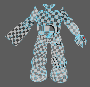
I began modelling the tank in Blender. I used Blenderkit and download free brushes to add bullet damage details because we wanted the Tank to look old and battle worn. The method I used was to create a high-poly model that would be used when texturing in Substance painter and then make a retopologised low-poly model for rigging and animating.


Initially, I had a problem with the model when I brought it into Maya to retopologise it as some meshes were black – I learned they were just inside out. I included an eye plate on the waist after Dan mentioned it would be good to have a recurring symbol across all of the characters that would make them more consistent. Although I used a soft-surface method of sculpting to create a metal character, I enjoyed using the pinch tool to make sharp edges that look solid. This method gave me the freedom to experiment with different shapes – I was happy with the shin shapes and I don’t think they would have been possible had I used a modular modelling method.
Once the Tank had been retopologised in Maya, I began UV unwrapping each object. Then, I laid them out using the UV editor. I had to make sure the high-poly model and low-poly model were exactly the same size and position etc. In Substance Painter, I opened up the low poly model and loaded in the high poly model and was happy to find out there wern’t any problems. Then, I baked the meshes so that I could begin adding textures.

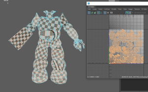


I spent lots of time trying to understand UV Mapping and watched a number of past lectures and YouTube tutorials to try and unwrap the Tank so each part could be textured seperately, but I still was having difficulty with it. It was a bit frustrating since I was able to do it on simpler assets last semester – it’s something I need to improve on. I think if I practice UVing on simpler models and work my way up I will eventually be able to get a character ready for texturing.
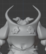
After recieving feedback on the Tank I realised there were several things that needed to be changed before I could send it to Mate for texturing. The head was too small and the eyes weren’t intimidating, so I played around with resizing it and sculpting it in Blender and I was happy with the cyclops look. The characters all needed to be more consistent – Dan mentioned sharing parts between each enemy which meant there were clear similarities between them. I placed Dan’s eye plate on the Tanks chest and used the same neck tubes from the Slagger sculpt. The anatomy of the Tank in general was not the best because I foolishly hadn’t studied enough references. After looking at a Transformers drawing, I realised the Tank looked bad mainly because of it’s hips – the legs were coming straight down rather than from the sides.


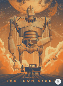
I learned the same lesson from looking at the hips of The Iron Giant. I noticed that every strong and heavy character concept I looked at was stocky and wide. I widened the Tank’s chest and shortened and widened all of his limbs, and made his shoulders much larger. Using the snake tool in blender, I added natural spikes and layers to play into the alien- robot appearance. I kept most of the objects separate to make it easier for emission to be added when texturing. Adding large horn-like spikes to the Tank’s back made the character more personality – looking at these references, the stronger looking characters have a hidden neck too which makes them look more indestructible.


Using blenderkit brushes, I added some cog details which made the back design more interesting. If I was to do this again I would make cog models so it would be easier to make them glow as this would look cool when playing the game.
I smoothed out the bullet damage dents because I think they would have been inconsistent with the other enemies. I added more details to the gun-arm using loop cuts and sinking the faces. I widened the talons and made them simpler so they would be easier to rig. If I could do this again I would spend more time on the base of the feet to make them less irregular and more pointy. I would also make the spindly parts on the legs thicker so that they wouldn’t separate after they had been retopologised. Once I was happy with the Tank’s final sculpt, I made a low and high-poly fbx’s which I sent to Odhran who offered to rig it and Mate who textured it.
I practiced rigging using Mike’s penguin and I tried animating the Tank using Odhran’s rig but I had difficulty with the joints and the animations he was making were so good, I thought if I animated the Tank it would lower the quality of the game so I focused on doing other animations.

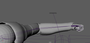
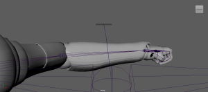
I moved on to animate the blade/knuckle armour for Mate. He needed two seperate animations – one for the blade rotating into action and one for the knuckle duster. These animations would be used on the arm of D3 in close combat. The blade whips out really fast while the hammer is a little slower, moving along the left before it shifts into place.


I uploaded these two different Maya files to the shared google drive that Maté set up.


I animated a punch for Josh. When I opened the file that was sent to me I assumed that the model was upright as the plane grid was upright and I had spoken to Josh about it in class, but after sending the finished animation I found out the punching arm was actually pointed downwards.